

Table of contents

TL;DR
A strong solution slide makes the answer to the problem immediately understandable. Investors should be able to see what the product is, how it works at a high level, why it is meaningfully different, and what outcome it creates. The best slides do not list every feature. They use one clear headline, one dominant visual, and a small amount of supporting information to make the solution feel credible and easy to remember.

A strong solution slide makes the answer to the problem immediately understandable. Investors should be able to see what the product is, how it works at a high level, why it is meaningfully different, and what outcome it creates. The best slides do not list every feature. They use one clear headline, one dominant visual, and a small amount of supporting information to make the solution feel credible and easy to remember.
Amélie Laurent
Product Manager, Sisyphus

Your Problem Slide Creates the Need. Your Solution Slide Must Resolve It.
The problem slide has made the pain visible. It has shown investors what is broken, who is affected, and why the current state cannot continue.
The next slide has to make your answer feel clear, credible, and proportionate to the problem you just established. This is where many pitch decks lose momentum. Founders often move from a focused problem statement to a dense product page filled with features, screenshots, technical terminology, and architecture. The product may be strong, but the investor is forced to assemble the story themselves.
A strong solution slide should answer four questions quickly:
- What is the product or platform?
- How does it solve the problem?
- Why is this approach different or better?
- What meaningful outcome does it create?
The entire product does not need to fit on one page. The first product page only needs to establish the simplest accurate mental model. Deeper technology, workflow, or clinical slides can follow once the investor knows what they are looking at.
DocSend's pitch deck research reinforces the need for a concise, well-organized story. Investors move through decks quickly, and the product section needs to emerge naturally from the purpose, problem, and solution. Clarity at this point in the narrative matters more than completeness.
At M'idea Hub, we have designed 300+ startup pitch decks across technology, healthcare, SaaS, biotech, and manufacturing. The strongest product stories are rarely the ones that explain the most. They give investors the right understanding first.
If you are still refining the slide that comes before this one, start with our guide to building a strong problem slide.
The Design Principles Behind a Strong Solution Slide
This page is not a feature inventory. It is the bridge between the problem and the investment thesis. Four principles help simplify the product without making it look generic.
The Anatomy of an Investor-Ready Solution Slide
The exact problem solution slide layout will change by company, but most strong versions contain five parts.
If your product is technically strong but still difficult to explain visually, our pitch deck design services for technology startups and healthcare companies are built around this exact challenge.
5 Solution Slide Examples and What Works Visually
The right design depends on the product, its complexity, the company's stage, and what investors need to believe next. A healthcare platform should not be presented like a therapeutic mechanism. The format needs to match the product's strongest explanation.
The examples below use different visual models, but each gives the investor a clear way to understand the solution.
Some company names and content in the referenced portfolio work have been redacted or replaced to maintain confidentiality.
1. The Platform Architecture Solution Slide
This format works when the value comes from connected parts working as one system. CardioPath divides the platform into a patient app, an AI layer, and a clinician dashboard.
.jpg)
What works visually:
- The patient and clinician interfaces sit on opposite sides, making the two-user system easy to understand.
- The AI layer occupies the center, giving the proprietary intelligence a clear role rather than treating AI as a vague claim.
- Directional arrows show how signals move through the platform.
- A benefit column translates the architecture into predictive risk modeling, clinical prioritization, and adaptive recovery pathways.
- Product screens make the system tangible.
Why investors care:
It shows this is more than a patient app. It connects home monitoring, intelligence, and clinical action into a scalable platform.
Portfolio reference: AI-powered healthcare Series A pitch deck
2. The Mechanism-of-Action Solution Slide
This approach works when investors must believe the mechanism before the opportunity. The CNS therapeutics example turns a complex brain-delivery concept into a six-step visual sequence.
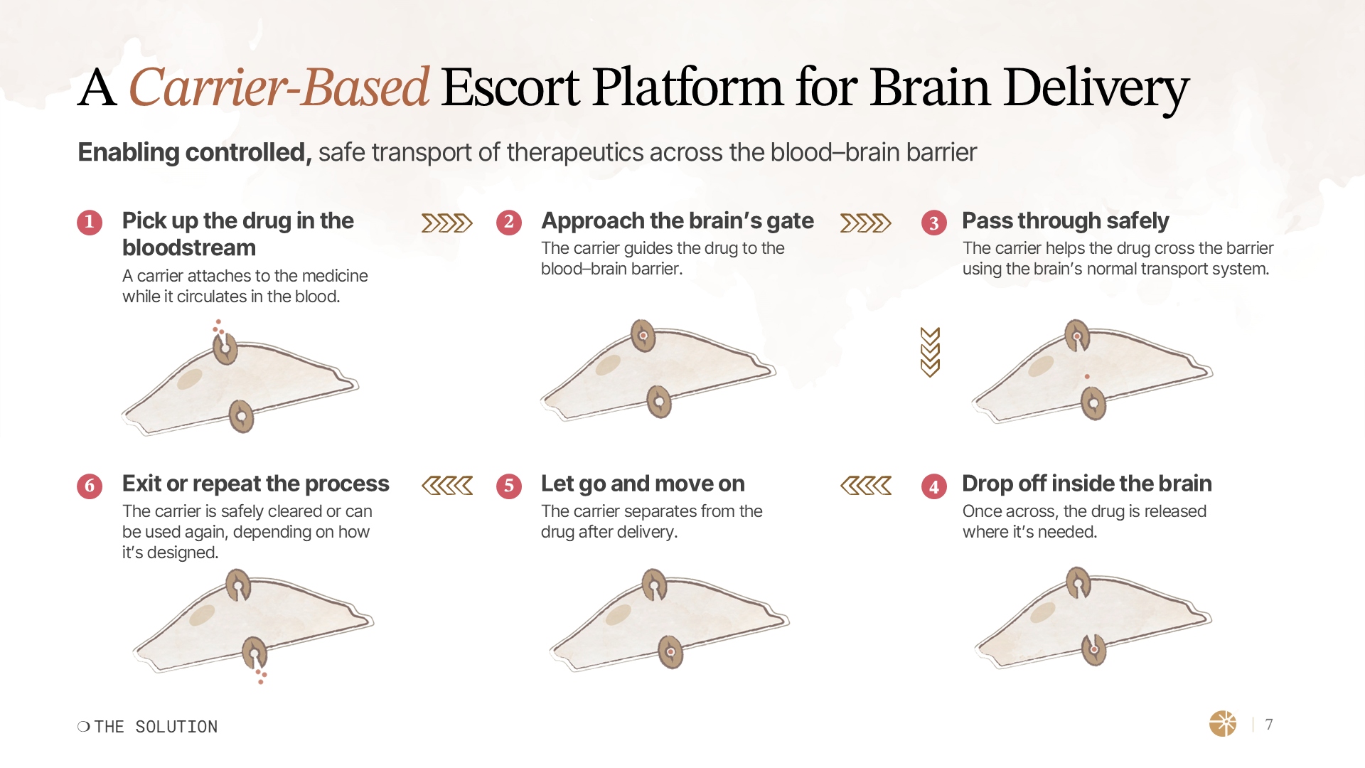
What works visually:
- The numbered sequence gives investors a defined starting point and reading path.
- Repeated illustrations help the viewer compare what changes at each stage.
- Plain-language step names reduce the cognitive load of a technical concept.
- The subtitle states the benefit: controlled, safe transport across the blood-brain barrier.
- The visual style preserves scientific credibility without turning the page into a research figure.
Why investors care:
It converts an abstract scientific claim into an understandable process. Investors can see why the approach is plausible and relevant without mastering the full science.
Portfolio reference: Series A pitch deck for a CNS therapeutic platform
3. The Animated Technology Solution Slide
Animation is useful when the story depends on sequence or layers. Nova AI introduces each pillar in stages while the custom illustration evolves with the explanation.
What works visually:
- Progressive disclosure keeps a complex AI model from becoming one dense architecture diagram.
- The active section is high contrast while upcoming sections remain visually quiet.
- Custom illustrations give each technical idea a concrete visual metaphor.
- Repeated slide structure helps the audience understand the sequence without reorienting each time.
- Motion controls the order of data organization, trustworthy insights, and personalized solutions.
Why investors care:
For an AI company, technology can sound impressive but remain difficult to distinguish. Controlled animation makes the operating logic easier to follow and gives each capability space to land.
Portfolio reference: Series B pitch deck for a B2B SaaS startup
4. The Workflow Transformation Solution Slide
This format works when the value comes from simplifying a fragmented or inefficient process. The B2B fintech example shows how a complex financial workflow can be transformed into a more connected, streamlined platform experience.
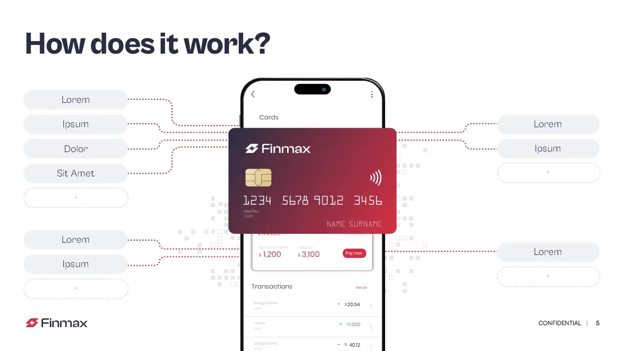
What works visually:
- The product interface becomes the central visual anchor, making the solution immediately tangible.
- Connected elements show how different parts of the workflow come together through one platform.
- The simplified structure makes a complex financial process easier to understand at a glance.
- Clear visual hierarchy guides the viewer from the product to the surrounding capabilities.
- Product UI replaces abstract feature descriptions with something investors can actually see.
Why investors care:
Investors can quickly understand how the platform reduces complexity and brings multiple operational touchpoints into one system. This is especially effective for fintech, SaaS, enterprise software, and workflow-driven products.
Portfolio reference: Series B pitch deck for a B2B fintech platform
5. The Product-Centered Solution Slide
This approach works when the product itself is the clearest proof of differentiation. Cerevia places the Ladybug device and patient at the center, surrounded by live brain imaging, deep-brain TMS, and AI-driven therapy.
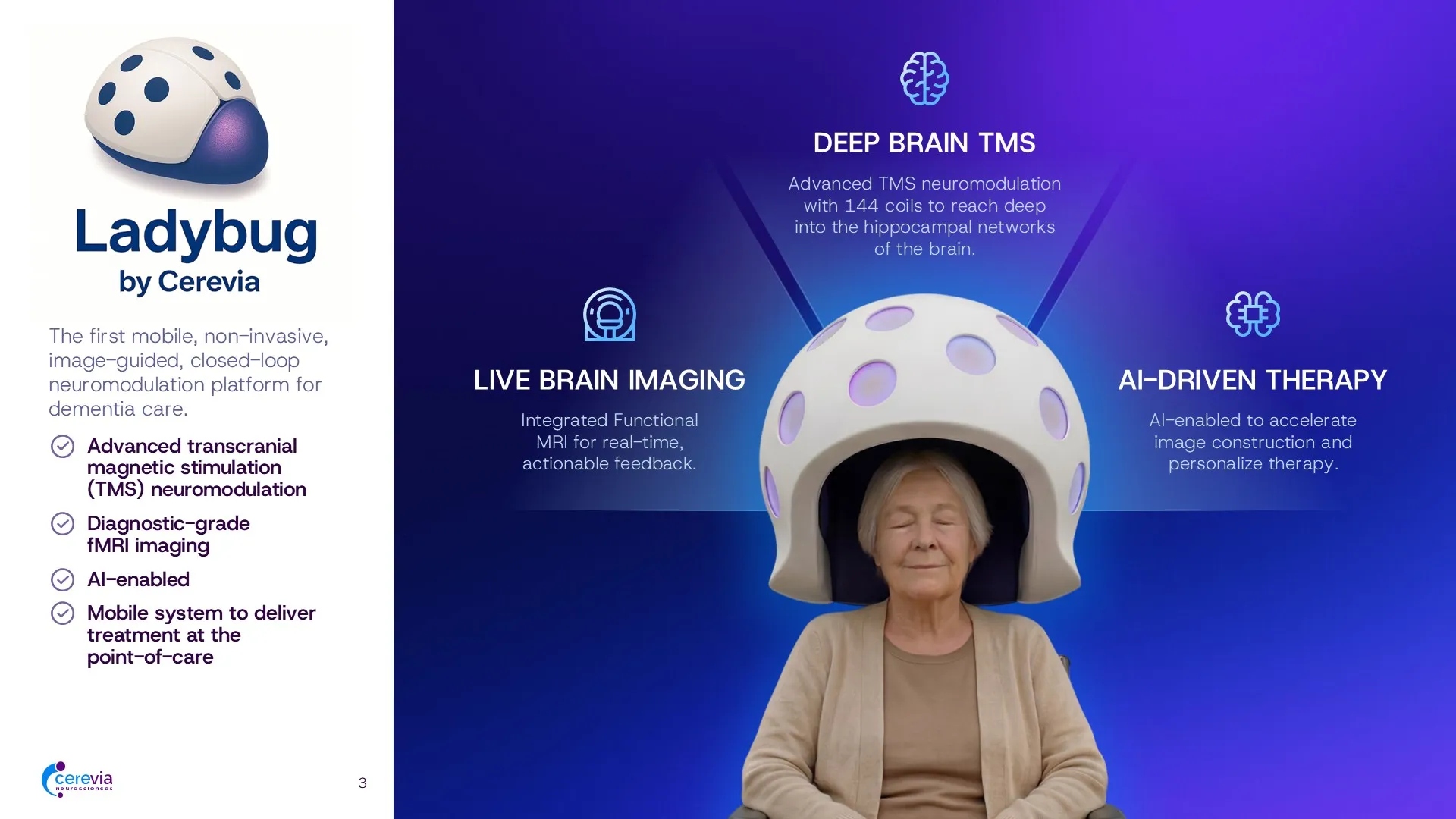
What works visually:
- The large product image creates an immediate visual anchor.
- Showing a patient using the device explains scale, context, and point-of-care use more effectively than an isolated render.
- Three capability zones reveal how the system combines imaging, treatment, and intelligence.
- The left panel provides a concise product definition and a short list of differentiators.
- The dark gradient creates focus while the white labels remain easy to scan.
Why investors care:
The slide makes a complex device tangible and shows that differentiation comes from combining imaging, neuromodulation, AI, and mobile delivery.
Portfolio reference: Series A pitch deck for an AI-driven dementia care platform
There is no universal template. The format depends on the proof investors need: system logic, scientific feasibility, technical sequence, visible transformation, or product differentiation.
How Your Solution Slide Should Evolve from Seed to Series C
The product may remain the same, but the investor question changes as the company matures.
StageWhat the slide must doWhat investors expectDesign prioritySeedMake the product vision easy to graspA clear insight, credible concept, early prototype, or simple user journeyEstablish one memorable mental modelSeries AConnect the solution to early proofProduct readiness, customer use, initial outcomes, technical feasibility, or clinical progressShow how the product works and why users adopt itSeries BShow a repeatable and scalable systemPlatform depth, workflow integration, performance, expansion potential, and defensibilityPresent the architecture without losing executive claritySeries CPosition the solution as category infrastructureProduct breadth, ecosystem role, enterprise readiness, data advantage, and durable moatShow how multiple capabilities reinforce one scalable platform
At Seed, simplicity builds belief. By Series B and C, the design should add depth as the evidence grows without losing the central idea.
5 Actionable Tips to Elevate Your Solution Slide
1. Replace “Our Solution” with an actual answer
Write the headline as a conclusion. Name the product category, the core mechanism, or the outcome it enables. This gives every other element a clear job.
2. Choose the visual before choosing the layout
Do not begin with a three-column template. Ask what visual would help an investor understand the product fastest.
- Use product screens when the interface is the experience.
- Use a workflow when value comes from a sequence.
- Use a mechanism illustration when technical feasibility matters.
- Use a device-in-context visual when the physical product is the differentiation.
- Use a before-and-after comparison when the outcome is visibly different.
3. Separate the solution from the feature list
The first product page should establish the big idea. Detailed features can follow. If every feature appears at once, investors may remember none of them.
4. Make the mechanism proportional to the claim
The larger the promise, the more explanation is needed. A productivity tool may need only a workflow. A therapeutic platform may need a mechanism and separate validation slides.
5. Connect every capability to an outcome
Complete “what it does” with “what changes.” Risk modeling helps identify patients earlier. A carrier system enables controlled brain delivery. Mobile imaging brings advanced care closer to the patient. That connection turns product description into investor value.
Common Solution Slide Mistakes That Weaken the Pitch
1. Treating the slide like a feature checklist
A long list of capabilities transfers the work of finding the main idea to the investor.
2. Explaining the technology before defining the product
Architecture means little until investors know what the company sells, who uses it, and what it solves.
3. Using a generic diagram that could belong to any company
Circles, arrows, and AI icons can make a slide look polished without revealing anything proprietary. The visual should expose the specific logic of your solution.
4. Trying to fit the entire product story on one page
Complex companies often need a short sequence: overview, how it works, product experience, differentiation, and proof. Give each page one clear job.
5. Using animation without a narrative purpose
Animation should control sequence, reveal relationships, or simplify complexity. If the elements only move for effect, the motion competes with the message.
Final Takeaway
The problem slide creates urgency. The solution slide converts that urgency into belief.
It should show what the product is, how it addresses the pain, why the approach is different, and what outcome it creates. The strongest version removes unnecessary effort from understanding the company.
Use one conclusion-led headline, one dominant visual, and only the mechanism needed to support the claim. Then connect the product to the result investors should remember.
If you are preparing for a fundraise and your product is still difficult to explain in one clear visual story, book a discovery call. We can help you turn the complexity into an investor-ready pitch deck without losing what makes the solution credible.
Frequently Asked Questions About Solution Slides
What should a solution slide include in a pitch deck?
A strong solution slide should include a clear headline, a visual representation of the product or approach, a simple explanation of how it works, a small number of meaningful differentiators, and the outcome it creates. Investors should understand the central idea before reading every supporting detail.
What is the difference between a problem slide and a solution slide?
The problem slide proves that the pain is real, urgent, and worth solving. The solution slide shows how the company resolves that pain and why its approach is credible and different. The two slides should feel connected: the solution should directly answer the problem established immediately before it.
Should the problem and solution be on the same slide?
For most investor pitch decks, separate slides are stronger because each idea has room to land. A combined problem and solution slide can work in a short teaser or a very simple business, but the visual hierarchy must make the transition from pain to answer immediately clear.
Should a solution slide show screenshots, a workflow, or a diagram?
Use the format that explains the product fastest. Screenshots work when the interface is central to the value. Workflows are useful for processes and software. Diagrams work well for platforms, scientific mechanisms, and connected systems. A physical product is often strongest when shown in its real use environment.
How do you explain a complex product on one solution slide?
Start with the simplest accurate mental model. Define what the product is, isolate one central mechanism, and use a visual sequence or labeled system to explain it. Move technical architecture, validation, and detailed features to the slides that follow.
What are the most common solution slide mistakes?
The most common mistakes are using a generic “Our Solution” headline, listing too many features, introducing technical detail before defining the product, using diagrams that do not reveal differentiation, and adding animation without a clear narrative purpose.
.webp)