

Table of contents
TL;DR
Your pitch deck's problem slide does the hardest job in the deck, it has to make investors believe the problem is real, painful, and big enough to build a venture-scale company around. If it doesn't, nothing else in the deck matters. A strong problem slide creates urgency, builds belief in the size of the pain, and earns investors the right to keep reading. Let's explore how to do it right.

Your pitch deck's problem slide does the hardest job in the deck, it has to make investors believe the problem is real, painful, and big enough to build a venture-scale company around. If it doesn't, nothing else in the deck matters. A strong problem slide creates urgency, builds belief in the size of the pain, and earns investors the right to keep reading. Let's explore how to do it right.
Amélie Laurent
Product Manager, Sisyphus

A problem slide is one of the first moments where investors decide whether the opportunity deserves serious attention.
For founders, this slide has to prove that the pain is real, urgent, and large enough to build a meaningful company around. The problem slide has to do 3 things quickly:
Make the pain visible.
Investors should understand the problem before they read every supporting detail.
Show the cost of the current state.
The slide should make it clear what is broken, who is affected, and what happens if nothing changes.
Create a natural opening for the solution.
By the time investors reach the next slide, the solution should feel necessary.
According to DocSend’s pitch deck benchmark research, investors spend limited time reviewing a deck, which means early slides need to work quickly. The problem slide cannot depend on patient reading. It has to communicate through structure, hierarchy, and visual clarity. This is where design becomes strategic.
At M’idea Hub, we’ve designed 500+ high-stakes pitch decks across tech, healthcare, SaaS, biotech, and manufacturing. The pattern is clear: the strongest problem slides are rarely the ones with the most information. They are the ones where the pain is easiest to understand and hardest to dismiss. For founders, this slide builds belief.
The Design Principles Behind a Strong Problem Slide
A strong problem slide is not designed after the story is written. It is part of the story.
The design decides what investors notice first, what they believe next, and how quickly they understand the scale of the pain. This is why problem slides cannot be treated like standard content slides. They need to be built around investor comprehension.
When those four principles hold, the slide stops feeling crowded and starts feeling intentional. Every element has a job. Here's what that looks like, part by part, the anatomy of a problem slide that earns the next read:
5 Problem Slide Examples and What Works Visually
The right design approach depends on the:
- Type of problem
- The stage of the company
- Evidence available
- The investor audience.
A healthcare AI problem slide should not look like a SaaS workflow problem slide. A biotech bottleneck should not be designed the same way as a manufacturing operations challenge. The design has to match the nature of the pain.
For founders, this is important because it prevents the deck from feeling templated. Here are five design styles that show how different problem slides can create urgency.
1. The Cost-and-Consequence Problem Slide
This style works well when the problem has both human impact and measurable financial cost.
The strongest version of this slide does not rely only on a large number. It connects the number to a real-world consequence.

- A clear headline frames the problem as urgent and unresolved.
- A large cost figure gives the slide immediate business weight.
- Human or clinical context prevents the slide from feeling purely financial.
- Supporting points are grouped so investors can scan the pain quickly.
- The layout separates emotional urgency from economic consequence.
Portfolio reference: AI-powered healthcare Series A pitch deck
2. The Scientific Bottleneck Problem Slide
This style works well for biotech, neuroscience, medical device, and deep-tech companies where the problem is highly technical.
The risk with these slides is over-explanation. Founders often try to educate investors on the full science too early. That can slow the deck down.

- A bold statistic creates immediate credibility.
- A simple scientific illustration makes the barrier tangible.
- Supporting points follow a clean logic path.
- The slide avoids unnecessary technical depth.
- The design makes the science understandable without making it feel shallow.
Portfolio reference: Series A neuroscience startup pitch deck
3. The Broken Workflow Problem Slide
This style works well for SaaS, enterprise software, AI platforms, and workflow-driven companies. In these categories, the problem is often less emotional and more operational.
The pain may live in fragmented systems, slow decisions, manual work, disconnected teams, poor visibility, or costly inefficiencies.

The design challenge is making that operational pain feel urgent.
- A structured layout makes the problem easy to compare.
- Icons or simple visual cues help investors scan faster.
- Short copy keeps the slide at an executive level.
- Contrast helps separate each pain point clearly.
- The overall design makes the problem feel systemic.
Portfolio reference: Series B SaaS startup pitch deck
4. The Multi-Pain-Point Grid
This style works well when the market has several connected problems that need to be understood together.
Manufacturing, infrastructure, logistics, healthcare operations, and industrial technology often fall into this category. The pain may involve multiple stakeholders, outdated processes, cost pressure, coordination issues, and execution risk.
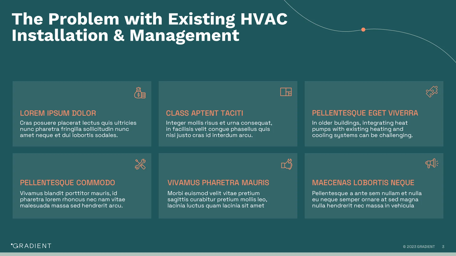
A long paragraph would make the slide heavy. A grid makes the complexity easier to scan.
- The grid turns complexity into clear categories.
- Each pain point gets its own defined space.
- Icons create quick recognition without adding clutter.
- Consistent formatting helps the investor move through the slide.
- The structure shows breadth without losing control.
Portfolio reference: Series B fundraising pitch deck for manufacturing tech
5. The Patient-and-Market Problem Slide
This style works well for healthcare, aging care, chronic disease, mental health, patient access, and care delivery companies.
In these categories, the problem has to be understood on two levels.
First, investors need to feel the human impact.
Who is affected? What does the patient, caregiver, clinician, or health system experience every day?
Second, they need to understand the market weight.
How large is the burden? What does it cost? Why is the current model not solving it?
A strong patient-and-market problem slide brings both sides together.

- Patient or caregiver imagery makes the problem feel real.
- Large data points show scale and market significance.
- Cost burden adds commercial significance.
- Treatment gaps or system limitations show why the current system falls short
- The design balances emotional urgency with analytical proof.
Portfolio reference: Series A pitch deck for an AI-driven dementia care platform.
The bigger lesson is simple: the problem slide should be designed from the type of pain the company is trying to prove. When the design style matches the problem, investors understand the opportunity faster. That is what makes the slide stronger.
How Your Problem Slide Should Evolve from Seed to Series C
A strong problem slide should mature as the company matures. The mistake many founders make is carrying the same problem framing from one round to the next. What works at Seed may feel too light at Series A. What works at Series A may feel too narrow at Series B or C. Investor expectations change by stage. The design has to change with them.
5 Actionable Tips to Elevate Your Problem Slide
1. Replace “The Problem” with a real problem statement
The headline should create direction for the entire slide. Once the headline is strong, every visual and data point has a clearer job.
Instead of: The Problem
Use something more specific:
- Hospitals are spending billions on preventable readmissions
- Neurotherapeutics are limited by one major delivery barrier
- Enterprise teams are making decisions with fragmented operational data
2. Choose one visual anchor
A strong problem slide needs one dominant visual anchor. That anchor could be a large number, a workflow diagram, a patient image, a market map, a cost breakdown, or a simple before-and-after comparison.
The right visual depends on the type of problem.
- If the pain is financial, lead with the cost
- If the pain is operational, show the workflow breakdown
- If the pain is clinical, show the patient or system burden
- If the pain is technical, simplify the bottleneck
The visual anchor should make the problem easier to understand, not just make the slide look more designed.
3. Show consequence, not just pain
Investors need to understand what happens if the problem continues. Many slides stop at the surface-level pain:
Workflows are inefficient. Systems are fragmented. Access is limited. Current solutions are outdated.
These may be true, but they are not strong enough on their own. A stronger problem slide shows the consequence:
Delayed decisions. Higher costs. Poorer outcomes. Lost revenue. Operational risk. Failed treatments.
This is what creates urgency. The slide should make the current state feel expensive, risky, or unsustainable.
4. Design for scanning before reading
Investors scan first. That means the slide should work even before someone reads every line.
The first glance should reveal the core problem
The second glance should show the evidence
The full read should add depth
Use size, spacing, contrast, and grouping to control what the investor sees first. The most important element should feel obvious. Supporting details should support the argument, not compete with it. This is especially important for complex sectors like healthcare, biotech, SaaS, and manufacturing, where the content can become dense quickly.
5. Make the solution feel necessary
The problem slide should create demand for the next slide. By the time investors reach the solution, they should already understand why the current approach is not enough.
- If the solution is AI-driven, the problem should show why manual or fragmented systems are failing.
- If the solution is a new therapeutic platform, the problem should show the limitation in the current treatment or delivery model.
- If the solution is enterprise software, the problem should show the operational gap clearly.
That sequence is what makes the deck feel more strategic, more focused, and easier for investors to follow.
If you’re wondering how to write a problem slide, start with the pain, then design around the strongest proof.
Common Problem Slide Mistakes That Turn Investors Off
After reviewing hundreds of investor decks, the same mistakes show up often. Most are not content problems. They are clarity problems.
1. Trying to explain everything
Founders often know the problem too deeply, so they try to include every detail. The slide becomes dense, slow, and hard to scan.
A problem slide should not explain the entire market. It should make the core pain impossible to miss.
2. Leading with data without a clear takeaway
Big numbers help, but only when the implication is clear.
A slide with multiple stats and no clear hierarchy feels scattered. Investors should immediately understand what the data proves and why it matters.
One strong data point with a clear visual treatment is usually more powerful than five competing numbers.
3. Making the slide too text-heavy
If the slide depends on full reading, it is too slow.
Investors should understand the problem from the headline, visual, and key proof point before reading every supporting line.
Design should reduce the effort required to understand the pain.
4. Giving every element the same visual weight
When the headline, data, visuals, and supporting copy all compete for attention, investors do not know where to look first. The slide may have the right information, but the hierarchy is weak.
A strong pitch deck problem slide should make the most important idea obvious immediately. The key pain, proof point, or visual anchor should lead. Everything else should support it.
5. Hiding the strongest proof
When the headline, data, visuals, and supporting copy all compete for attention, investors do not know where to look first. The slide may have the right information, but the hierarchy is weak.
A strong pitch deck problem slide should make the most important idea obvious immediately. The key pain, proof point, or visual anchor should lead. Everything else should support it.
Final Takeaway
Your problem slide is one of the first places investors decide whether the opportunity deserves more attention.
It should make the problem easy to see, easy to believe, and hard to ignore.
A strong problem slide has a clear headline, one strong visual anchor, credible proof, and a layout that guides the investor’s eye. It shows what is broken, why it matters, and why the current approach is not enough.
For founders, this slide builds belief before the solution appears. it is one of the highest-leverage slides to sharpen before a fundraise.
If the problem feels urgent, the solution gets more attention.
If you’re preparing for a fundraise and want a second set of eyes on your deck, we’d be happy to review it with you. Book a Discovery Call and let’s bring your story to life.
Frequently Asked Questions About Pitch Deck Problem Slide
What should a problem slide include in an investor pitch deck?
A strong problem slide in a pitch deck should include a clear problem statement, one strong visual anchor, credible proof, and the consequence of the pain. Investors should quickly understand what is broken, who is affected, and why the problem is worth solving.
How do you make a problem slide stronger?
To make your pitch deck problem slide stronger, make the headline more specific, reduce unnecessary text, and create a clear visual hierarchy. The slide should be easy to scan, with the most important evidence clearly emphasized.
Should a problem slide use data or storytelling?
A strong investor pitch deck problem slide should use both. Data gives the problem credibility, while storytelling makes the pain easier to feel. The strongest problem slides connect the number to a real human, business, or operational consequence.
How long should the problem section be in a pitch deck?
For most investor pitch decks, the problem section should be one strong slide. In complex categories like healthcare, biotech, SaaS, or manufacturing, it can become a short sequence, but each slide should still have one clear job.
What is the biggest mistake founders make on the problem slide?
The biggest mistake founders make on the startup pitch deck problem slide is overexplaining. Too much context, too many bullets, and too many data points make the slide harder to scan and weaken the urgency.
How does the problem slide change from Seed to Series A?
At Seed, the pitch deck problem statement slide can rely more on founder insight, lived experience, and early customer pain. At Series A, investors expect stronger evidence such as customer interviews, usage signals, waitlist demand, or early adoption patterns.
.webp)


