Table of contents
TL;DR
Most startups don’t miss Series A because the business isn’t working. They miss it because their pitch deck still looks and sounds like Seed. This guide shows, through a real case study, how decks must evolve from storytelling to proof.

Most startups don’t miss Series A because the business isn’t working. They miss it because their pitch deck still looks and sounds like Seed. This guide shows, through a real case study, how decks must evolve from storytelling to proof.
Amélie Laurent
Product Manager, Sisyphus

A large percentage of companies that successfully raise Seed capital never make it to a Series A.
We've watched this pattern unfold dozens of times. A founder raises Seed capital on vision, story, and early promise. The product gains traction. Customers sign on. Everything feels like it's working.
Then they start the Series A process using the same deck that helped close Seed conversations starts working against them.
Not because the company stalled. But because their pitch deck never evolved.
This transition is one of the most misunderstood moments in startup fundraising. Founders think the gap between Seed and Series A is mostly about numbers, more revenue, more users, better charts.
They're half right. The real shift is how you communicate that progress and what investors are actually evaluating at this stage.
At Seed, investors back belief. They invest in you, your insight, and the potential you've identified. Your story carries the deck because proof is still emerging.
At Series A, belief isn't the question anymore. Execution is. Investors are looking for repeatability, momentum, and clear signals that the company can scale without breaking. And they decide that faster than most founders expect, often in a few minutes of scanning.
The stakes are different too. Series A rounds are often 5X larger than Seed. The bar changes. The risk profile changes. Your deck has to reflect that shift immediately.
This guide breaks down how your pitch deck needs to evolve from Seed to Series A, slide by slide. What investors expect to see, how storytelling shifts from vision to proof, and how design becomes a credibility signal, not just polish.
If you’re a founder preparing for a Series A, or a VC helping portfolio companies level up their fundraising narrative, this guide breaks down how your pitch deck needs to evolve from Seed to Series A, slide by slide with a case study.
Why Most Startups Fail Between Seed and Series A
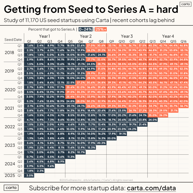
According to Carta's analysis of over 11,000 U.S. startups, there's a dramatic drop-off after Seed funding. Only a small fraction make it to Series A, and recent cohorts are performing even worse.
Just look at the numbers:
According to seasoned investors and operators, it comes down to 4 brutally simple reasons:
- Poor revenue growth
- Unscalable economics
- Overextended Seed valuations
- Changing market dynamics
But underneath all of this is a deeper issue: Most founders don’t visually prove they’re ready for Series A. They still pitch like they're raising Seed.
Even with solid traction, if your pitch deck feels cluttered, narrative-heavy, or unpolished, investors subconsciously conclude:
- You’re not focused on precision
- You haven’t built investor-ready systems
- You may still be “early” for the raise you’re targeting
Seed vs. Series A: What’s Actually Changing?
The difference between these rounds isn't just bigger numbers. It's a completely different evaluation framework.
At Seed, investors ask: "Is this insight real, and is this team the right one to pursue it?"
At Series A, they ask: "Is this working in a scalable way, and can this team execute under pressure?"
That fundamental shift affects 3 things:
Mindset Shift:
Seed investors underwrite potential. They're comfortable with uncertainty if the insight is sharp and the founder is credible.
Series A investors need to see that what should work is already working, consistently, across customers, channels, and time. This is why Series A conversations move faster and feel more intense.
Narrative Shift:
Seed decks lean on storytelling. You paint the problem emotionally. You explain the solution conceptually. You frame the market in broad strokes. That works early on.
At Series A, your story must be anchored in proof. Every claim needs support. Every metric needs context. Each major slide should answer follow-up questions before they're asked.
For example:
- Traction isn’t just “growth”. It’s what’s driving growth.
- GTM isn’t just a strategy. It’s what’s already working and why.
- Market size isn’t ambition. It’s where you’re entering and how you expand.
Design Shift:
Seed decks emphasize more on storyline, aesthetics, clarity of problem and founding insight.
At Series A, design becomes a credibility signal. Clean layouts, readable charts, and disciplined structure tell investors you're operationally mature. Cluttered slides suggest the opposite.
This isn't about making things pretty. It's about making decisions easy.
Slide-by-Slide Evolution With Case Study
Let's walk through a real example using CardioPath, a digital therapeutics platform that helps cardiac patients during the critical post-discharge period. We worked with them through both their Seed and Series A raises, and the transformation in their deck tells the whole story.
When they came to us for Seed, they had a powerful founding insight: cardiac readmissions cost the U.S. healthcare system over $17 billion annually, yet there was virtually no systematic support for patients after they left the hospital. The deck leaned into that emotional truth.
18 months later, they had real data: 2,400+ enrolled patients, 34% reduction in 30-day readmissions, and contracts with three major health systems. But their deck still looked like a Seed deck. That's when we rebuilt it for Series A.
Here's what changed, slide by slide.
Overall Design Tone
Seed
- Warm, approachable color palette to build empathy
- Larger illustrations showing patient journeys
- Generous use of icons and storytelling devices
- Design that invited you to feel the problem
Series A
- Cleaner, more restrained layouts
- Strong visual hierarchy and breathing room
- Minimal illustrations, maximal data visualization
- Design supports fast decision-making
The Seed deck said "this problem matters." The Series A deck said "we've figured out how to solve it at scale."
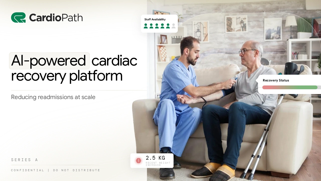
1. Title Slide
Seed version:
- Introduce the company with just logo + tagline

Series A version:
At Series A, investors don't need to be convinced that cardiac care matters. They need to know you're the company solving it. The title slide should immediately establish credibility and differentiation.
- Establishes credibility with a clear, outcome-led headline (“Reducing readmissions at scale”)
- Cleaner layout with restrained typography and confident spacing
- Brand colors and visual treatment feel operational and established
- Subtle data and UI cues signal real-world usage and execution
2. Executive Summary
Seed version:
- Often omitted or replaced by verbal context in meetings
Series A version:
Series A investors are looking at 10-15 decks a week. Many will review your deck before a meeting, or even instead of a meeting if they're passing you along to a partner. You need a slide that tells your entire story in 30 seconds.
- One-slide snapshot of the entire business at a glance
- Clear statement of what you do, for whom, and why it matters
- Designed for fast scanning with strong hierarchy and whitespace
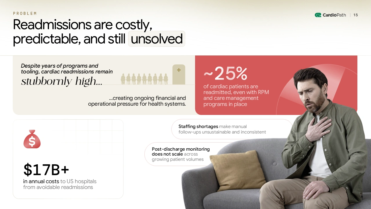
3. Problem
Seed version:
- Narrative-heavy and anecdotal focused framing
- Visuals emphasize empathy and awareness of the problem
- Minimal data, designed to build understanding and belief

Series A version:
By Series A, investors already understand that healthcare has gaps. What they need to know is: How big is this problem economically? Who's paying for it? And is it getting worse or better?
- Data-backed urgency with a clear, decisive headline
- Key metrics surfaced upfront
- Visual contrast used to highlight scale and systemic failure
- Layout guides the eye from problem → impact → operational constraint
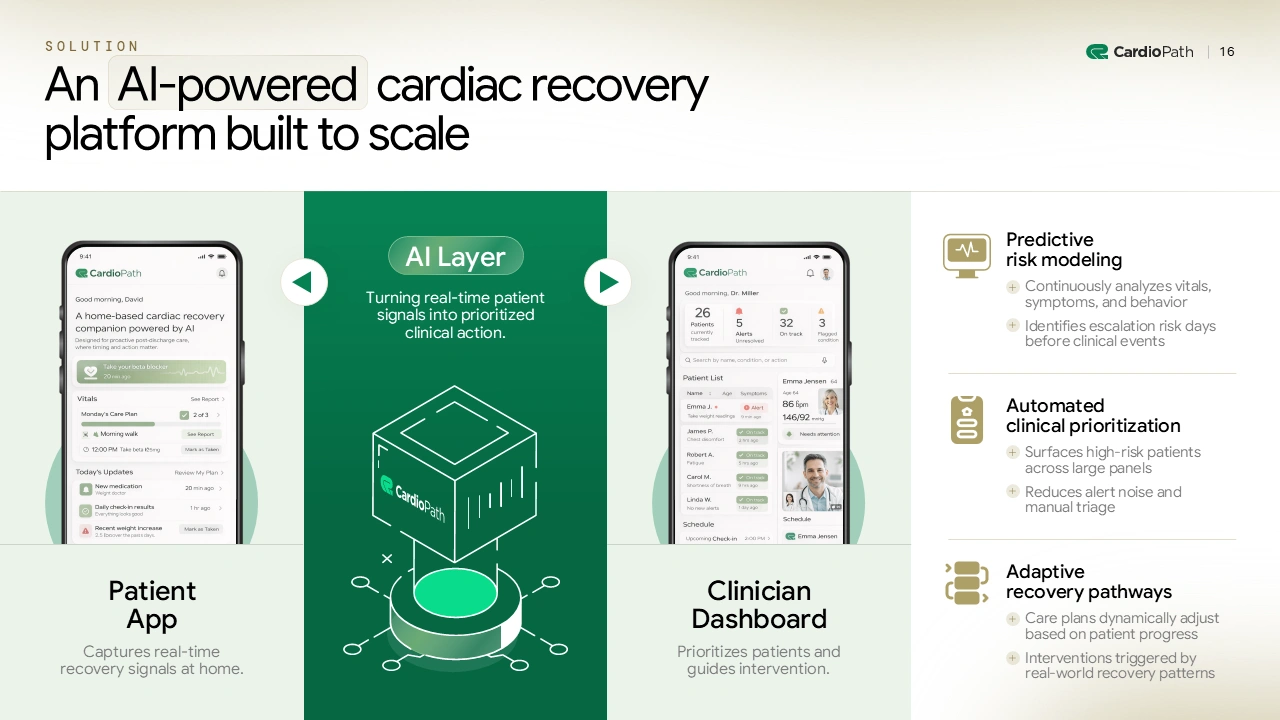
4. Solution
Seed version:
- Early mockups or MVP screens explaining the concept
- Focus on what the product does at a high level
- Visuals support storytelling and product vision
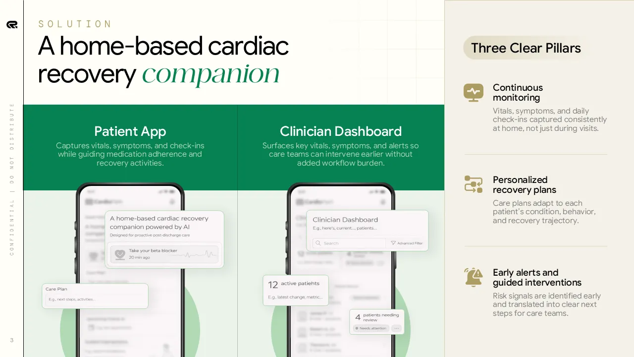
Series A version:
Mockups signal "we're still building." Series A investors want to see the actual product in use.
- Real product screenshots showing live usage and workflows
- Engagement overlays or data cues to demonstrate adoption
- Animate flows to help investors see how it works in 10 seconds or less.
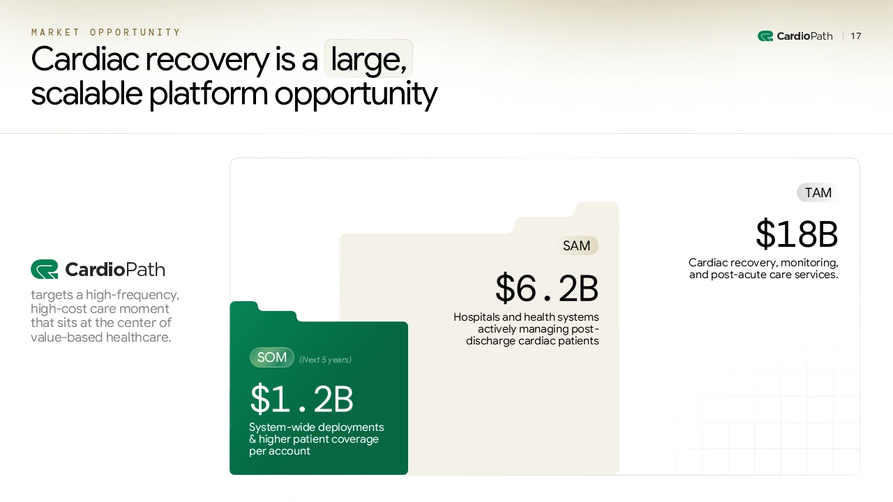
5. Market Opportunity
Seed version:
- TAM, SAM, and SOM used to validate market size and long-term upside
- Focused on validating that the opportunity is big enough
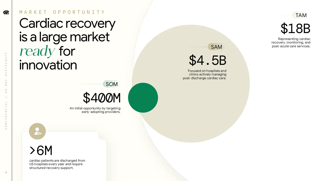
Series A version:
At Series A, investors don't just want to know the market is big—they want to know where you're winning first and how you'll expand from there.
- TAM, SAM, and SOM structured to communicate focus and entry point
- Custom charts designed for quick scanning and credibility
- Clear hierarchy and spacing guide investor interpretation
- Design shifts from “big market” to “where we win first”
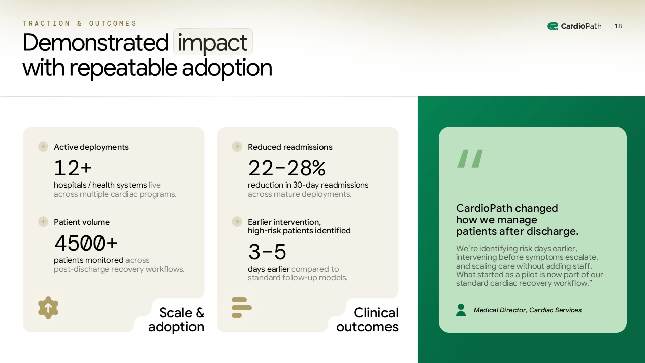
6. Traction
Seed version:
- Focus on early adoption and initial validation
- Metrics highlight usage, pilots, and qualitative proof points
- Visuals are simple and supportive of the narrative
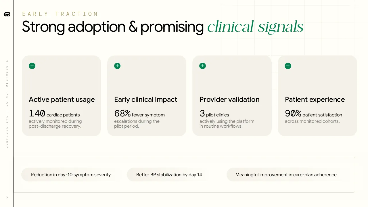
Series A version:
They want to see output metrics (revenue, retention, efficiency) paired with leading indicators (pipeline, cohort behavior, unit economics).
- Clear separation between scale metrics and performance metrics
- Use clean graphs with consistent colors, no chart junk
- Clean, consistent visual system to make data easy to scan
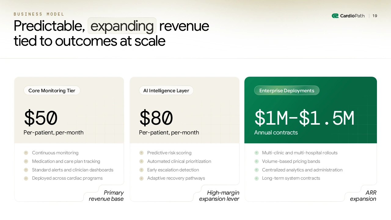
7. Business Model
Seed version:
- Flat or simple tiered pricing shown with minimal structure
- One or two tiers designed to explain how customers pay

Series A version:
They want to understand your revenue architecture. how you land customers, how you expand within accounts, and where margin improvement comes from.
- Segment-level pricing tied to usage and outcomes
- Tiered structure clearly separating base revenue and expansion levers
- Visual cues (icons, labels, spacing) to communicate margin and scale at glance
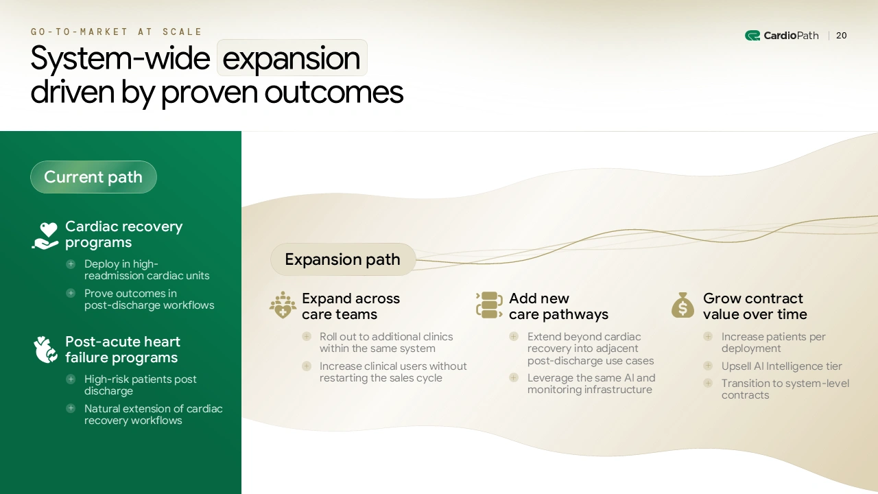
8. Go-To-Market
Seed version:
- High-level entry strategy focused on initial customer segment
- Simple flow diagrams to explain how customers are acquired
- Design supports understanding of where to start, not how to scale
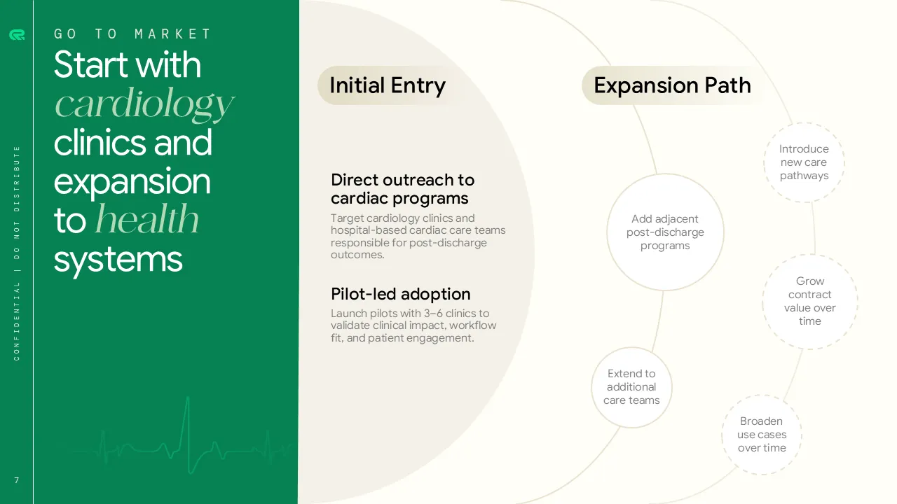
Series A version:
Series A investors have seen hundreds of GTM strategies. What separates fundable companies from the rest is a repeatable playbook backed by data.
- Clearly mapped expansion path from initial wedge to system-wide adoption
- Funnel-style or journey diagrams that compress complex execution into one view
- Strong visual hierarchy separating entry, expansion, and monetization stages
- Consistent icons, spacing, and labeling to reinforce repeatability and efficiency
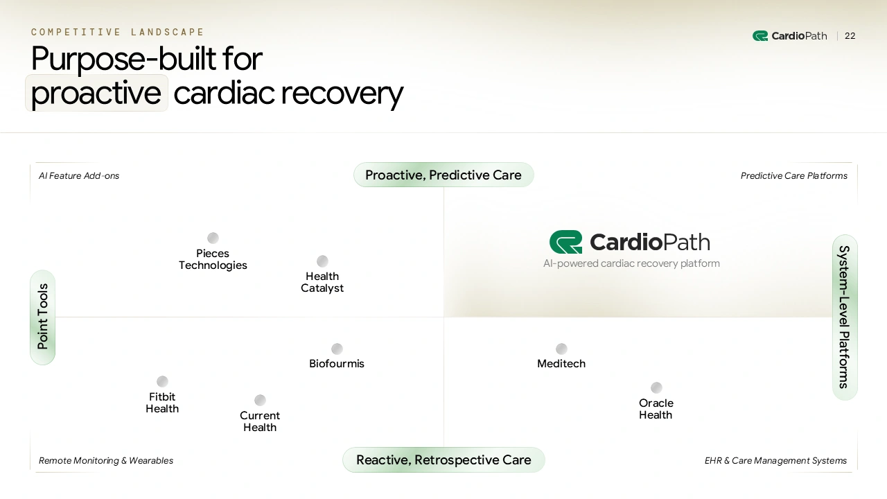
9. Competitive Advantage
Seed version:
- Feature comparison table used to establish category placement
- Visual focuses on where you sit in the market landscape
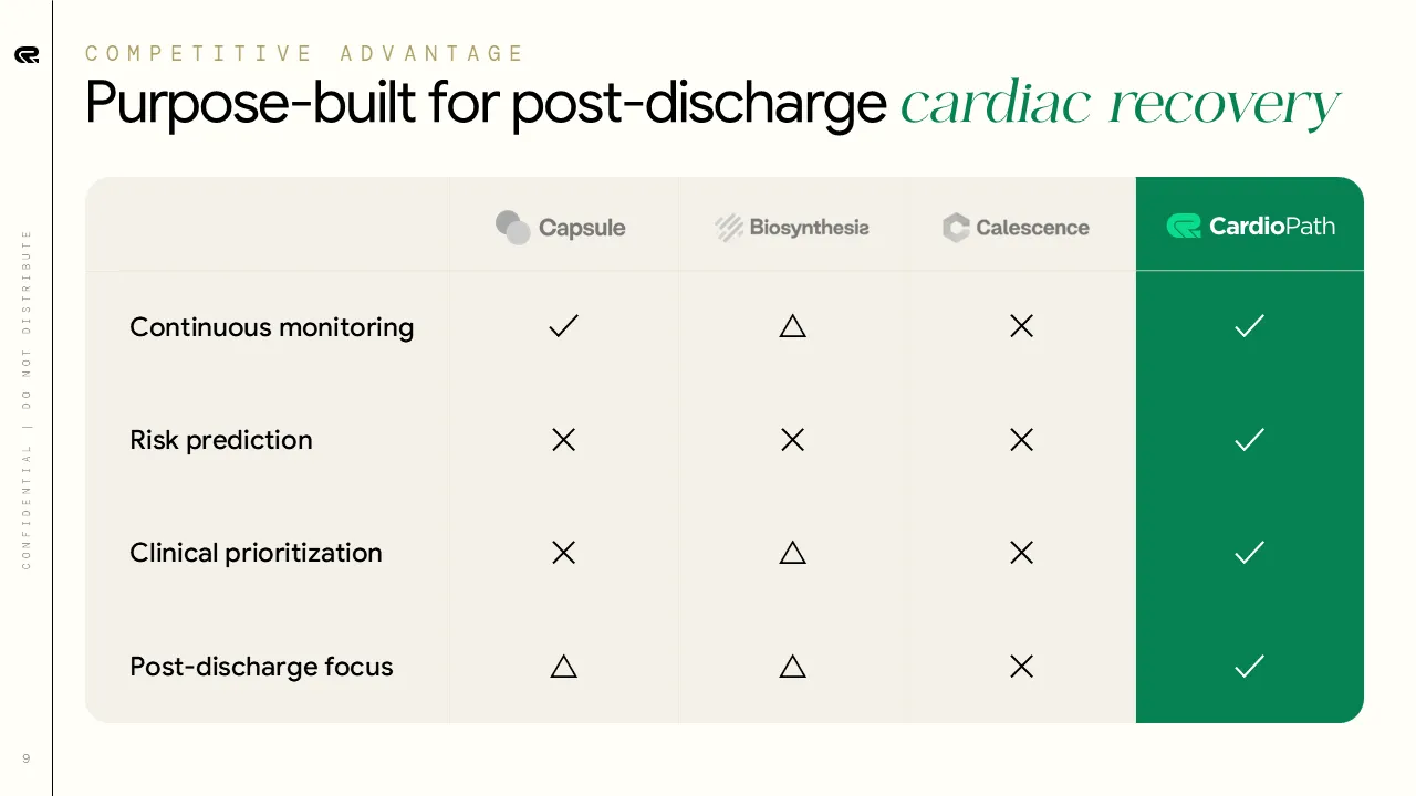
Series A version:
- Positioning matrix (2×2) to show concrete advantages
- Rows represent core capabilities. Columns compare competitors side by side
- Consistent icons and color cues make gaps obvious at a glance
- Design shifts from abstract positioning to proof-driven superiority
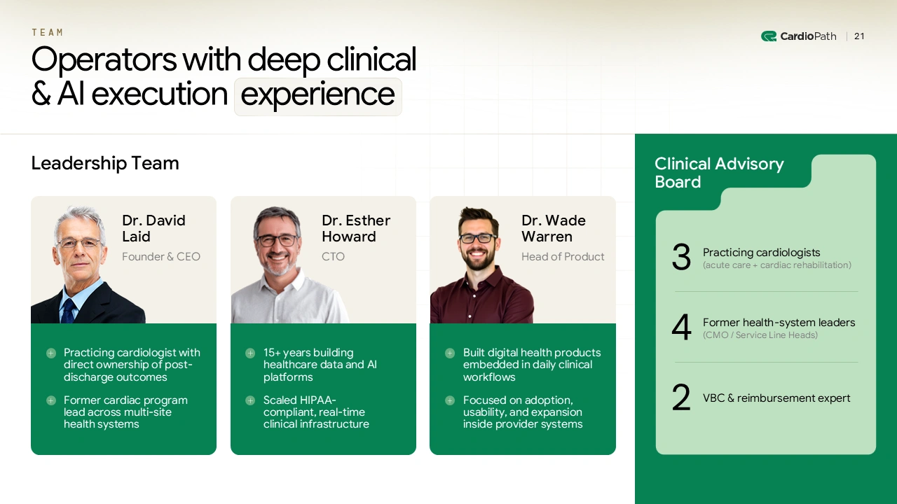
10. Team
Seed version:
- Large portraits and short bios to build personal trust
- Minimal structure. Focused on who is building the company

Series A version:
By Series A, investors want to see you've built an operating team that can scale. It's not just about the founders anymore.
- Expanded view showing key operators across clinical, technical, and product roles
- Clear separation between leadership team and advisory board
- Structured grid layout to communicate organizational depth
- Design shifts from “great founders” to “team built to scale and operate”
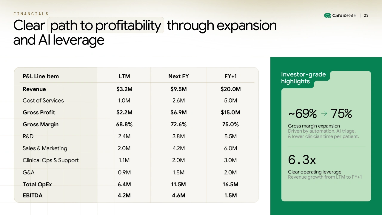
11. Financials
Seed version:
- Snapshot-style view of early revenue, unit economics, and short-term outlook
- Card-based layout to highlight a small set of core metrics
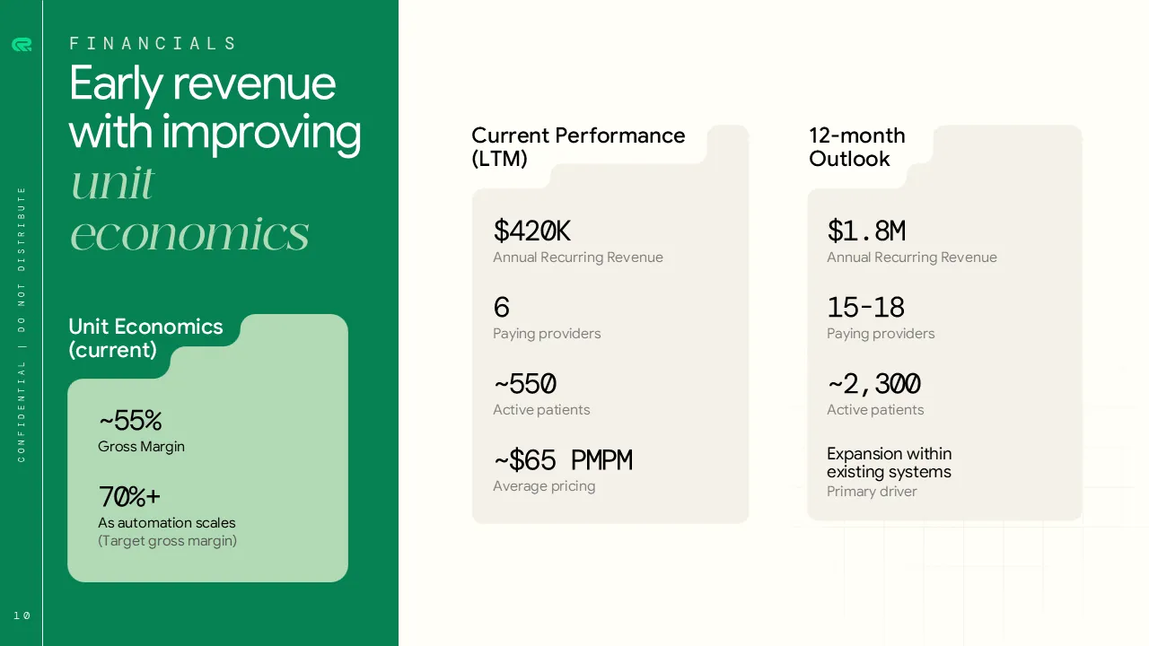
Series A version:
Investors want to see a full P&L with strategic narrative. They're modeling your business in their head. Make it easy for them.
- Tables are simplified and supported by callouts to guide interpretation
- Structured P&L view paired with investor-grade highlights
- Visual hierarchy separates topline growth, margins, and operating leverage
- Consistent typography and spacing reduce the “Excel export” feel
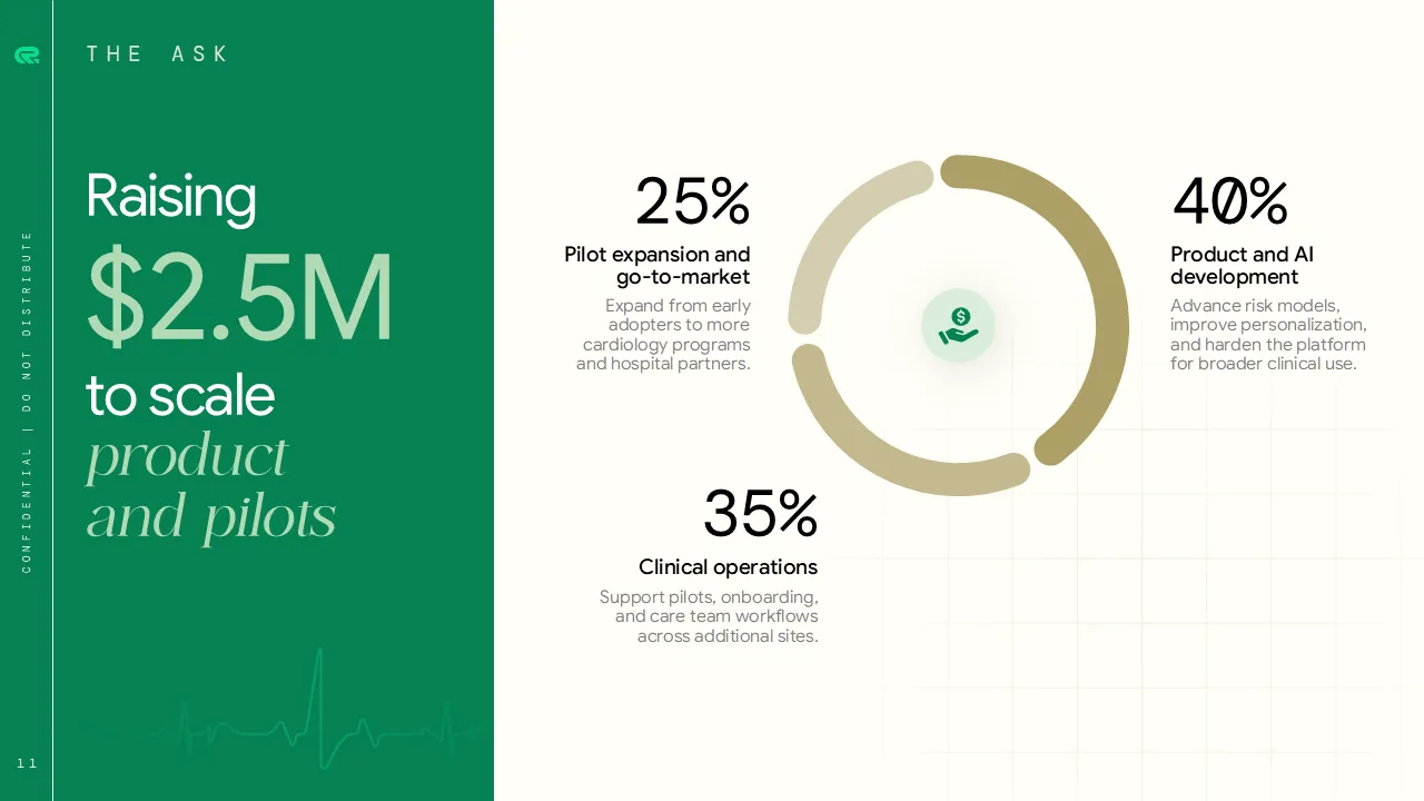
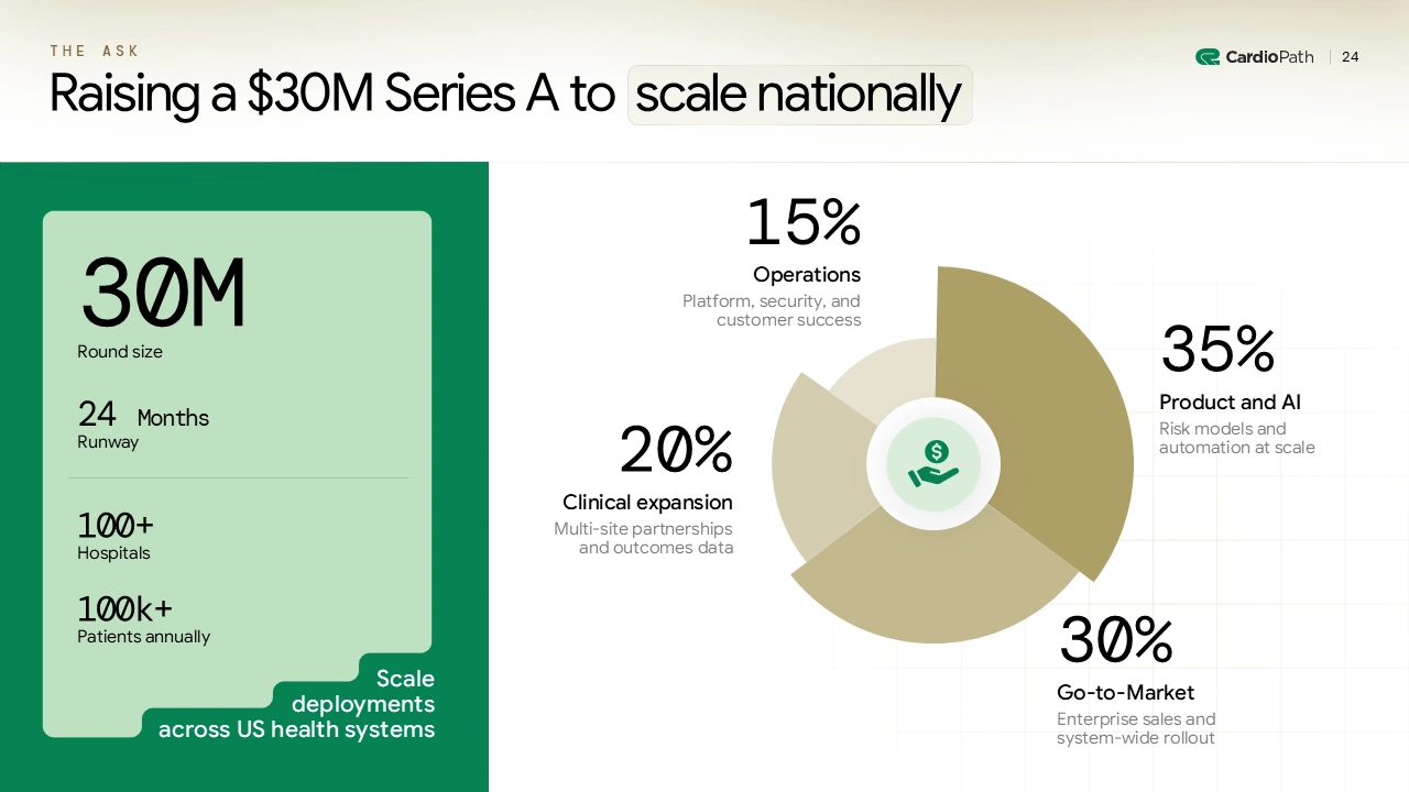
12. Ask
Seed version:
- Simple raise amount paired with a high-level objective
- Circular or ring chart used to broadly indicate use of funds
- Few categories, lightly annotated to keep focus on momentum
Series A version:
Series A investors are writing much larger checks. They need to understand exactly how that capital creates value and what milestones it unlocks.
- Clear headline stating round size and strategic intent
- Side-by-side structure separating what is being raised from how it is used
- Pie or segmented charts with precise percentages and labels
- Strong visual hierarchy to connect spend directly to outcomes
- Design communicates operational clarity and execution readiness
Series A Self-Check. Are You Truly Ready?
Before you send your deck to investors, pause here. Series A investors rarely explain why they passed. Use this checklist to catch issues before they do.
Ask yourself:
- Is every slide optimized for clarity over density?
If a slide needs verbal explanation to make sense, it's doing too much. - Is my deck designed for investors scanning it in 3 minutes?
Headlines, hierarchy, and spacing should carry the narrative on their own.
- Do my slides connect metrics with meaning?
Charts should explain why numbers matter, not just display them. - Does my GTM slide explain what worked + where I’ll double down?
Strategy without proof reads as theory. Investors look for repetition.
- Would I fund this company if I were a VC?
No founder bias. Just the deck. - Is the design mature enough to match our vision?
Series A decks should signal execution readiness, not early-stage scrappiness.
Not sure where the gaps are? Book a free Series A deck review and get expert feedback before your next investor meeting.
The Bottom Line
Series A is where growth, traction, and team quality stop being claims and start being signals.
Your deck should reflect that shift.
The best Series A pitch decks don't rely on data alone. They combine evidence, narrative clarity, and mature visual design to make the story obvious at first glance.
Investors aren't just evaluating your metrics. They're reading signals of execution, focus, and readiness. Design is one of the clearest signals you send.
At M'idea Hub, we help founders present what's already working with clarity, confidence, and visual discipline that meets Series A expectations.
Want to see how this shows up in real decks? See our Series A pitch deck for a neuroscience startup and Series A pitch deck for an AI clinical agent startup in our portfolio. Raising Series B instead? See our Series B pitch deck for a B2B SaaS startup for the next stage or book a discovery call for a free Series A audit.
Frequently Asked Questions
1. How many slides should a Series A deck include?
Most Series A pitch decks land between 10–15 core slides, with a supporting appendix for deeper financials, data, or technical detail. The goal is scanability first. If an investor cannot understand the business in 3–5 minutes, the deck is doing too much.
2. What do Series A investors care about most?
At Series A, investors focus on traction, go-to-market clarity, and team quality. More specifically, they look for proof of demand, early repeatability in GTM, and a team that has shown it can execute. This aligns closely with what investors look for before investing at this stage.
3. How should slide structure and storytelling evolve from seed to Series A
Seed decks explain potential. Series A decks explain progress.
The best pitch deck structure at Series A shifts toward metrics-backed storytelling. Slides become more structured, cleaner, and more intentional. Narrative still matters, but it is now anchored in data, outcomes, and execution signals.
4. What’s the biggest mistake founders make in Series A decks?
The most common mistake is using the same story and design as a Seed deck. This includes early-stage visuals, crowded slides, and vague claims. The best Series A pitch decks feel more confident, more selective, and visually calmer. They show maturity, not experimentation.
5. Can M’idea Hub help redesign my pitch deck?
Yes. We work as a strategic pitch deck designer partner for founders raising Seed through Series A. Our focus is not decoration. It is clarity, structure, and investor-ready storytelling. You can explore our portfolio or reach out to start a redesign.
6. What is the 10 20 30 rule for pitch deck?
The 10–20–30 rule suggests 10 slides, 20 minutes, and 30-point font. While useful as a guideline, it is not a strict rule for Series A. Modern pitch decks for startups often exceed 10 slides, but the principle still applies. Fewer ideas per slide. Larger type. Faster comprehension.