Designing a High-Stakes Series B Pitch Deck for an AI-Powered Enterprise


Nova AI, an enterprise AI/ML startup, needed a Series B pitch deck that could translate technical depth into investor clarity. Their existing deck lacked structure, visual hierarchy, and storytelling. We delivered a custom-designed AI/ML pitch deck featuring custom illustrations, product visuals, and a branded design system.
AI/ML
4 Weeks
Series B Pitch Deck
San Ramon, CA

The original deck lacked visual hierarchy, clarity, and strategic flow. Slides were text-heavy, the color palette was underutilized, and the message felt buried. Without strong visuals or strategic storytelling, the presentation struggled to convey the depth and potential of their AI/ML platform.
Pain-Points
Non-branded
Weak visuals
Overwhelming slides


After understanding the pain-points, business model, and technicalities of the business. We performed a thorough competitor analysis to establish an unique branding. Along with that, to simplify the complex technical back-end of the model, we designed custom illustrations that easily conveys the messaging.


We transformed the aesthetics and elevated the brand positioning by using custom illustrations. Used new fonts, modern-techy aesthetic and color palette to strengthen brand identity. Improved messaging hierarchy for better investor communication. The result was a SaaS startup pitch deck that clearly conveyed the company’s vision and market opportunity.
Value Add
On-brand
Custom illustrations
Strong messaging
Simplified technicalities


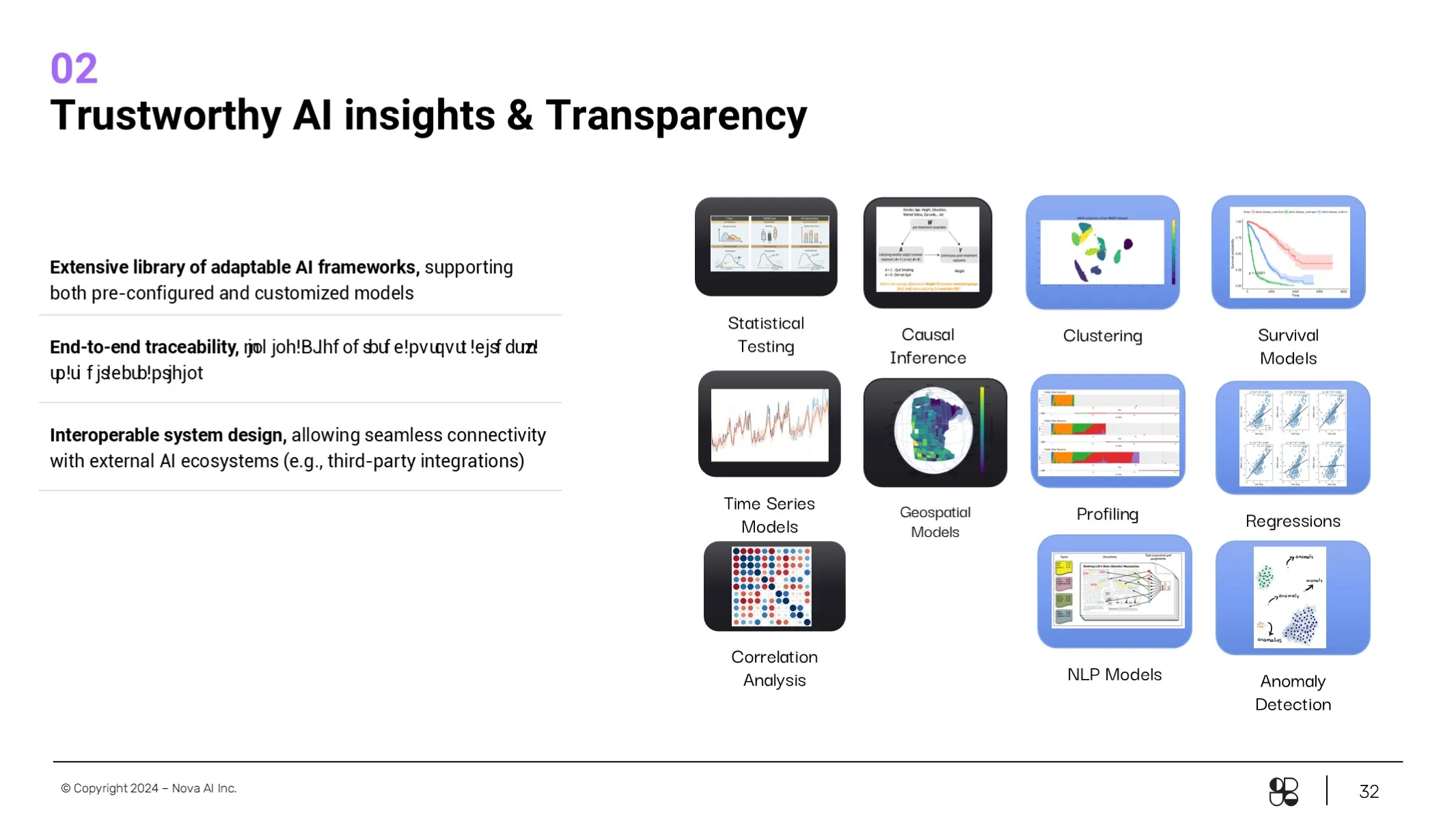
To simplify and convey the complex technology of the AI model easily, we integrated animations with custom illustrations for key solution slides.


A well-designed, functional, and simplified investor-facing deck.