Table of contents
TL;DR
Founders often struggle to turn cluttered slides into a clear story. This before and after pitch deck series breaks down real pitch deck slide redesign projects, showing how we transform key slides such as Problem, GTM, and Financials into investor-ready pitch deck slides that communicate strategy, sharpen messaging, and build confidence. Built for serious teams raising capital or presenting at the highest level.

Founders often struggle to turn cluttered slides into a clear story. This before and after pitch deck series breaks down real pitch deck slide redesign projects, showing how we transform key slides such as Problem, GTM, and Financials into investor-ready pitch deck slides that communicate strategy, sharpen messaging, and build confidence. Built for serious teams raising capital or presenting at the highest level.
Amélie Laurent
Product Manager, Sisyphus

If you're a founder building your pitch deck, there's a moment you hit a wall. This is especially true for founders building a technology startup, where the pitch deck must simplify complex products and technical differentiation for investors.
You have all the content. You know the story. But the slides? They just don't look or feel investor-ready.
One of the most common challenges I see after working on 500+ pitch deck redesign projects is founders struggling to turn complex ideas into clean, compelling visuals.
That’s why we created this Before/After Series where we’re breaking down real pitch deck slides we redesigned for founders, VCs, and marketing teams. You’ll see:
- The core design challenge behind each slide
- Our thought process for simplifying and clarifying the message
- The final solution — and how it makes the message investor-ready
If you’re designing your own pitch or want to understand what actually works in high-stakes presentations, this is your blueprint.
Download the pitch deck template to start transforming cluttered slides into investor-ready stories; just like the ones in this Before/After series. Many of these examples come from high-growth tech startup pitch decks, where clarity around product, growth mechanics, and competitive positioning directly impacts investor confidence.
Go-to-Market Slide
Overview Deck for an Enterprise SaaS
Design Challenge
CMO of an enterprise SaaS startup wants to effectively convey the strategies they are deploying for expansion. Key problem of the slide is ‘Information overload’.

Design Solution
We simplified the slide to focus on the key areas and core messaging. Specific details on all 4 strategies shifted to the following slides. Created a branded layout with custom icons.

Use of Funds Slide
Pitch Deck for a Fintech Startup
Design Challenge
CFO of the Fintech startup added the content on the ‘Ask’ slide and now they want the data to be visualized for the investors. They do not want a typical pie chart for the ‘use of funds’.

Design Solution
Highlighted the important numbers from the ‘Ask’. For the ‘Use of funds’ segment, instead of the pie chart, we created a ‘Treemap’ chart. It covers the space well and looks more balanced.

Read From Data to Design Series: 6 Unique Charts That Will Transform Your Investor Pitch Deck — and discover design strategies for the use of funds slide pitch deck that make your financials clear, compelling, and investor-ready.
Problem Slide
Pitch Deck for an AI Startup
Design Challenge
Founder of an AI startup wants to tell a story about the problem a lot of his prospects face. Finding a relevant document at the right time is a headache and how their tool helps them solve this problem.
Design Solution
We designed a custom illustration telling the complete story (Problem and Solution) with on-click animation. Visual metaphor effectively shows how the solution helps find the right document.

How it Works Slide
Scientific Deck for a Biotech Firm's Biotech deck
Design Challenge
Founder of a biotech startup wants to showcase how their product works using a YouTube Video. Current slide looks bland and does not convey any information without opening the video in browser.

Design Solution
We studied the video and outlined 5 steps process. Using the screenshots and text from the video, we designed the slide that is informative even without watching the video.

Financial Slide
Portfolio Case Study from a VC Fund Pitch Deck
Design Challenge
A senior associate wants to present key financial data from their portfolio companies to LPs. Numbers in the table format is hard to visualize and comprehend.

Design Solution
We converted the data into a meaningful chart that visualizes the growth and highlights the key numbers. Also made it more branded with subtle colors and text hierarchy.
.webp)
How it Works Slide
Scientific Deck for a Biotech Company
Design Challenge
Founder of a Biotech startup wants to explain the product/technology, but the flow of the content is a bit confusing while presenting. Key takeaway is not highlighted. Formatting does not look polished.

Design Solution
Simplified the layout to represent a 3-step process. Added visuals to each step and formatted the text hierarchy. Key takeaway is highlighted at the bottom. Overall, looks easy to comprehend and polished.

Competitive Advantage Slide
Pitch Deck for Saas Startup
Design Challenge
Founder of a SaaS startup wants to showcase the Competition in her pitch deck. The current slide looks basic with plain text. Doesn’t look branded. There’s no focus on their competitive advantage.
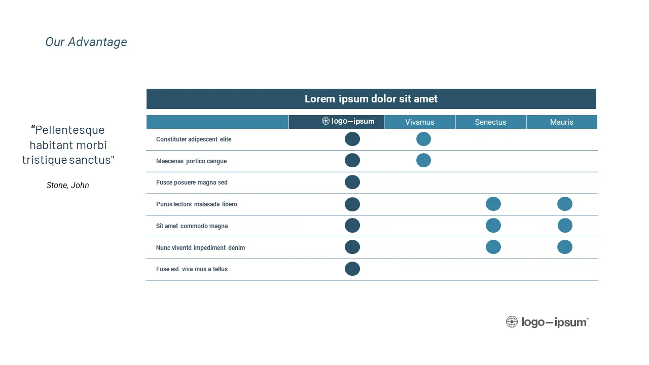
Design Solution
Applied a better font hierarchy. Added branded elements in the table to highlight their strength across the verticals. Testimonial is visualized in a callout box with a headshot to add more credibility.

Portfolio Case Study Slide
Venture Capital Fund Deck
Design Challenge
Portfolio manager at a VC firm wants to have a template that she can use to create ‘Portfolio Case Study’ slide. Current version looks basic and it's not conveying the information in a structured way.

Design Solution
We created a master template slide that has dedicated space for imagery and a table that displays all the information clearly. Added a timeline visual and made everything look branded.

Flywheel Slide
Tech Startup Series B Pitch Deck
Design Challenge
Founder of a tech startup wants to explain their growth strategy to investors. The slide looks basic, non-branded and fails to depict the flywheel effect that leads to their organic growth.

Design Solution
With some additional inputs from the client, we designed an actual flywheel that explains their growth and scaling GMV effectively. We added on-click animation to present one point at a time.

Problem Slide
Cybersecurity Startup Series B Pitch Deck
Design Challenge
CMO of a Cybersecurity startup wants to effectively convey current challenges and opportunities in the market. They are looking to make this slide easier to comprehend for investors.

Design Solution
Categorized challenges and relevant opportunities. Gave each a short title to make it easier to glance. Created a functional layout with relevant icons to make the slide more engaging.

Business Model Slide
Tech Startup Series A Pitch Deck
Design Challenge
Founder of a tech startup wants to explain his business model to investors. They already have solid traction and metrics, but the slide is not conveying their foundation and vision for growth.
Design Solution
Based on their vision, we conceptualized a theme of ‘Tree’. Created on-brand illustration. Added on-click animation for text. Suggested a relevant title. Optimal balance of creativity and functionality.

Competitive Landscape Slide
Corporate Overview Deck for Fintech Startup
Design Challenge
CFO of a Fintech startup wants to display a competitive landscape and how their startup is leading the market. The tabular format with only text is not conveying their market leadership.

Design Solution
Rather than a cliché layout of tick-marks in the table, we designed an innovative layout that shows the scale and position of each competitor relative to the Fintech Startup.

Team Slide
VC Fundraising Deck for Healthcare VC
Design Challenge
A healthcare-focused VC partner wants to showcase the leadership team's expertise in three categories. However, the presentation slide falls short in conveying the message effectively.

Design Solution
Added headshots. Color-coded the team’s expertise in three categories, and assigned each member relevant color dots. Added their previous employers’ logo in each category. Made it look sophisticated.

Market Opportunity Slide
GTM Strategy Deck for Cybersecurity Startup
Design Challenge
CMO of a Cybersecurity startup wants to showcase the possible markets after raising Series A. He doesn’t want to focus on the market size ($) but rather all the potential markets they could tap into.
.webp)
Design Solution
Designed a custom infographic layout that represents ‘expansion’. Sorted the internal segments by size. Added branded icons, colors and subtle animation to make it engaging.
.webp)
Process Slide
Fund Presentation for a VC Firm
Design Challenge
A VC firm trying to showcase their tight selection process with multiple stages when acquiring a startup. The selected startups are then nurtured.
.webp)
Design Solution
Created a custom and on-brand funnel infographic highlighting the numbers and diversity of startups. The inverted funnel shows the growth of the selected startups.

Read Best Pitch Deck Storytelling Examples: How Visual Slides Help You Raise Faster - and explore how Series B pitch decks use smart design and storytelling to turn investor interest into conviction.
Want to Transform Your Slides Like This?
Whether you’re a founder refining a raise, a VC building LP materials, or a CMO leading a strategic deck - high-impact slides make all the difference. Whether you’re refining a SaaS, AI, fintech, or cybersecurity tech pitch deck, the goal is the same: make every slide easier to understand in seconds.
At M’idea Hub, our pitch deck design services don’t just make slides look good - they make them communicate with clarity, credibility, and confidence.
Book a discovery call and let’s build a presentation that gets results.
Frequently Asked Questions
1. How long does it take to redesign a pitch deck?
A pitch deck redesign typically takes one to two weeks, depending on the number of slides and how clear the story already is. Most redesigns focus on structure, hierarchy, and visual clarity rather than rewriting content, which is why slide-by-slide transformations matter more than starting over. You can see how this plays out in real before-and-after pitch deck redesigns in our portfolio.
2. How much time do investors actually spend viewing a pitch deck?
Investors usually spend only a few minutes scanning a pitch deck on the first pass. That’s why slides need to communicate the takeaway instantly, without explanation. This reality shapes how we design decks for fast-moving VC and PE review environments, where clarity drives whether a conversation moves forward, as reflected in our work supporting venture capital and private equity presentations.
3. How long should a pitch deck be?
Most effective pitch decks land around 10 to 15 slides. The goal isn’t completeness. It’s clarity. A shorter deck with strong visual structure almost always performs better than a longer deck packed with dense information.
4. When should a founder redesign a pitch deck instead of updating it?
A redesign is the right move when the story works verbally but the slides don’t hold up on their own. If founders find themselves talking through cluttered or confusing slides, that’s usually a design and structure issue, not a content one. This is exactly where a focused redesign has the biggest impact.
5. What slides matter most to investors in a pitch deck?
Investors pay the closest attention to the problem, solution, market opportunity, traction, and financial slides. These slides carry the most decision-making weight, which is why they’re often the first ones redesigned in a before-and-after process to improve clarity and credibility. In most tech startup pitch decks, investors pay the closest attention to the problem, solution, market opportunity, traction, and financial slides.
6. What are the most common pitch deck slide mistakes?
The most common mistakes are text-heavy layouts, unclear headlines, inconsistent formatting, and visuals that don’t support the narrative. These issues slow investors down and dilute the message. Fixing them is less about adding content and more about simplifying what’s already there.
7. What makes a pitch deck slide investor-ready?
An investor-ready slide communicates one clear idea, can be understood in seconds, and visually reinforces the story without explanation. Strong hierarchy, clean layouts, and purposeful visuals are what separate polished decks from ones that get skipped.
8. Do pitch deck rules like the 10/20/30 rule actually matter?
Rules like the 10/20/30 rule can be useful as rough guidelines, but they aren’t what determine whether a deck works. What matters is whether each slide is clear, focused, and easy to scan. Good design adapts to the story instead of forcing it into a rigid formula.
.webp)