BEFORE

The Challenge With the Existing Template

Aelris came to us with a presentation template that no longer matched the firm’s needs. It looked generic, and most layouts were not practical across the decks the team was actually building. With multiple departments building different types of decks, the team ultimately had to build slides from scratch every time, losing hours and still landing on low-quality work.

Pain-Points

The existing design did not reflect the level of polish and credibility expected by LPs, partners, and portfolio stakeholders.

Missing layouts meant teams had to rebuild slides manually, increasing production time and reducing consistency across materials.

One rigid template could not support the range of decks needed across LP meetings, quarterly reports, and deal memos.

Original real estate private equity LP deck slide showing portfolio at a glance metrics and market weights in a dense, spreadsheet-style layout without clear visual hierarchy.Text-heavy LP fundraising slide presenting NOI composition and tenant concentration charts with limited proof framing and inconsistent visual structure.Original “Why Now” slide in a real estate private equity LP presentation using dense paragraphs and basic charts that lack institutional storytelling clarity.Original acquisition criteria slide in a real estate private equity LP deck outlining buy box strategy in a dense, text-heavy format without clear institutional framing.Pre-redesign portfolio footprint slide in a real estate private equity fundraising presentation showing asset types and geographic exposure with limited visual differentiation.Original execution track record slide in a private equity LP presentation listing recent acquisitions and returns in a paragraph-heavy layout lacking structured proof presentation.Original execution track record slide in a private equity LP presentation listing recent acquisitions and returns in a paragraph-heavy layout lacking structured proof presentation.Original execution track record slide in a private equity LP presentation listing recent acquisitions and returns in a paragraph-heavy layout lacking structured proof presentation.
STEP 1

Moodboard and Design Direction

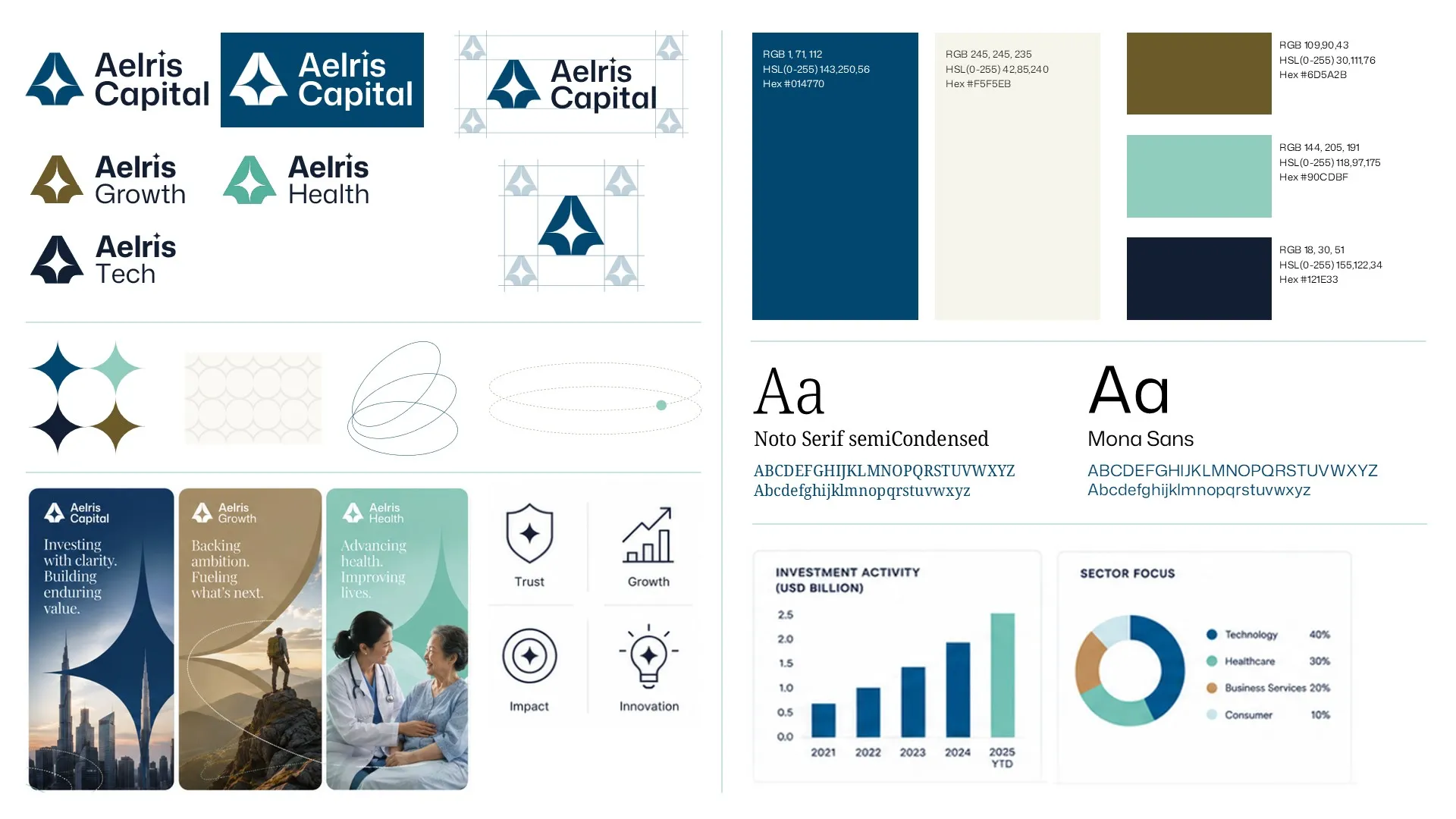
Aelris already had a strong brand foundation. What was missing was a presentation system that translated that brand into a polished, institutional visual language. Before designing individual layouts, we developed a cohesive, institutional grade visual language drawn from their existing identity and built specifically for slides. This direction became the foundation for a template system that could support LP meetings, quarterly reports, and deal materials across funds.

Design system moodboard featuring "Fraunces" and "DM Sans" typography, a teal gradient palette, and custom icons to modernize the private equity presentation design and fund overview deck.
Circular grid pattern composed of thin white intersecting lines on a black background.
STEP 2

Strategic Approach

We built the system around real work, not assumptions.
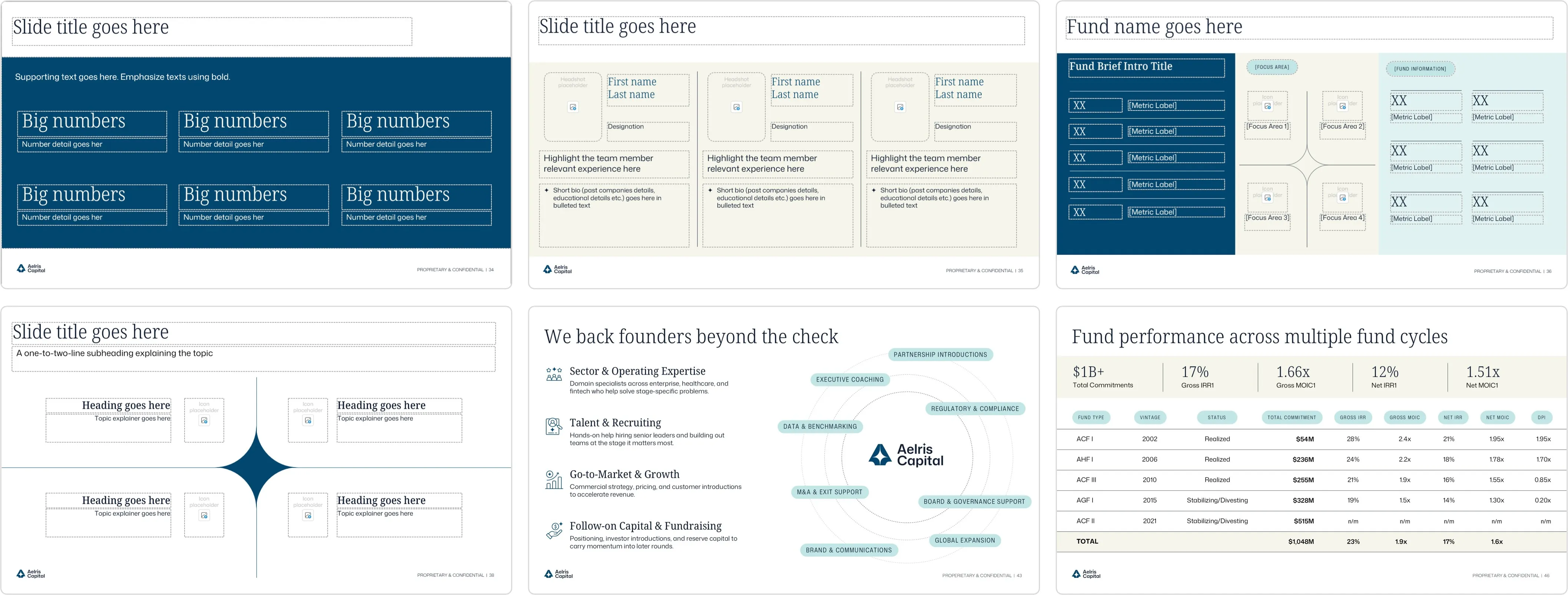
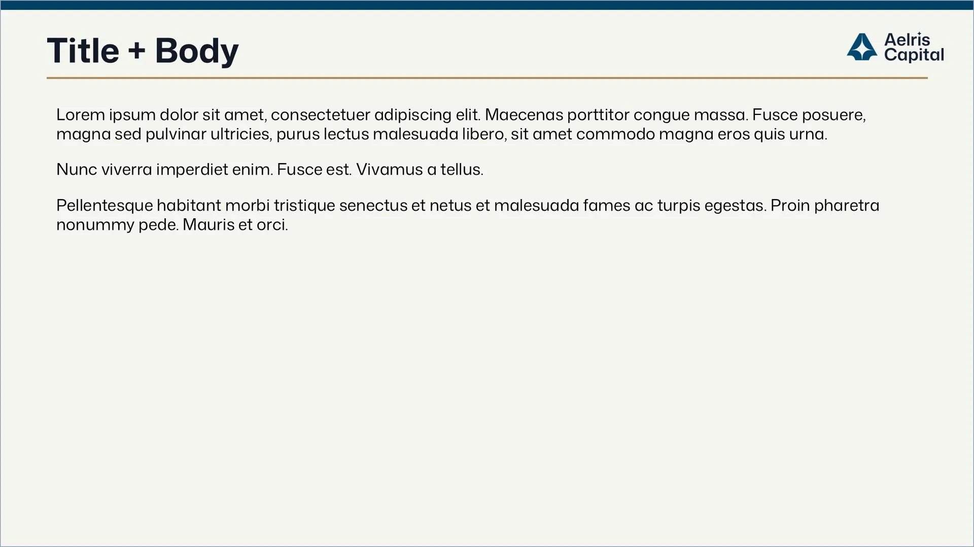
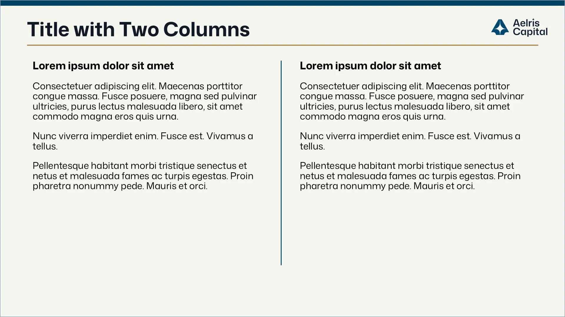
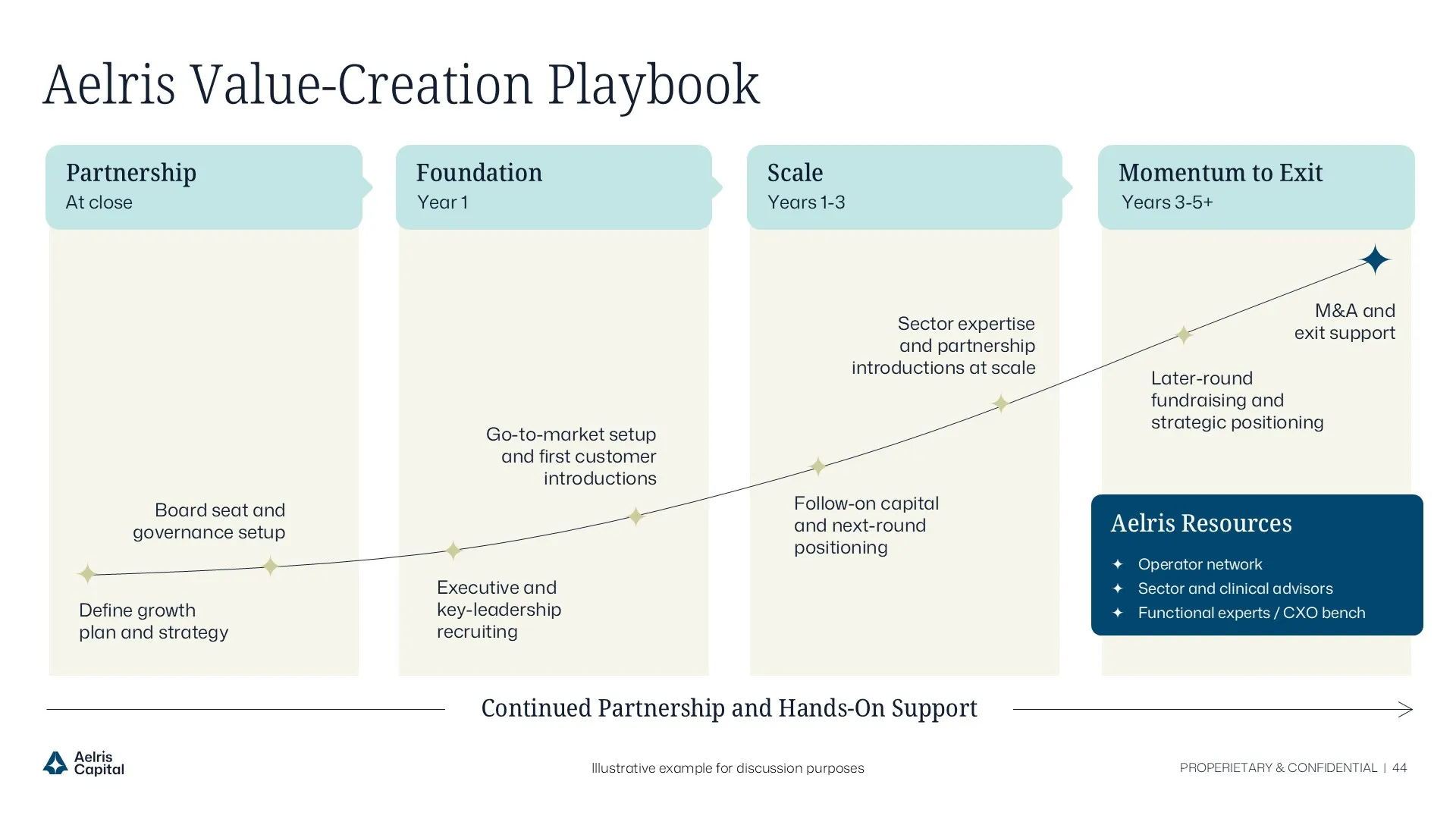
Before building the template system, we reviewed the decks Aelris was actively using across LP meetings, quarterly reports, AGMs, and deal materials to understand what the team actually needed. From there, we mapped recurring layouts, high-value slides, and one-off pages. This became the foundation for a practical template system with reusable master layouts and pre-made slides for the team’s most common use cases.

Design system moodboard featuring "Fraunces" and "DM Sans" typography, a teal gradient palette, and custom icons to modernize the private equity presentation design and fund overview deck.
Circular grid pattern composed of thin white intersecting lines on a black background.
AFTER

Final Master Layouts

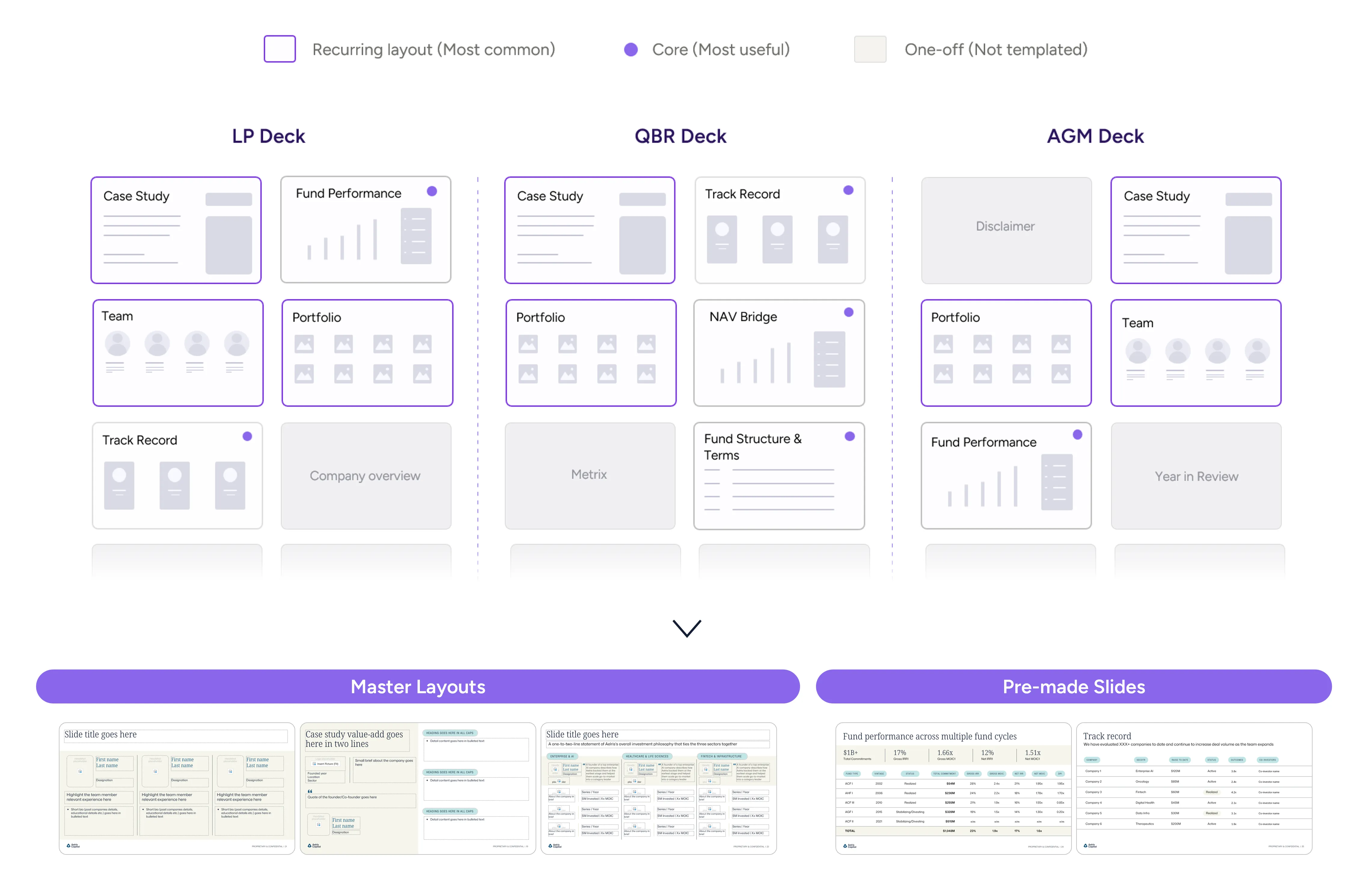
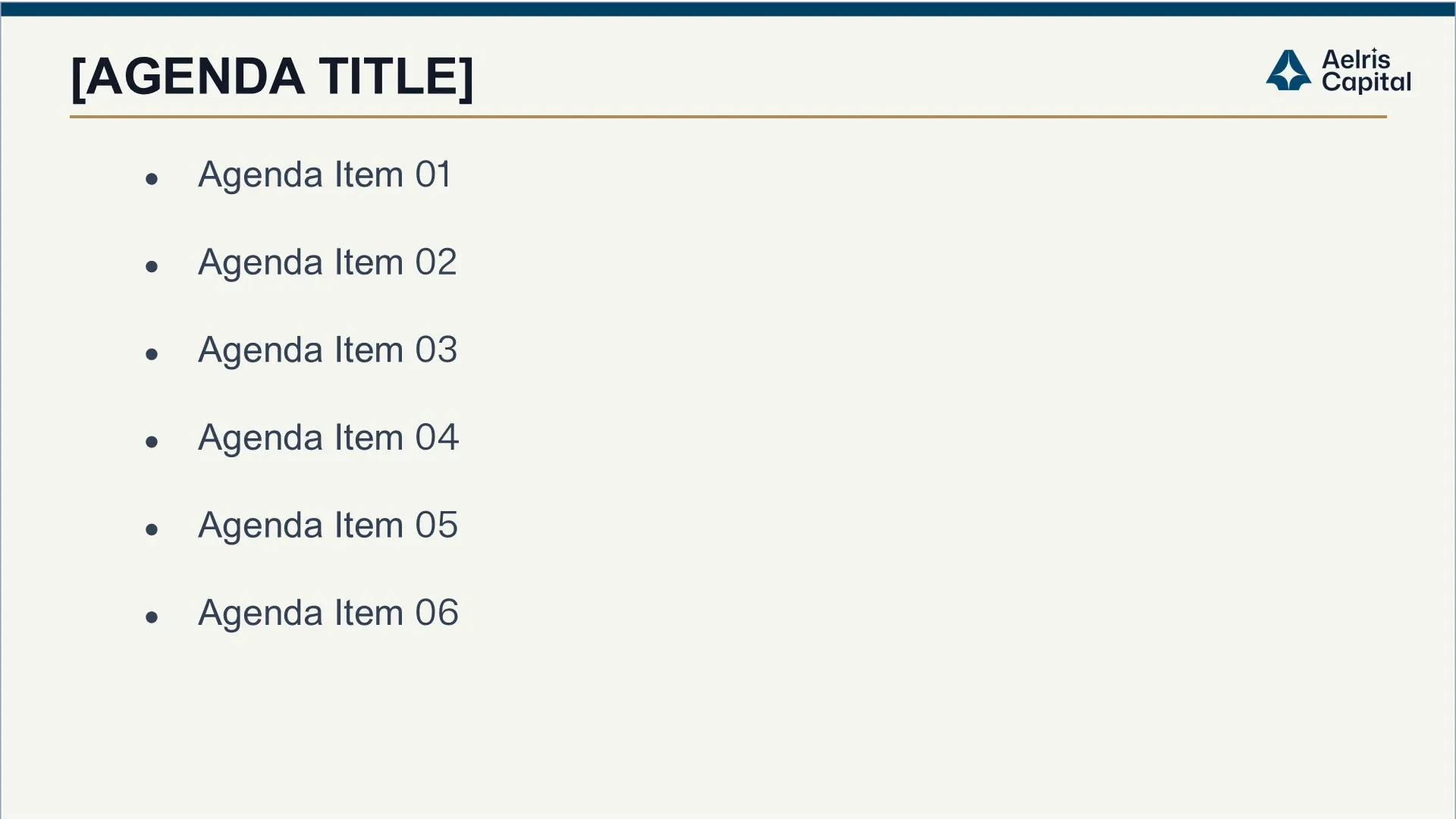
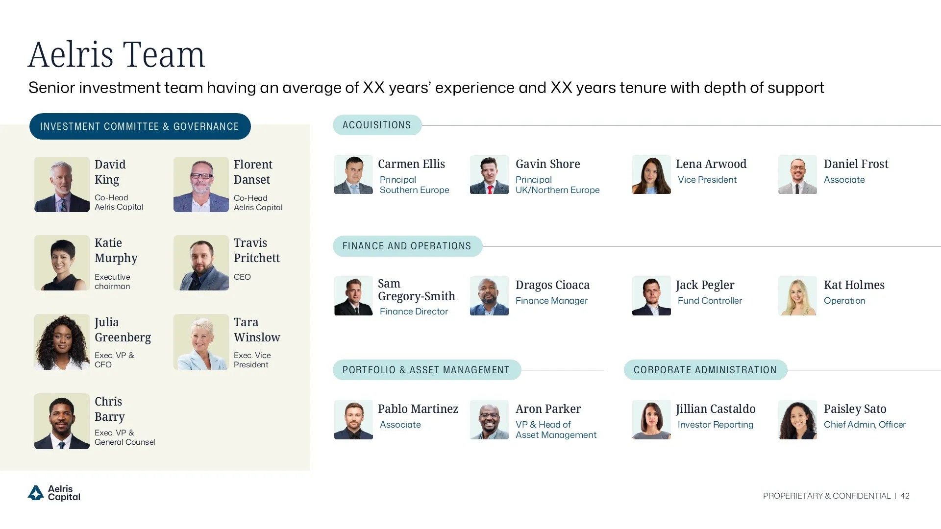
Reusable layouts built for the team’s most common presentation needs.

Final real estate private equity LP fundraising slide visualizing diversified NOI composition and tenant concentration limits with a clean institutional dark-theme layout.Institutional LP deck slide mapping geographic portfolio exposure and key fund metrics across major U.S. MSAs in a structured, investor-ready format.Institutional LP presentation slide defining a disciplined real estate private equity buy box with structured investment criteria and underwriting guardrails.Final LP deck slide presenting U.S. housing supply and demand trends with data-driven charts to support real estate private equity market timing and rent growth assumptions.Track record slide in a real estate private equity LP fundraising presentation showcasing recent acquisitions, NOI growth, and IRR performance metrics in a structured proof layout.Institutional portfolio overview slide highlighting diversified retail and mixed-use assets with NOI breakdown and resilience factors for limited partner evaluation.
Circular grid pattern composed of thin white intersecting lines on a black background.
AFTER

Final Pre-Made Slide Library

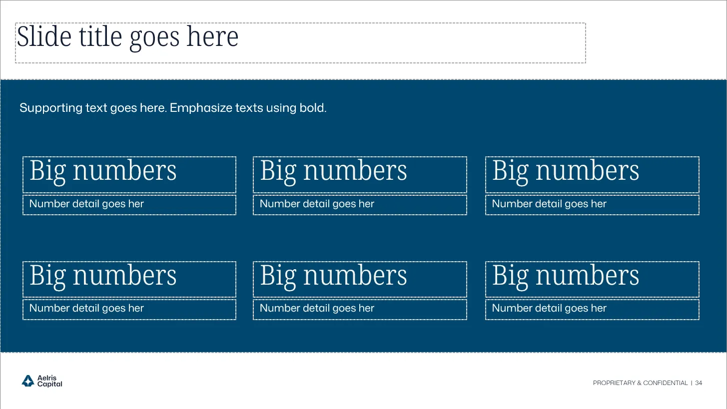
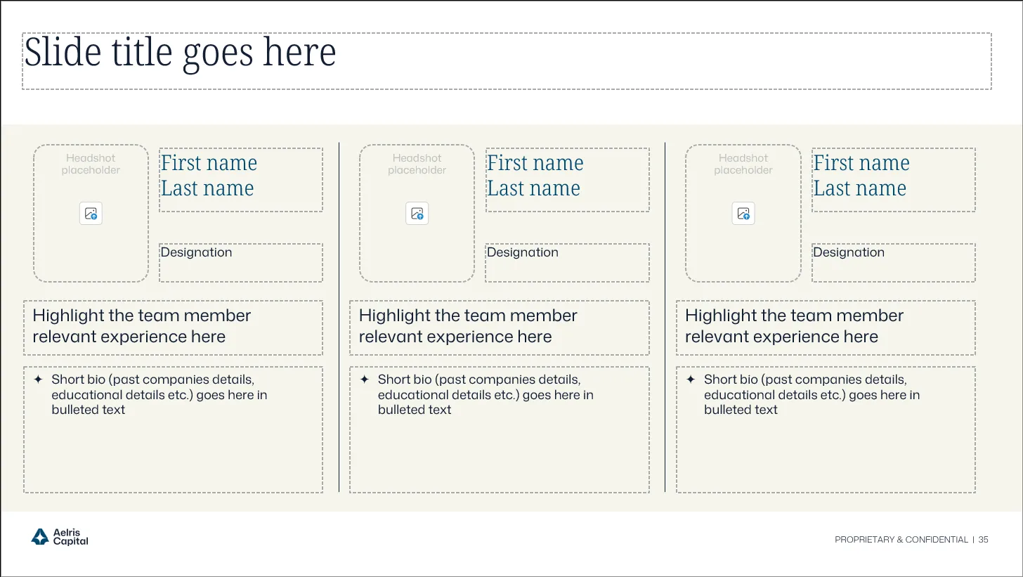
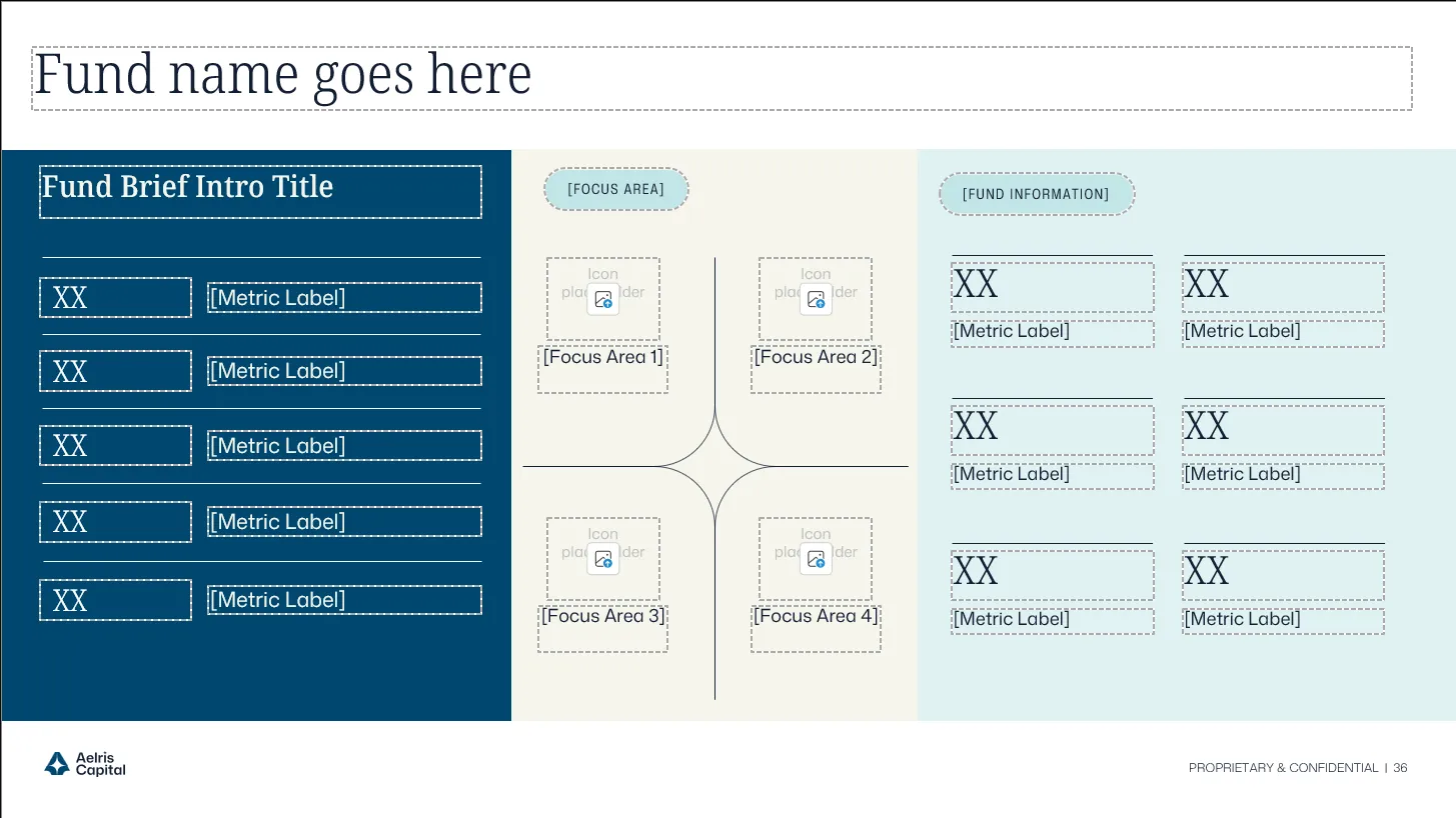
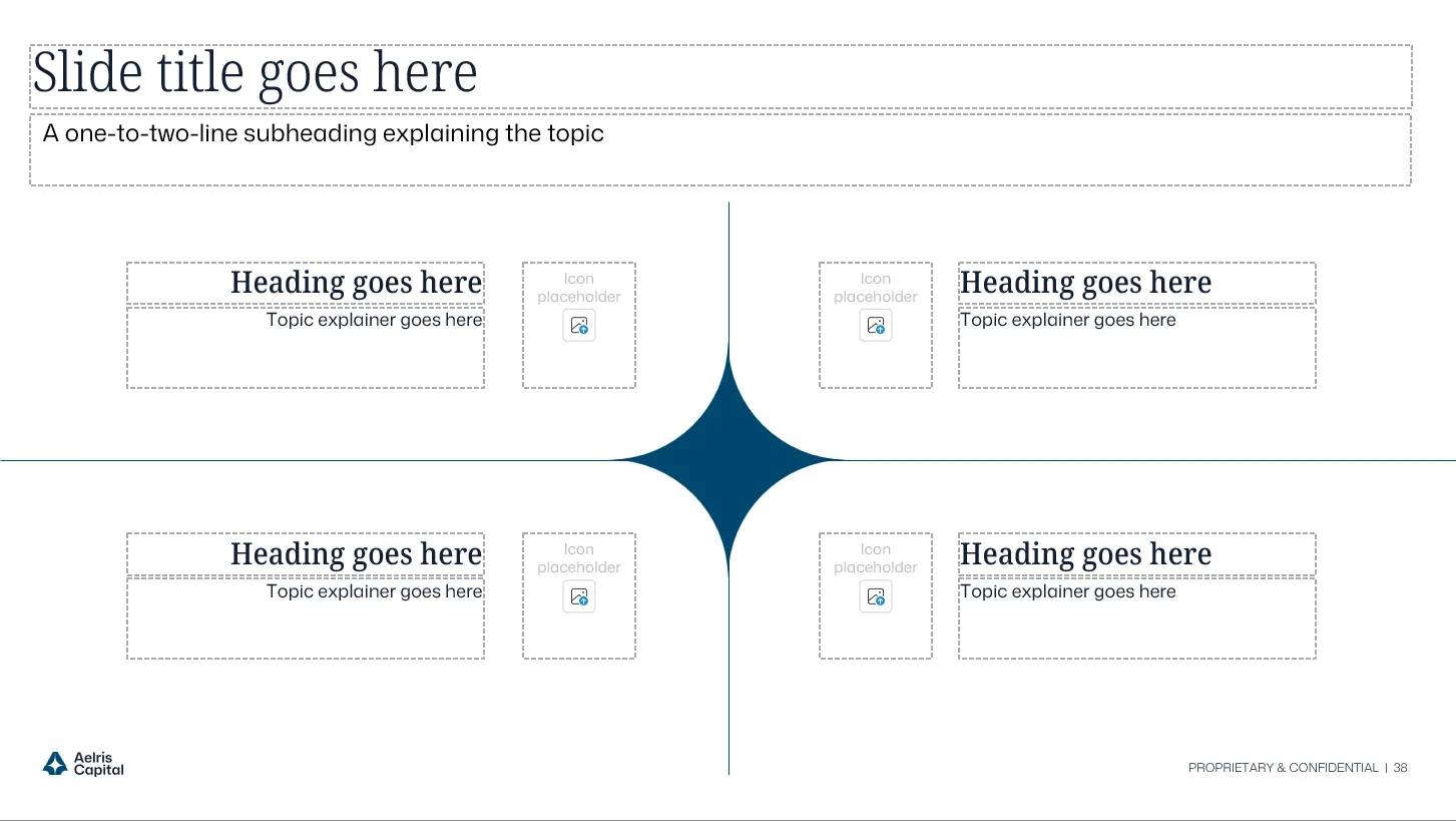
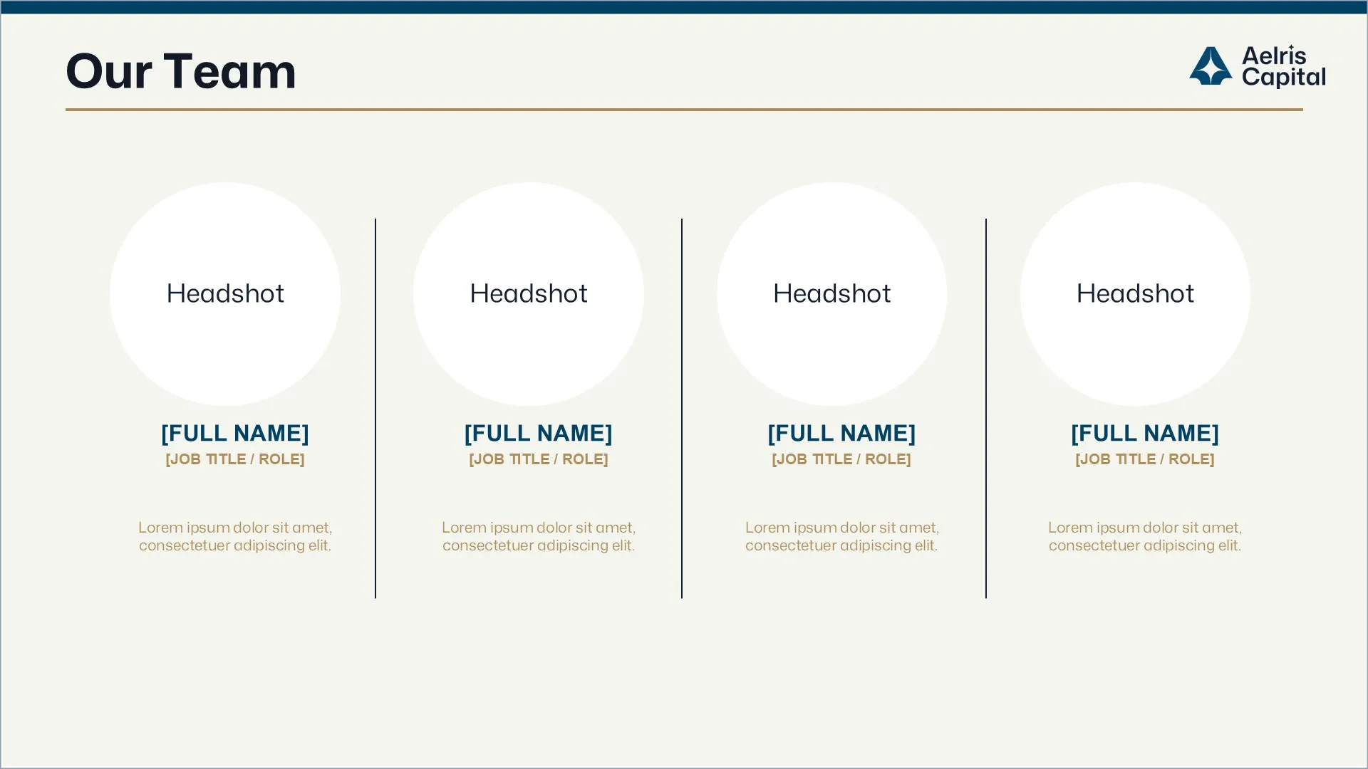
Ready-to-use slides designed for high-value fund, LP, and reporting moments.

Final real estate private equity LP fundraising slide visualizing diversified NOI composition and tenant concentration limits with a clean institutional dark-theme layout.Institutional LP deck slide mapping geographic portfolio exposure and key fund metrics across major U.S. MSAs in a structured, investor-ready format.Institutional LP presentation slide defining a disciplined real estate private equity buy box with structured investment criteria and underwriting guardrails.Final LP deck slide presenting U.S. housing supply and demand trends with data-driven charts to support real estate private equity market timing and rent growth assumptions.Track record slide in a real estate private equity LP fundraising presentation showcasing recent acquisitions, NOI growth, and IRR performance metrics in a structured proof layout.Institutional portfolio overview slide highlighting diversified retail and mixed-use assets with NOI breakdown and resilience factors for limited partner evaluation.

Meaningful Solution (Print vs Digital)

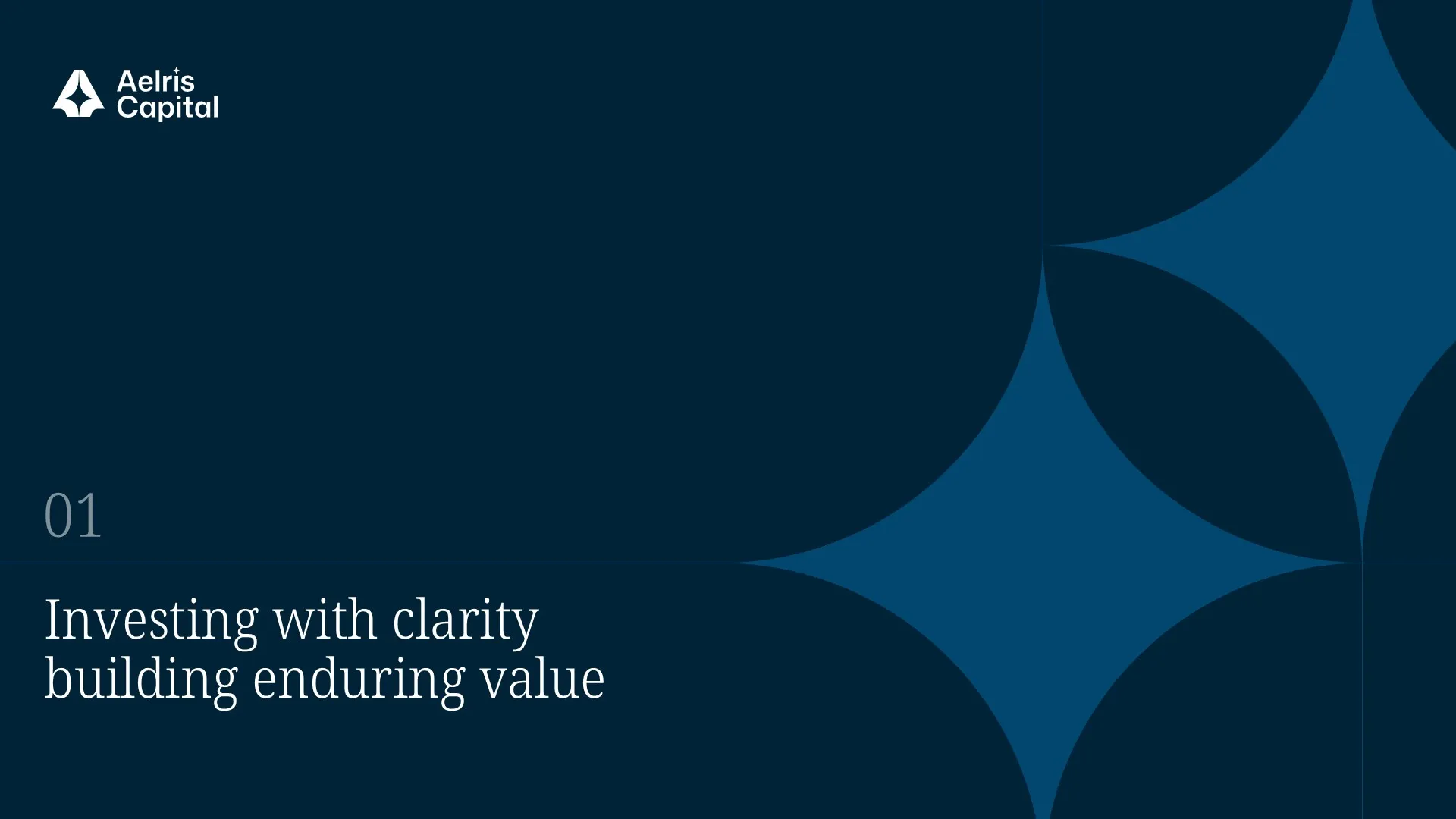
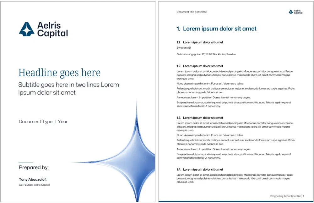
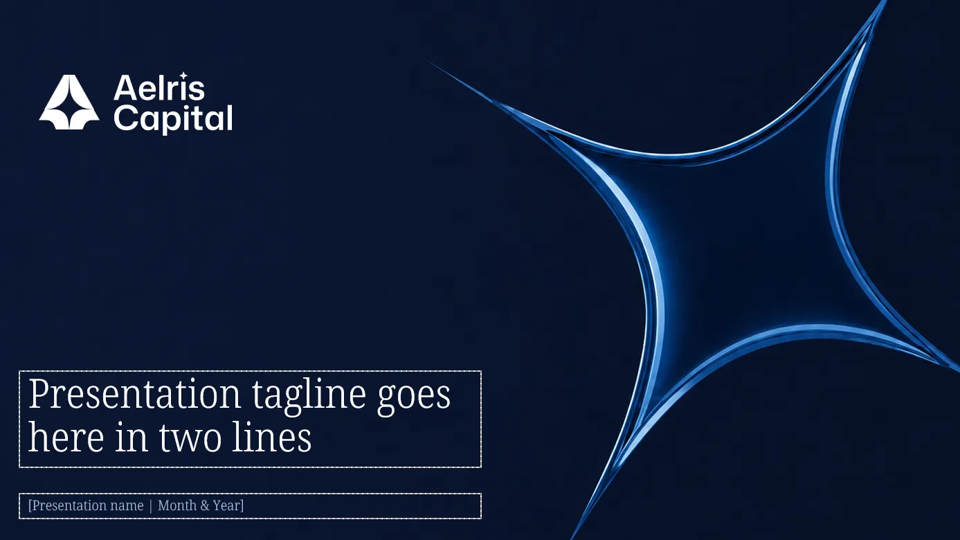
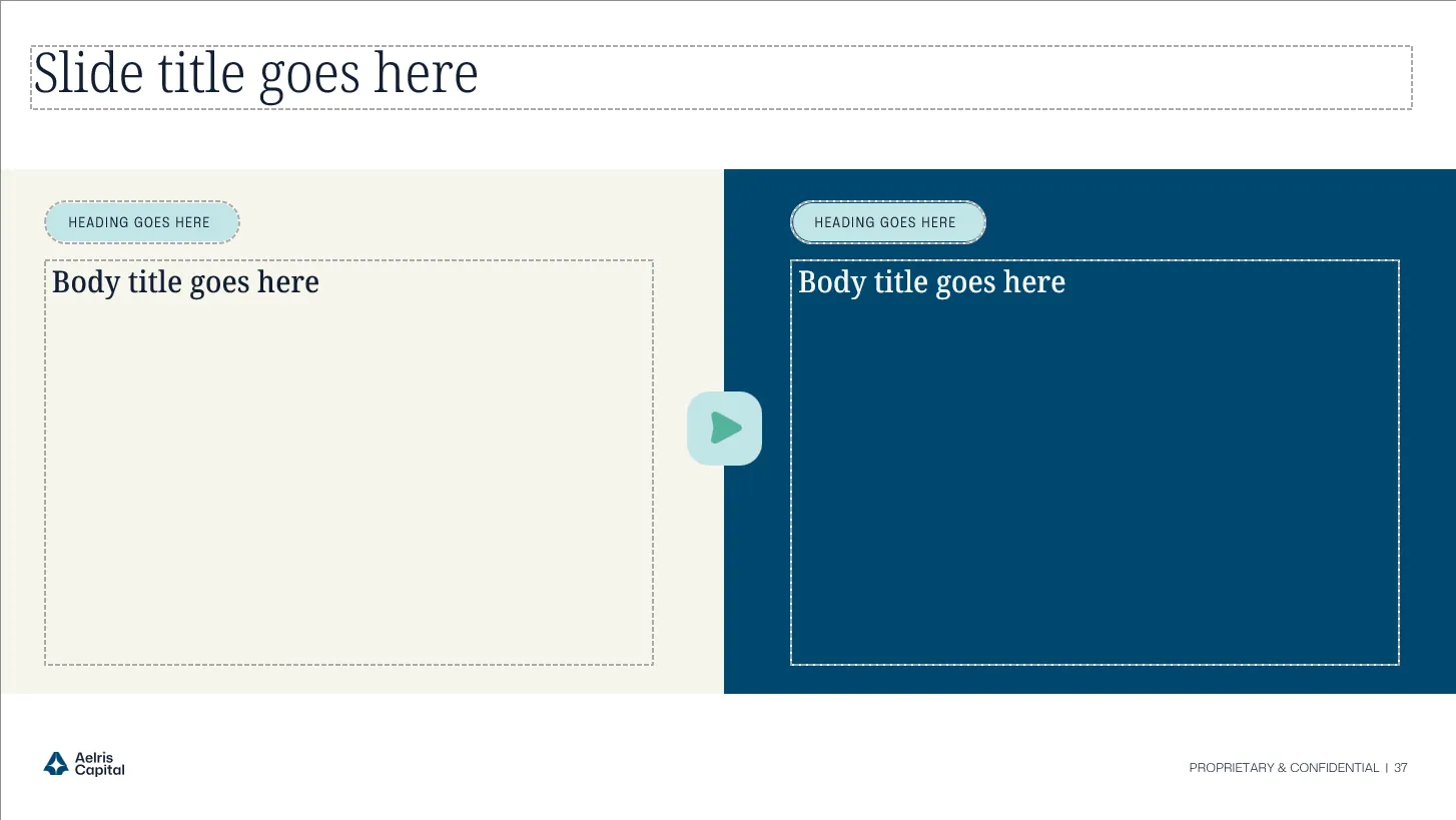
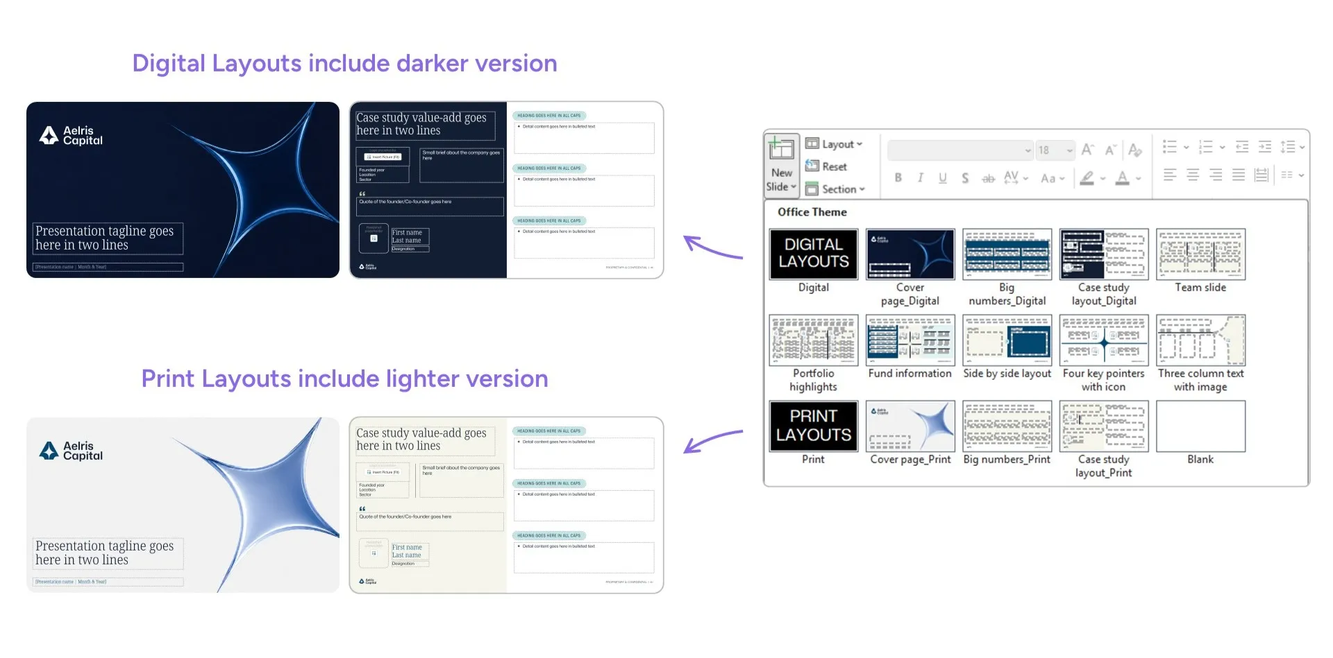
Dark layouts gave the deck a strong on-screen presence, but they were not always practical for print or offline review. We created matching digital and print versions for key slides, keeping the same layout, hierarchy, and brand system while adapting contrast and background treatment. The result was one flexible template system built for live presentations, PDF sharing, and printed LP materials.

Design system moodboard featuring "Fraunces" and "DM Sans" typography, a teal gradient palette, and custom icons to modernize the private equity presentation design and fund overview deck.
Circular grid pattern composed of thin white intersecting lines on a black background.

One Master Template System Across Three Funds

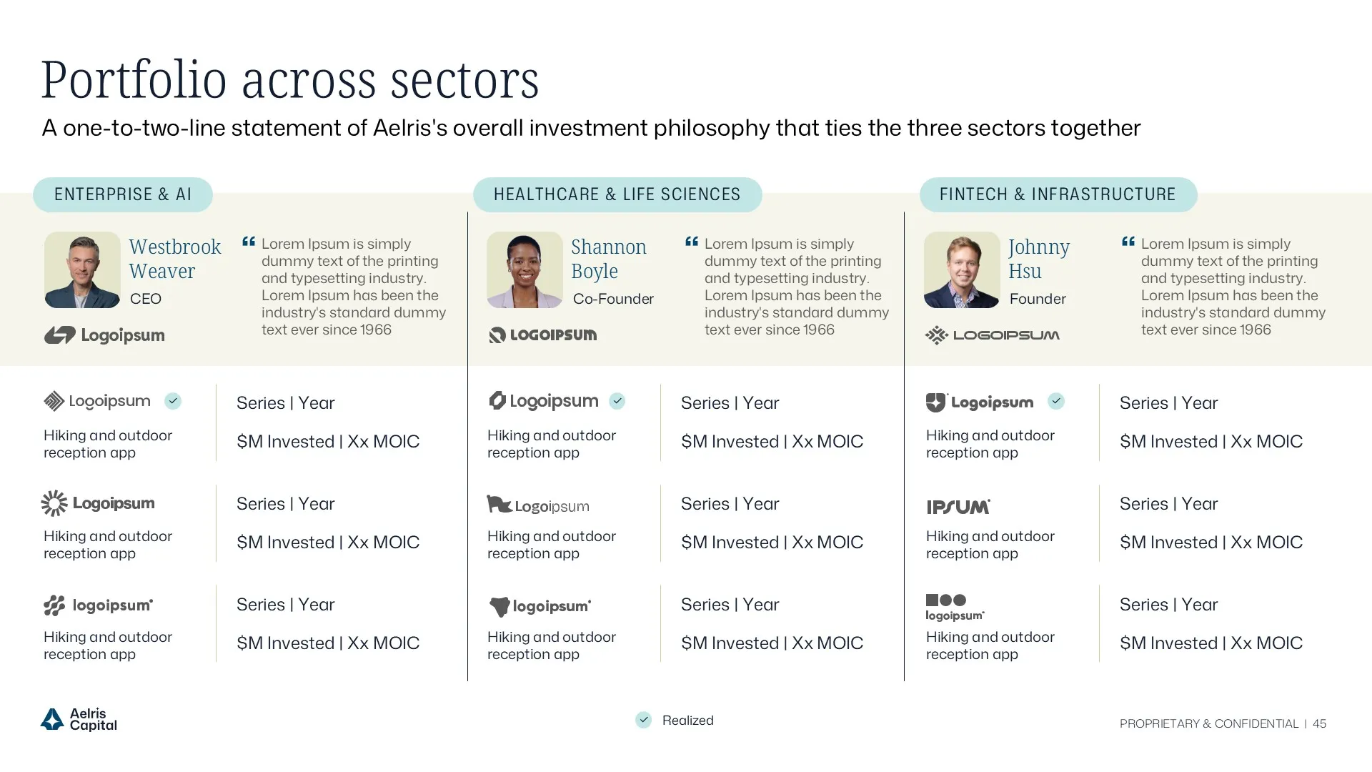
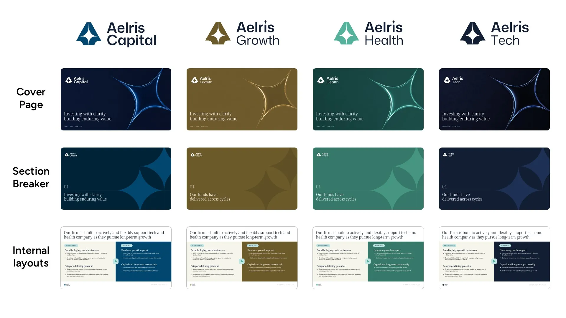
Aelris manages three funds, each with its own logo, accent color, and brand expression. Rather than building three separate templates, we created one master system where the layouts stay consistent and only the fund-specific brand elements change.
The result: one template to maintain, three fund identities preserved, and every deck kept on-brand across LP, reporting, and internal use cases.

Design system moodboard featuring "Fraunces" and "DM Sans" typography, a teal gradient palette, and custom icons to modernize the private equity presentation design and fund overview deck.
Circular grid pattern composed of thin white intersecting lines on a black background.

Complete Presentation Design System

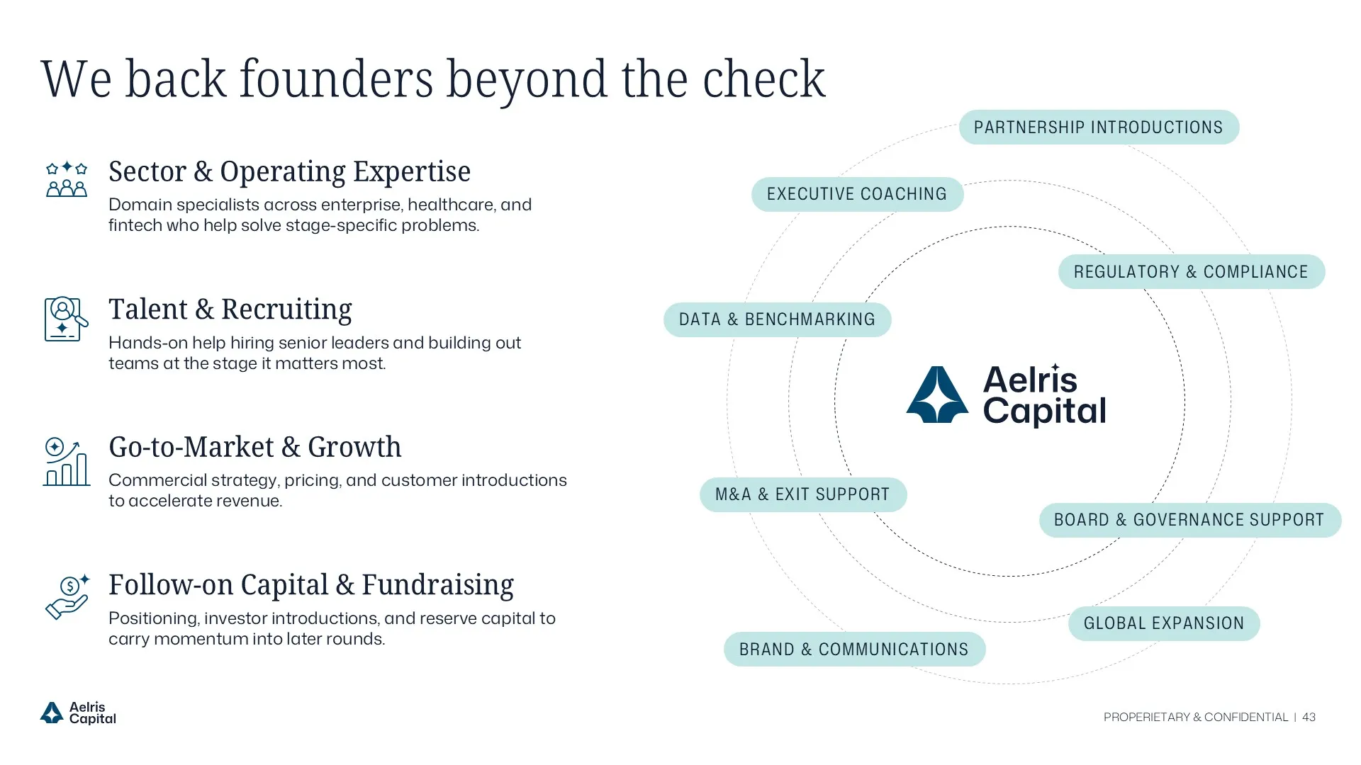
We did not just hand over a template. We built a complete presentation kit.
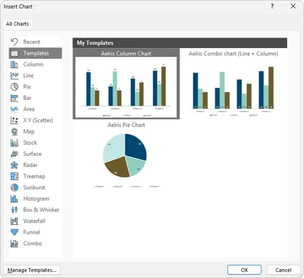
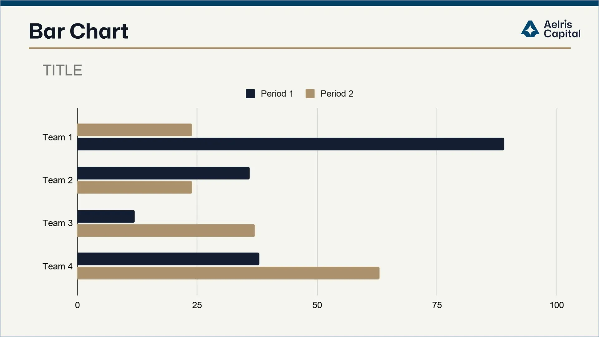
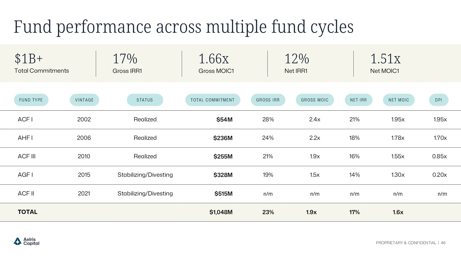
Tables, charts, icons, shapes, and reusable components were built into the system so the team could create polished slides without starting from scratch. We also extended the same visual language into a Word template and chart template file, helping memos, reports, charts, and presentations stay consistent across every format.

Circular grid pattern composed of thin white intersecting lines on a black background.