Table of contents
TL;DR
LPs allocating across billion-dollar real estate portfolios are not looking for more slides. They’re looking for signals. The right 12 slides make your fund easy to understand, evaluate, and back.

LPs allocating across billion-dollar real estate portfolios are not looking for more slides. They’re looking for signals. The right 12 slides make your fund easy to understand, evaluate, and back.
Amélie Laurent
Product Manager, Sisyphus

Here's a scenario we see often. A GP has a genuinely strong strategy, a track record of execution, and clear market tailwinds. They put together a deck. It looks clean, covers the right categories, and runs about 20–25 slides.
And LPs still come out of the meeting with too many open questions.
Not because anything was missing. Because too much of what mattered was hard to find.
The investment thesis takes effort to piece together.
The strategy required effort to follow.
Portfolio quality is there, but not immediately visible.
The story requires interpretation.
And in a 30–45 minute meeting, that’s where confidence starts to drop.
LPs are not just evaluating returns. They’re evaluating clarity, discipline, and how you think.
Your LP deck is often the first real interaction an LP has with your fund. Before diligence. Before meetings. Before any conversation. In that moment, how your presentation is structured is a direct signal for how your fund is managed.
We’ve worked with 70+ VC and PE firms on investor materials, including real estate funds at different stages of capital formation. The difference between a deck that builds conviction and one that stalls is rarely about adding more.
It comes down to a small set of slides done right
In this article, we break down the 12 slides that consistently build institutional trust in a real estate LP presentation, using a live fund deck as a reference.
Most Real Estate Investor Presentations Contain More Noise Than Signal
Here’s what we see most often when a GP shares their original deck.
- The strategy is there, but spread across 4 slides when it should live on one.
- The market data is thorough, but reads like a data dump, not a conclusion.
- The team slide lists credentials, but doesn’t connect them to execution risk.
- The fund terms are included, buried in an appendix, formatted like legal text.
Nothing is missing. But everything requires effort to understand.
That’s the problem.
Institutional LPs are not reviewing your deck in isolation. They’re looking at multiple allocations at once. Pension funds, endowments, family offices — they’re comparing, filtering, prioritizing.
Every piece of information an LP needs is somewhere in the deck. But finding it requires work.
That's the noise problem.
The decks that succeed are the ones that make the most important signals impossible to miss.
The fix is rarely more content. It's better architecture.
The strongest LP fundraising presentations we've worked on share one quality: every slide answers a specific question an allocator is asking.
That's what we're mapping out in the section below.
Case Study: Redwood Realty Partners LP Fundraising Presentation
Client: Redwood Realty Partners, real estate private equity sponsor focused on supply-constrained U.S. MSAs
Project: LP Fundraising Presentation
Timeline: 3 weeks
Problem:
Redwood came to us with a deck that had strong fundamentals, disciplined underwriting, a repeatable NOI growth strategy, and a credible portfolio. But the presentation read like an internal working document, not an LP-facing fundraising story.
- Fragmented storyline
- Weak proof framing
- No cohesive visual system
The content was all there. The architecture wasn't.
So before touching a single slide, we asked one question: what does this deck need to communicate, and in what order does an LP need to receive it?
Before the Slides: The Architecture That Makes an LP Deck Work
The real estate LP presentations that perform consistently in diligence share the same underlying structure, even when they look visually different. They're organized around four trust layers:
- Clarity of Strategy — Does the fund have a repeatable edge, and is it immediately legible?
- Proof of Execution — Has the team actually done this, and can they show it specifically?
- Visibility of Future Performance — What's the forward picture, and is it grounded or aspirational?
- Institutional Credibility and Risk Control — Are the guardrails real, visible, and testable?
Each layer answers a different LP concern. Together, they form a complete picture, one an allocator can translate directly into an IC memo without having to reconstruct your argument from scratch.
The 10 slides below are mapped to these four buckets. Some you likely already have. The question is whether they're doing the job they need to do.
The 12 Slides That Do the Heavy Lifting in a Real Estate LP Deck
Bucket 1: Strategy
1. Fund Strategy and Market Overview
This slide defines your edge. It tells an LP, in one pass, how you make money and why it’s repeatable.
This is where most investment decisions starts.
- Use modular blocks to break down the strategy (like this example)
- Add a bottom takeaway bar to anchor the message
- Avoid mixing multiple ideas in one block

2. Why Now?
This slide answers timing. It tells an LP why this strategy works now, not just in general. This is where you convert a good strategy into a timely opportunity.
- Anchor the slide around one core takeaway
- Break into clear blocks (supply, demand, affordability, capital markets)
- One supporting chart is enough; avoid stacking multiple visuals

3. Acquisition Engine (Disciplined Buy Box)
This slide proves your strategy is executable. It shows how you make decisions in the market, not just how you describe it.
For an LP, this is where “repeatable edge” becomes real.
- Use one real example to show how the buy box is applied in practice
- Use visual separation between framework and example
- Include asset visuals to ground the story

4. Market Opportunity (Submarket Selection)
This slide validates your assumptions. It shows that your strategy is grounded in real, measurable demand
- Focus on specific submarket characteristics, not broad geography
- The chart visually reinforces portfolio positioning in stronger markets
- Keep chart clean and use labels and callouts to guide interpretation

Bucket 2: Portfolio
5. Portfolio Overview
This slide translates strategy into reality. It shows what you own (or will own) and how that composition supports returns and downside protection.
- Use visual composition (tiles/images) to represent allocation
- Overlay key numbers directly on visuals (fast readability)
- Maintain strong visual hierarchy (what matters is obvious first)

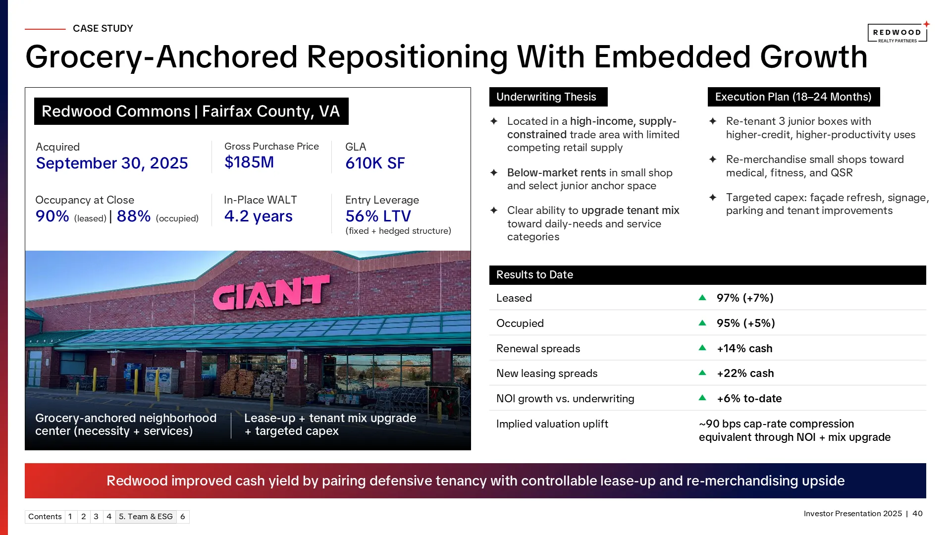
6. Case Study
This slide proves execution. It shows how your strategy actually translates into returns on a real asset.
- Connect assets to real-world use cases (daily-needs, residential demand, etc.)
- Use clear deal snapshot (price, leverage, occupancy, WALT)
- Make portfolio mix understandable in under 5 seconds
- Avoid cluttering with too many asset-level details
7. Pipeline (Active Development & Deployment)
This slide shows what happens next. It answers: where does my capital go, and how predictable is that path?
- Show current pipeline by stage and asset type
- Use a clean table format with clear categories
- Highlight key metrics: cost, capital deployed, projected yield
- Add select visuals of key assets to make it tangible

Bucket 3: Fund Structure
8. Fund Overview
This slide defines the rules of the fund. It tells an LP: how is my capital protected, aligned, and governed?
- Clearly define fund structure, not just strategy recap
- Use a clean, structured table for all key terms
- Group related items logically (size, structure, returns, governance)
- Keep formatting simple and consistent
- Avoid making it look like a legal document

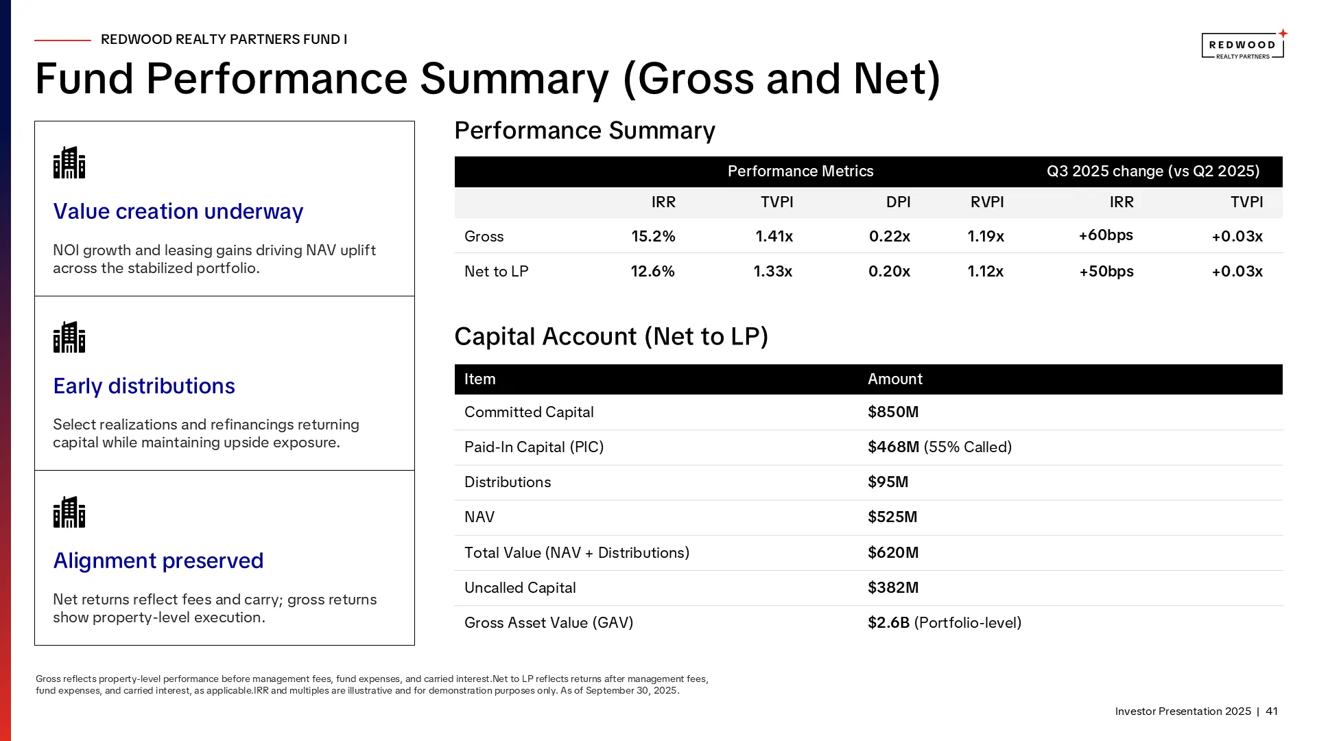
9. Fund Performance
This slide validates credibility. It answers: does the track record support the story being told?
- Present performance in a way that is transparent and interpretable
- Use a clean metric hierarchy (IRR, TVPI, DPI, RVPI)
- Avoid cramming too many metrics into one table
- Make key numbers visually easy to compare (gross vs net)
10. Line of Sight (Forward Performance)
This slide connects today’s portfolio to future returns. It answers: how much of the upside is already visible vs assumed?
This is where uncertainty gets reduced.
- Separate visible growth vs projected growth
- Use one primary chart (leased vs occupied works well)
- Avoid adding multiple charts or unnecessary complexity
- Use annotations to explain what the chart means

Bucket 4: Leadership and ESG
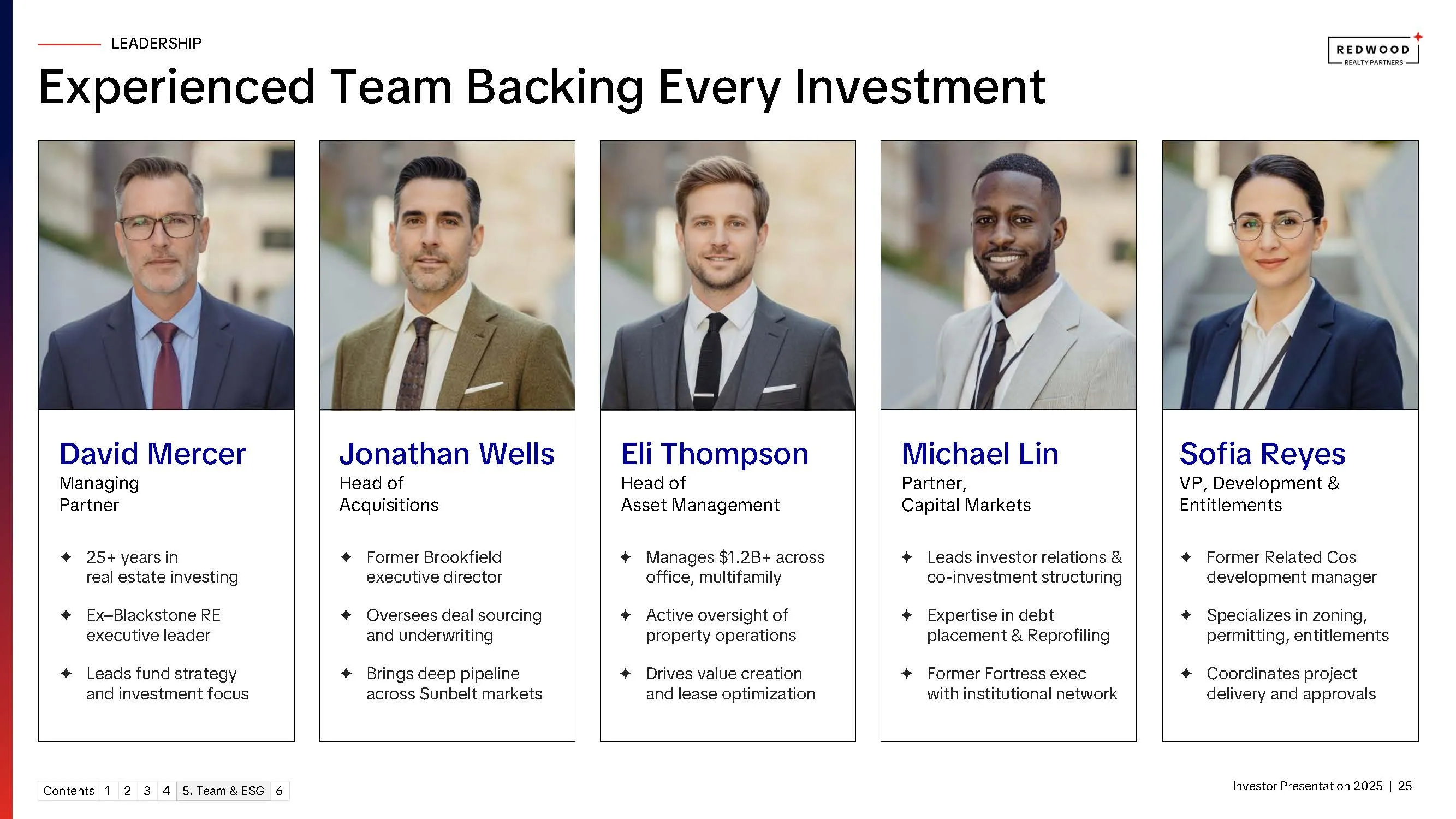
11. Team
This slide builds confidence in execution. It answers: does this team have the experience and structure to deliver on the strategy?
- Present the team as a system, not a group of individuals
- Use uniform profile cards for consistency
- Ensure visual balance across team members (no hierarchy distortion unless intentional)
- Avoid clutter like long career histories or irrelevant credentials
- Use clean, consistent layout; easy to scan
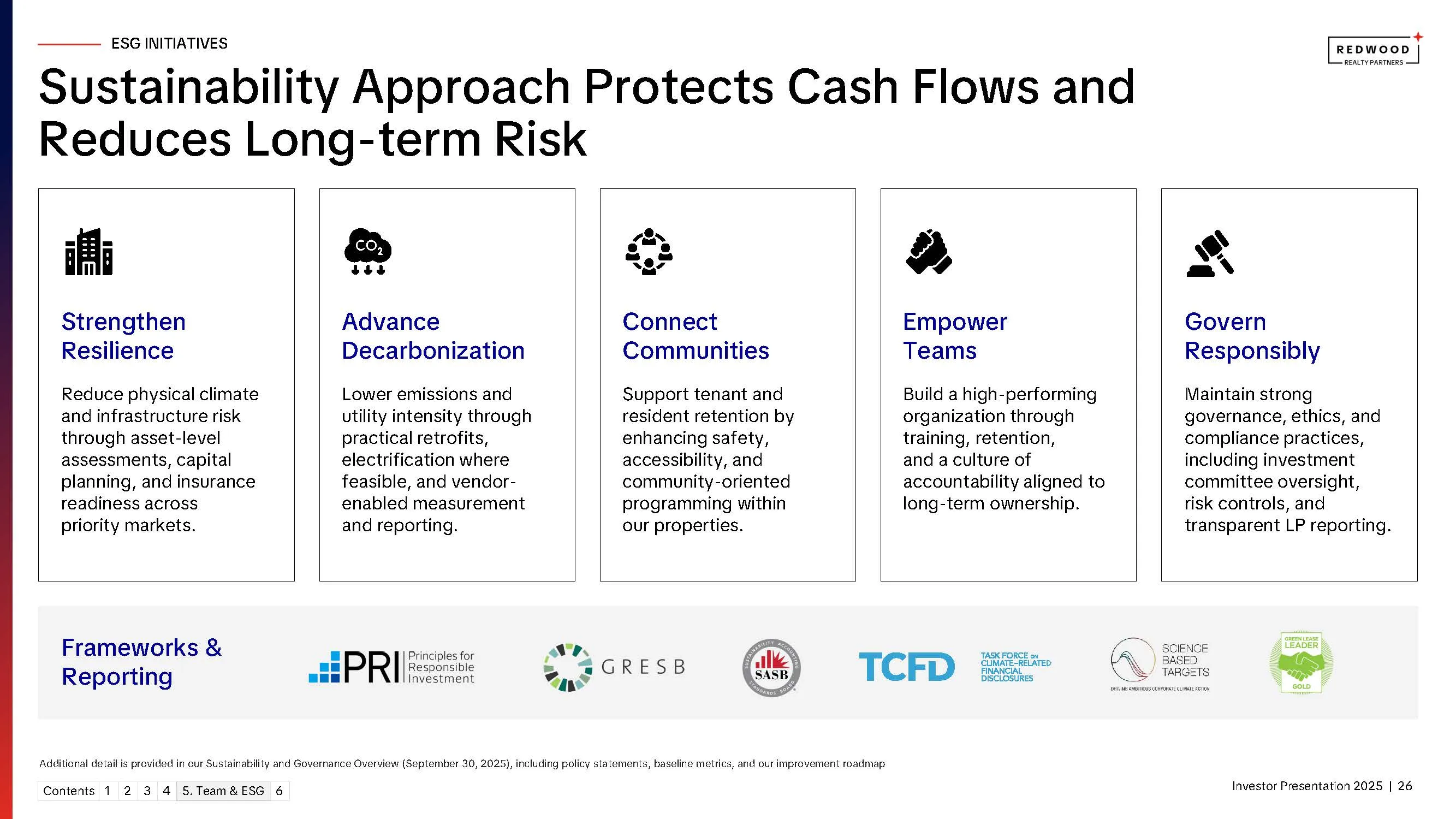
12. ESG Initiatives
This slide reframes ESG as a driver of cash flow protection and risk reduction. It answers: how are non-financial risks being managed in a way that impacts returns?
For LPs, this is less about values and more about durability and compliance.
- Position ESG as risk management.
- Use modular blocks (one pillar per card). Each block = one clear outcome + how it’s achieved
- Use icons to create quick visual scanning
- Avoid dense paragraphs or policy-heavy language
Key Takeaways: What Actually Builds Trust in a Real Estate LP Deck
Most real estate investor presentations already have the right content. Strategy. Portfolio. Track record. Pipeline.
What's missing is not information. It's how that information is structured, surfaced, and understood.
Across every real estate fundraise we've worked on, trust comes down to four things, viewed through a design lens:
- The first 5 minutes matter more than the full deck. If the strategy isn't legible in the opening slides, the rest of the deck is fighting an uphill battle.
- Visual structure should mirror investment logic. The way information is sequenced tells LPs how the GP thinks.
- Consistency builds subconscious trust. Typography, spacing, grid, alignment — when these are tight, the deck feels institutional before a word is read.
- Good design reduces the need for explanation. If a slide needs a paragraph to set up, the slide isn't working.
The slides in this article aren't the only slides in a strong LP deck. But they're the ones that carry the trust argument. Get these right and the rest of the deck has context. Get these wrong and the rest of the deck has an uphill battle.
The pattern across all 12 is the same: specificity over generality, structure over narrative, visible constraints over implied discipline.
At M’idea Hub, this is exactly where most of our work sits - taking decks that already have the right inputs and restructuring them so LPs can build conviction faster.
While this guide is real-estate-specific, the same structure applies across asset classes; see our private equity pitch deck guide for the PE version and our VC fund pitch deck guide for the venture variant.
If you're preparing for a raise or refining your LP narrative, you can explore more real estate and private equity investor presentation examples in our portfolio. Or feel free to reach out, happy to discuss where your current deck is losing signal.
View Portfolio → | Book a Call →
Frequently Asked Questions