
Designing a Series A Deck and Customer QBR for an Enterprise AI Platform
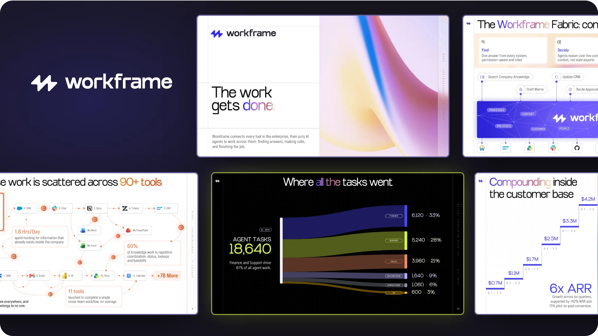

Workframe is an enterprise AI platform that connects a company's tools and puts governed agents to work across them. Heading into its Series A, the team needed a deck that made its action-first story clear to investors, and a quarterly business review its customer success team could present to its largest customer. We created a new visual direction and designed an 18-slide Series A deck and an 8-view customer QBR from it.
All content, company names, people, and figures in this project are illustrative.
Enterprise AI
4-5 weeks
Series A Deck + QBR
San Francisco, CA

The challenge
The materials had everything investors and customers needed. The design made none of it easy to see.
The deck opened on product modules, so the story never had a reason to exist.
Workflows and architecture were described in bullets instead of shown.
Screenshots from three tools, three eras of UI, and no shared style.
Default fonts, placeholder logo, and colors chosen slide by slide.
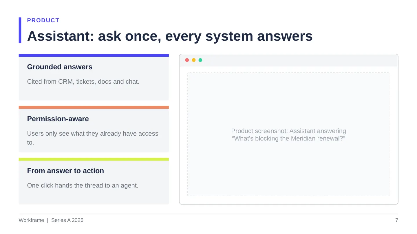
A usage export and dashboard screenshots, read aloud line by line.
Dense layouts that fell apart on a boardroom screen.
Every metric looked equally important, so none stood out.
No view the customer could lift into their own board report.
Moodboard
Enterprise buyers need to trust the product; investors need to feel momentum. The direction had to carry both.
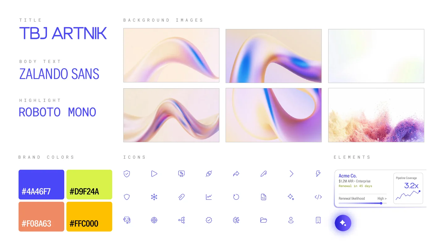
#4A46F7
Primary
#D9F24A
Highlight
#F08A63
Alert and accent
#FFC000
Data accent
Iridescent forms bring energy to an otherwise technical product.
A single stroke style keeps dense slides calm and consistent.
Frosted product cards sit over imagery, so the product always reads first.
Spotlight 01 · The problem slide
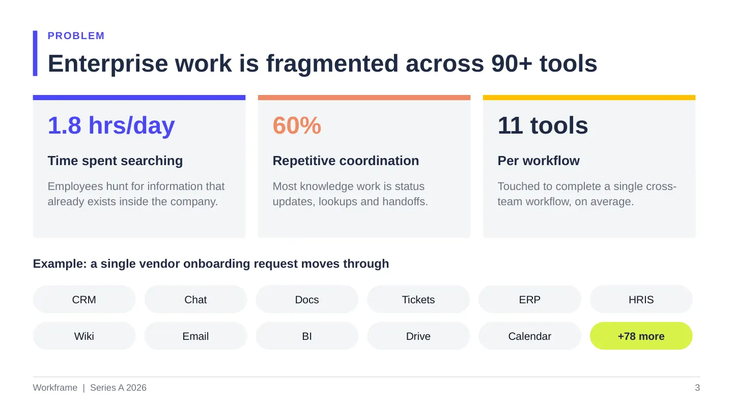
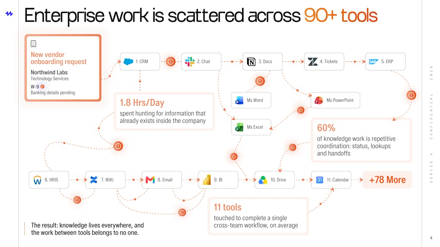
The problem was easy to state and hard to feel. We designed it as one real workflow instead of a list of tools.
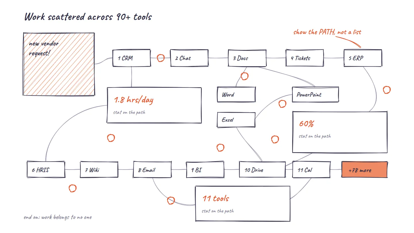
Step 1
Map one real workflow: a single vendor request moving through 11 systems.
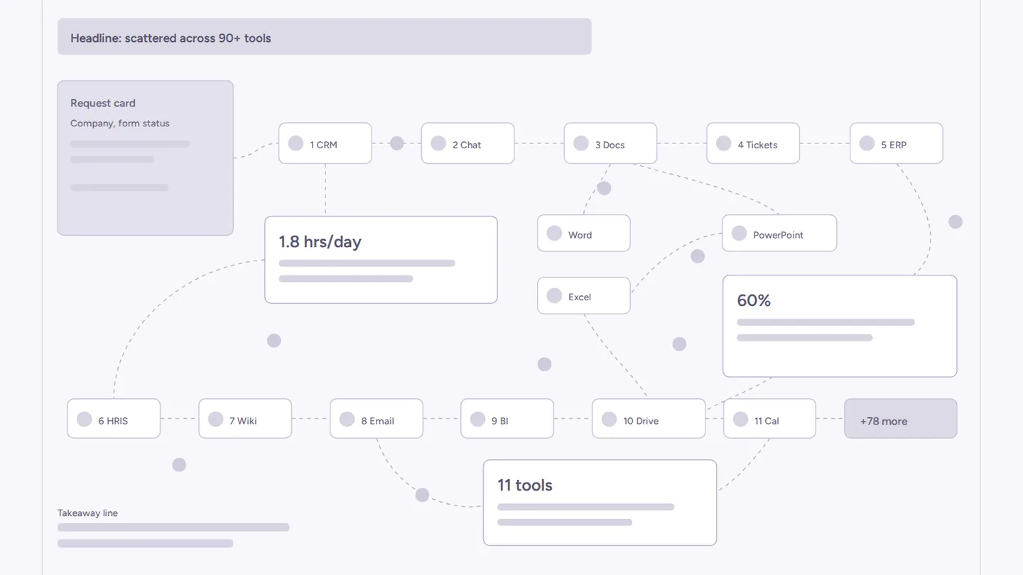
Step 2
The request enters top left, stats sit where the path breaks, and it ends at +78 more.
Step 3
Real logos, coral alert markers at every handoff, and each stat on the part of the path it describes.
Drag the handle to compare the client's version with the final slide.
Before
After
Spotlight 02 · The solution slide
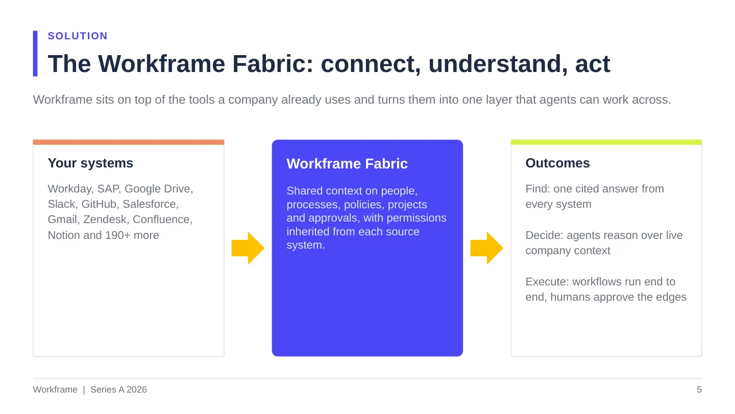
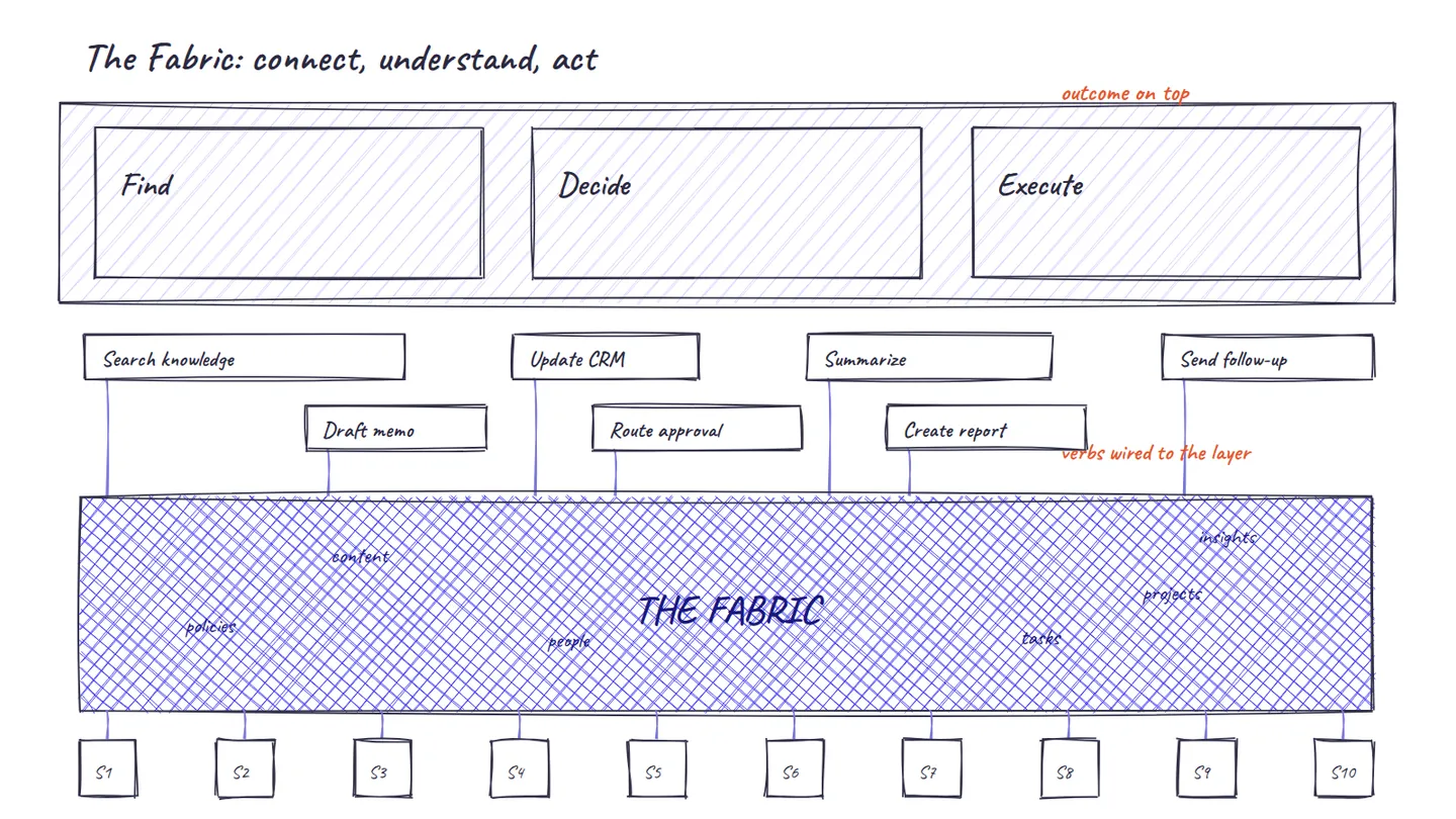
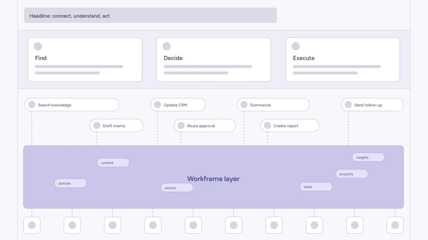
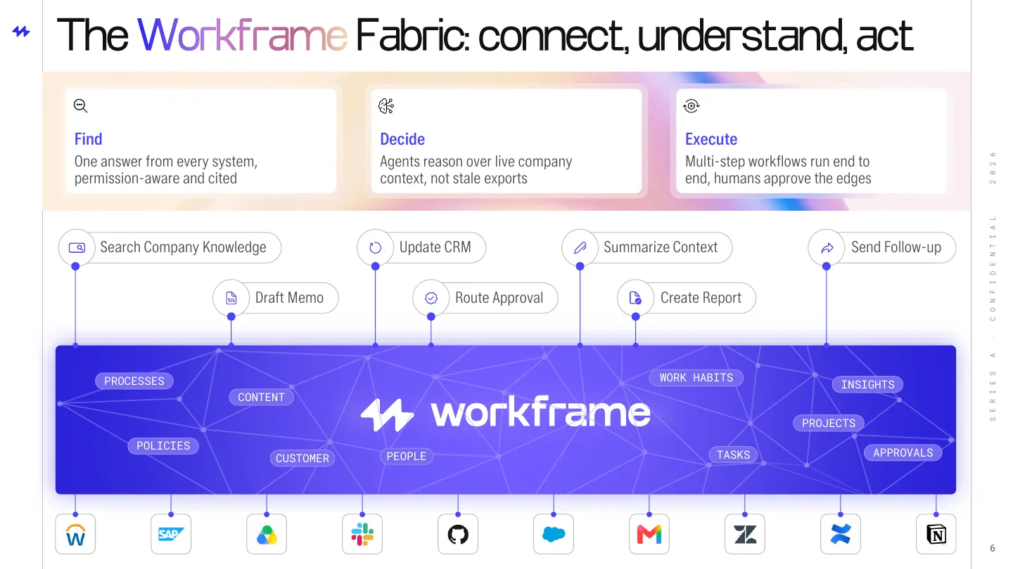
Architecture slides usually end up as plumbing diagrams. We built this one in the order an investor needs to understand it.
Step 1 · Sketch
Systems at the bottom, the outcome on top, and every verb wired to one layer between them.
Step 2 · Structure
Spacing and hierarchy locked in grayscale, so the diagram reads top to bottom in one pass.
Step 3 · Systems
Ten systems of record sit at the base as recognizable logos.
Step 4 · The layer
One blue band carries what Workframe understands, from people to policies, instead of an architecture diagram.
Step 5 · Actions
Real actions, from Update CRM to Route approval, wired straight into the layer.
Step 6 · Outcomes
Find, Decide and Execute sit on frosted cards over ribbon imagery at the top of the slide.
Before
After
Solution
Built around how a Series A investor evaluates a platform: why now, what it is, whether it works, and what the money buys.
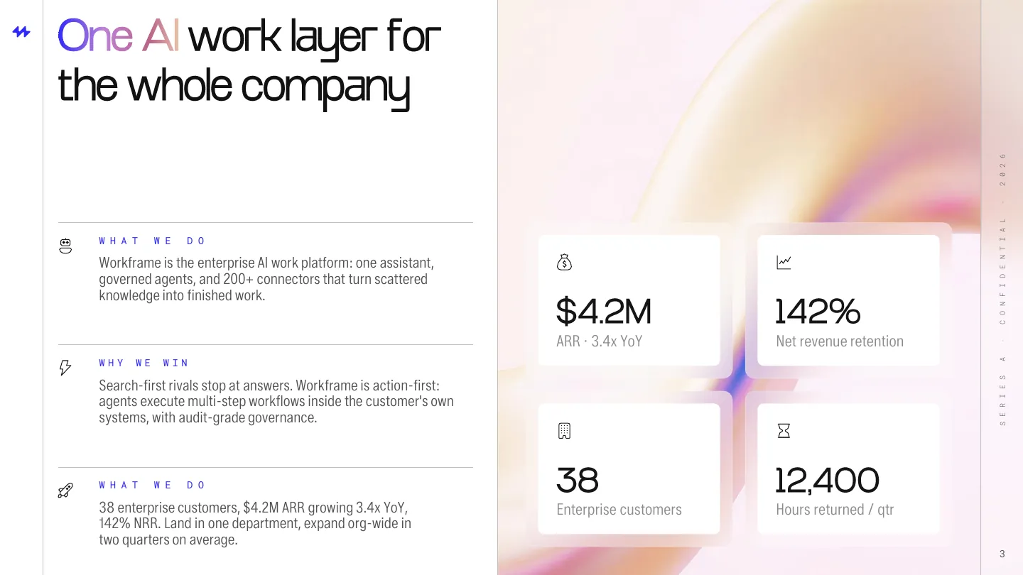
Chapter 01 · The shift
An editorial grid, hairline rules and one gradient word per title set a calm, confident tone.
Client's version
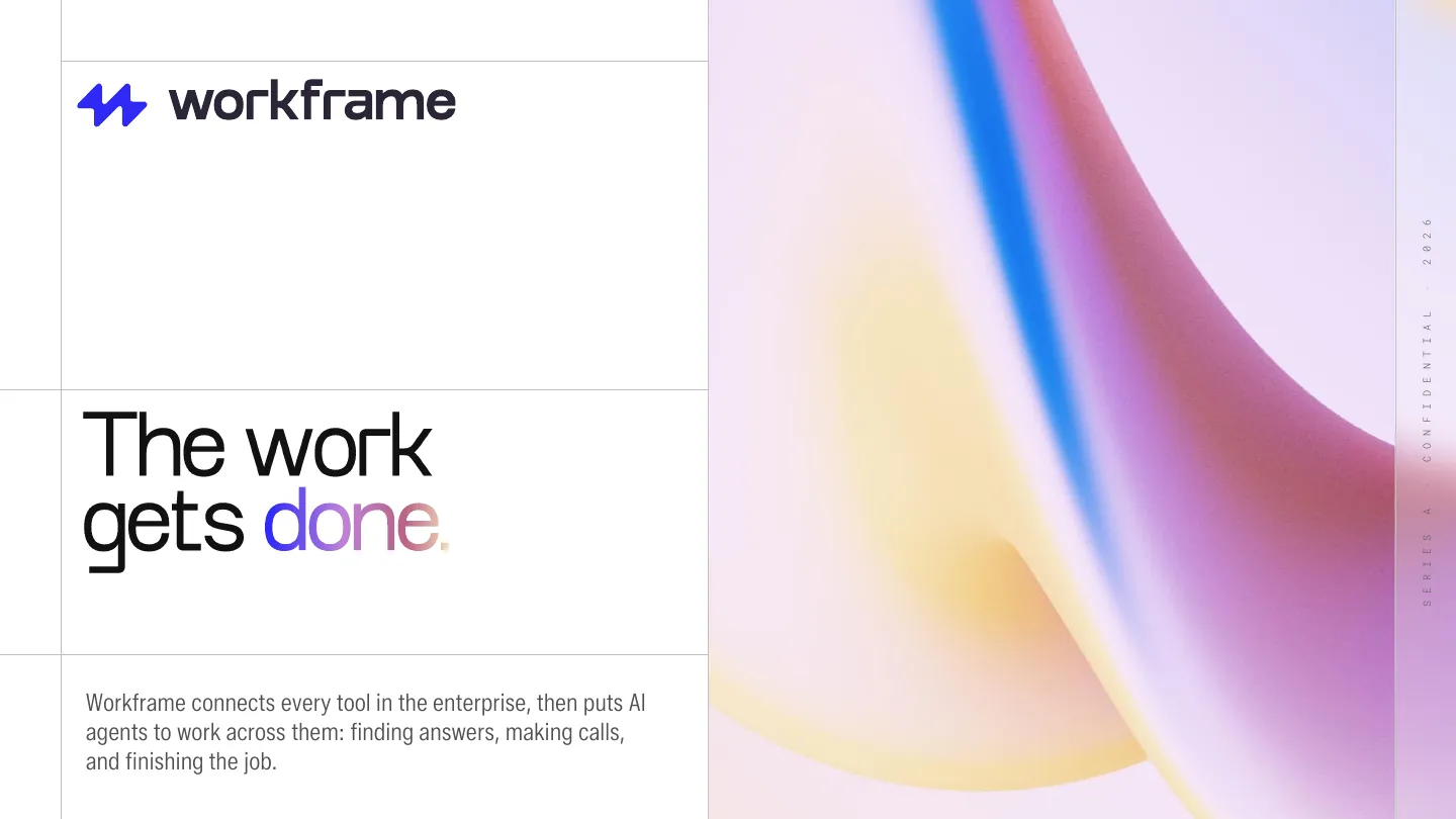
02Cover: editorial split with ribbon imagery
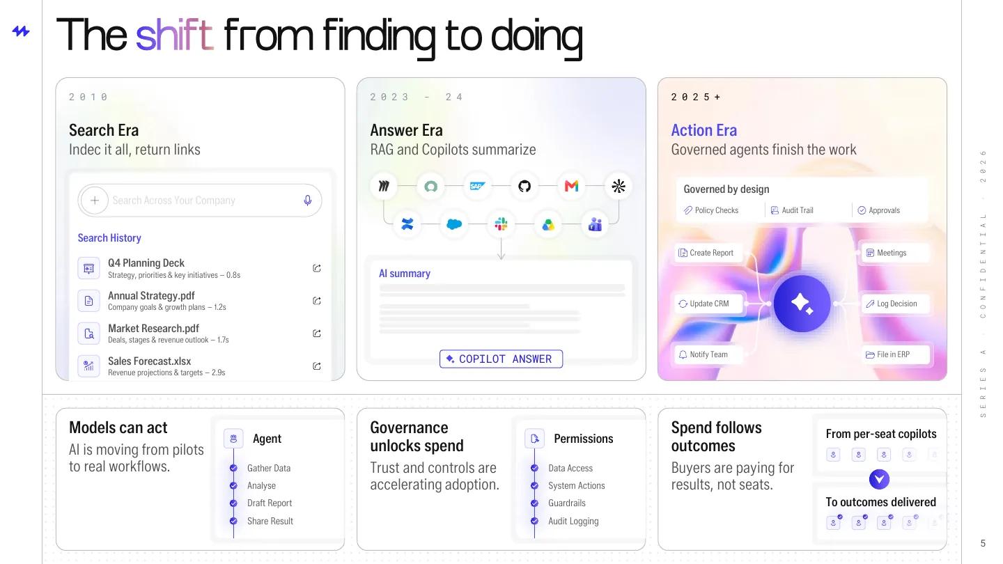
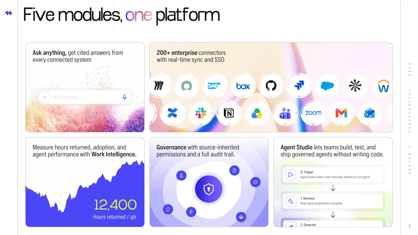
Chapter 02 · The platform
Screens from three different tools rebuilt as a single UI language on frosted cards.
Client's version
06Solution: the Workframe Fabric as a single layer
Chapter 03 · The proof
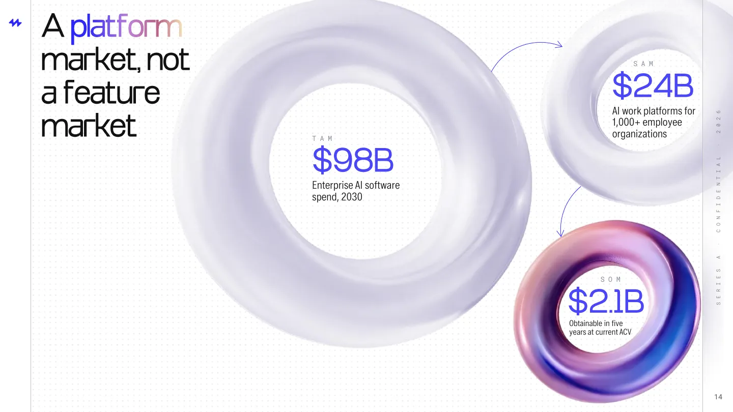
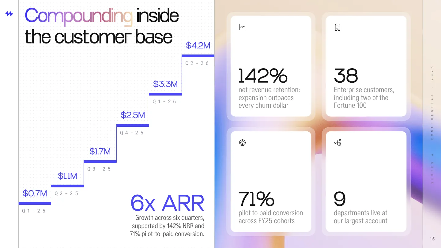
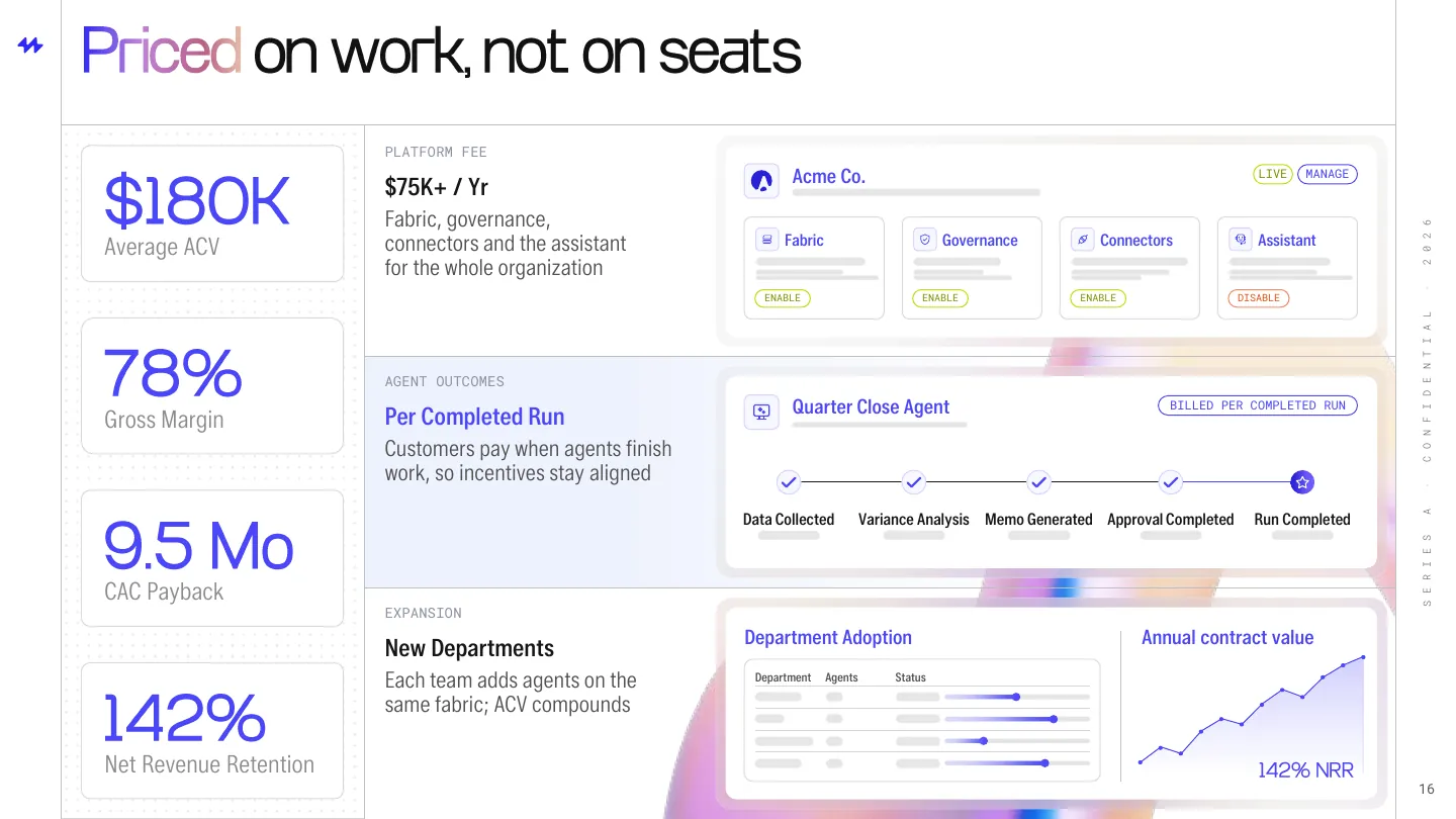
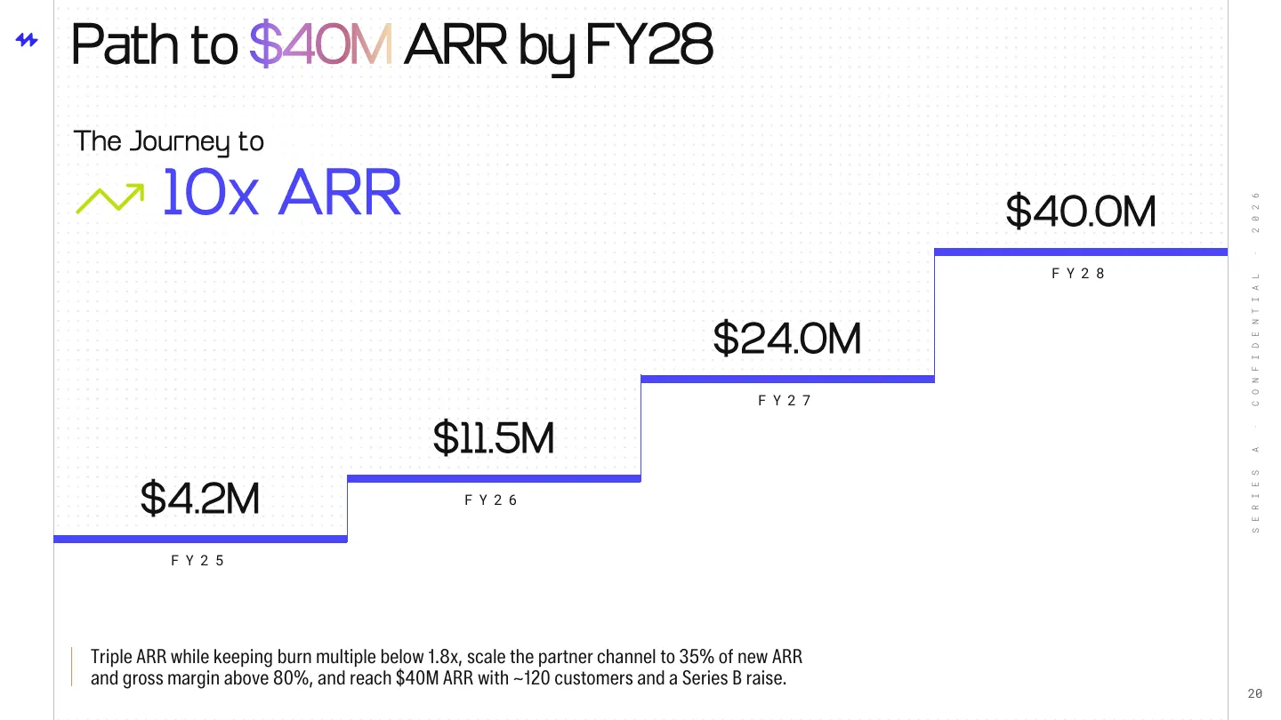
Glass rings for market size, a staircase for growth, and product cards for pricing.
Client's version
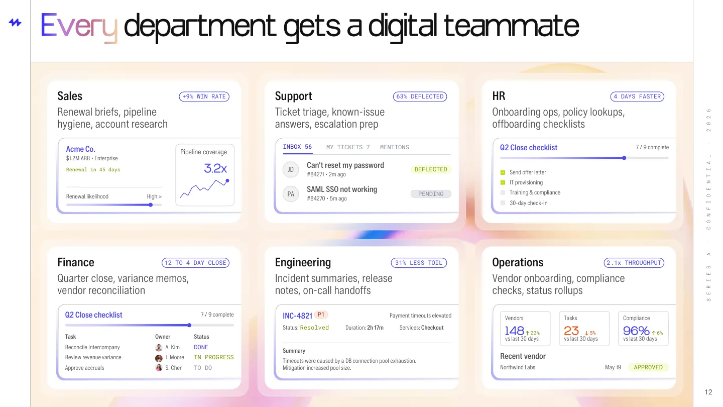
12Use cases: a product card for every department
Chapter 04 · The path
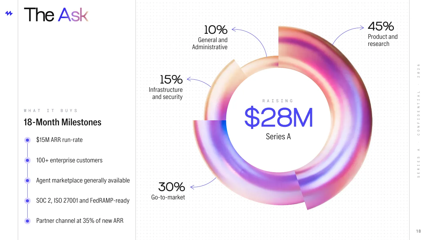
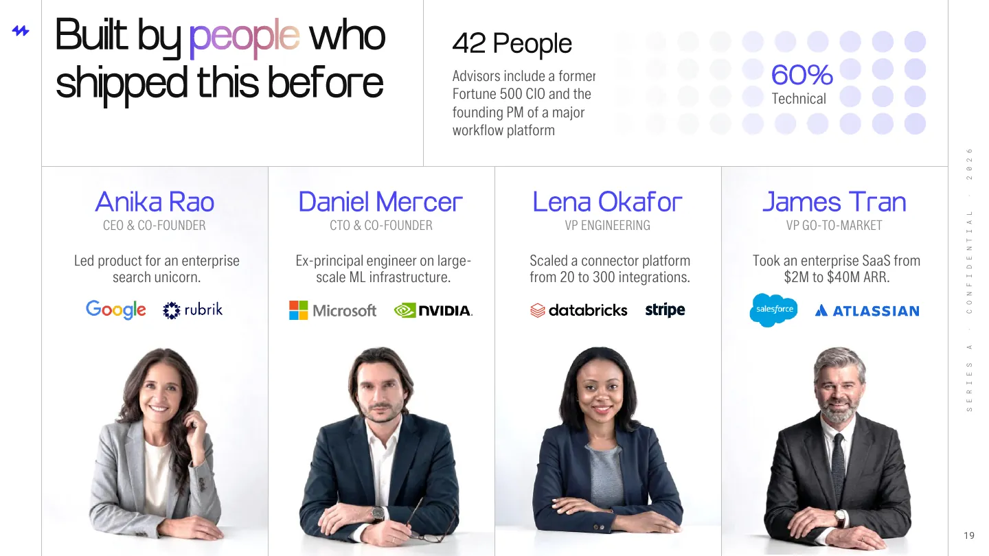
A gradient ring for the ask, portraits for the team, and one line to the plan.
Client's version
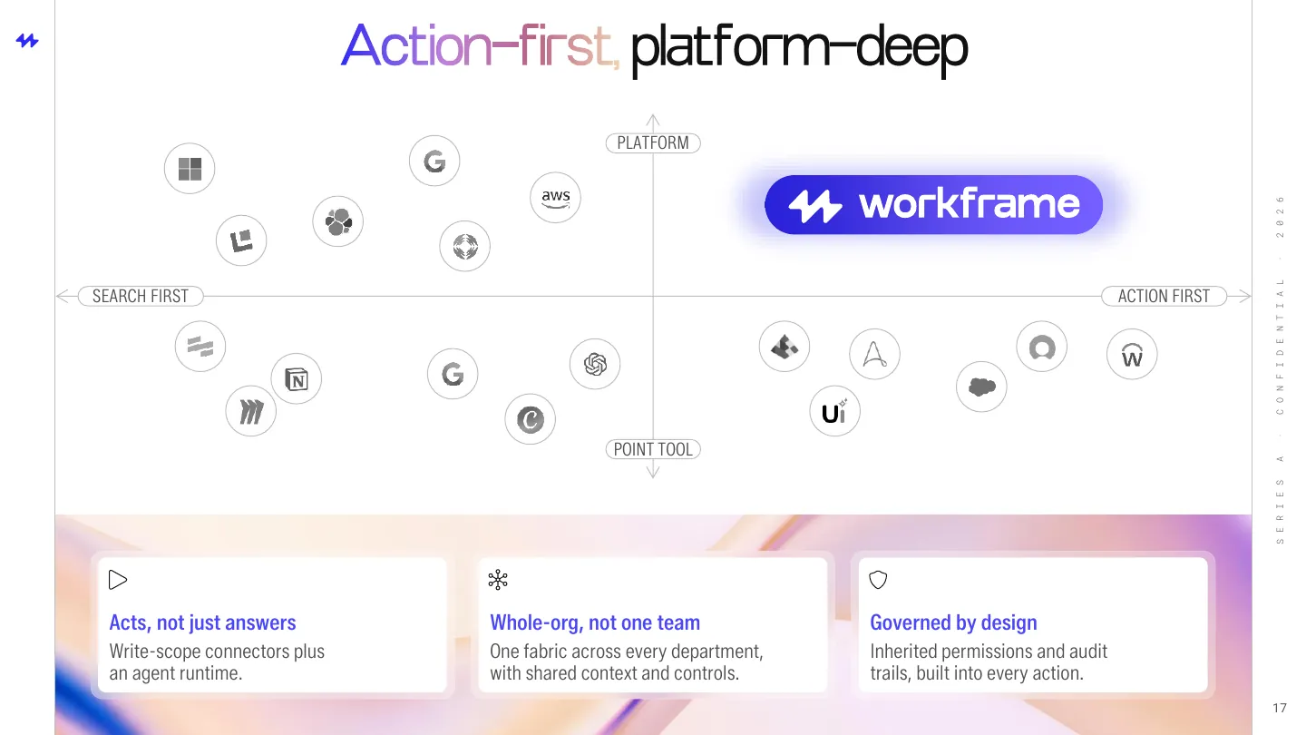
16Competition: a logo map with a clear top right
UI as proof points
Instead of claiming what the product does, the slides show it. We designed each UI element to prove one claim. Select one to see where it lives in the deck.
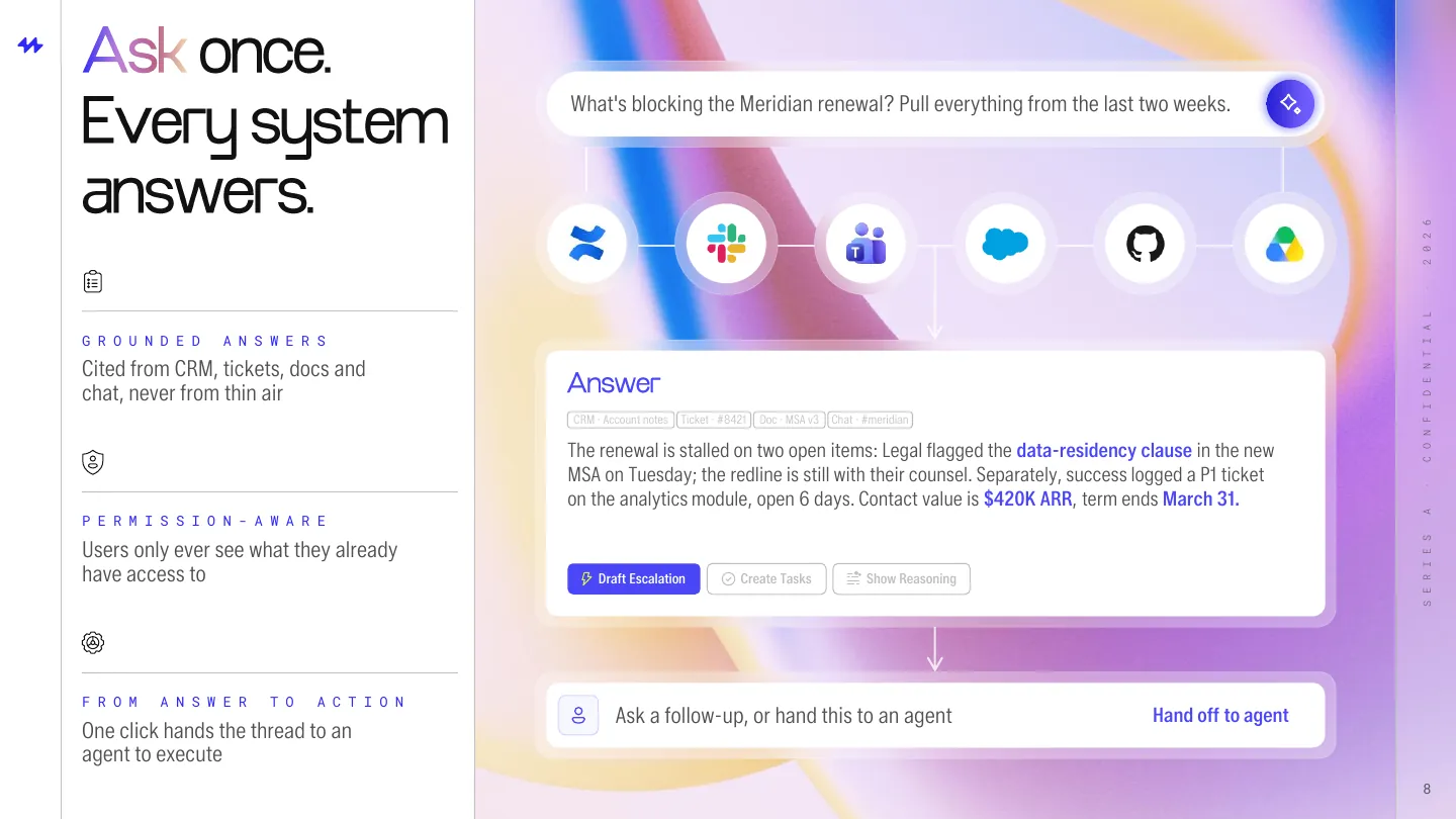
Series A slide 8
Answer card
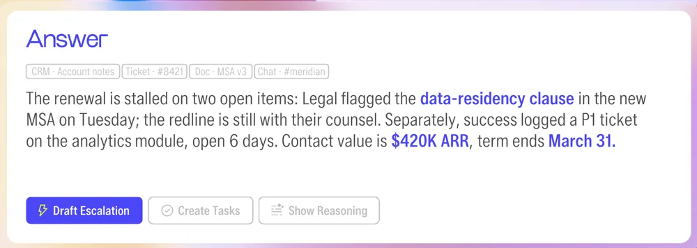
Answer card
Proves answers are cited and actionable, not generated from thin air.
Slide 8
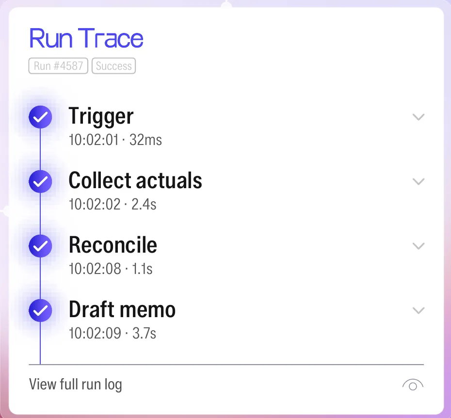
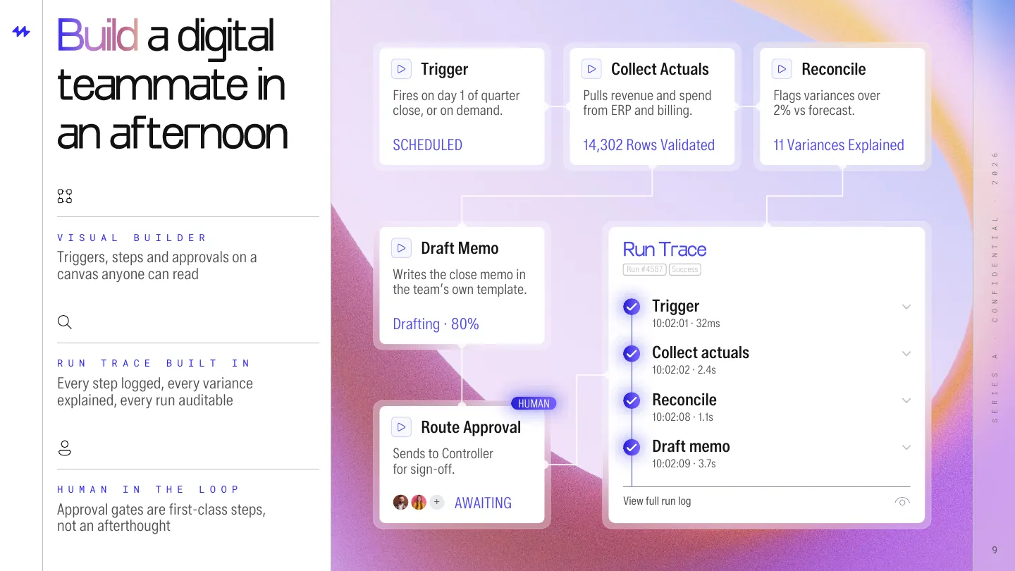
Run trace
Proves every agent step is logged, timed, and auditable.
Slide 9
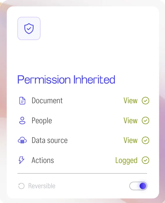
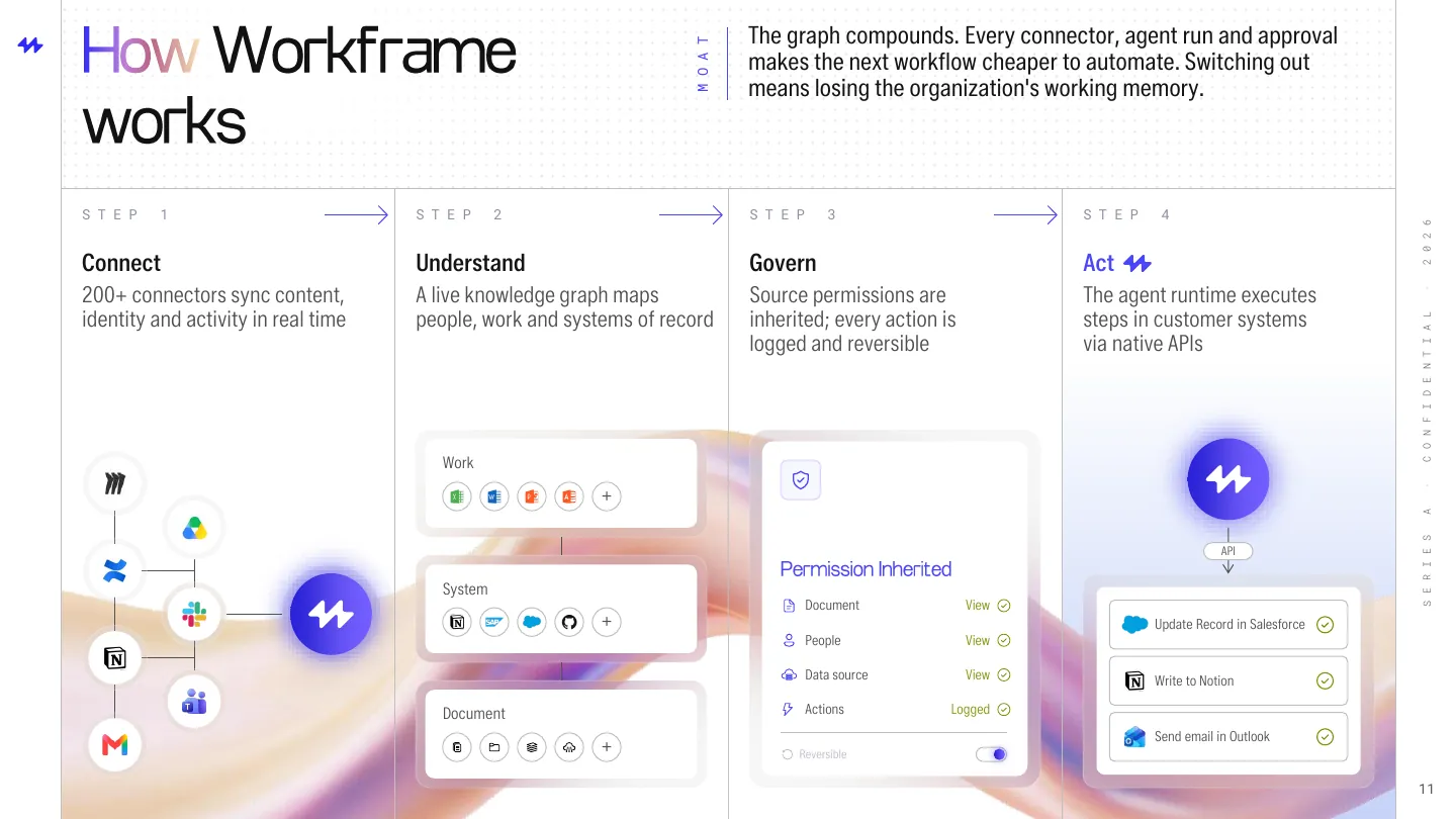
Permission panel
Proves access always mirrors the source system.
Slide 11
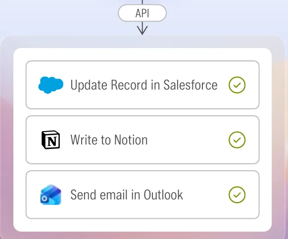
Action list
Proves agents act inside real systems, not just summarize.
Slide 11
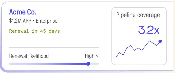
Account card
Proves sales teams see renewal risk before the call.
Slide 12
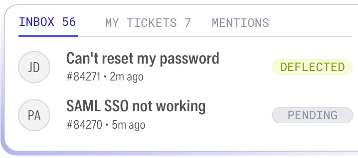
Ticket inbox
Proves support tickets resolve without a human.
Slide 12
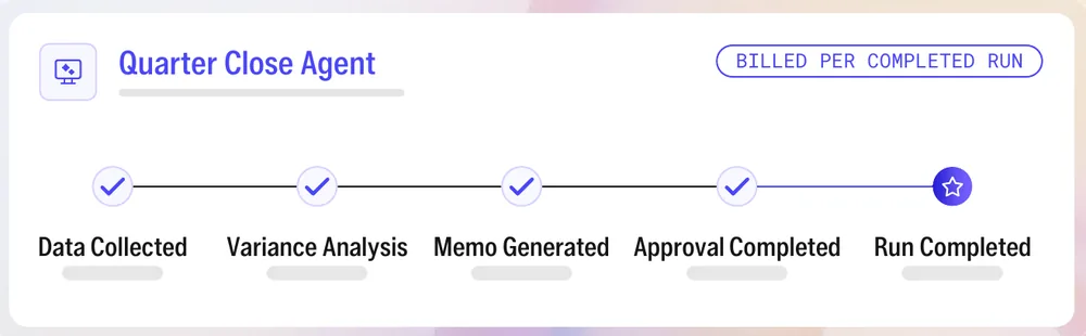
Per-run billing
Proves customers pay only when agents finish work.
Slide 15
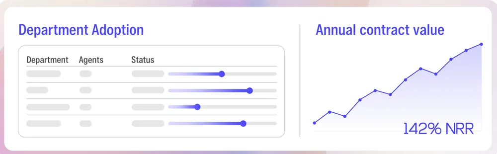
Department adoption
Proves the platform expands team by team.
Slide 15
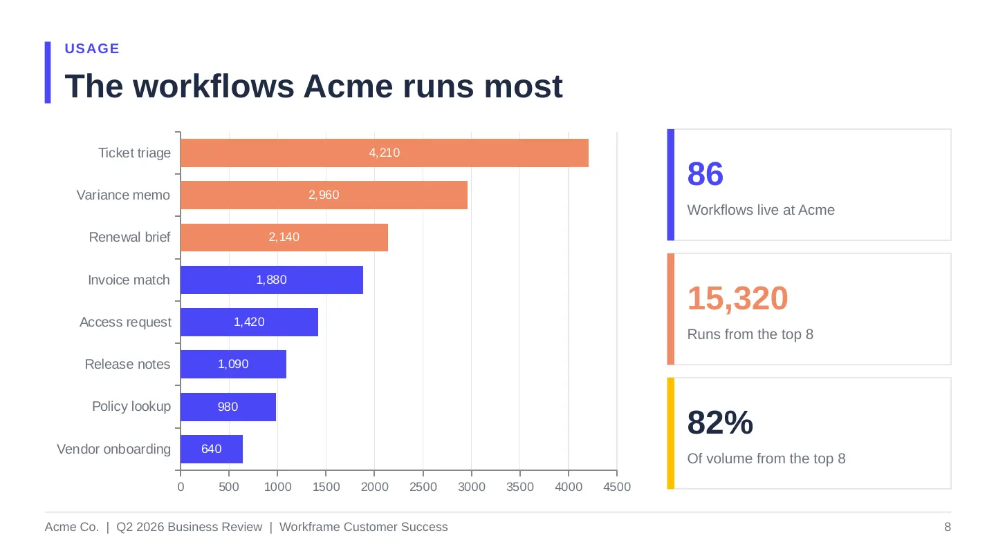
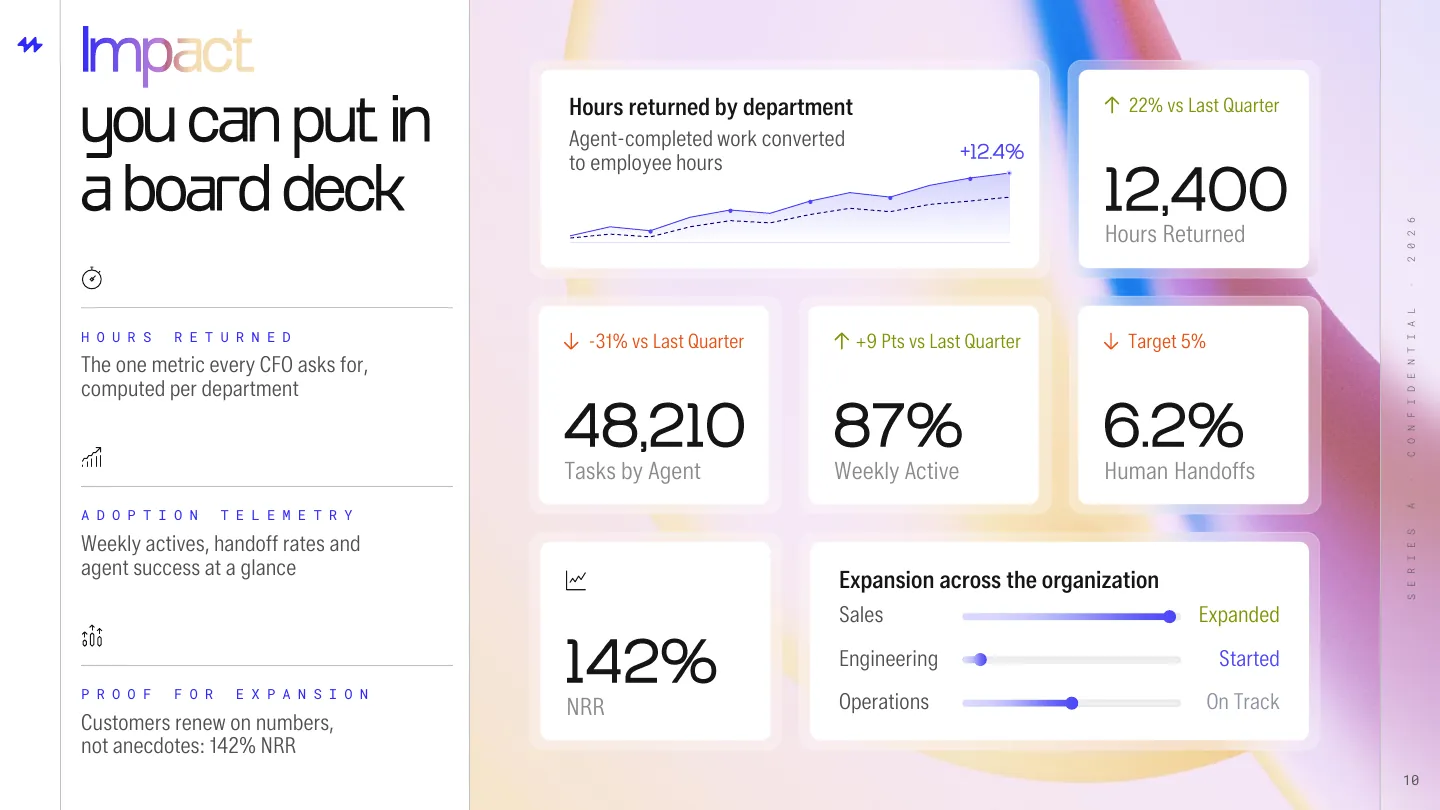
Data visualization
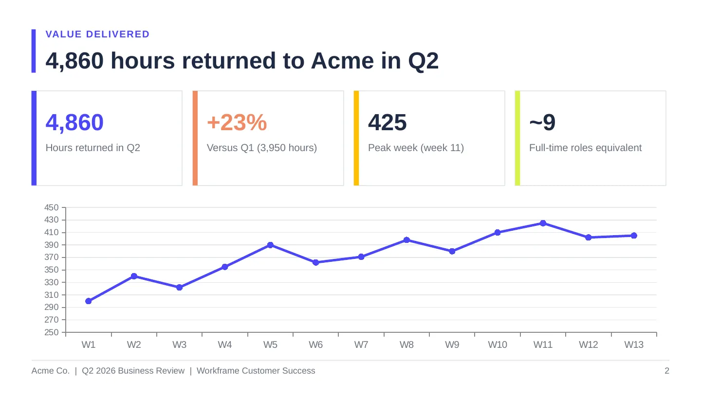
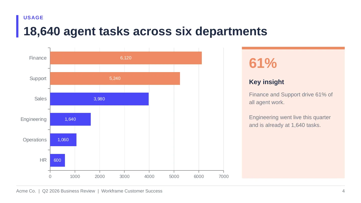
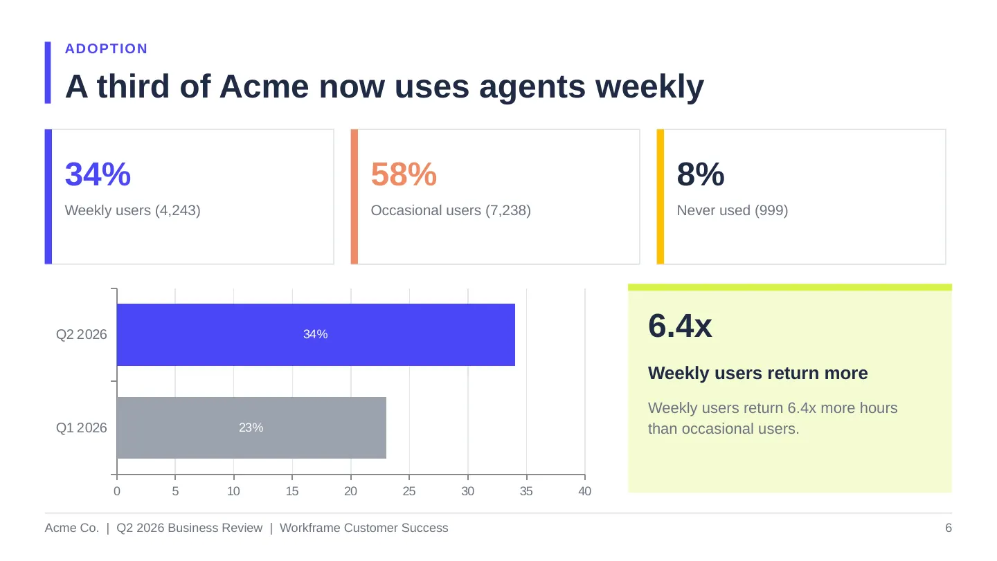
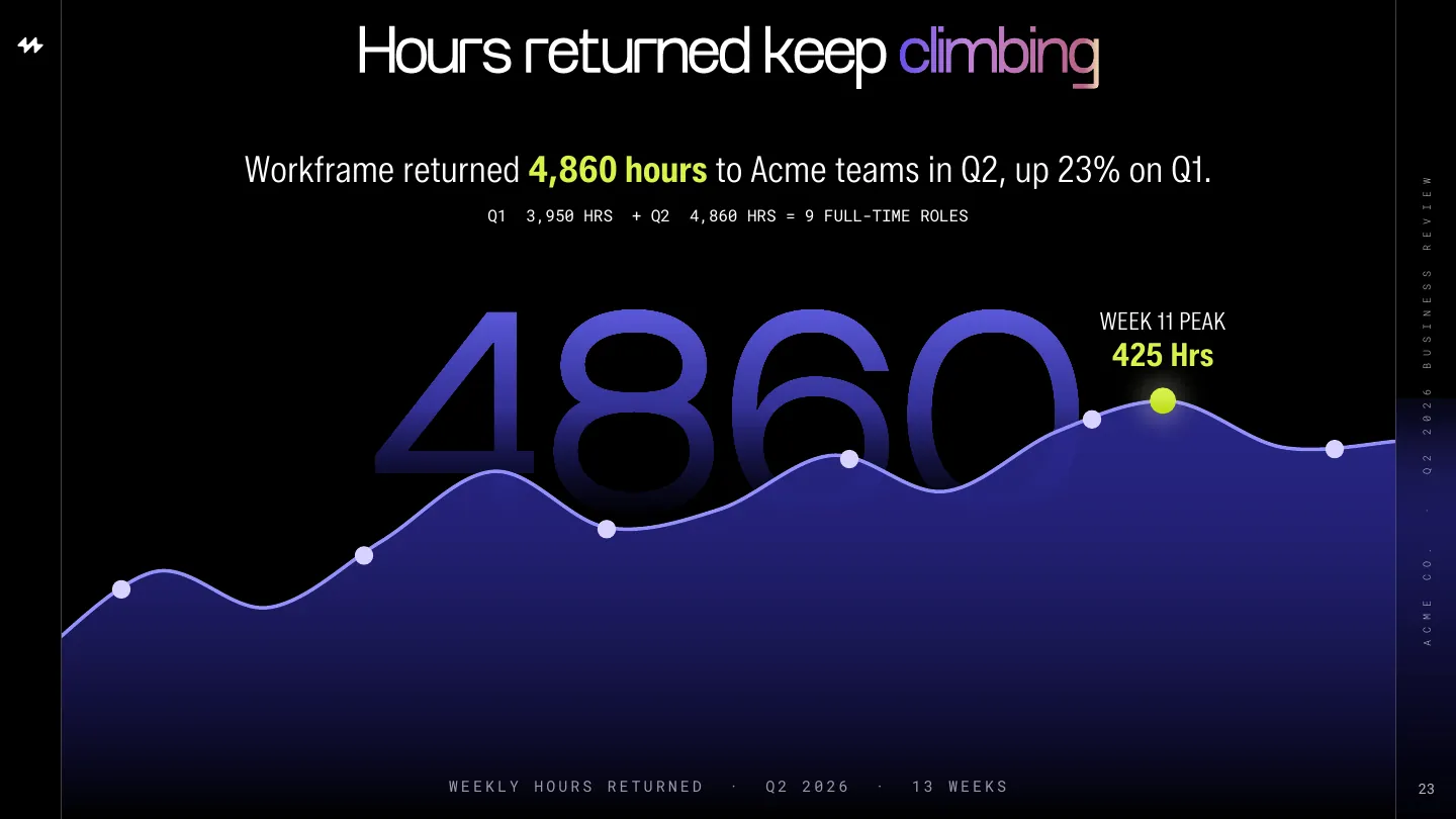
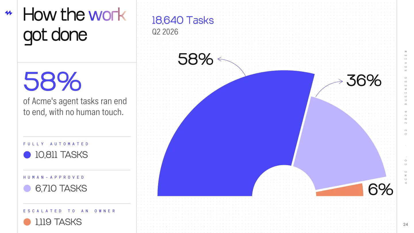
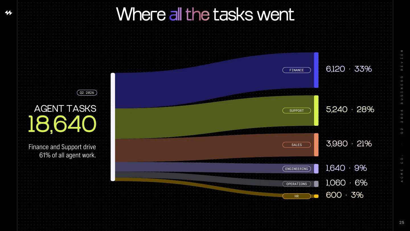
Eight views, each answering one question a CFO asks before renewing, readable from the back of the room.
Presented by Workframe customer success
To Acme's VP of Finance Operations
45 days before renewal

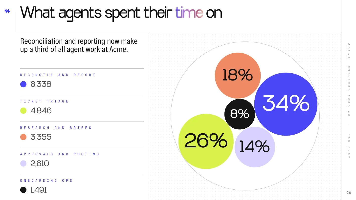
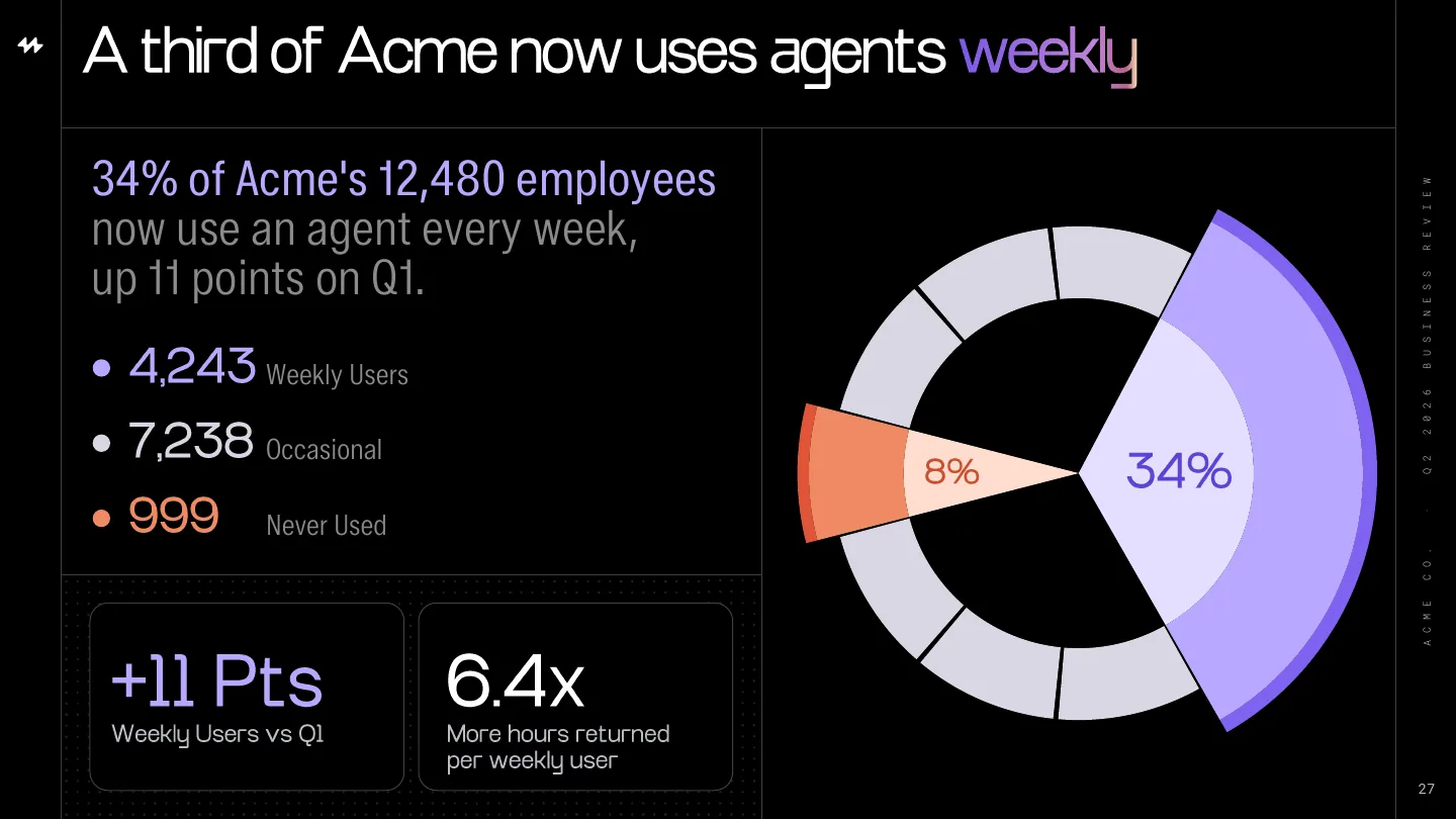
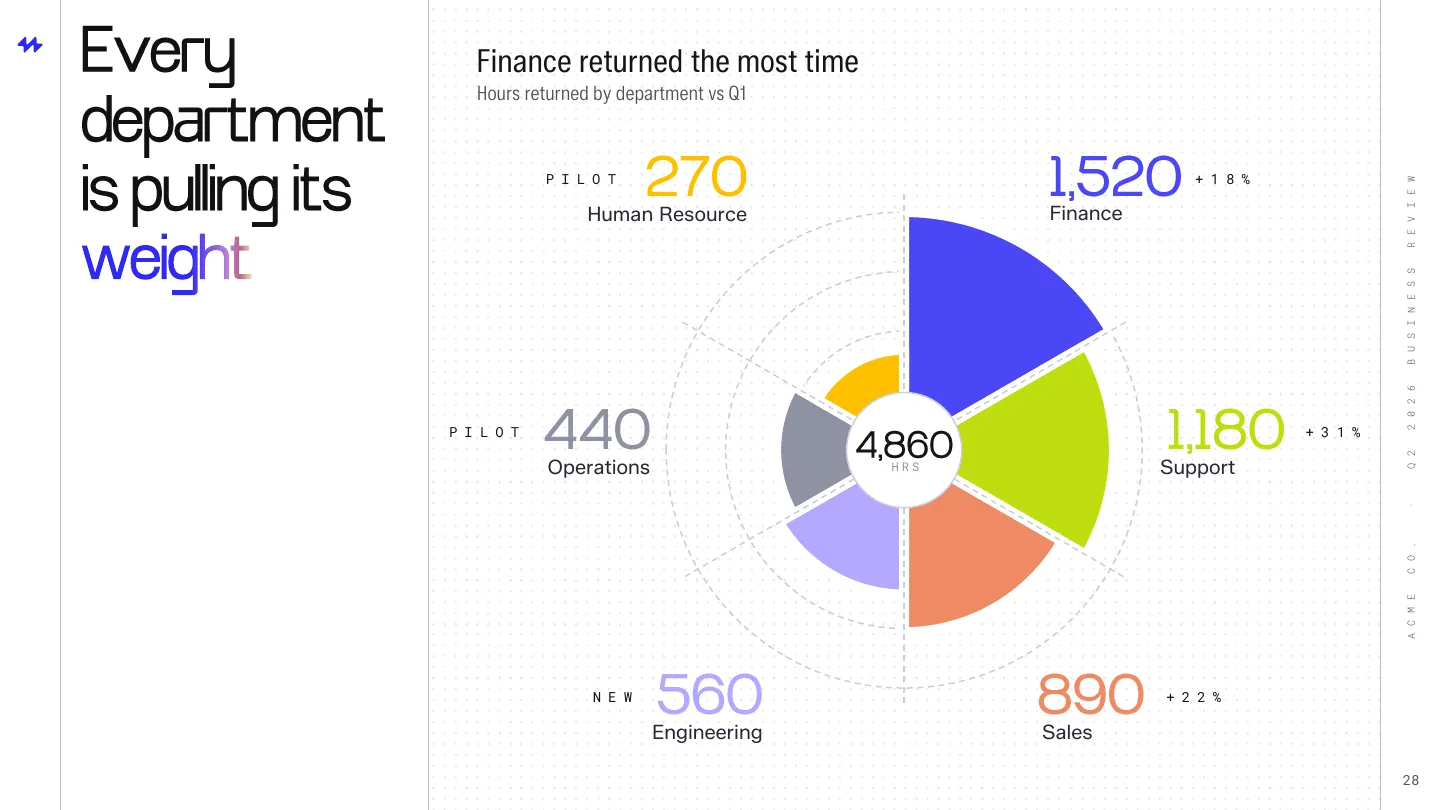
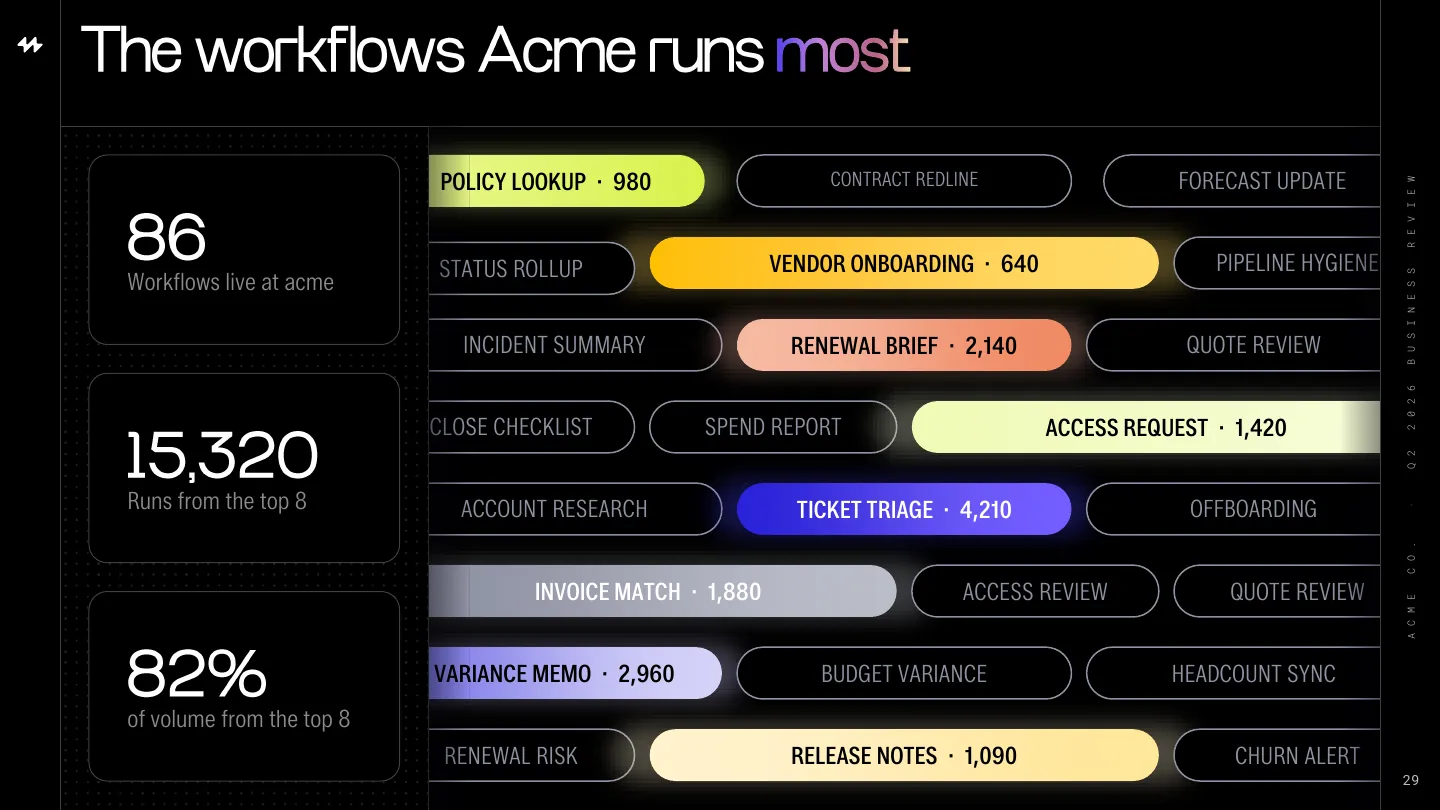
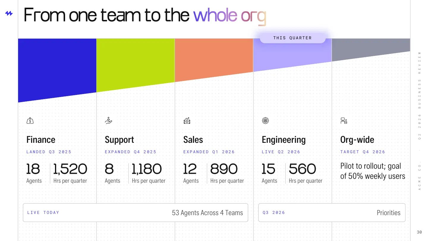
Acme Co. Q2 business review
Q2 2026 Business Review
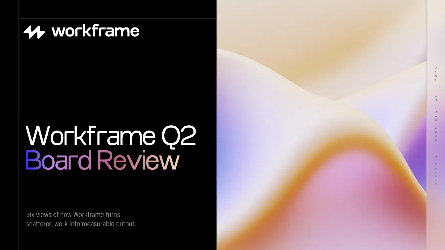
Cover. The dark cover opens the room with one idea: this is a review of results, not a product demo.
00 / 08
Scroll to present
Where the slides went
A deck is judged where it's used, not where it's made. Each format was designed for its setting from the first draft.
The Series A, presented live and left behind in the data room.
The QBR on a large display, readable from the back of the room.
Acme Co. Board of Directors
Page 7
Two QBR views, lifted into Acme's own quarterly board report.
Result
18
Series A slides across four chapters.
8
Data visualization views for the customer QBR.
8
Product UI elements designed as proof points.
1
Visual direction shared by both decks.
For AI companies
We design the deck investors fund and the review customers renew on.
 ChatGPT
 Google AI
 Claude
 Perplexity