Designing a Series B Investor Presentation for a
Clinical-Stage Cancer Platform

Before

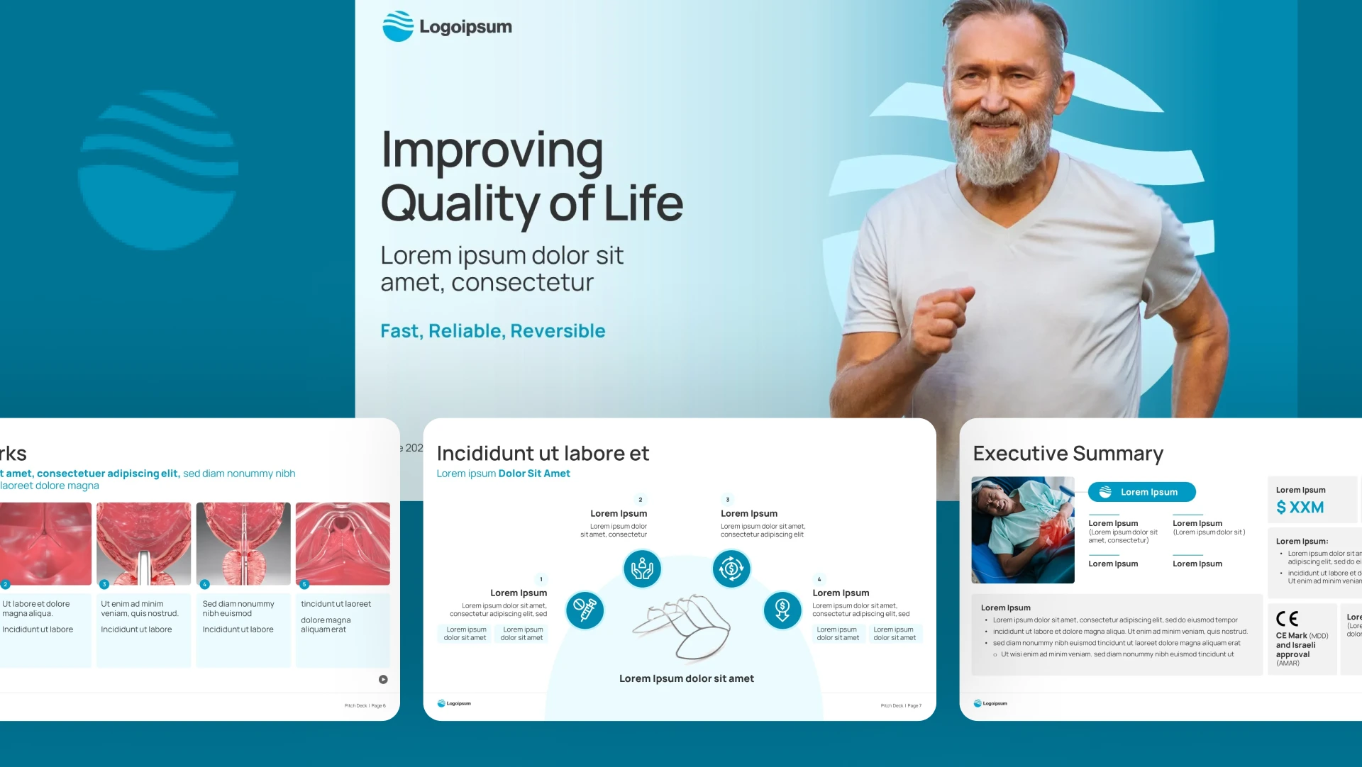
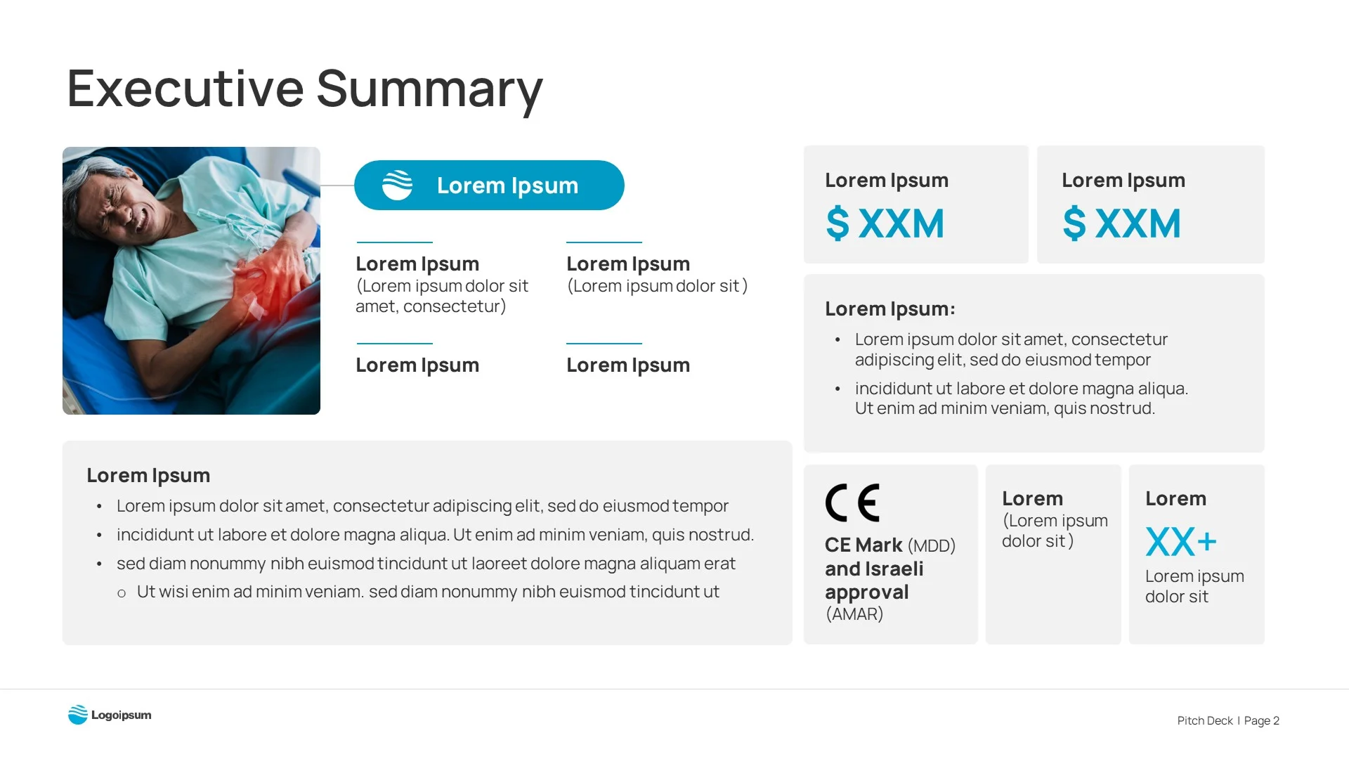
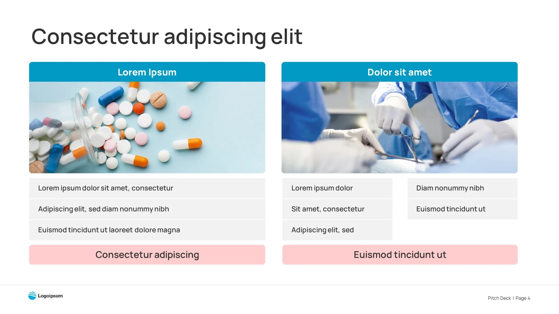
What we received from the client resembled a PowerPoint template, thus lacking the appeal of a healthcare brand. The content on the slides lacked hierarchy and visual alignment.

Generic "Lorem Ipsum" cover slide with stock photography, typical of an unoptimized series b pitch deck draftCompetitive landscape slide with scattered logos (Teleflex, Boston Scientific), needing organization by presentation design experts
Text-heavy overview slide with dense bullet points, lacking the visual hierarchy needed for a compelling biotech pitch deckComplex process slide with a confusing arrow diagram, failing to clearly communicate the scientific narrative in a biotech pitch deck
"Significant Market" slide with basic anatomical icons and unclear data, typical of early-stage healthcare pitch deck designsGeneric features slide using standard PowerPoint icons, which reduces credibility in high-stakes investor presentation design

After

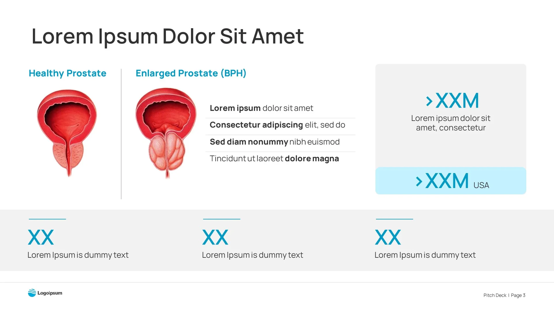
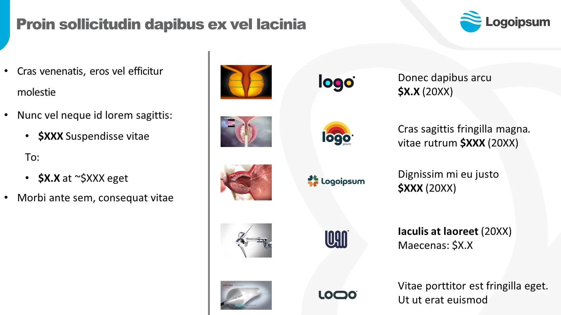
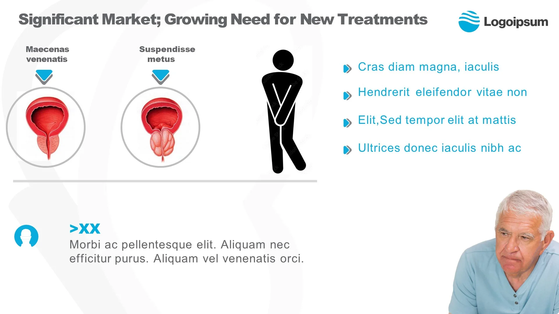
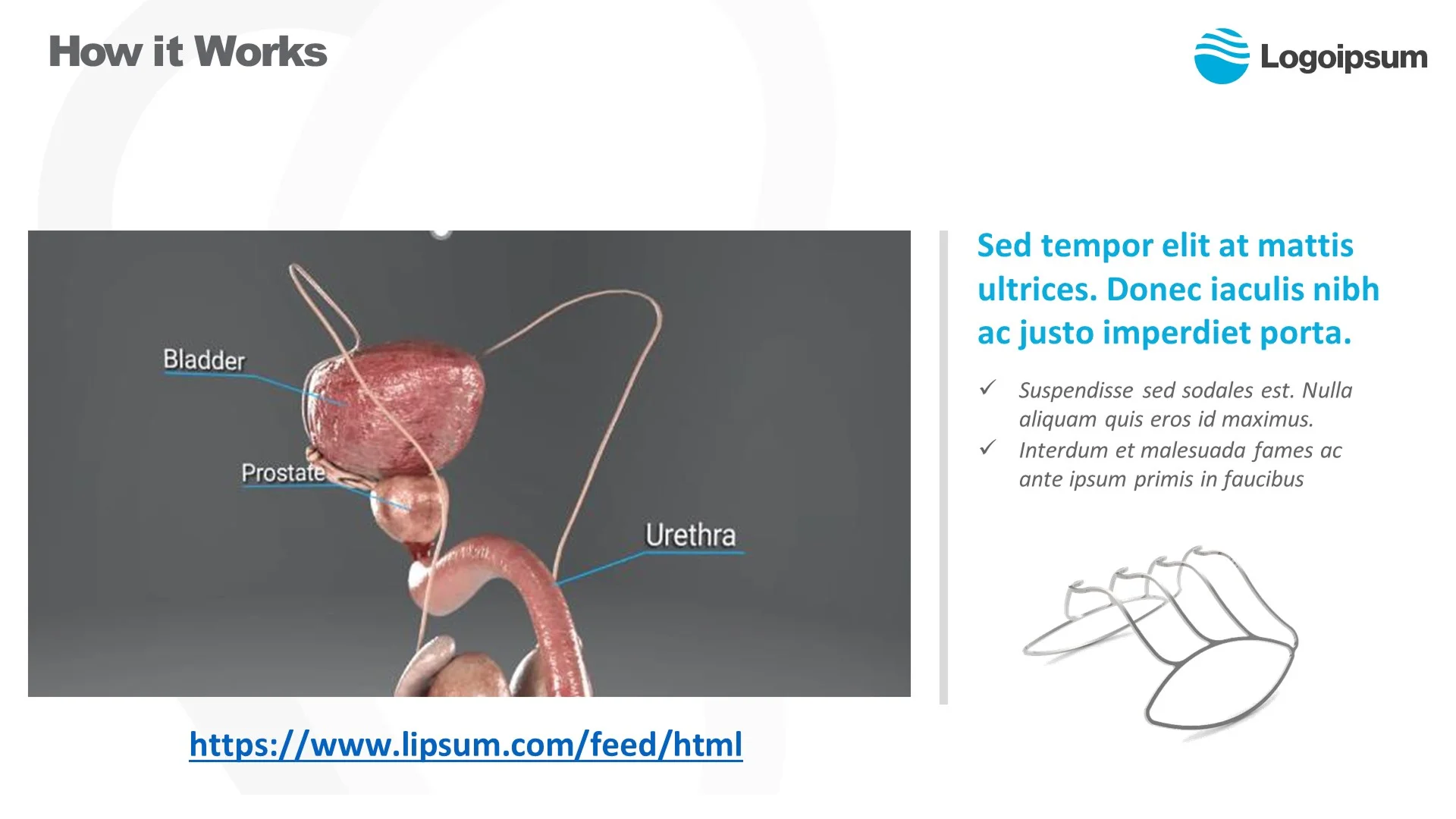
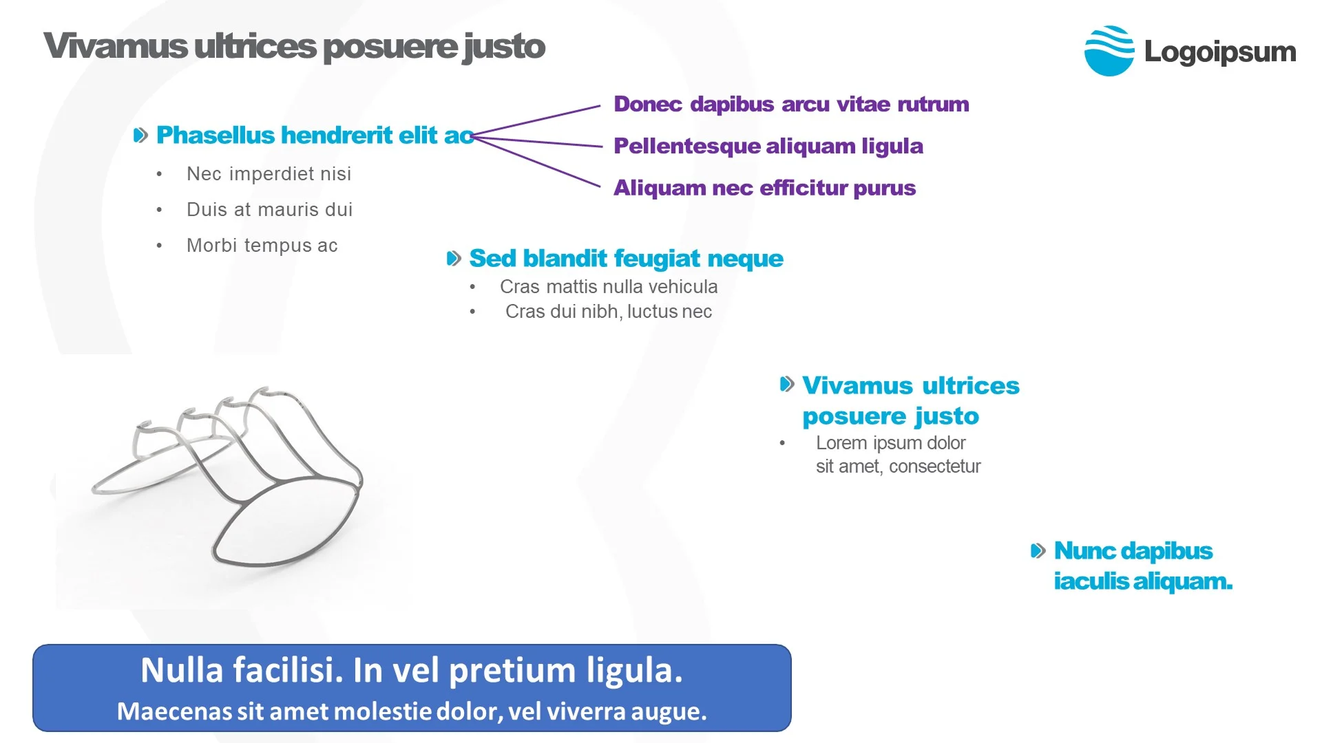
We used the brand colors and looked for fonts that would best fit the healthcare research brand. We polished and aligned the deck, maintaining the hierarchy. The images of the prostate and the equipment were rightly highlighted, focusing on the key messaging.

Redesigned "Improving Quality of Life" cover slide featuring active lifestyle imagery and clean typography, establishing a premium tone for a series b pitch deck
"Executive Summary" slide organizing financial metrics and regulatory approvals (CE Mark) into a structured grid, essential for investor presentation design
Clinical pathology slide comparing healthy vs. enlarged prostate using clear medical illustrations, optimized for a high-impact healthcare pitch deck"Board Members" slide displaying leadership profiles and bios, a critical component of credibility in a series b pitch deckMarket valuation and acquisition slide with placeholder logos, formatted for a strategic healthcare pitch deck
Product solution slide contrasting pharmaceutical and surgical options with clear visual hierarchy, created by presentation design experts"Treatment Landscape" slide visualizing disease progression stages (Mild to Severe), essential for a biotech pitch deck narrative"Thank You" closing slide featuring patient lifestyle imagery to evoke emotional connection, designed by presentation design experts

Well-Structured Slides Transformation

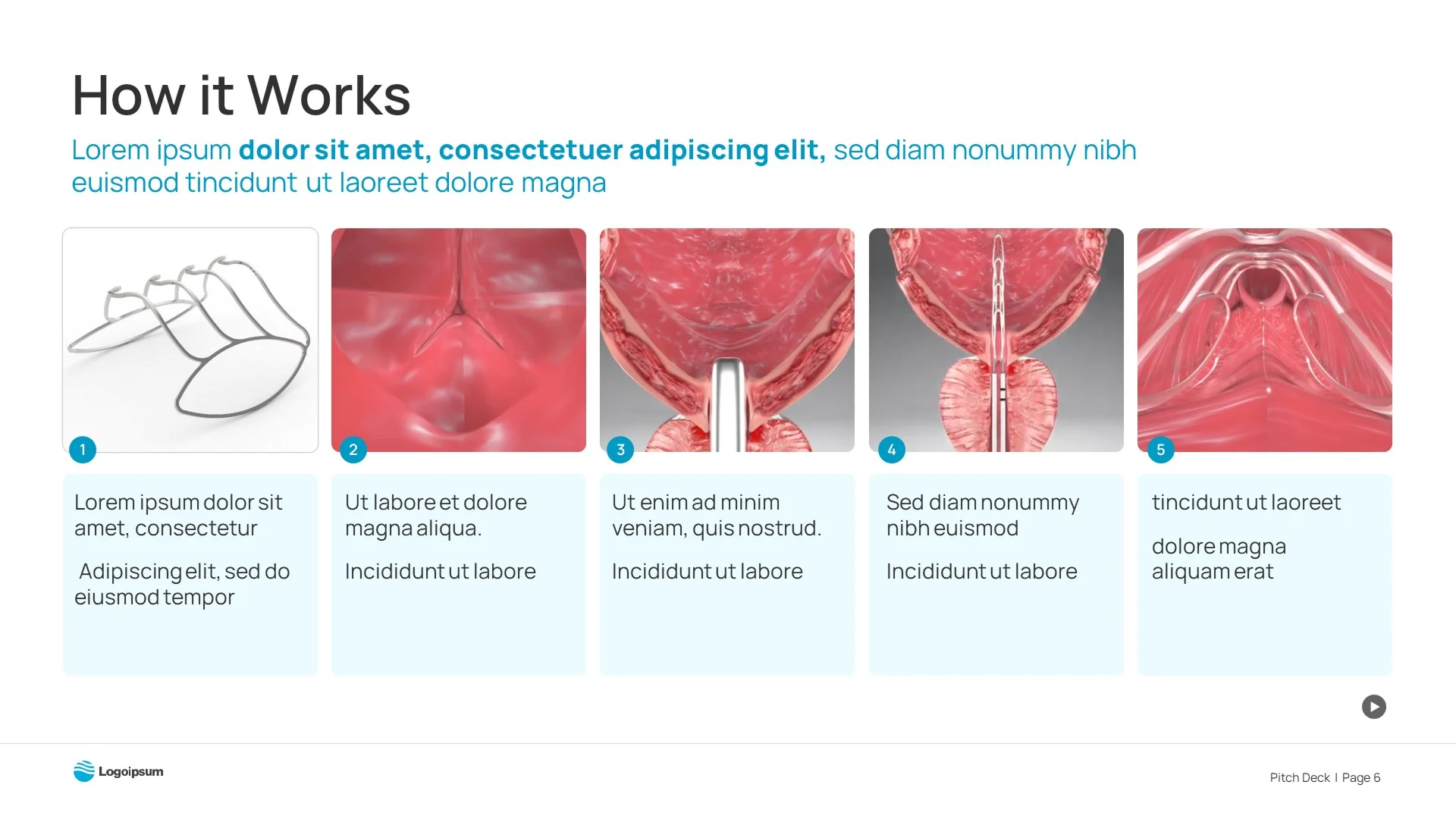
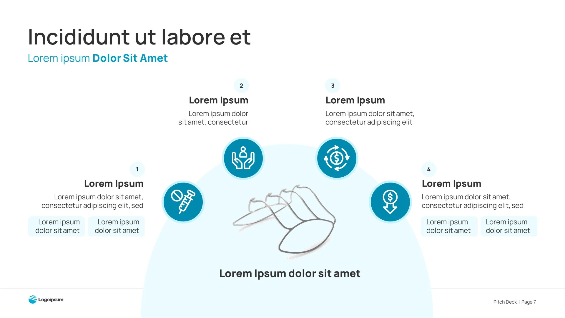
After reading and doing some research on the subject, we got a good grasp of how their product works. We used animation to demonstrate the product in three steps, including all the important details. The on-click animation made it easy for them to explain the slide to their audience smoothly.

Original "How it Works" slide featuring a dark, complex 3D model that failed to clearly communicate the mechanism in a biotech pitch deck
Slide Navigation Arrow
Redesigned sequential slide using clear anatomical illustrations to demonstrate the procedure step-by-step, optimized by presentation design experts

Improved the visual of two separate processes coming together to create the final Targeted High-Capacity Drug Conjugate. This refined approach places a heightened emphasis on the remarkable end result.

Original technical slide with disjointed text and wireframes, lacking the visual polish expected in a series b pitch deck
Slide Navigation Arrow
Redesigned slide visualizing the "Targeted High-Capacity Drug Conjugate" process with a central infographic, essential for effective investor presentation design

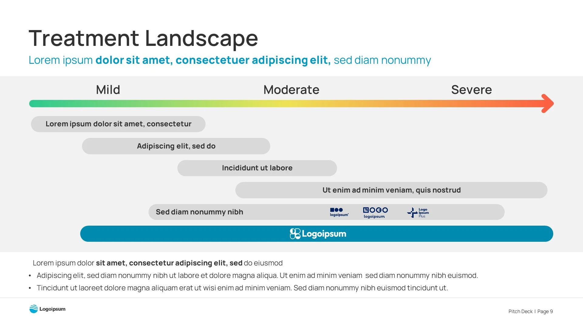
Made their product stand out by having a higher DIAM than their competitors’ products. The use of different color shades suggests increasing DIAM values, which align with improved clinical effectiveness.

Original valuation slide with cluttered text and small thumbnails, failing to highlight exit potential in a series b pitch deck
Slide Navigation Arrow
Redesigned timeline slide showing clear M&A and IPO milestones, essential for establishing market potential in investor presentation design
background grid image two column portfolio page