Crafting a Fund Presentation that Connects Science to Strategic Capital


Noven Group is a private equity investment firm advancing life science innovation and human health. They back visionary companies developing breakthroughs in biotechnology, digital health, and therapeutic platforms. They came to us with a dense, text-heavy fund presentation that lacked narrative flow, brand consistency, and visual clarity. We rebuilt the deck from the ground up. The success of the led to an ongoing partnership, including their Annual General Meeting presentation and other LP-facing deliverables.
All the content and company name is redacted/replaced to maintain confidentiality.
Private Equity Firm
5 Weeks
Fund IV + AGM Presentation
NY, USA

The original private equity fund presentation lacked clarity, hierarchy, and narrative structure. Slides were overloaded with text, off-brand in style, and visually flat, making it difficult for investors to grasp the depth of the firm’s Fund IV thesis.
Pain-Points
Non-Branded
Inconsistent
Flat Visuals
Text Heavy


We kicked off with a brand-aligned moodboard to reset the visual language. By introducing fractured-glass gradients, modern typography, and structured layout grids, we built a clean foundation that signaled innovation, credibility, and trust.

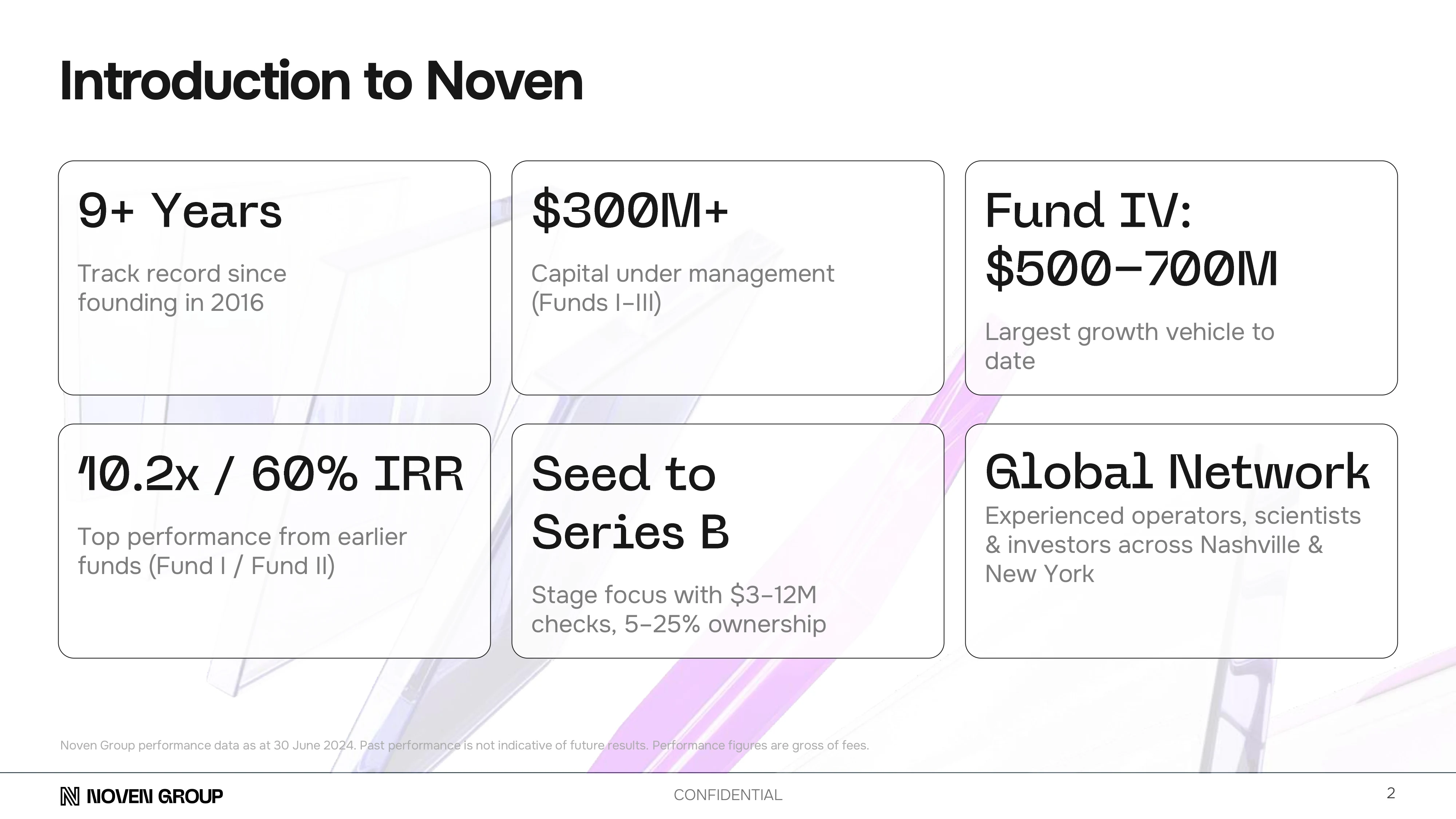
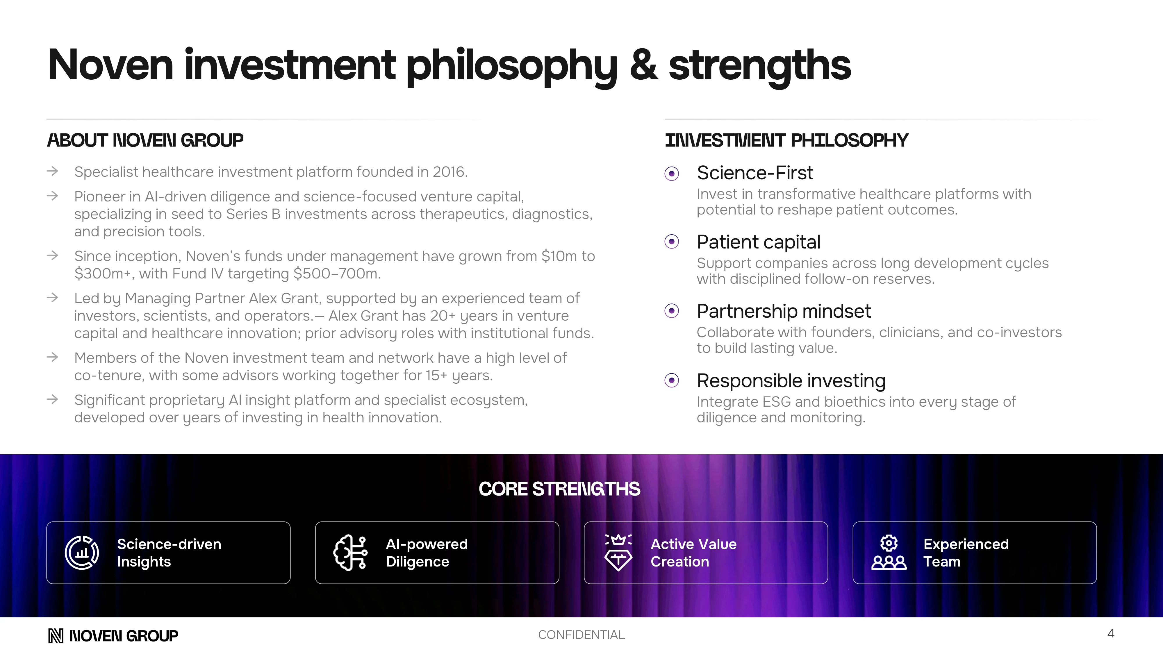
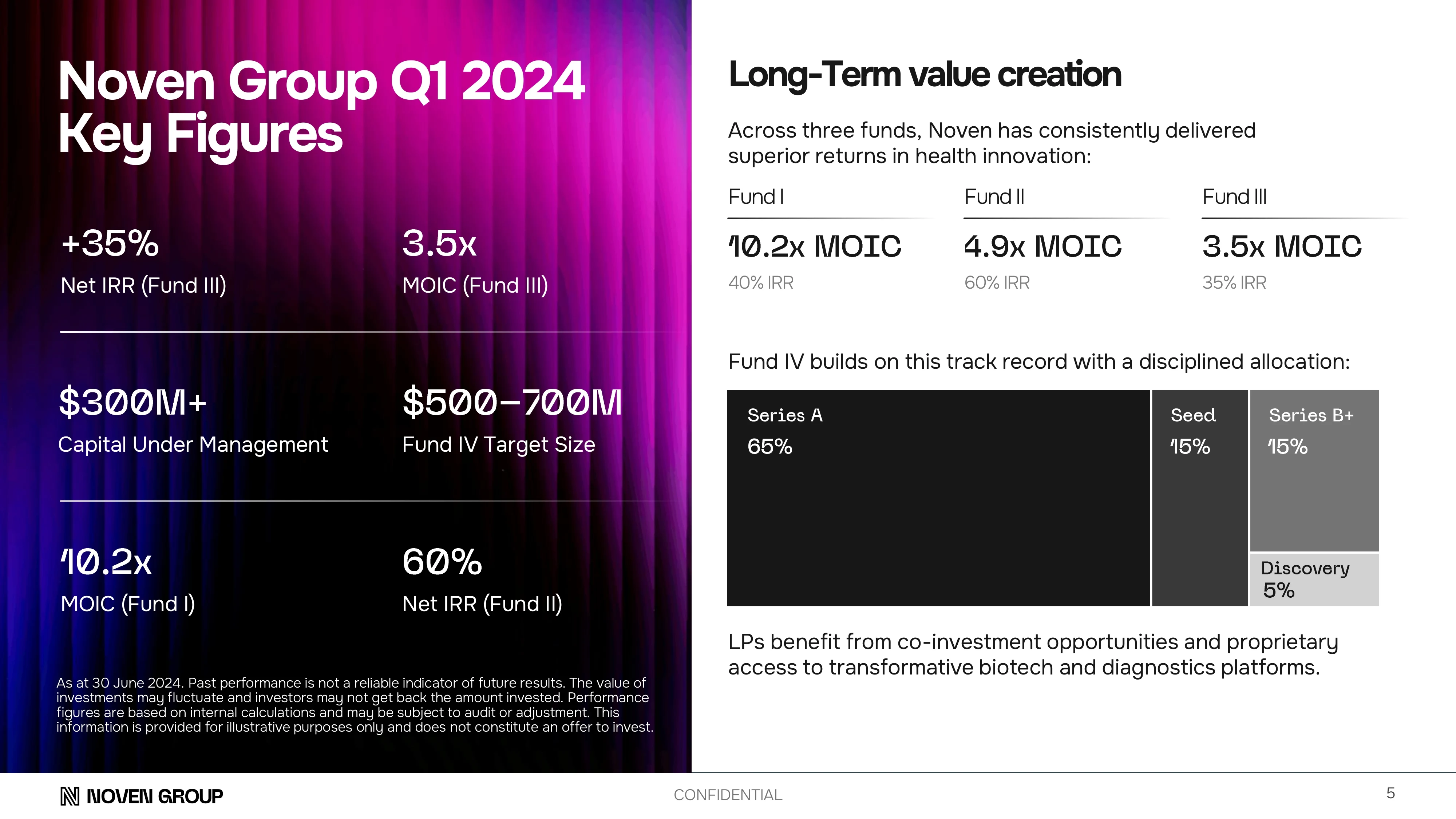
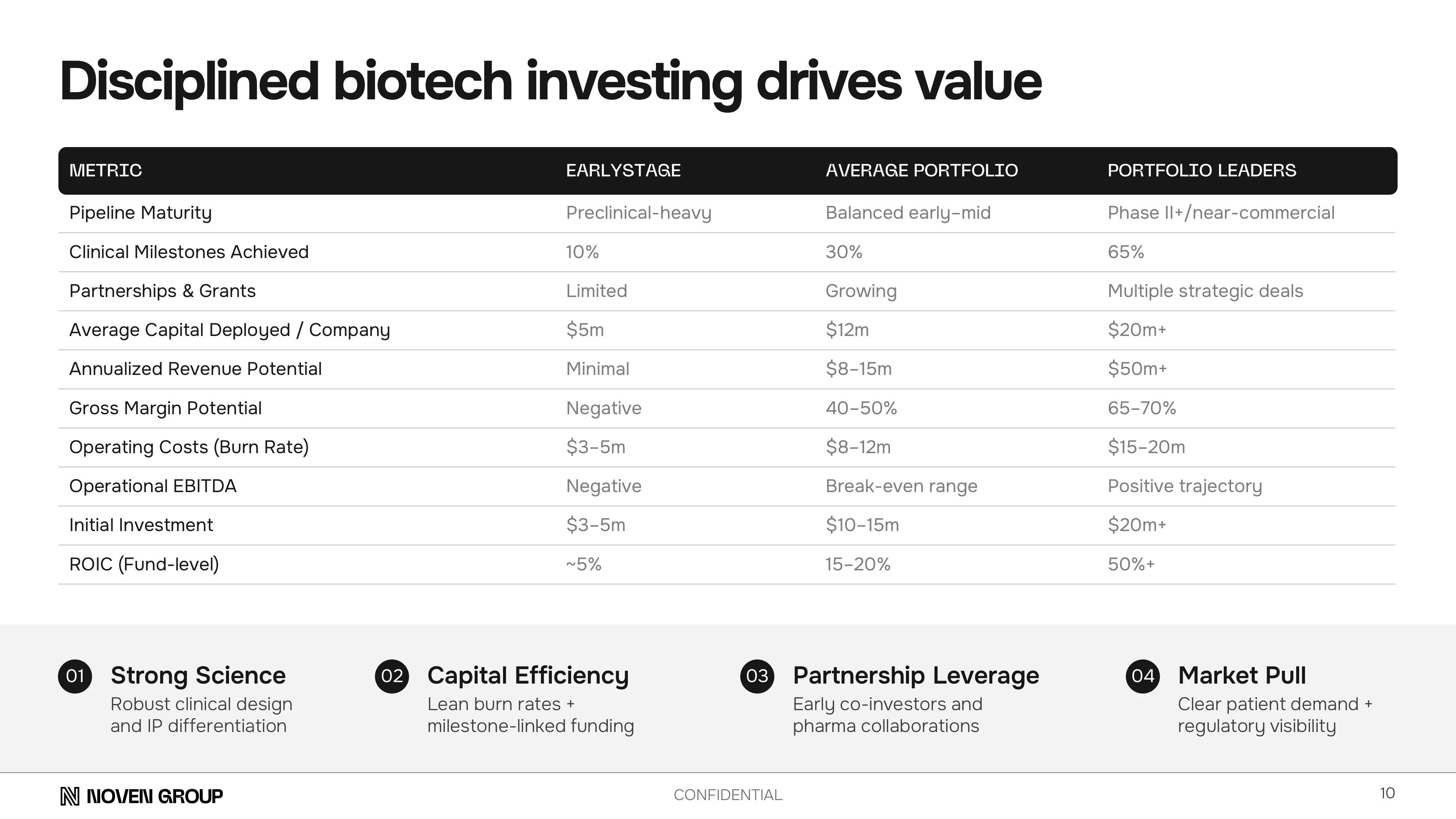
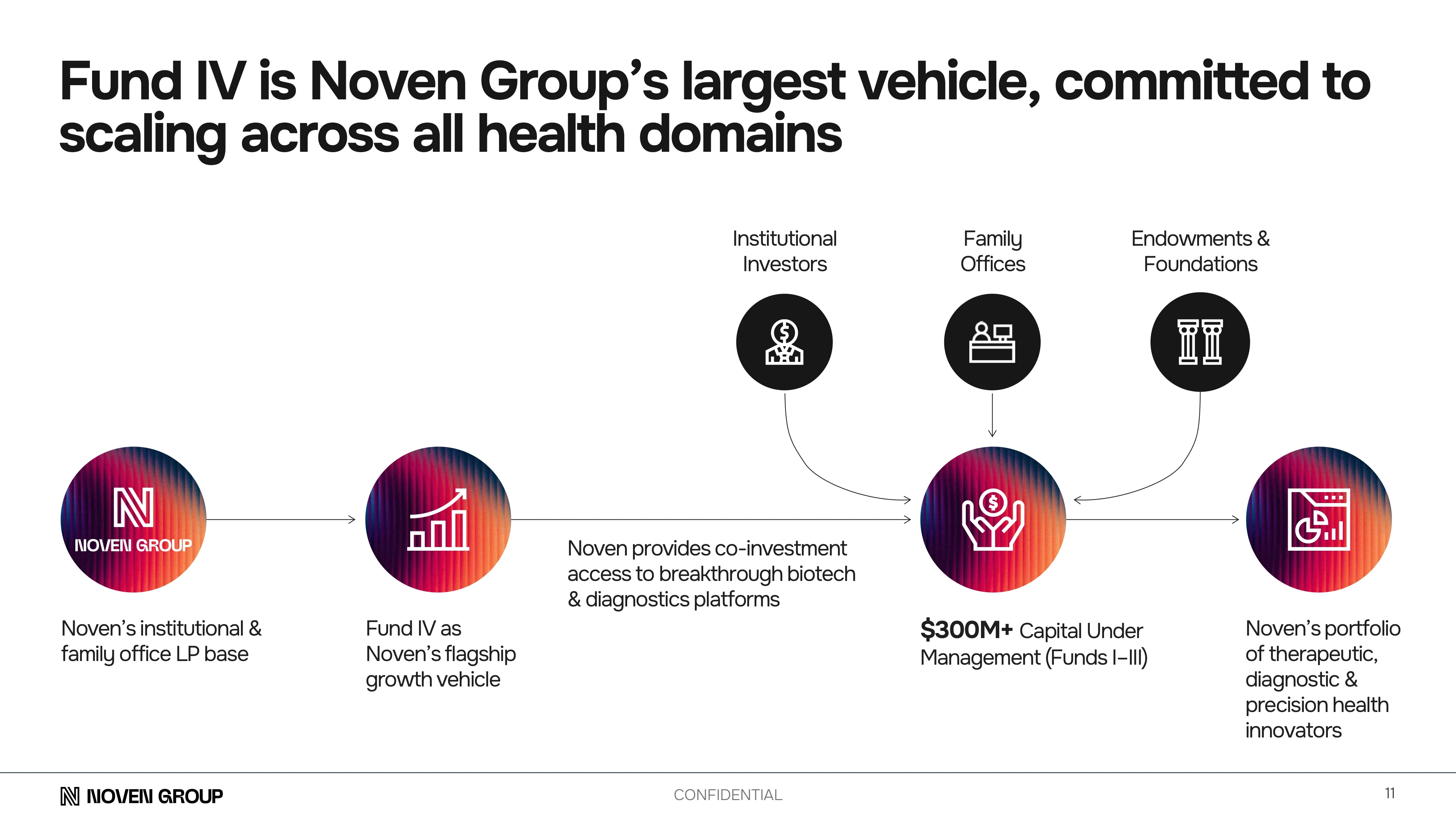
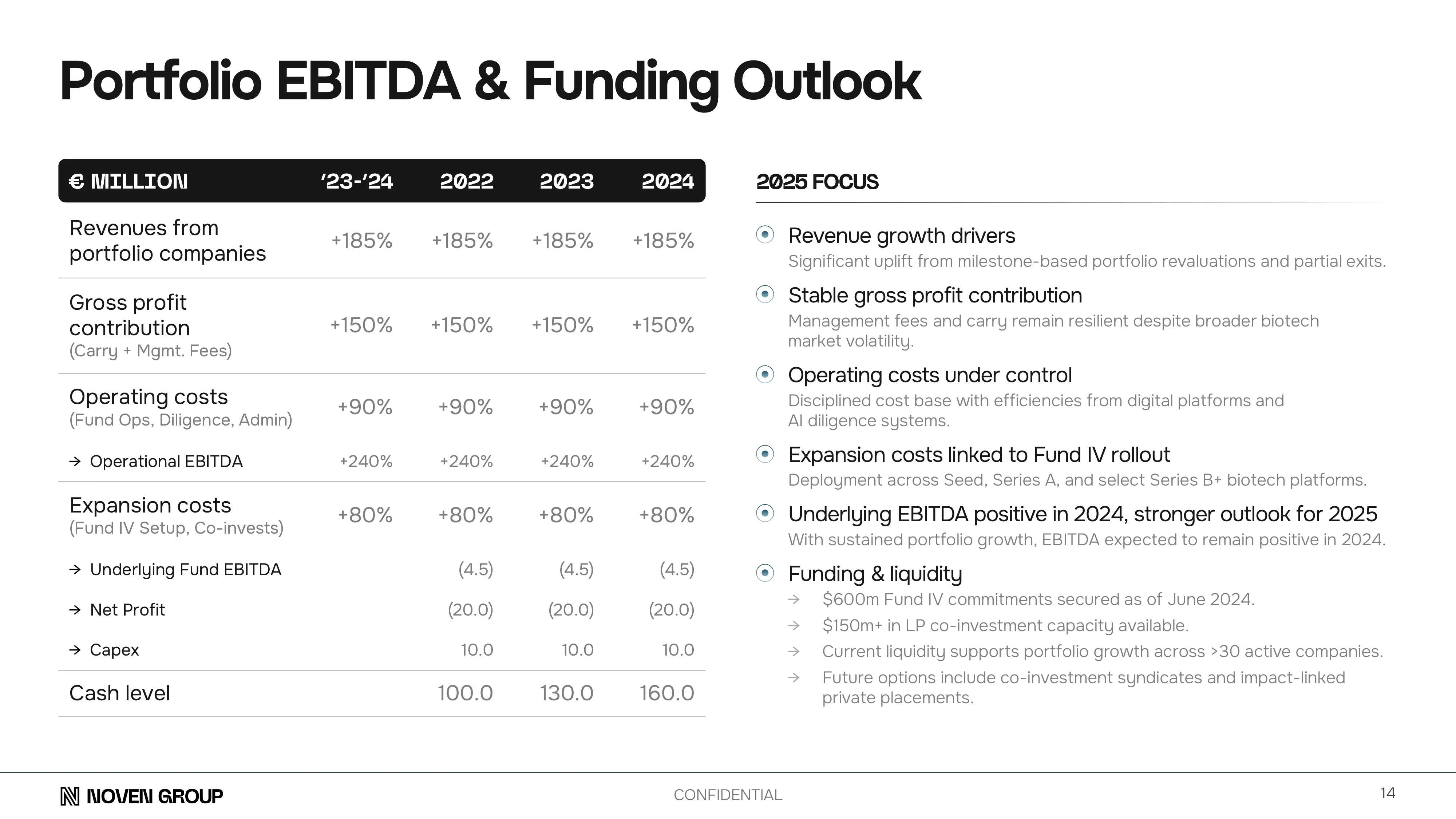
We redesigned key slides with powerful data visualizations, sharper messaging, and branded storytelling. Every slide was restructured for clarity—turning complex fund mechanics into investor-ready narratives.
Value Add
Brand Consistency
Data Visualization
Enhanced Messaging
Improved Aesthetics


The result: a compelling private equity fund pitch deck that stood out visually and strategically designed to resonate with LPs and communicate the fund's differentiated position in human health and life sciences.


The result: a compelling private equity fund pitch deck that stood out visually and strategically designed to resonate with LPs and communicate the fund's differentiated position in human health and life sciences.