BEFORE

What the Client Provided

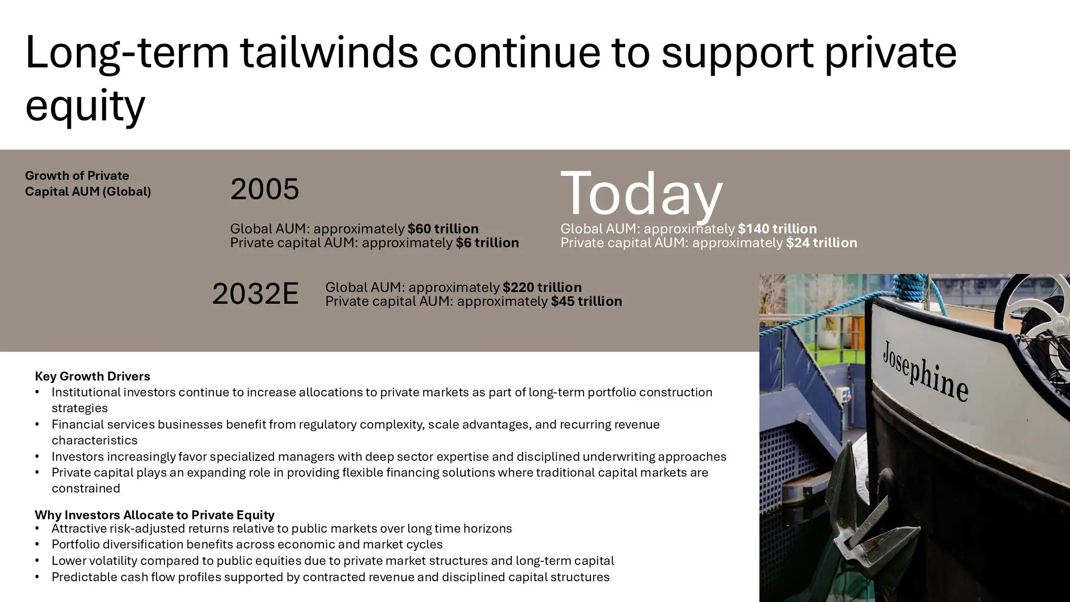
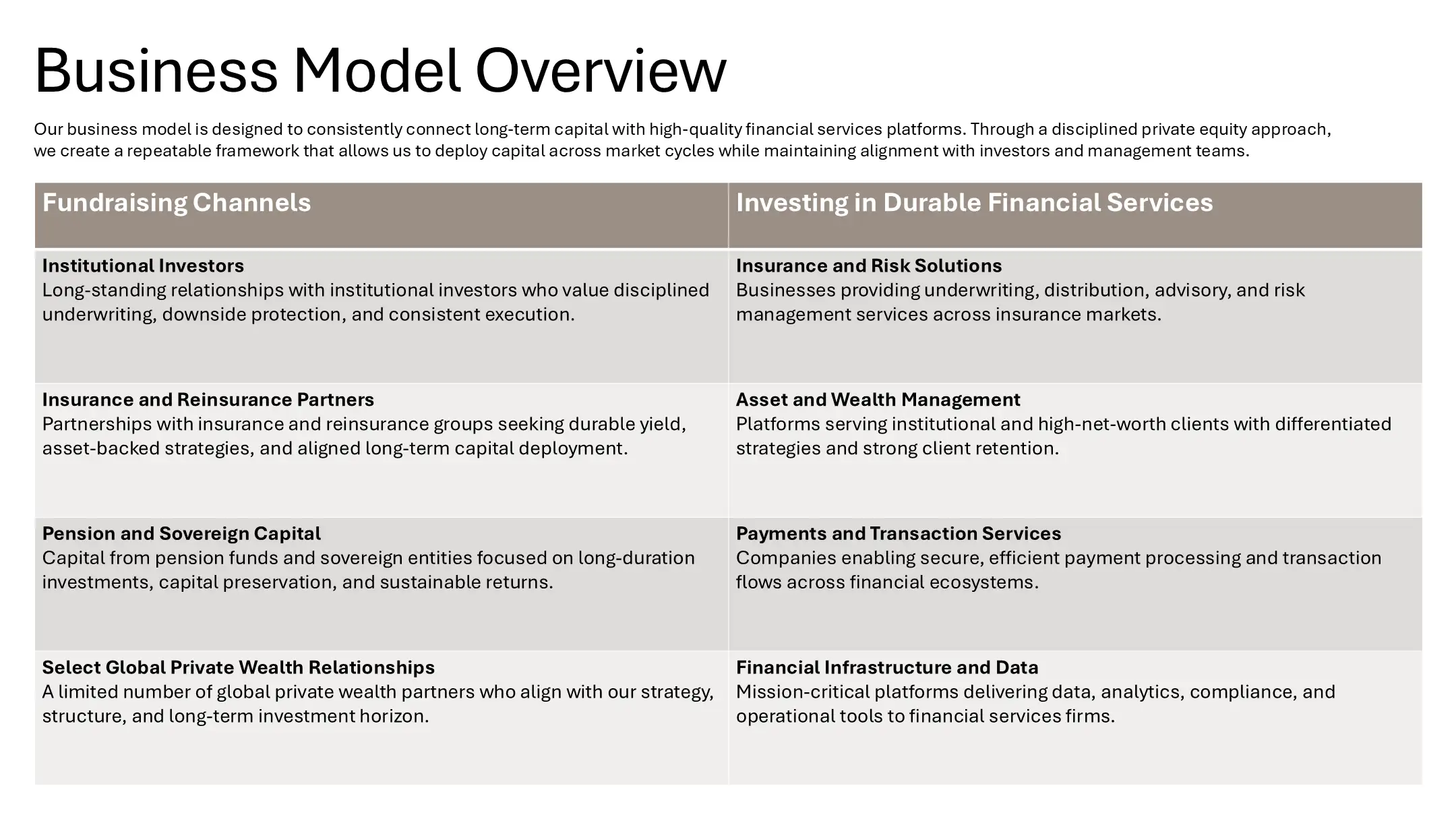
The original Anchorline Capital deck was assembled as a working, non-branded document. While the content was strong, the presentation suffered from information overload, inconsistent visuals, and a lack of institutional polish, making it hard for LPs to quickly understand the platform, strategy, and track record.

Pain-Points

Content Heavy

No Visual Hierarchy

Hard to Scan

Non-Branded

Original plain cover slide with minimal branding, lacking the visual impact required for premium private equity presentation designText-heavy "Overview" slide with dense bullet points, hindering effective investor communications and clarity."Our Strategy" slide using generic boxes and icons, failing to differentiate the firm in their fund overview deck.Text-heavy case study slide with dense paragraphs, lacking the storytelling elements essential for private equity presentation design."Areas of Focus" slide using basic column layouts that fail to visually distinguish the investment sectors in the fund overview deck.Investment criteria slide presenting data in a raw, spreadsheet-style table, hindering effective investor communications.
STEP 1

Moodboard & Brand Assets

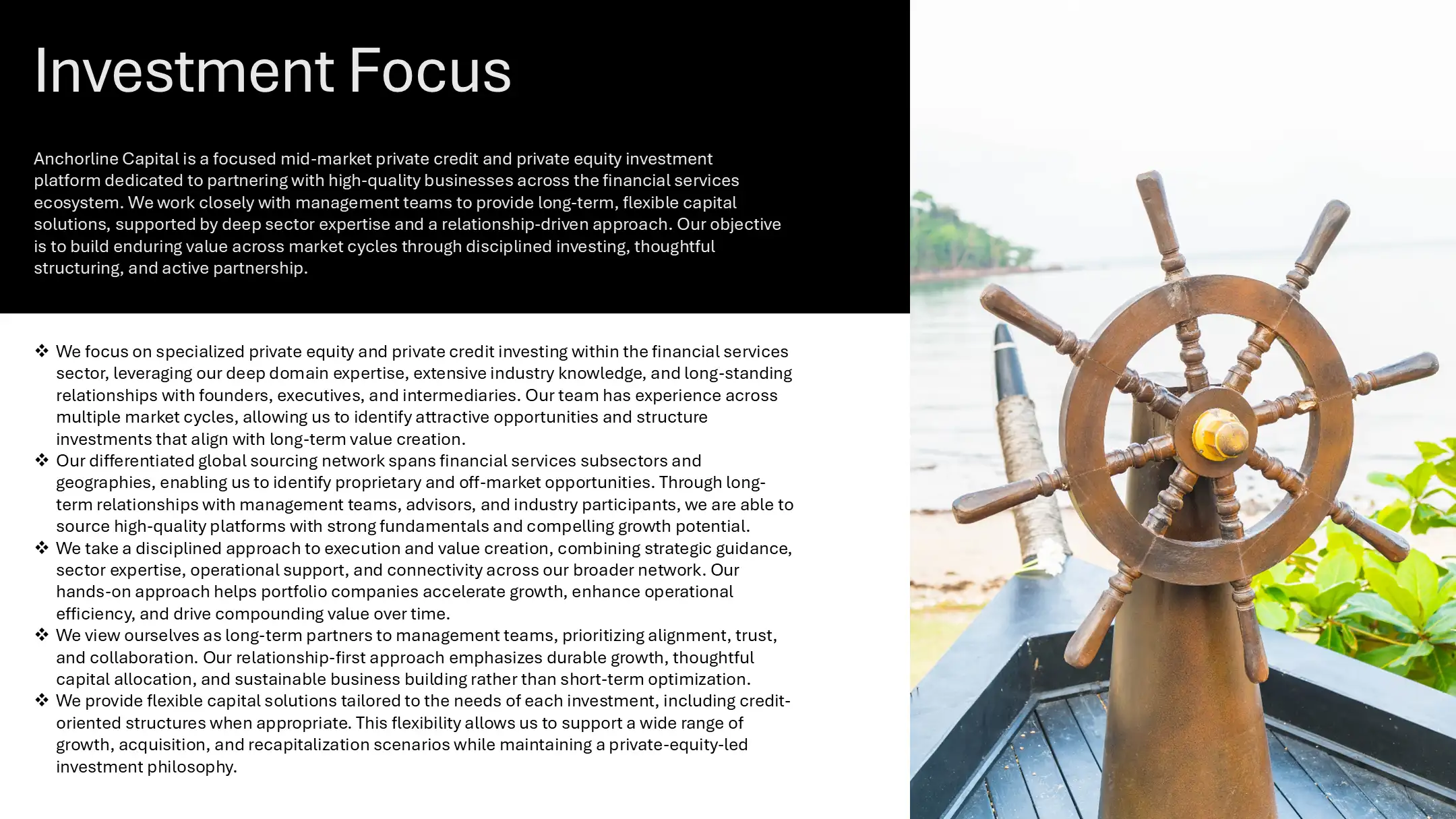
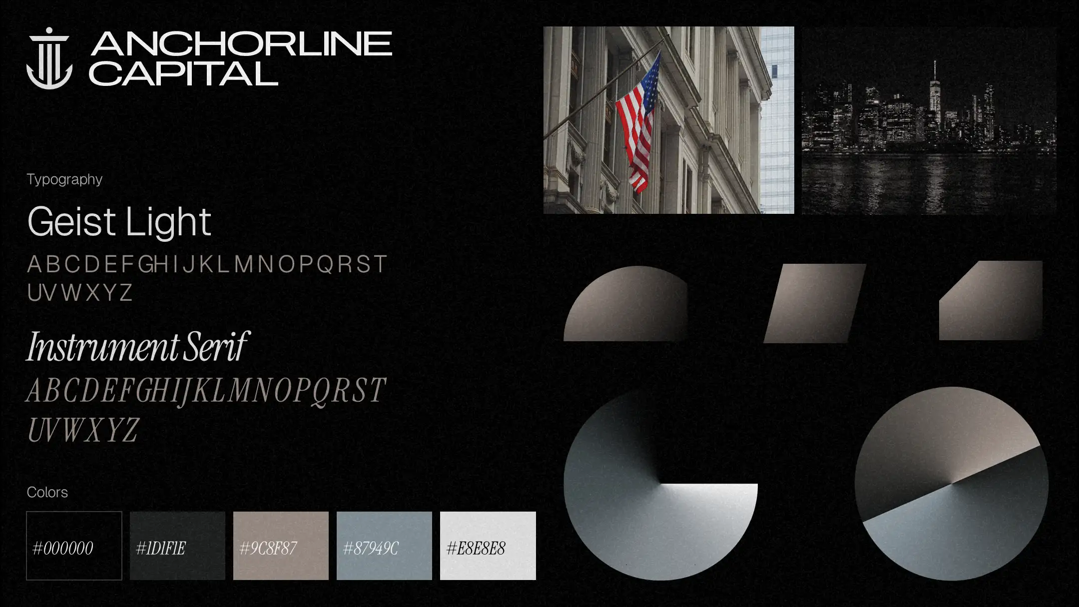
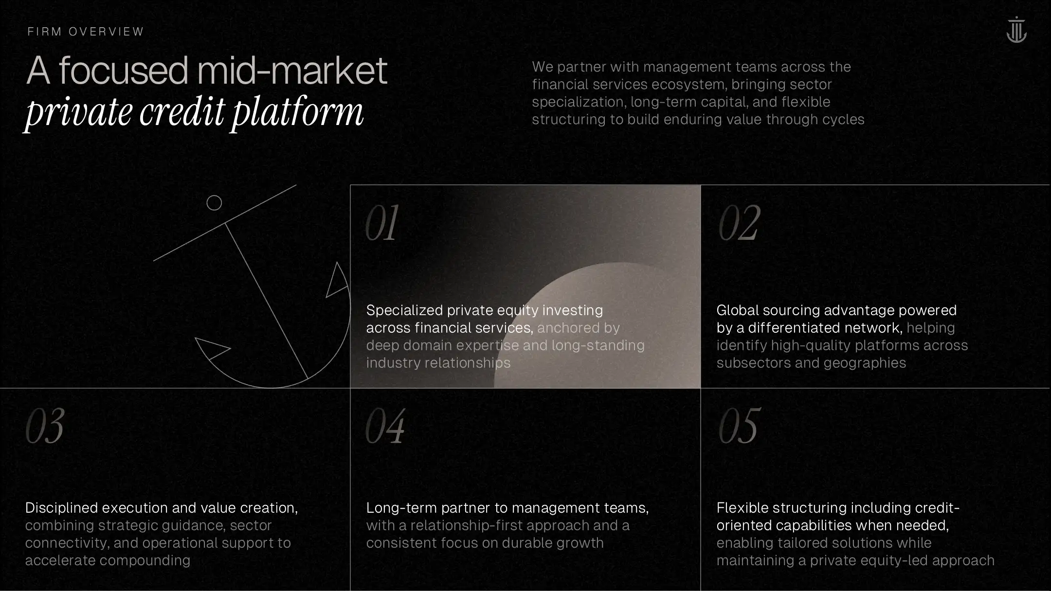
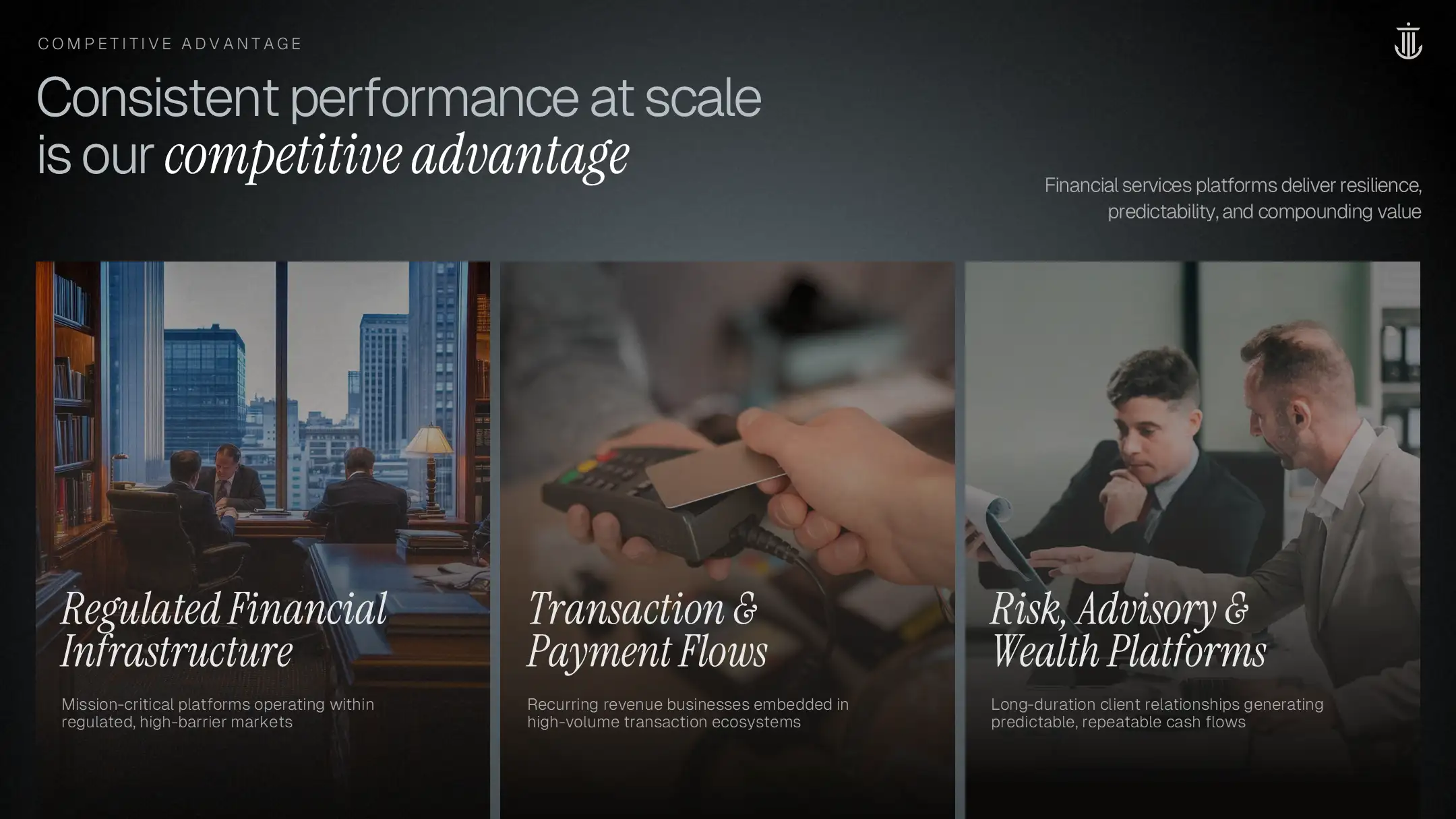
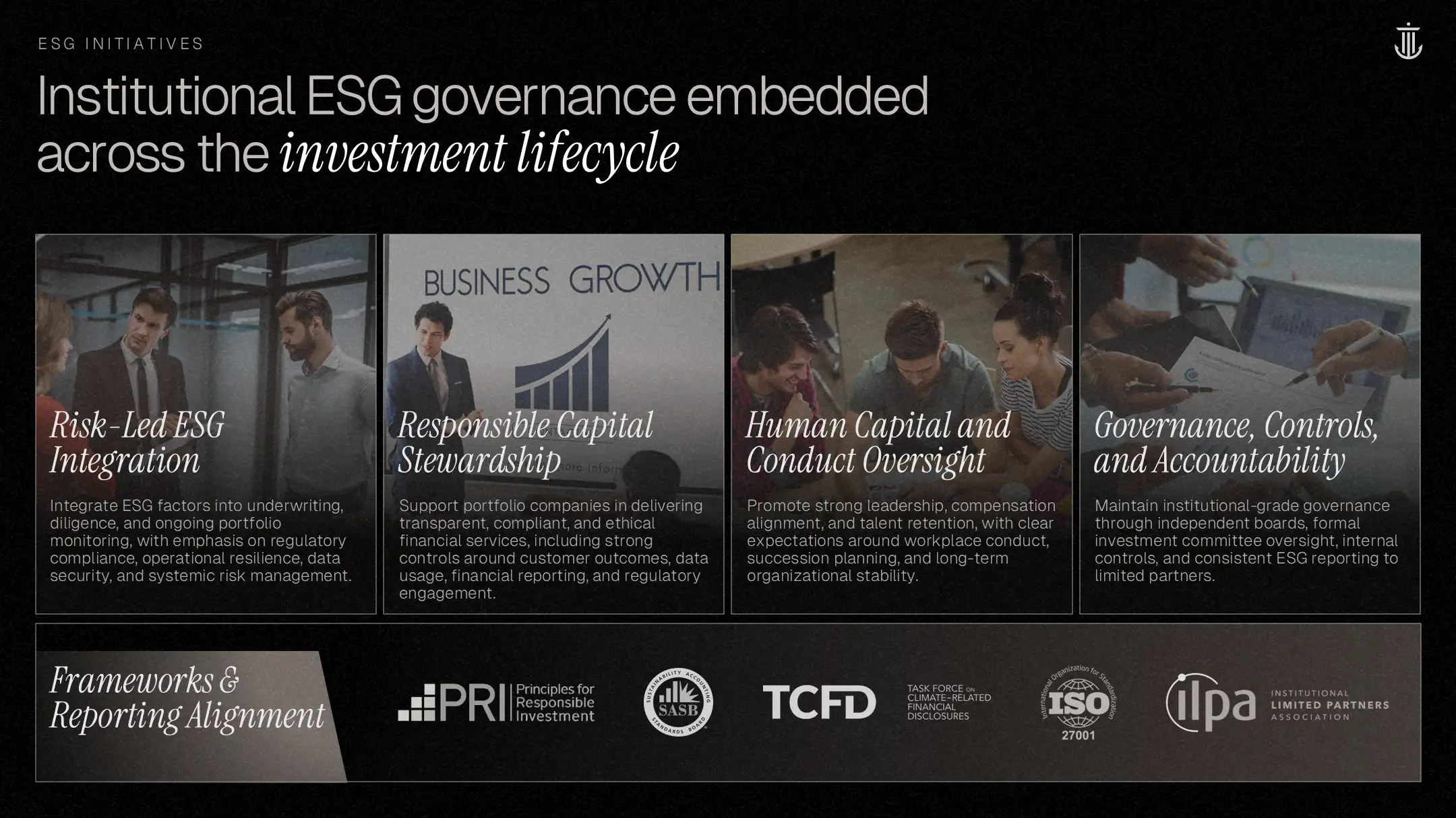
We established a clear visual language and uplifted aesthetics, aligned to a modern, institutional private equity platform. This included defining typography, color usage, spacing, and layout principles to bring consistency and credibility across the entire LP deck.

Design system moodboard featuring "Fraunces" and "DM Sans" typography, a teal gradient palette, and custom icons to modernize the private equity presentation design and fund overview deck.
STEP 2

Transforming Key Slides

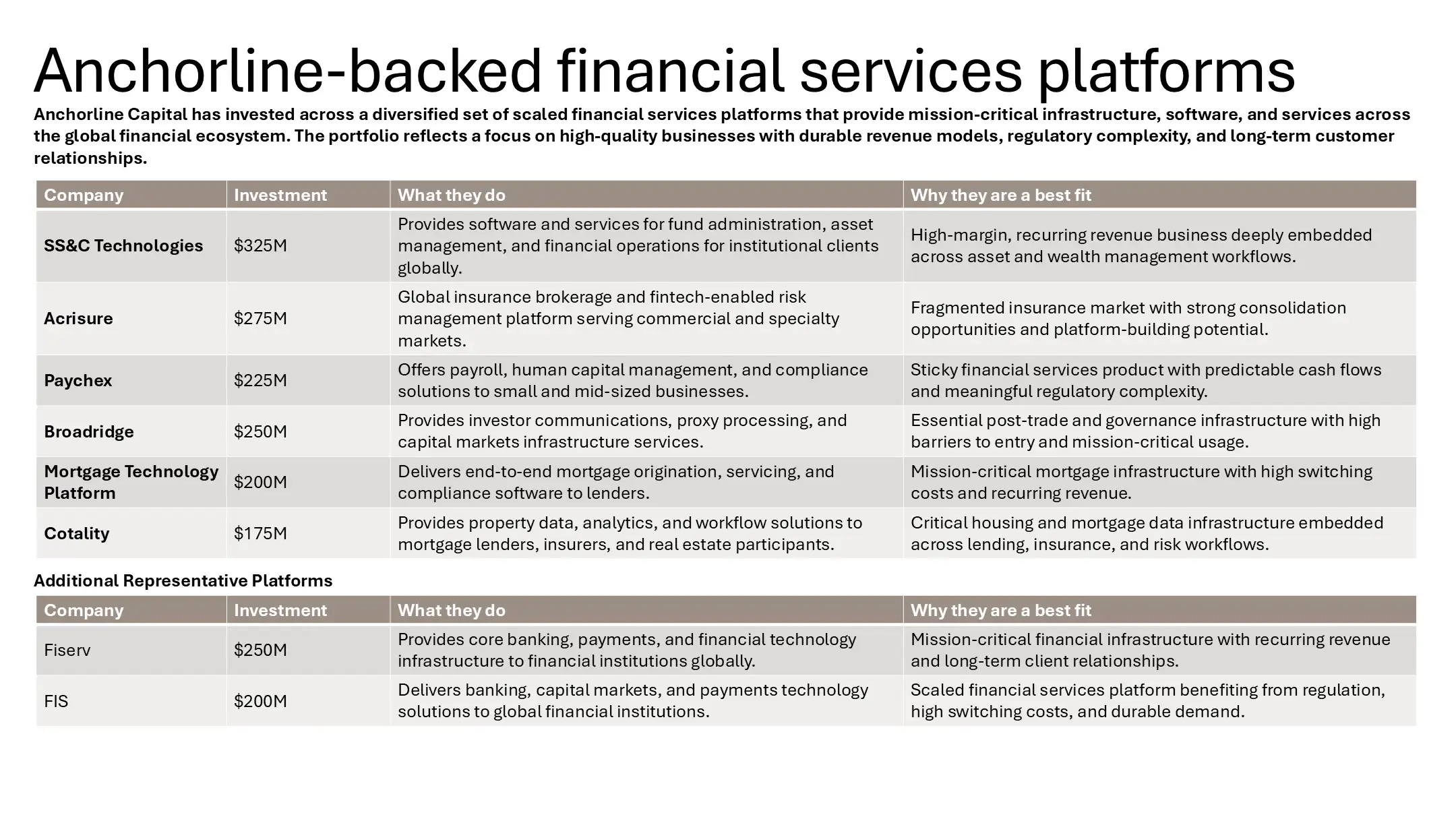
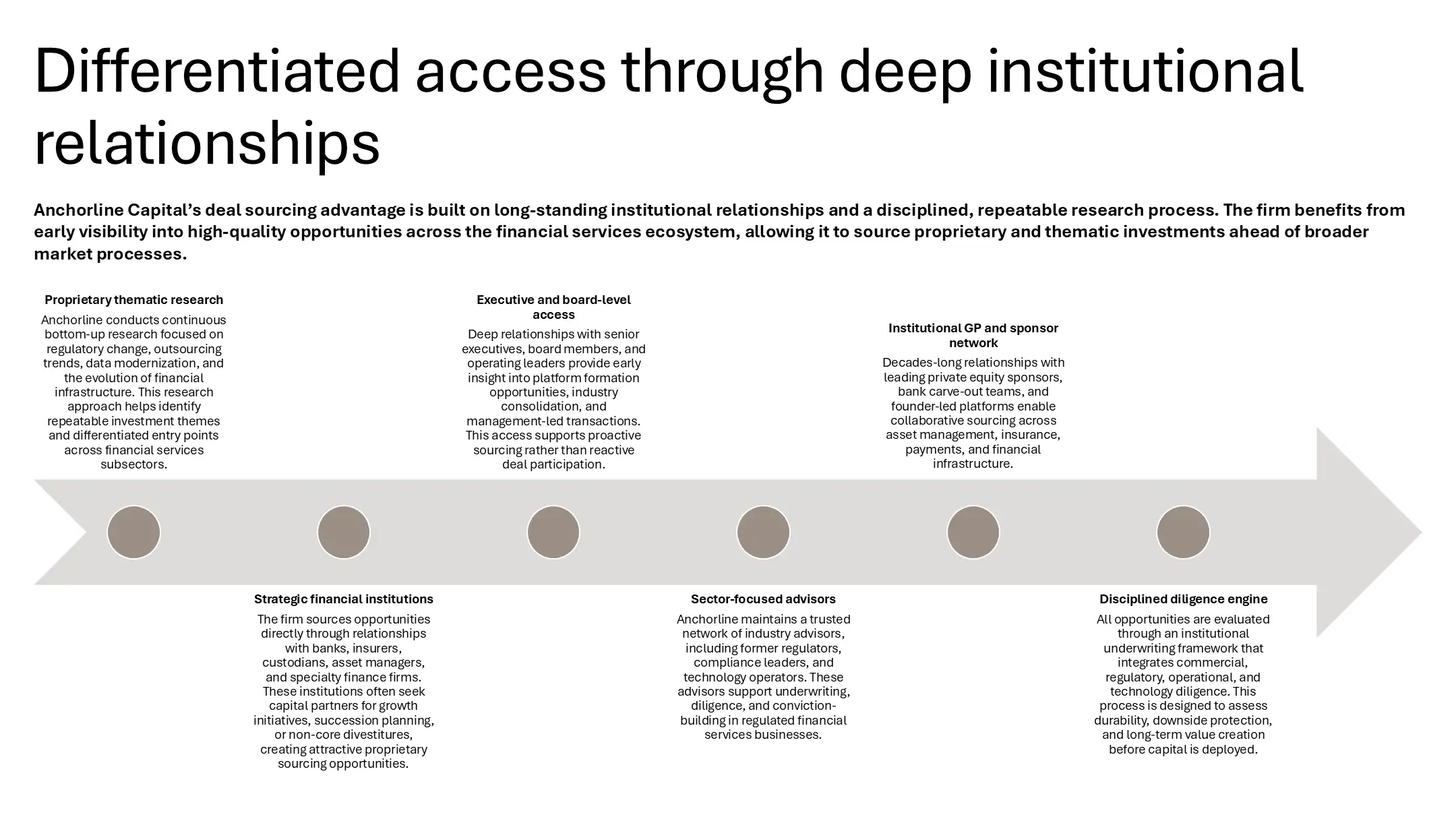
We restructured key slides to improve flow, reduce cognitive load, and surface the most important investor takeaways. Complex concepts were simplified, data was visualized more clearly, and messaging was tightened to support fast LP review and decision-making.

Improvements

Brand Consistency

Visual Clarity

Content Optimization

Investor Friendly

Original "Value Creation" slide with a cluttered bubble diagram, hindering clarity in the fund overview deck.
Redesigned engagement slide using a clean flow diagram and teal gradients, a key improvement in private equity presentation design.
Original fund composition table with basic formatting, lacking the visual clarity needed for effective investor communications.
Redesigned portfolio diversification slide using donut charts to visualize fund growth in the fund overview deck.
Standard three-column growth strategy slide, missing the dynamic flow required for premium private equity presentation design.
Redesigned growth process slide featuring a "step-up" visual trajectory to illustrate value creation in the fund overview deck.
Original case study slide with dense text blocks, failing to highlight the key financial wins for effective investor communications.
Redesigned case study featuring a dark teal card with clear metrics ($20M to $52M EBITDA), a strong example of private equity presentation design.
AFTER

Final LP Deck

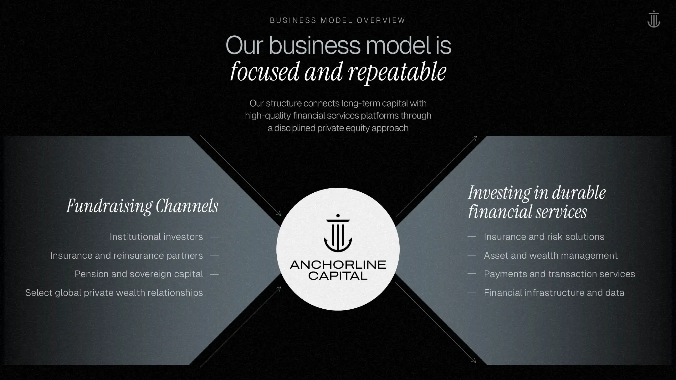
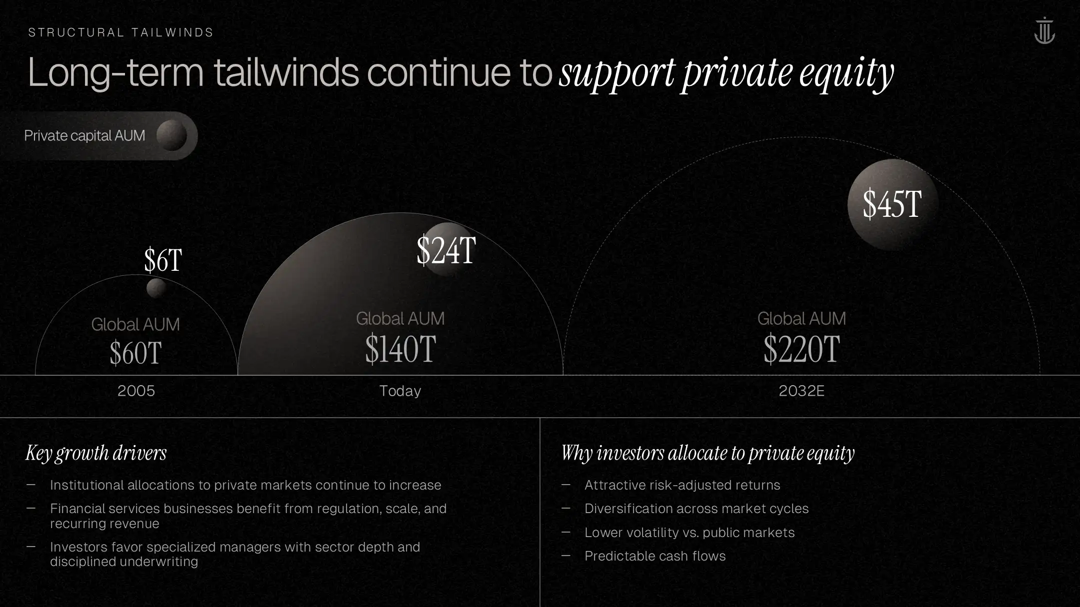
We redesigned the presentation using clean layouts, brand-aligned graphics, and refined data visuals to elevate the deck to an institutional standard. The final output balances clarity with sophistication, suitable for fundraising, deal discussions, and ongoing LP communications.

Final "Purpose-Led Growth-Driven" cover slide featuring a modern teal gradient and refined typography, establishing a premium brand for the fund overview deck."Areas of Focus" slide with clear, structured columns for Consumer, Healthcare, and Professional Services, enhancing investor communications.Final firm overview slide with split layout and key metrics ($1.8B equity), designed for clear investor communications."Our Strategy" slide featuring a clean grid of investment themes (Secular Tailwinds, Defensible Businesses) for the fund overview deck."Investment Archetype" slide using a dark teal table to define macro themes and company traits in private equity presentation design.Portfolio overview slide mapping investments from 2020-2025, showcasing the firm's track record in the fund overview deck."Third Party Resources & Accreditations" slide using a structured teal hierarchy to display tech and operational partners in the fund overview deck."Third Party Resources & Accreditations" slide using a structured teal hierarchy to display tech and operational partners in the fund overview deck.
Data Visualization Slides

Complex DataVisualized

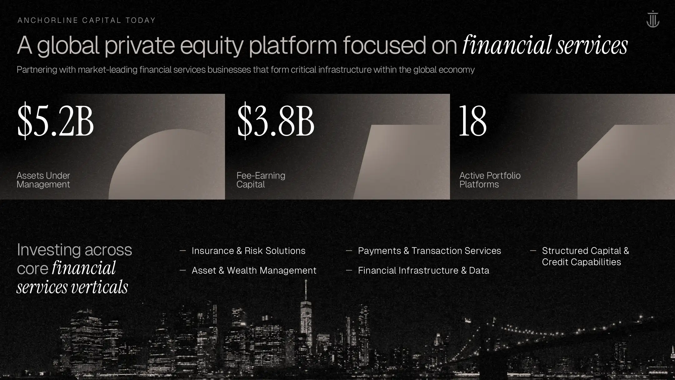
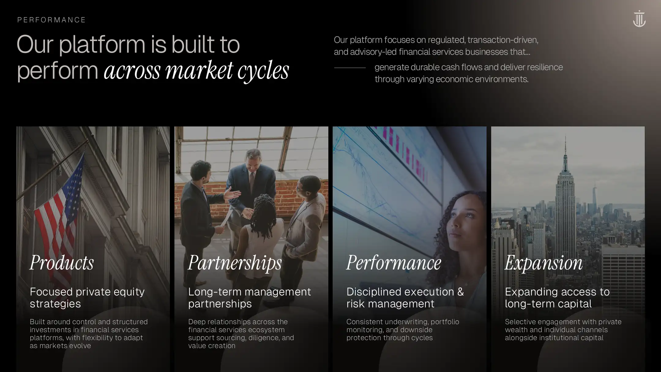
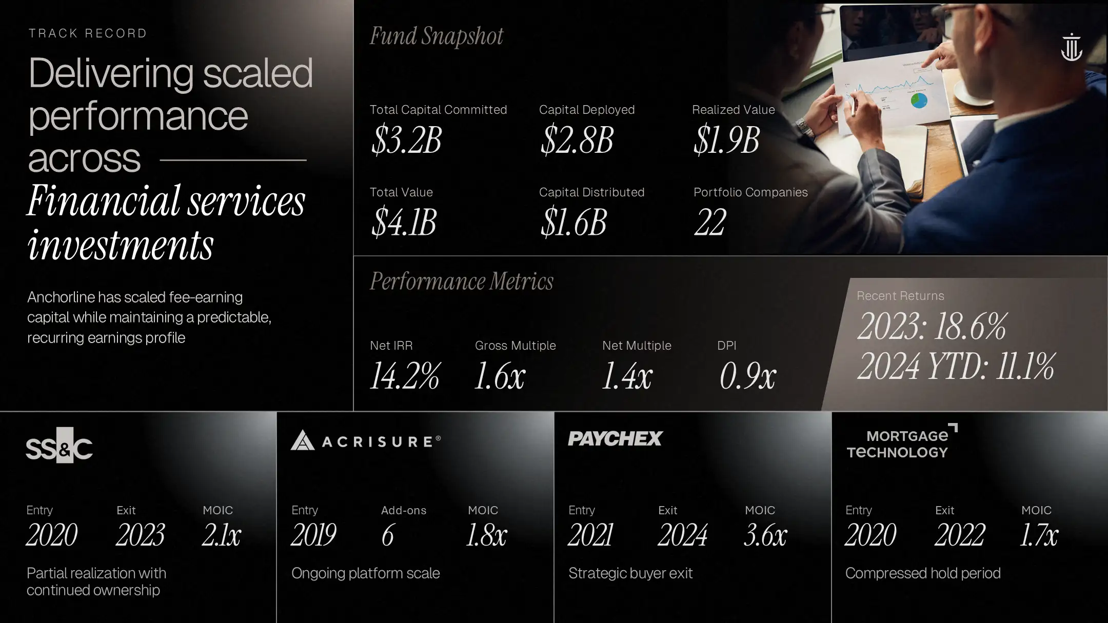
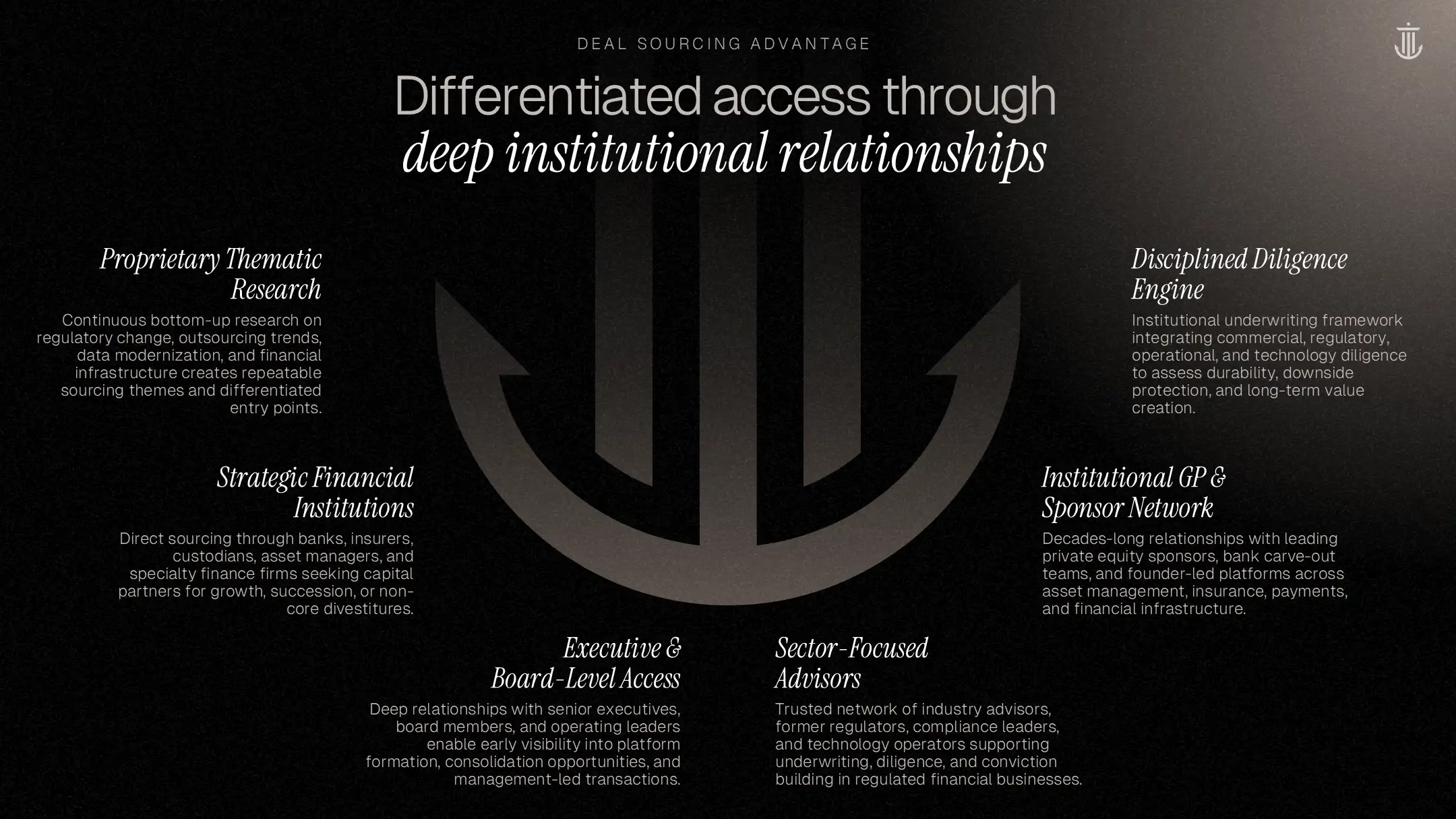
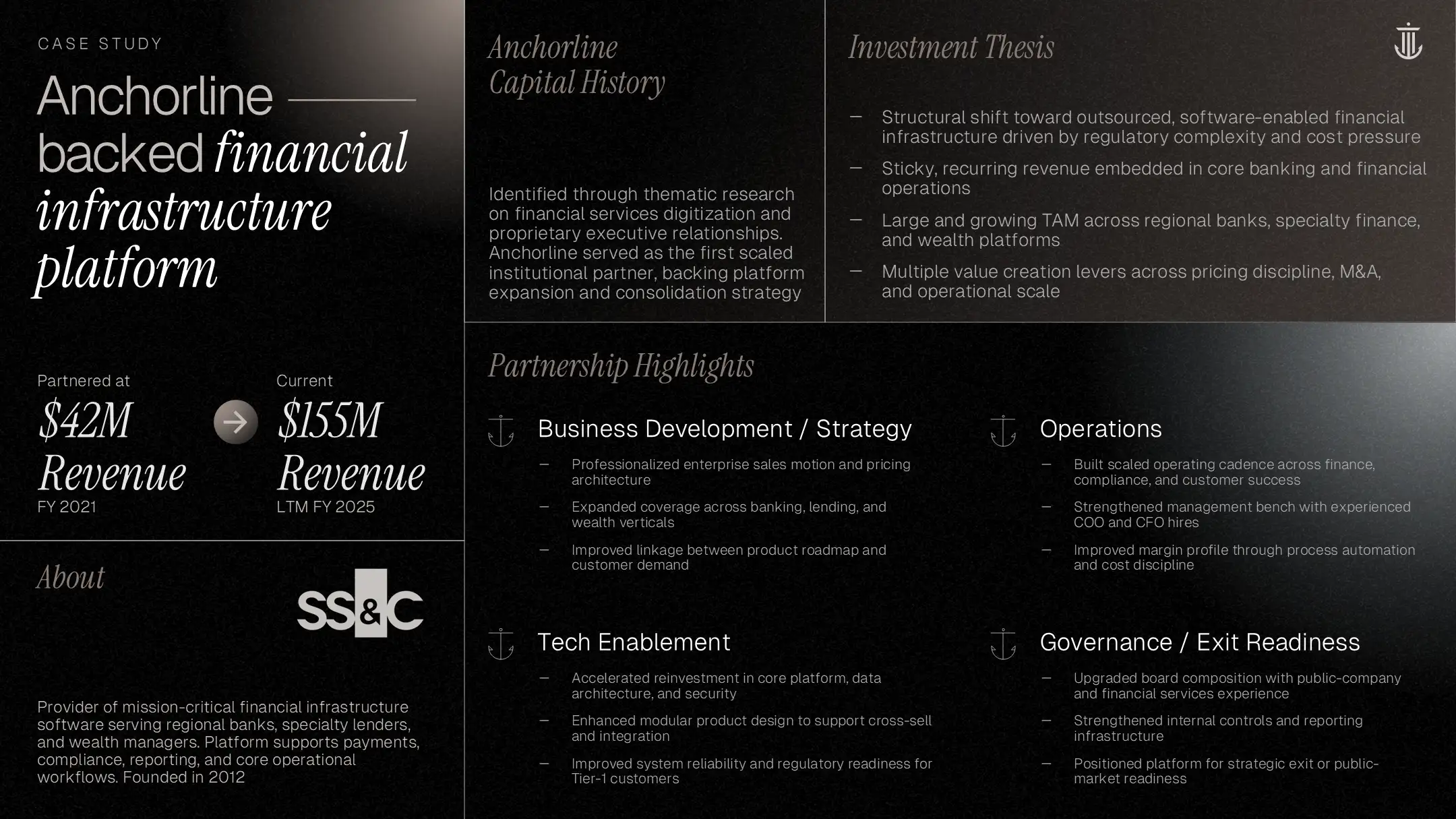
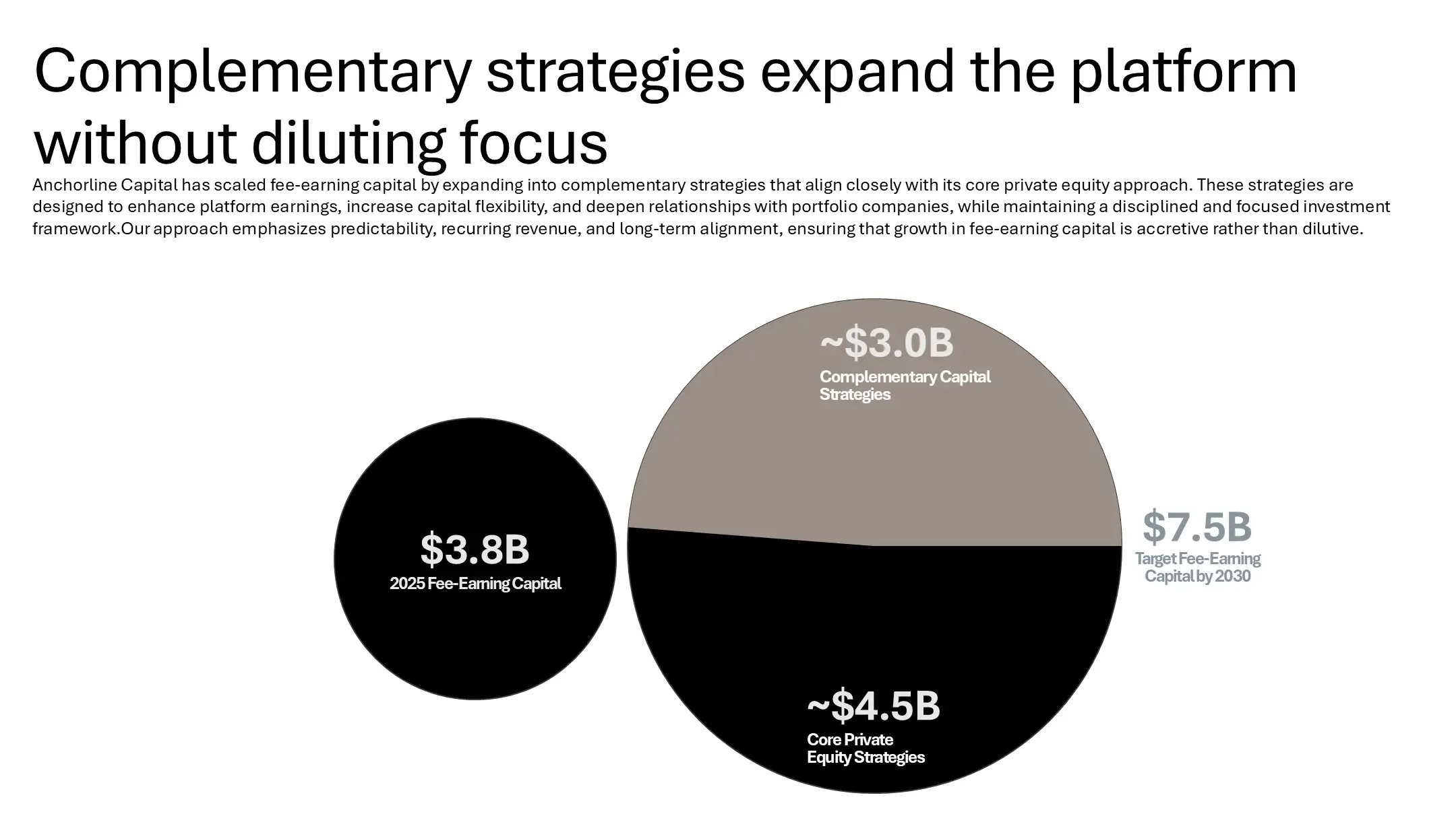
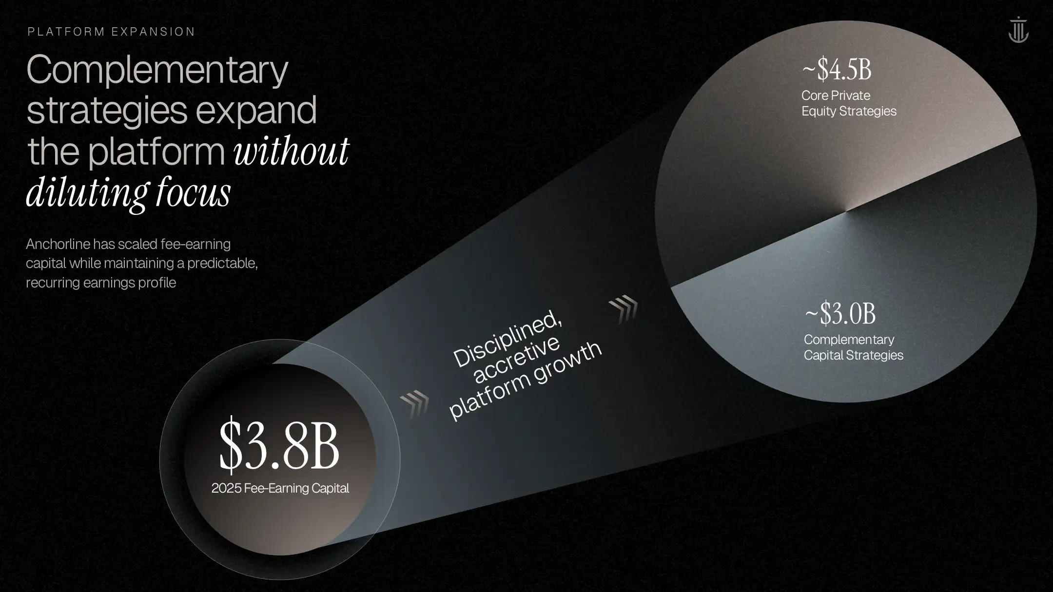
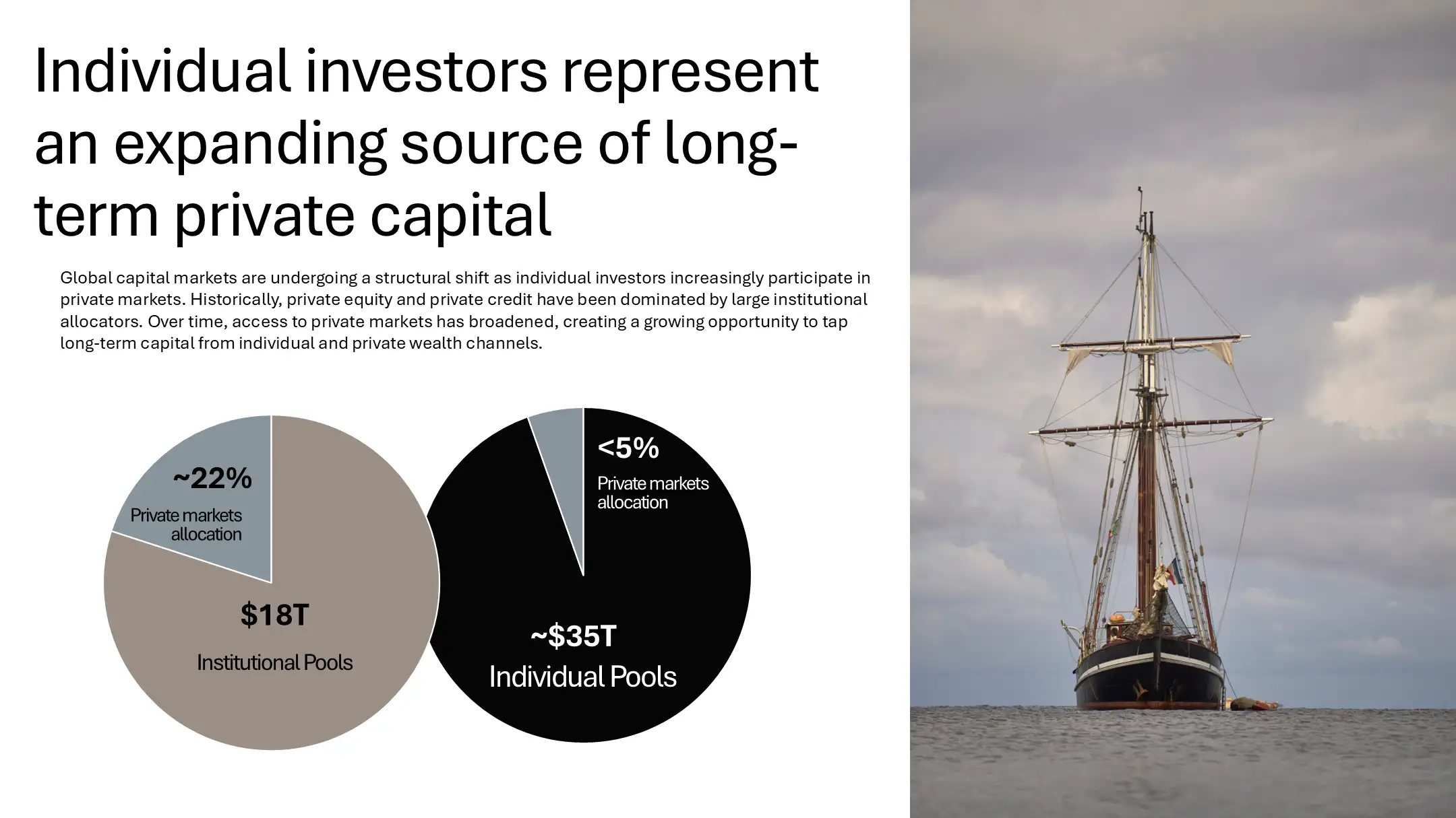
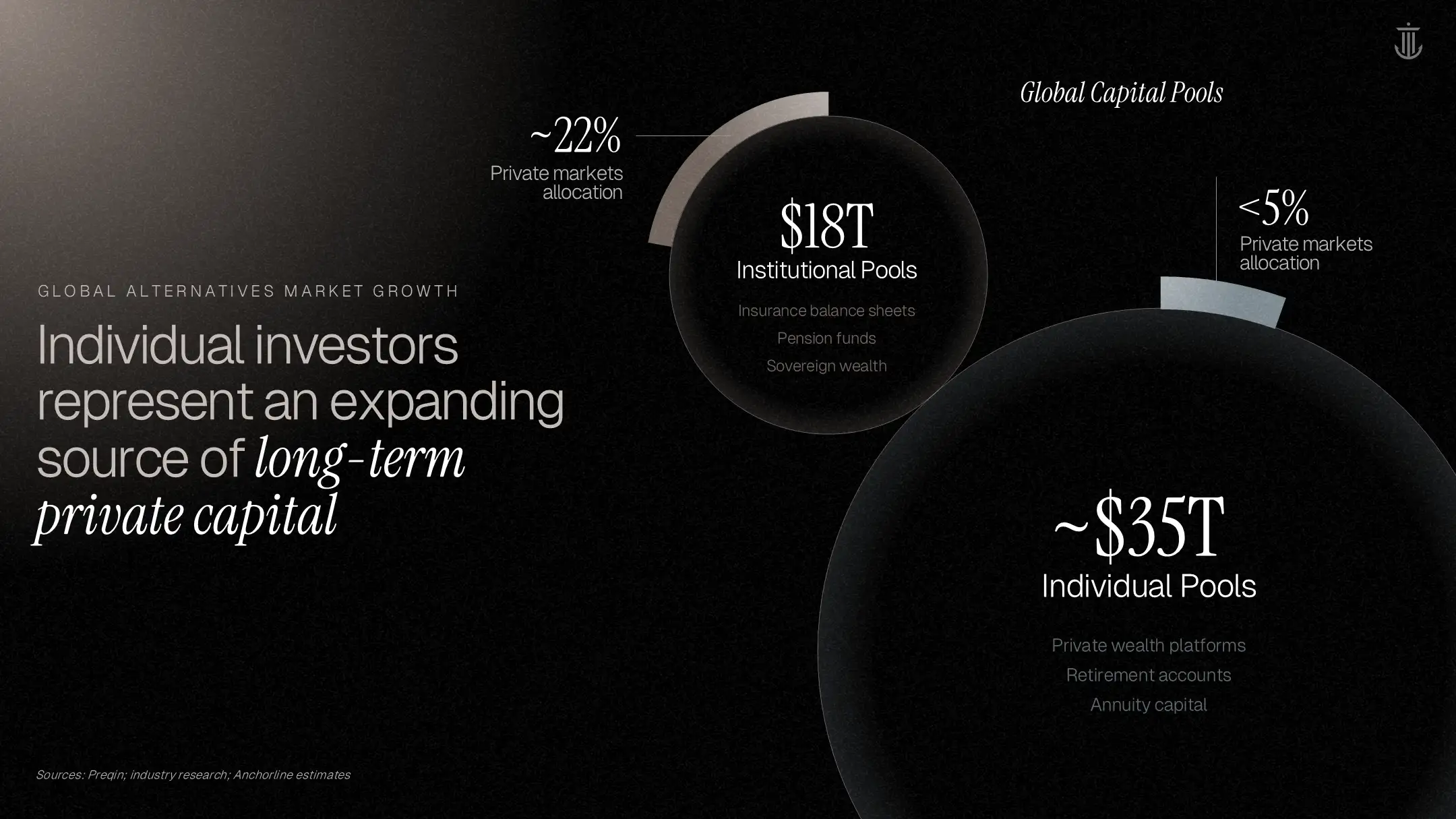
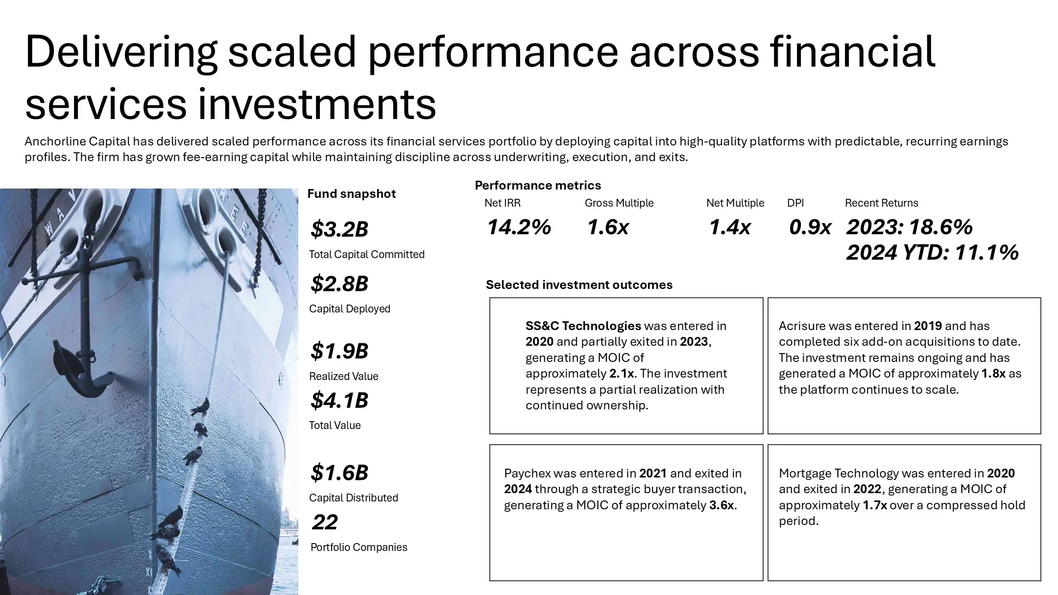
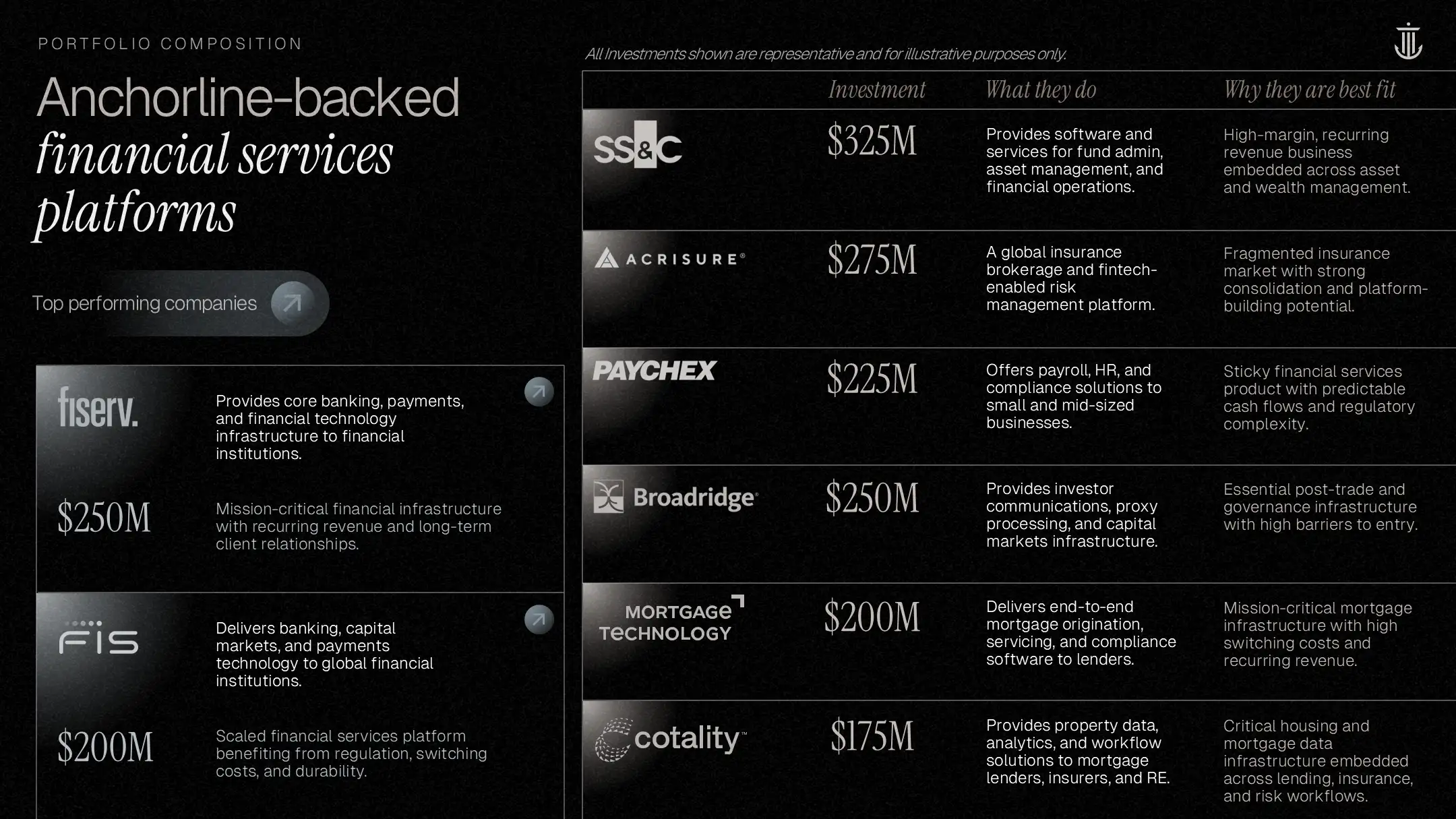
We transformed dense, complex financial data into clear, structured visuals, using hierarchy, charts, and layout discipline to help investors quickly understand performance, strategy, and risk without needing to work through heavy explanatory text.

Original "Value Creation" slide with a cluttered bubble diagram, hindering clarity in the fund overview deck.
Redesigned engagement slide using a clean flow diagram and teal gradients, a key improvement in private equity presentation design.
Original fund composition table with basic formatting, lacking the visual clarity needed for effective investor communications.
Redesigned portfolio diversification slide using donut charts to visualize fund growth in the fund overview deck.
Standard three-column growth strategy slide, missing the dynamic flow required for premium private equity presentation design.
Redesigned growth process slide featuring a "step-up" visual trajectory to illustrate value creation in the fund overview deck.
Original case study slide with dense text blocks, failing to highlight the key financial wins for effective investor communications.
Redesigned case study featuring a dark teal card with clear metrics ($20M to $52M EBITDA), a strong example of private equity presentation design.