Table of contents
TL;DR
This founder-led guide breaks down 7 proven tips used by top PE firms to craft decks that communicate clarity, inspire confidence, and build trust with LPs. Backed by insights from working with working on 50+ private equity presentation.

This founder-led guide breaks down 7 proven tips used by top PE firms to craft decks that communicate clarity, inspire confidence, and build trust with LPs. Backed by insights from working with working on 50+ private equity presentation.
Amélie Laurent
Product Manager, Sisyphus

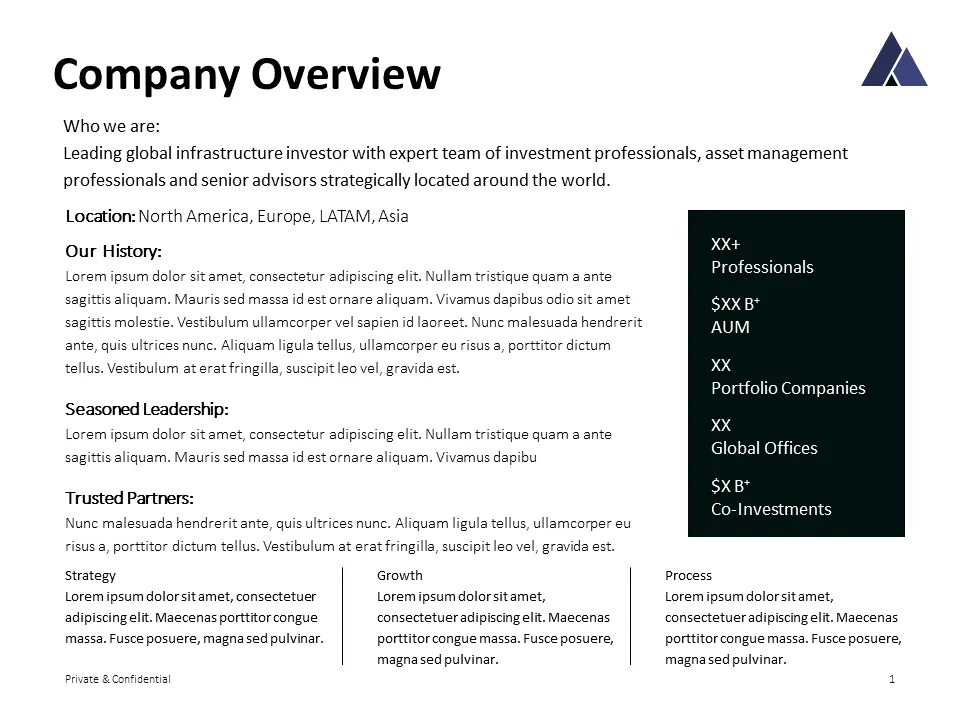
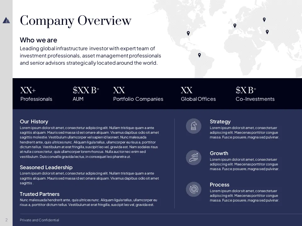
A private equity presentation is a strategic communication tool. Whether you’re raising a fund, sharing quarterly updates, or pitching to LPs, your deck must do more than report performance. Every slide, every chart, every word reflects how the firm thinks, operates, and manages capital.
But here's the challenge: these decks - like any VC pitch deck template - often end up dense, difficult to follow, or visually outdated. And that’s where most PE teams lose their audience.
We’ve worked with 50+ private equity firms, from lean funds to institutional giants, helping them build presentations that are not just “well-designed,” but strategically sharp. These decks opened doors, clarified vision, and made a case that felt investor-ready in every way.
This guide lays out the 7 principles we apply when building private equity presentation that raise capital, win buy-in, and drive momentum.
Lead with a Strong Opening
Your opening slide sets the tone. It’s your firm’s handshake. Make it count.
- Start with a bold statement or key performance metric
- Use a clean, well-branded visual layout
- Reinforce your credibility early with AUM, investment focus, or portfolio success
Investors and LPs make snap judgments. The first 30 seconds should signal that your deck is worth their attention.
Structure with Visual Hierarchy
PE decks are data-heavy by nature. Without a clear hierarchy, the message gets buried.
- Use font weight, sizing, and spacing to create information flow
- Apply consistent color coding to distinguish categories (returns, strategy, portfolio)
- Anchor each slide with a 1-line summary takeaway
This small change alone improves readability and keeps attention where it matters most.


Navigate with Purpose
Many private equity decks are 20+ slides. Without built-in navigation, you risk losing your audience.
- Use a slide index or menu header across sections
- Label segments like: “Team,” “Strategy,” “Track Record,” “Pipeline”
- Include slide numbers and visual breadcrumbs for easy orientation
Professional navigation signals precision and makes the deck more usable in meetings and follow-ups.

Tell the Story Behind the Numbers
- Turn dry metrics into visual narratives with trendlines, benchmarks, or before/after comparisons
- Use color to highlight key insights or outperformers
- Avoid overloading charts with noise or unnecessary breakdowns
If your results are strong, don’t hide them in clutter. A strong private equity pitch deck gives the data room to breathe and speak.


Align Every Visual Element
Precision is non-negotiable in private equity decks. Misaligned charts or inconsistent fonts weaken your credibility.
- Use left-aligned or grid-aligned layouts across slides
- Match chart styles and use a branded color palette
- Maintain consistent margins and white space
These subtle cues build trust. Sloppy slides feel rushed. Polished slides feel institutional-grade.


Use Icons and Imagery with Purpose
Visuals are powerful — but only when used with intent.
- Use icons to quickly convey investment focus areas (e.g. healthcare, tech, infrastructure)
- Pair photos with data when you want to humanize a strategy or spotlight a founder
- Don’t overuse — one strong visual per slide is enough
Think of visuals as narrative accelerators, not decoration.


Create a Master Template for Charts
If your team builds decks often, a custom PowerPoint template is a must.
- Design branded charts with built-in formatting
- Preload with title styles, font rules, and firm colors
- Include layouts for fund metrics, exits, value creation, and more
This not only saves time — it ensures every presentation your team builds stays on-brand and investor-ready.


FAQs
What should a private equity presentation include?
A private equity company presentation, also called a PE pitch deck, is the document a PE firm uses to communicate its investment thesis, fund structure, portfolio performance, and value creation playbook to Limited Partners. At minimum it includes firm overview, team, investment strategy, portfolio snapshot, track record, and key metrics. For LP decks, include fund structure, fees, pipeline, and exits. For dedicated board-level updates, see our board presentation design guide with the 10-slide formula.
How long should a PE presentation be?
Typically 15–25 slides depending on depth. But clarity beats length. Some firms use a shorter “teaser” followed by a deeper data deck.
How does a Fund I PE deck differ from a Fund VI deck?
Fund I decks lean on the GP's individual track record because there's no fund-level history yet. By Fund VI, the deck becomes about institutional process, how decisions get made, how value gets created, how exits repeat. We break this down in our guide to how fund decks evolve from Fund I to Fund VI.
What's the difference between a PE pitch deck and a VC fund pitch deck?
Both raise capital from LPs, but the narrative differs. PE decks lead with operational expertise, value creation playbooks, and exit history. VC fund decks lean harder on thesis, sourcing edge, and emerging market opportunities. For VC-specific structure, see our VC fund pitch deck guide.
What should an LP deck include?
An LP deck, sometimes called an LP presentation keeps Limited Partners aligned before, during, and after fundraising. At minimum: fund thesis, team, track record, portfolio composition, fee structure, and a clear ask. For examples, see our VC and PE portfolio work.
Should you hire a presentation design agency for private equity decks?
Yes, especially when stakes are high. A professional presentation design agency can translate your data and strategy into a compelling, executive-level visual storytelling.
Should PE firms use one deck for both LP fundraising and portfolio company outreach?
No. An LP-facing PE deck sells your fund's strategy. A portfolio-facing PE deck sells your firm to the management team you want to back. The audience, narrative, and slides are different. Most PE firms maintain at least two distinct templates; see our custom PowerPoint template approach for how we build branded systems that scale.
Summing it Up!
Your deck represents your firm when you're not in the room. It’s how you win LP confidence, communicate with clarity, and stay top-of-mind in competitive deals.
At M’idea Hub, we specialize in private equity presentation design, from fund decks to quarterly LP updates and branded templates. We understand how PE firms think, how LPs evaluate, and how to communicate value visually.
Want to see an example? View our private equity fundraising presentation built for a PE firm to win LP confidence at fund close. For PE firms preparing annual meetings, see our AGM presentation guide for private market firms.
If your team is preparing for a raise, portfolio update, or critical investor presentation, we’re here to help.
Book a discovery call and let’s build a deck that reflects your firm's full potential.