Healthcare Overview Deck Design for a Post-Acute Care Startup


NextPhase Health is a post-acute care startup building a clinically led recovery model for high-risk Medicaid seniors, managing the post-discharge episode from hospital to home. They came to M'idea Hub to transform an existing healthcare company overview deck into a structured presentation that could communicate a complex care management model to stakeholders - audience, vendors, buyers, and investors.
All the content and company name is redacted/replaced to maintain confidentiality.
Digital Health
3 weeks
Overview Deck

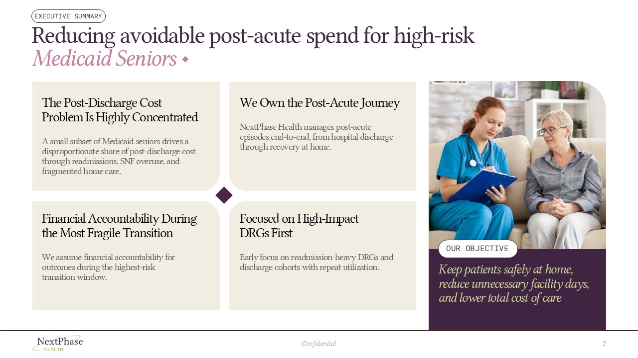
The client brought a 12-slide presentation with strong clinical thinking but significant design gaps. Every section was dense with bullet points and text with no visual support and white space. Mismatched generic icons undercut the quality of the clinical narrative underneath. There was no brand system, imagery, and data visualization.
Pain-Points
Dense Content
No Visual Hierarchy
Inconsistent
Weak Problem Framing
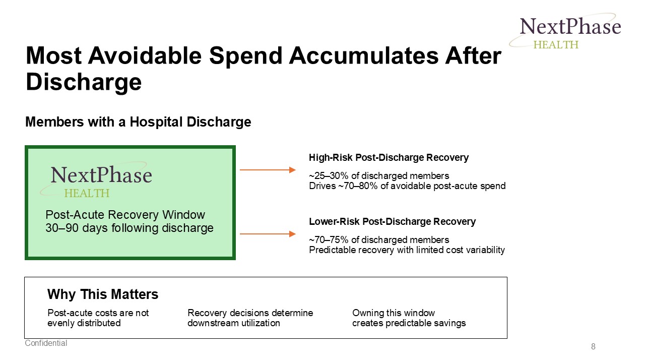
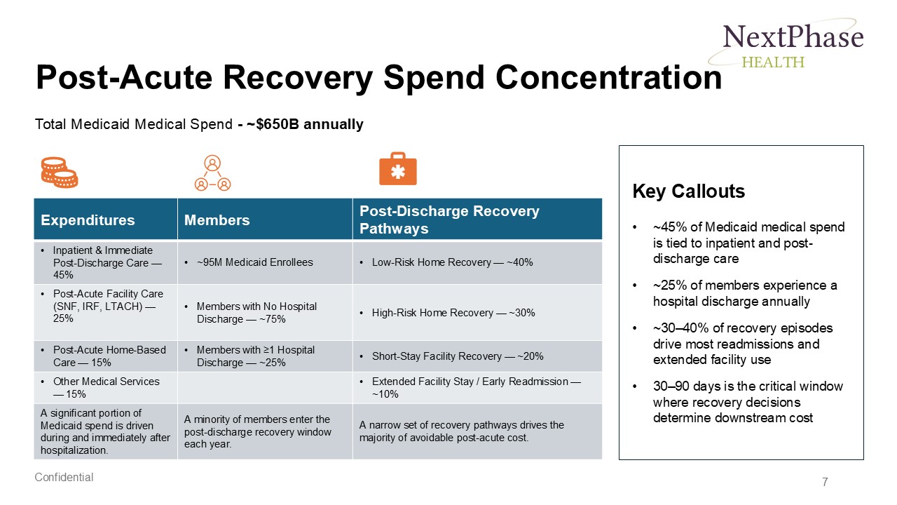
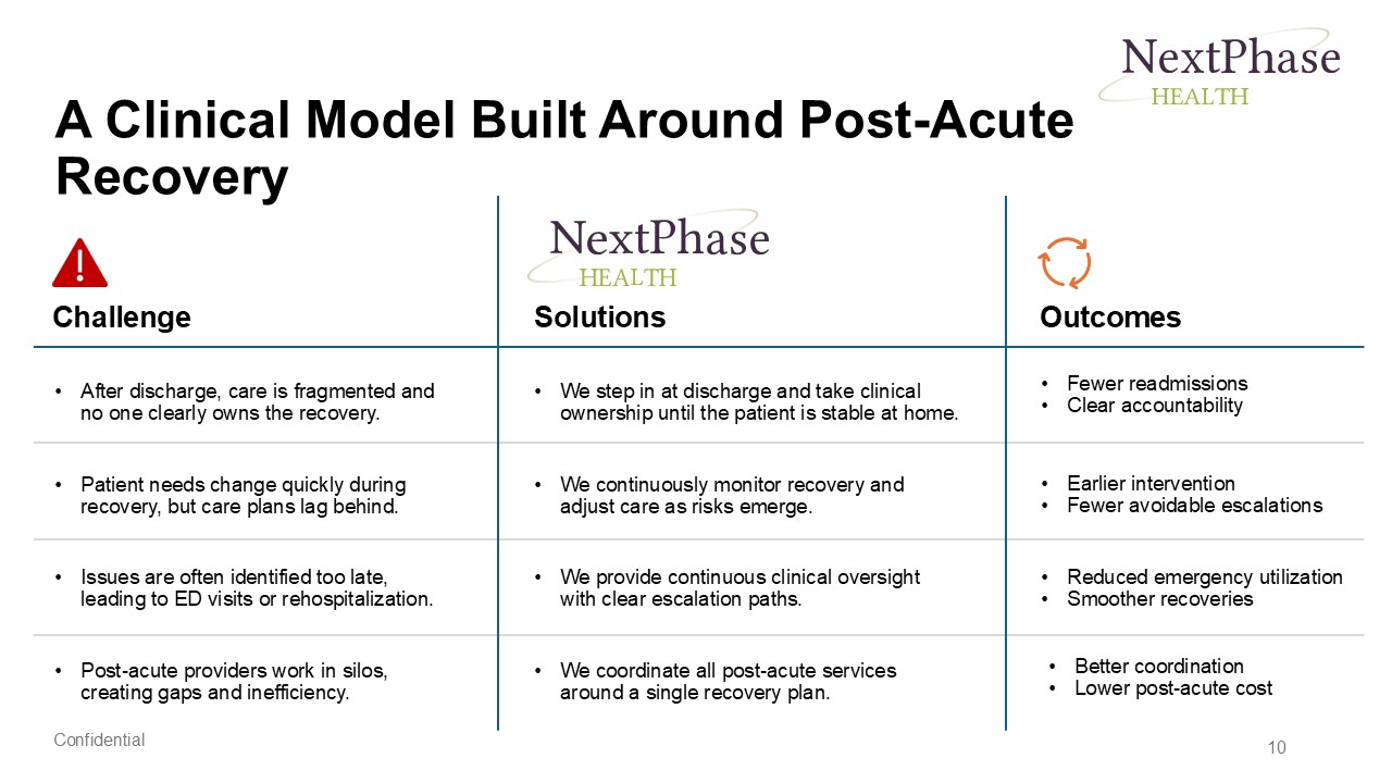
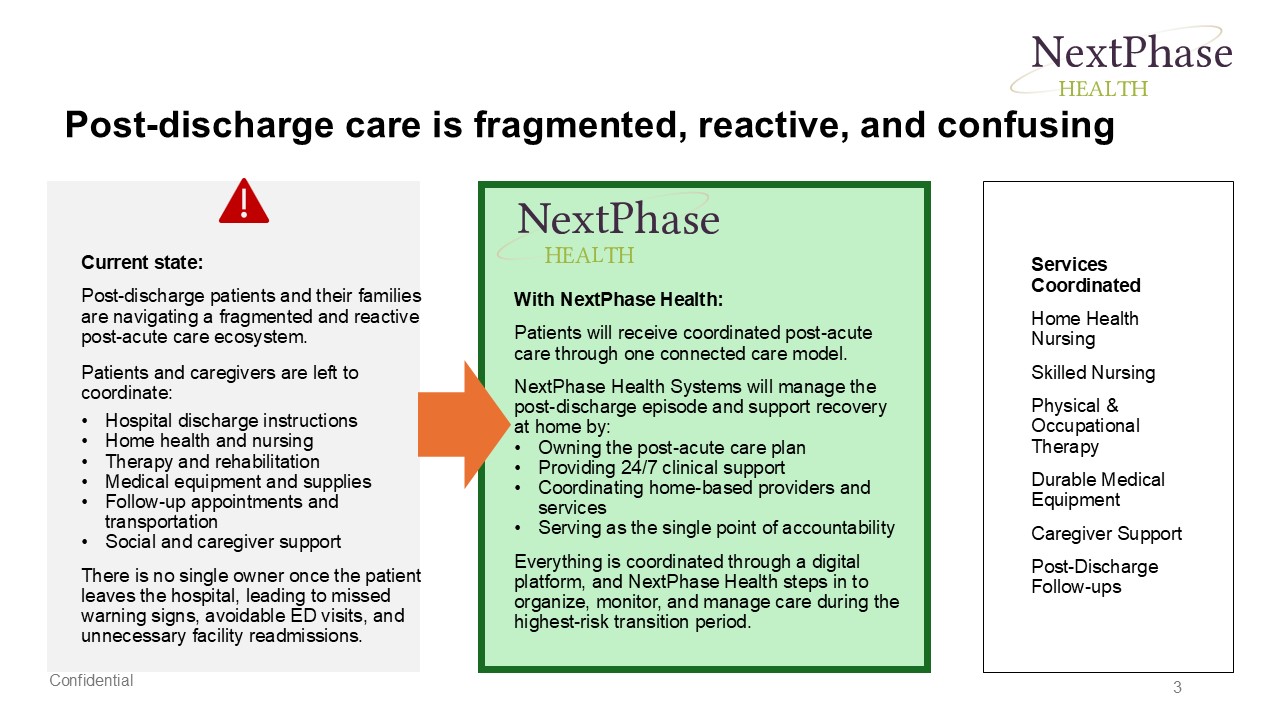
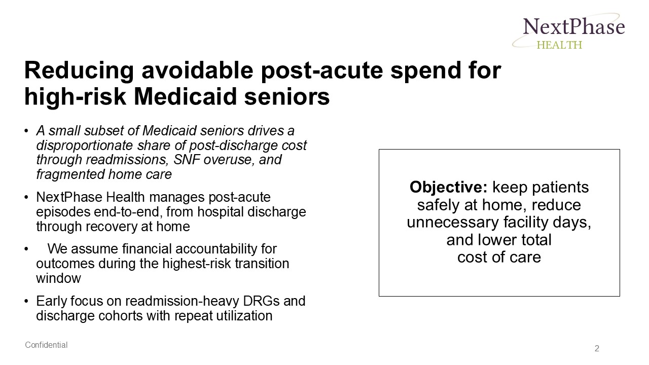
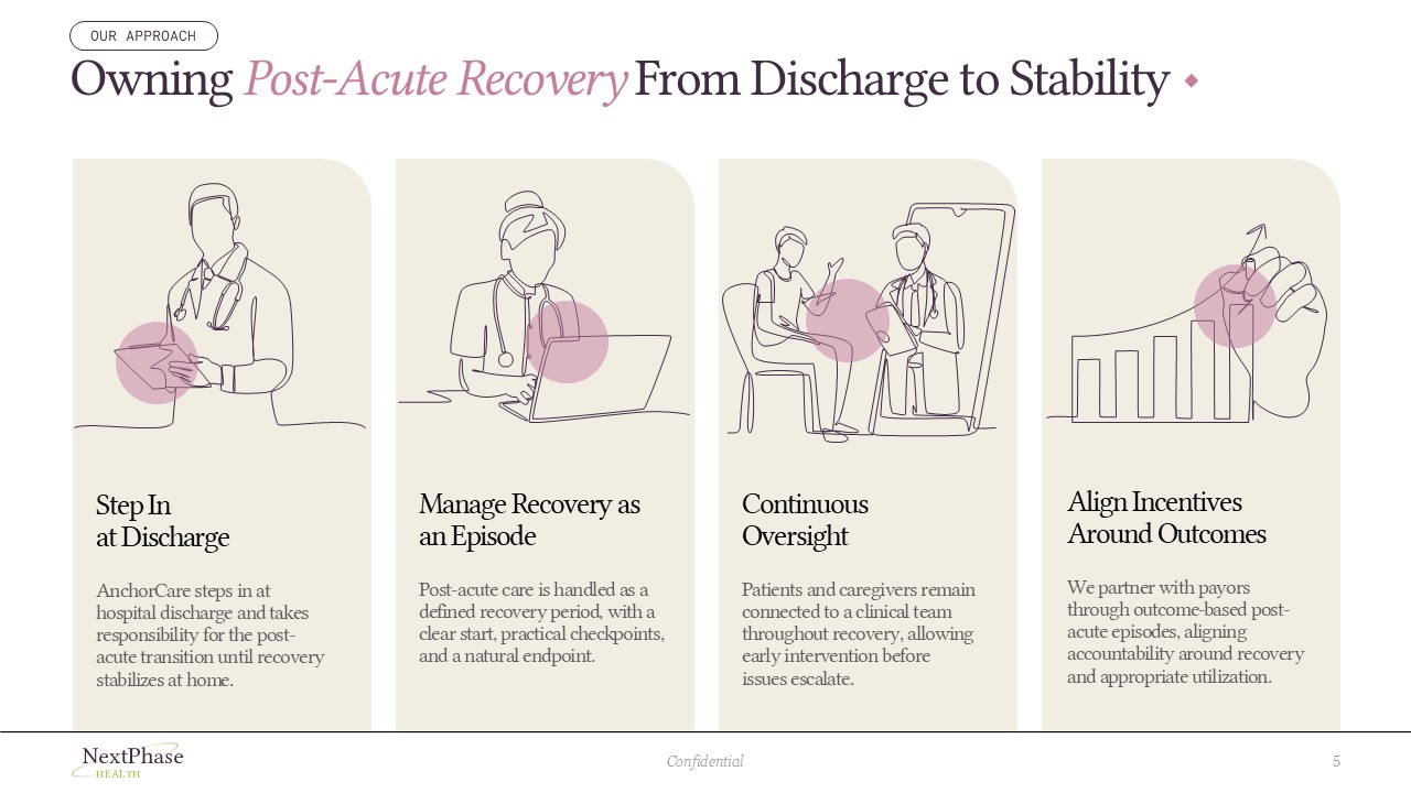
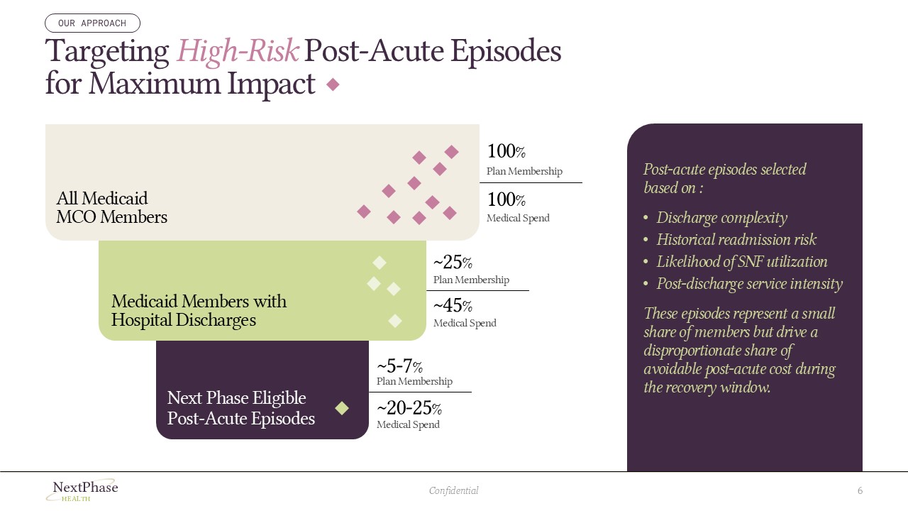
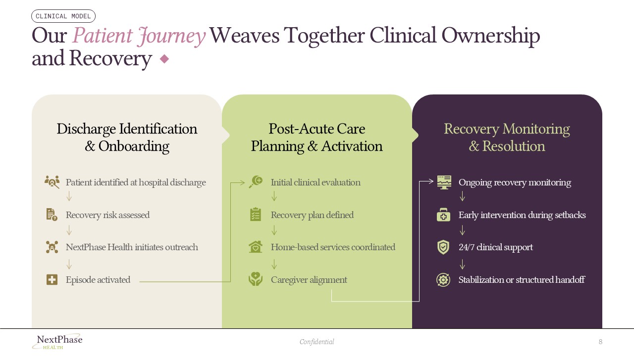
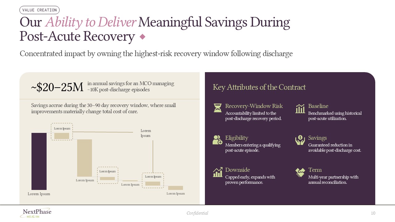
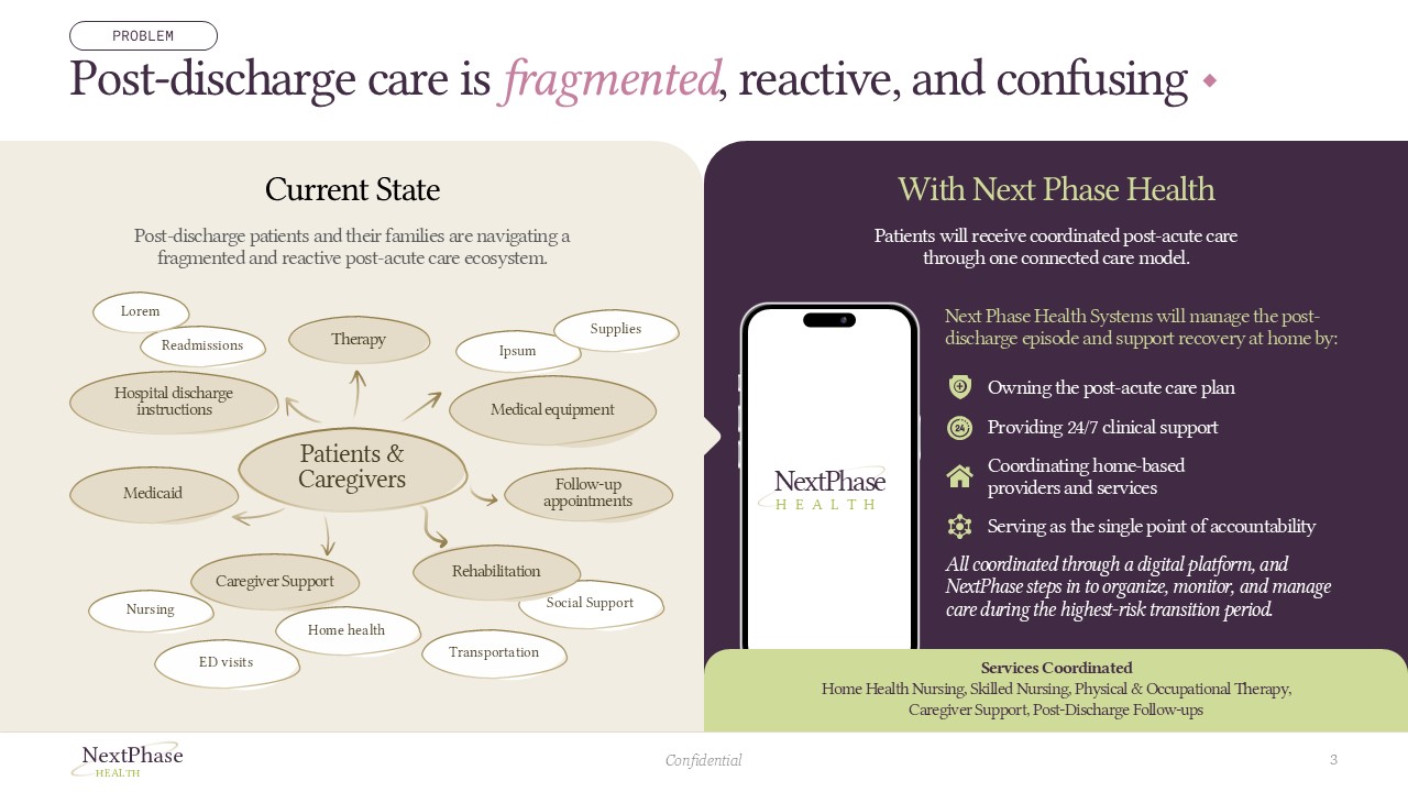
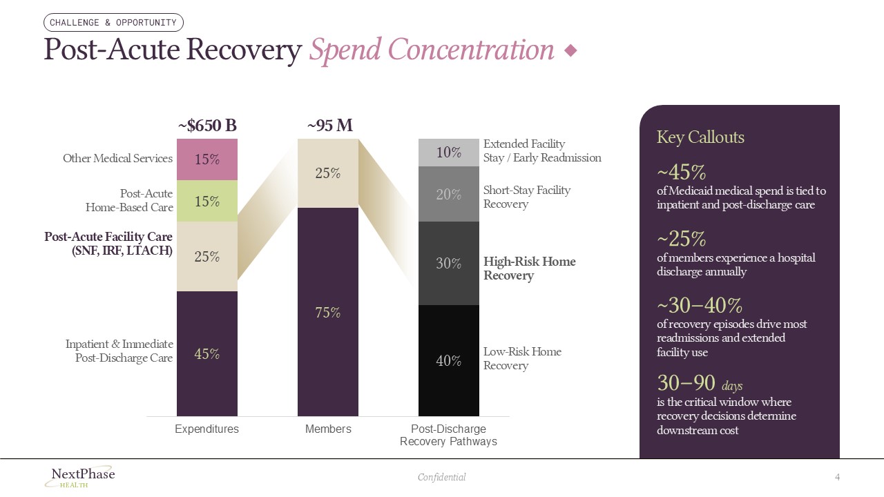
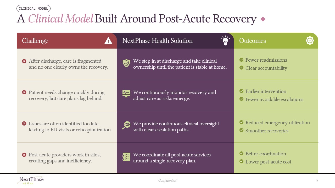
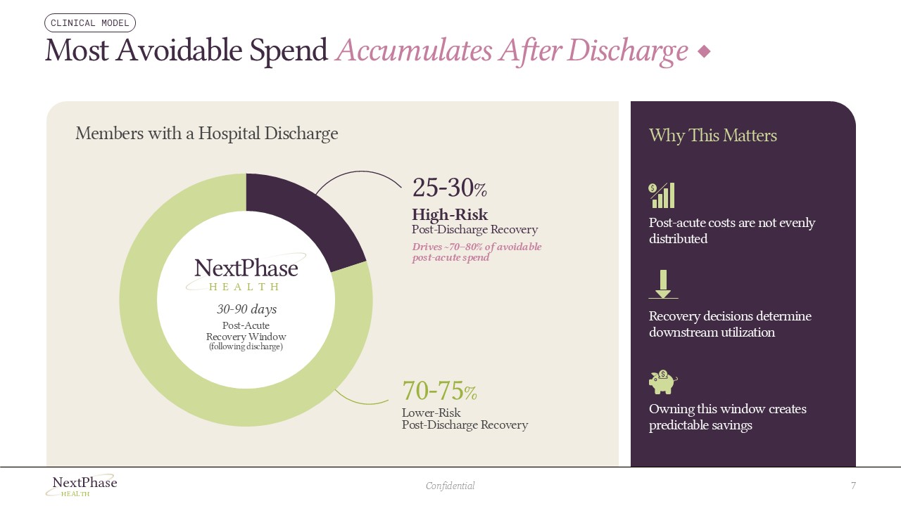
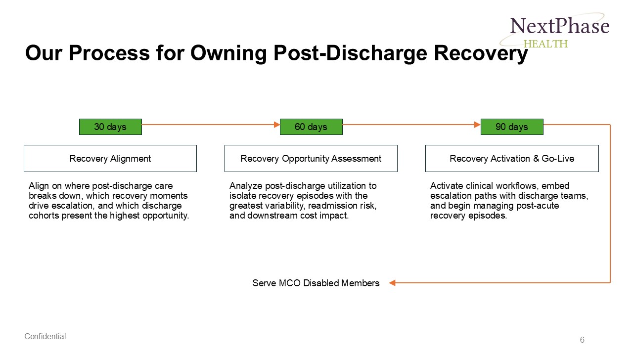
Every slide was rebuilt from structure up, following a clear healthcare storytelling design framework: problem framing, clinical model, data opportunity, patient journey, and value creation. The problem slide became a split-panel layout with a custom network diagram and a mobile device mockup, making the contrast between fragmented and coordinated care immediately visible. Data-heavy slides were redesigned with purpose-built chart treatments including a stacked bar chart, a donut chart, and a layered funnel approach. Every slide now earns its place in the narrative.
Improvements
Clear Hierarchy
Simplified Visuals
Custom Illustrations
Optimized Flow & Structure
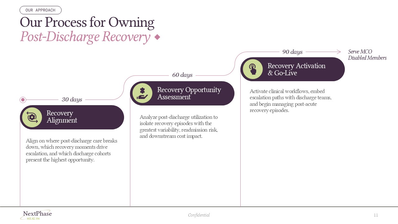

The final deck positions digital health startups as a credible, design-mature care management platform. What was a dense 12-slide document became a cohesive, visually led healthcare overview presentation that communicates clinical complexity without overwhelming the audience. The healthcare storytelling framework applied throughout the deck creates a clear, accessible narrative structure, making the presentation easy to follow for a wide range of audiences, from patients and partners to clinical stakeholders and decision-makers.