Ongoing Design Partner for a Private Equity Firm’s LP Communications


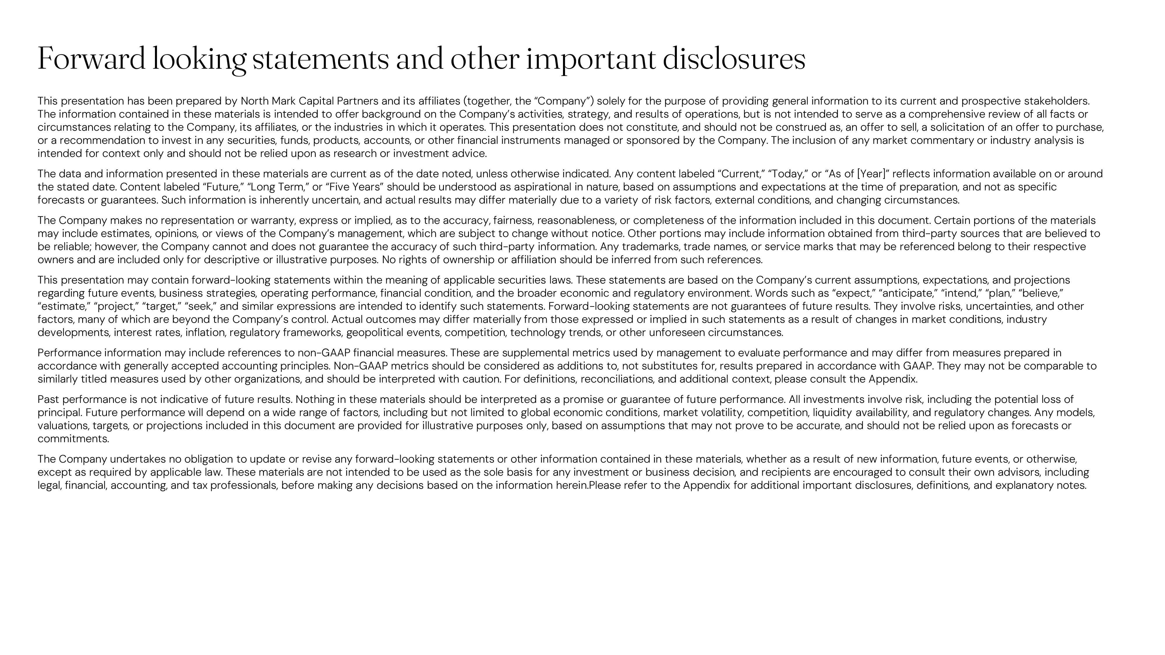
The original fund presentation was text-heavy, lacking structure, hierarchy, or visual branding. It was hard to scan and buried their strengths, making it difficult for LPs to grasp strategy or value.
Pain-Points
Content Heavy
No Visual Hierarchy
Hard to Scan
Non-Branded
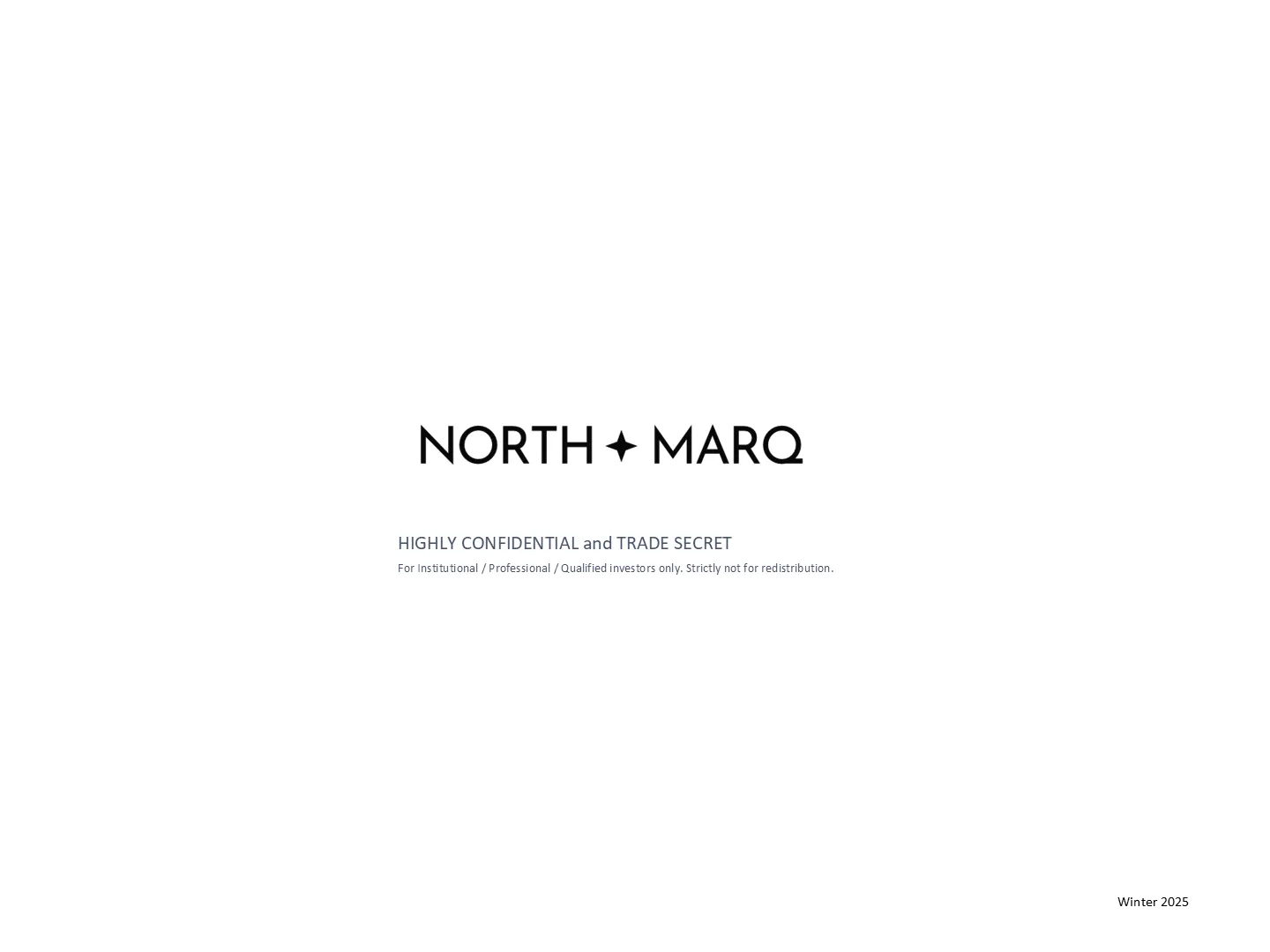
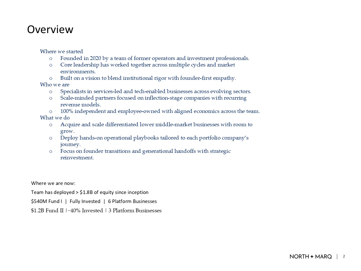
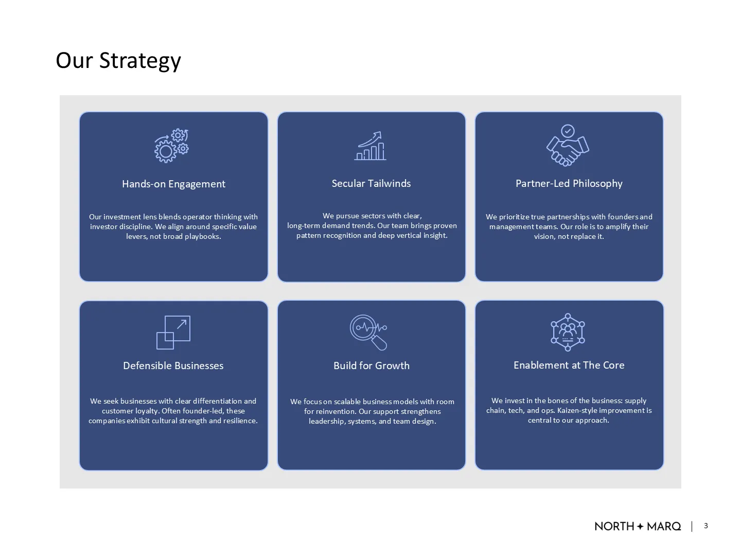
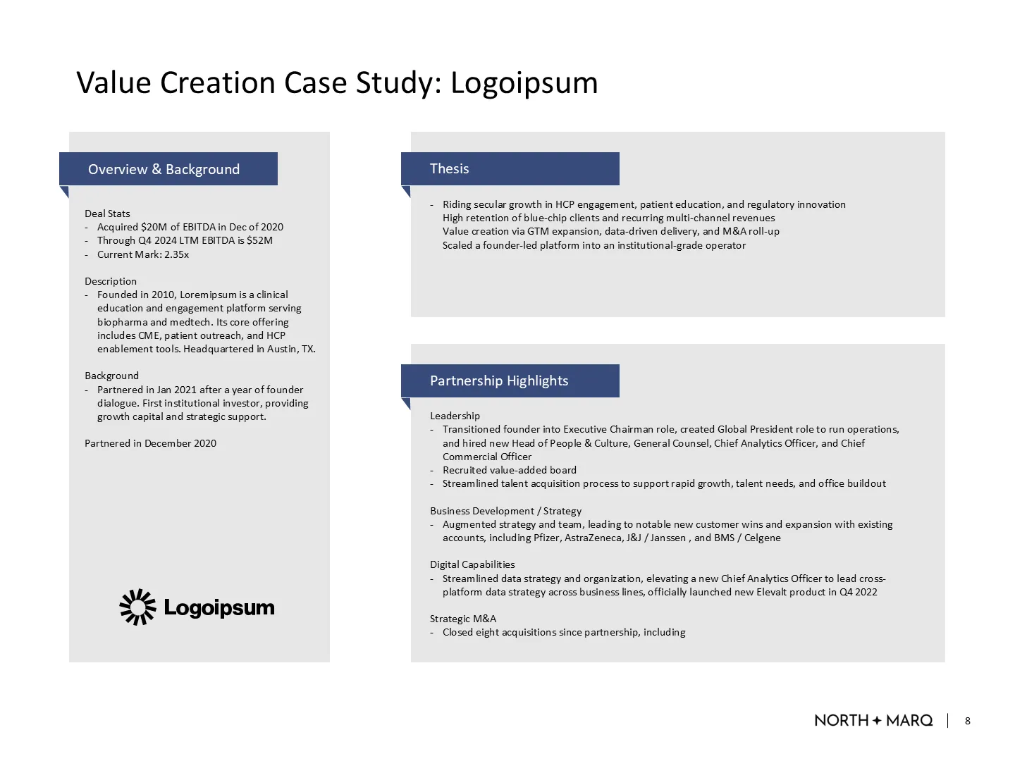
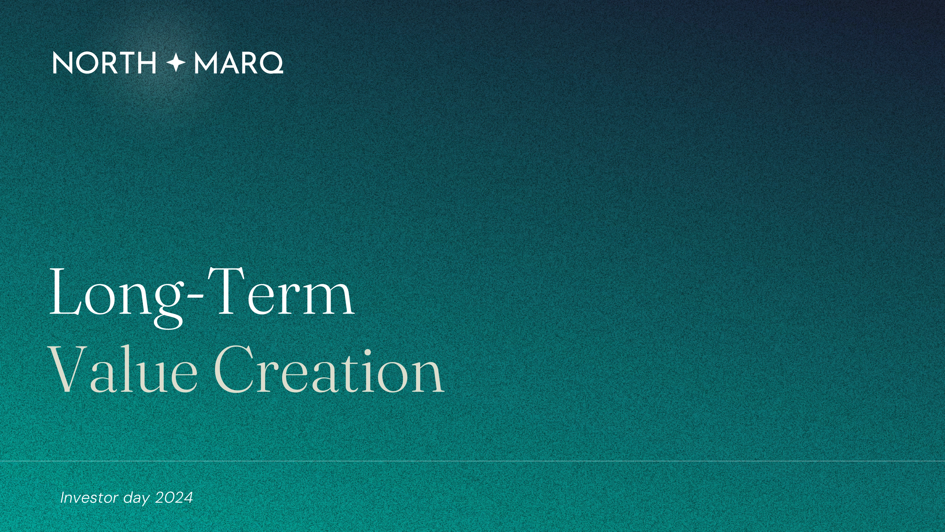
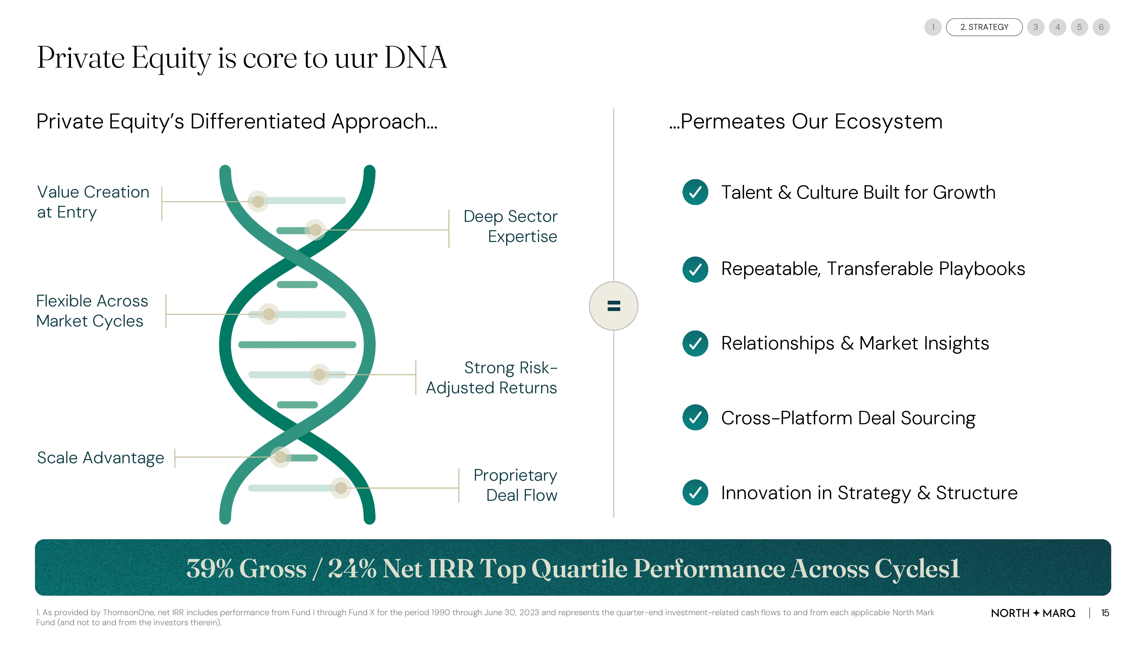
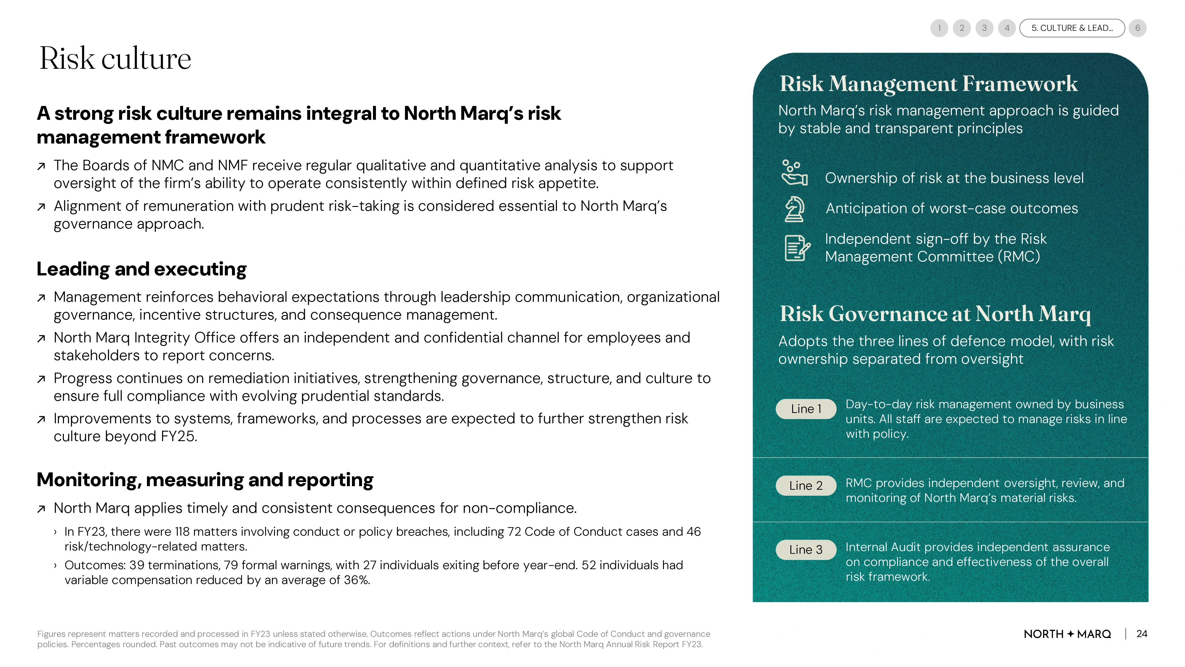
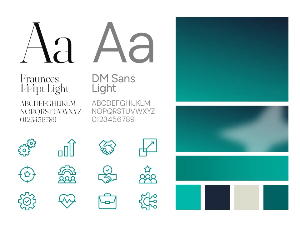
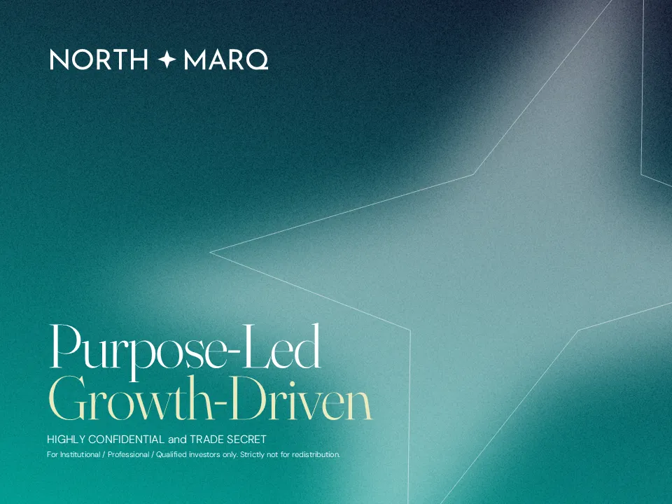
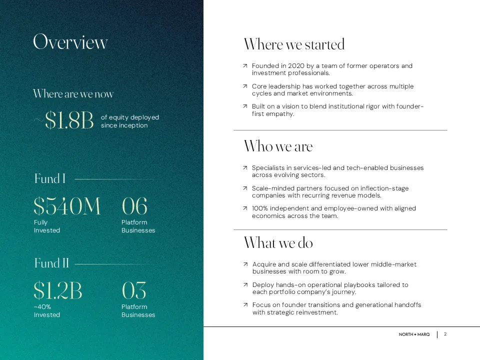
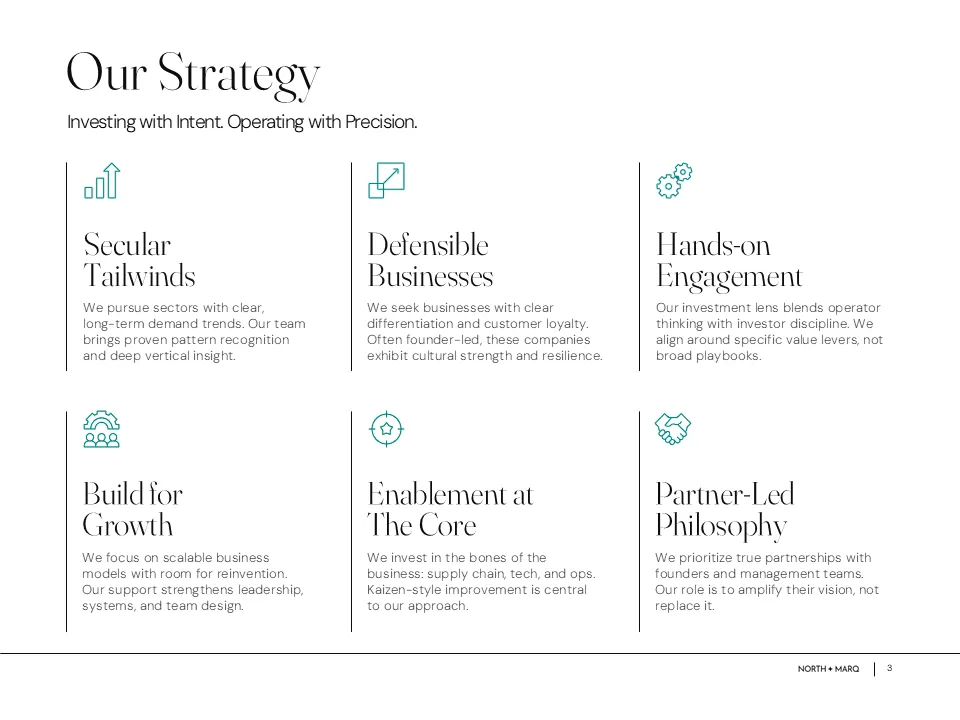
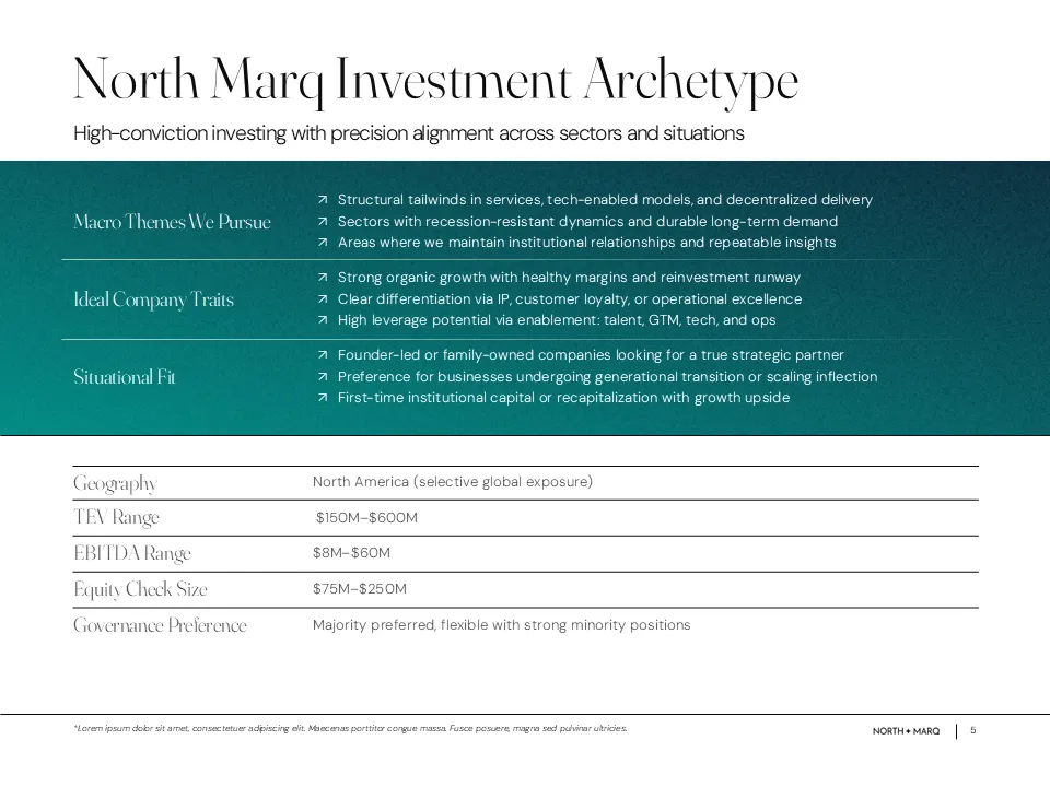
We began with a full design refresh, introducing new typography, a focused color palette, soft gradients, and a structured layout grid system. This set the visual foundation for a deck that felt modern, calm, and credible, something LPs could trust at a glance.

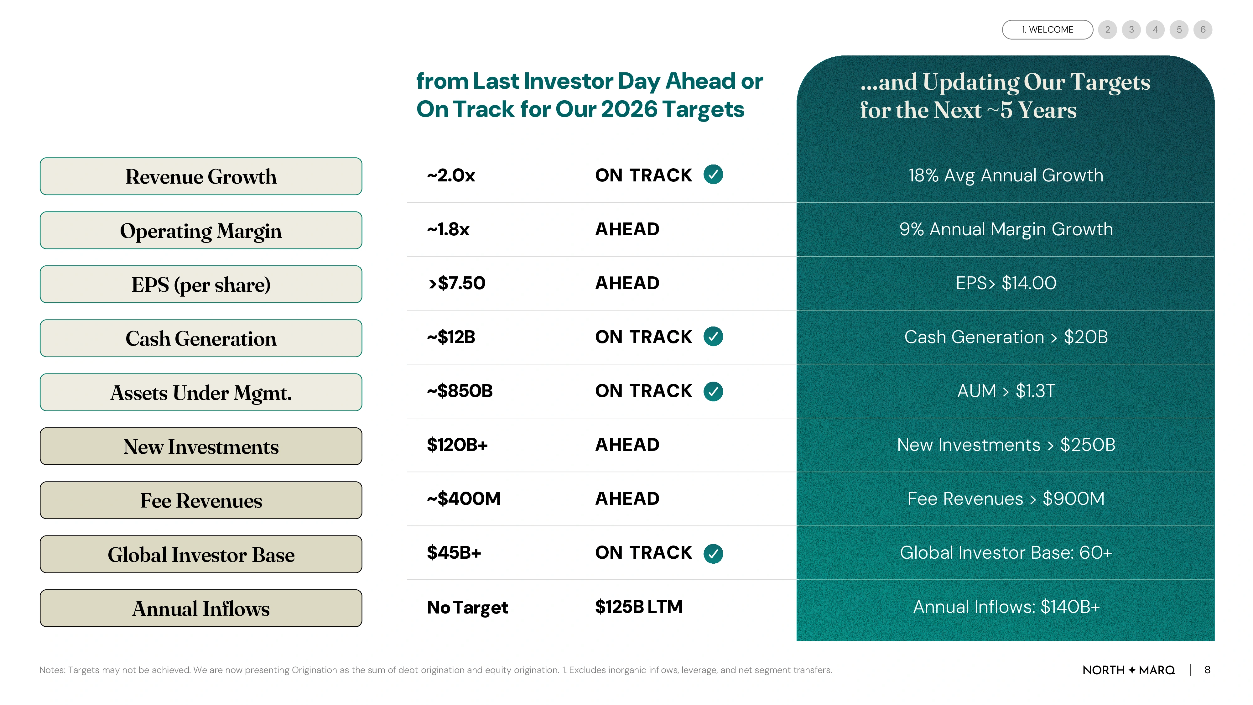
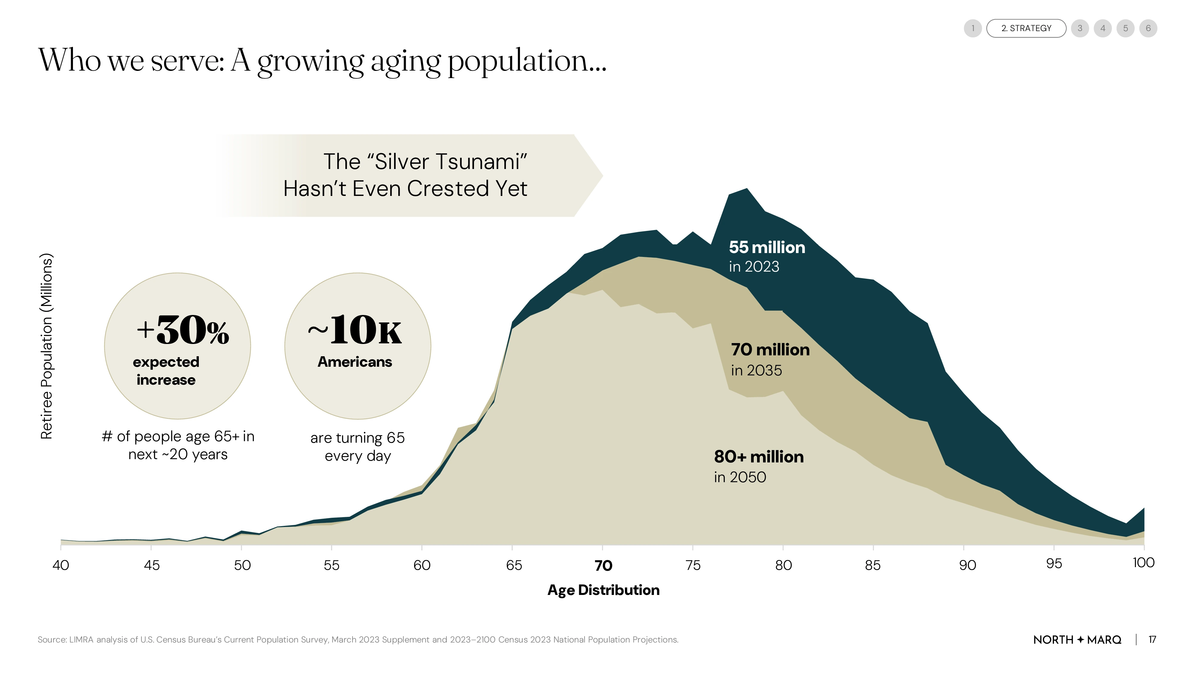
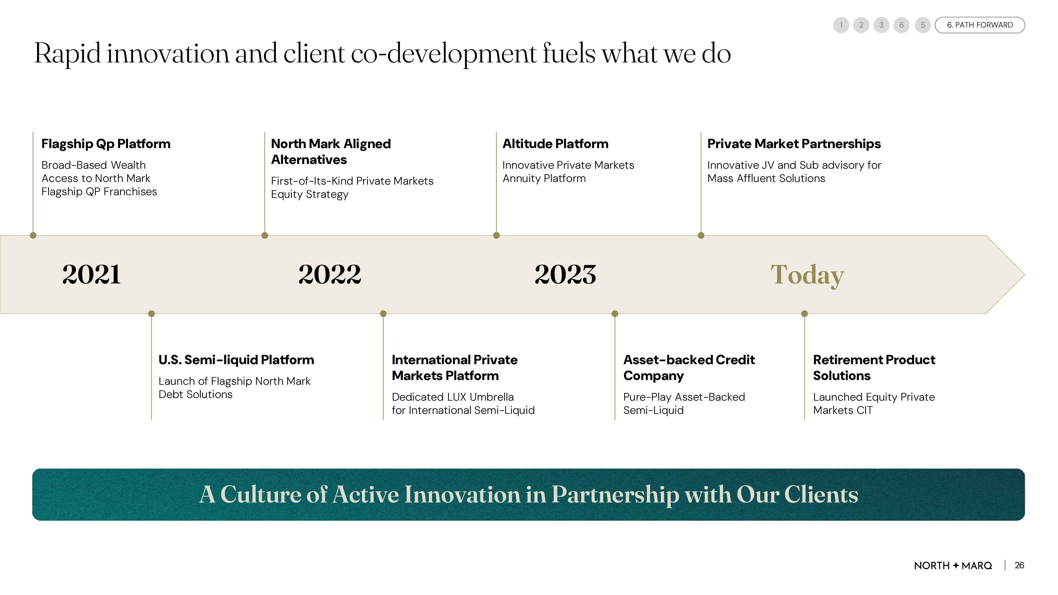
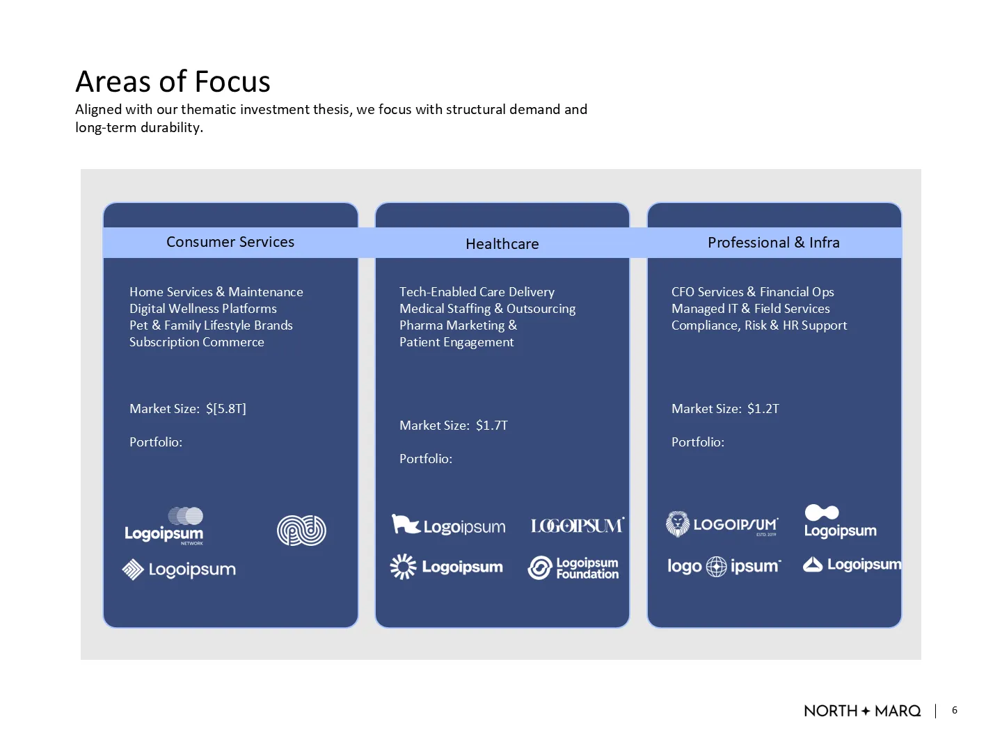
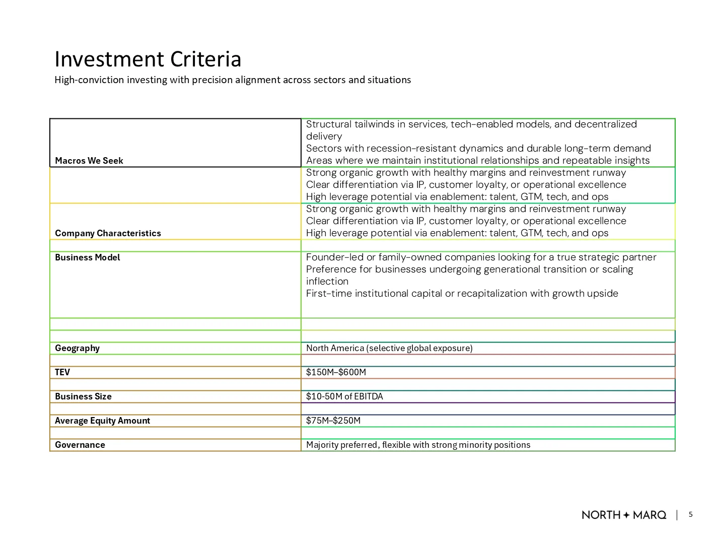
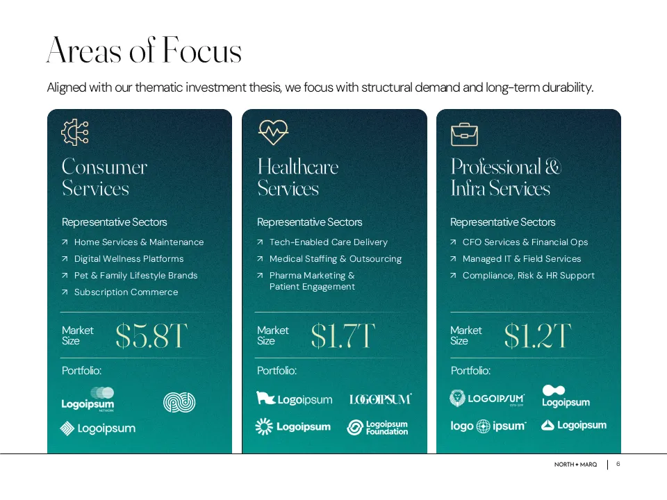
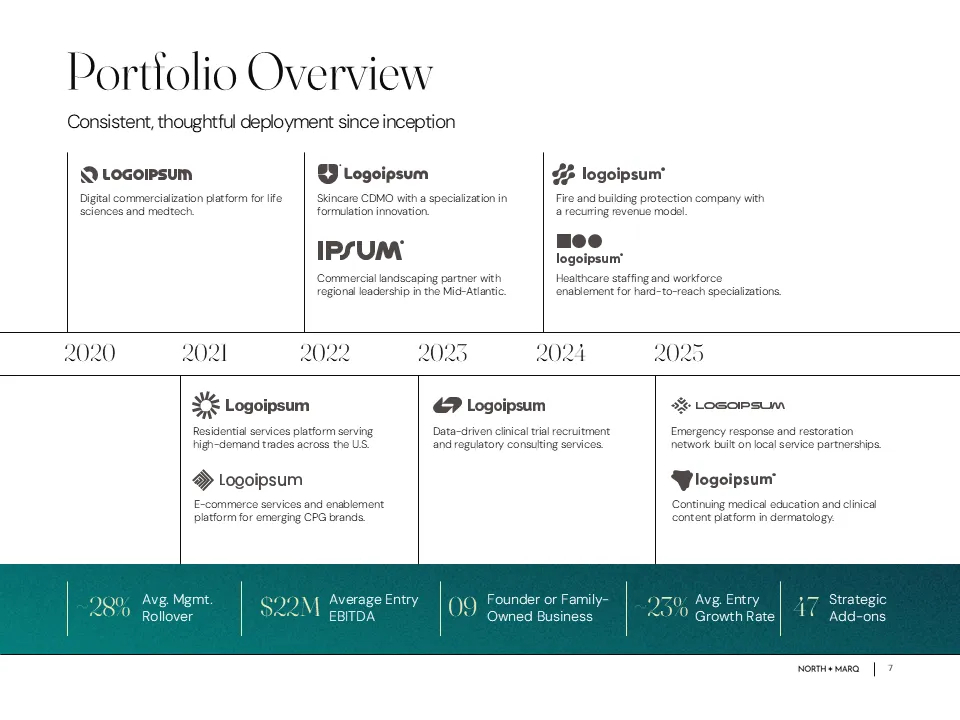
We redesigned key slides with improved data visuals, clearer messaging, and refined layouts. Brand-aligned gradients and graphics helped communicate the firm’s strategy and investor proposition more effectively.
Improvements
Brand Consistency
Visual Clarity
Strategic Layout
Data Visualization
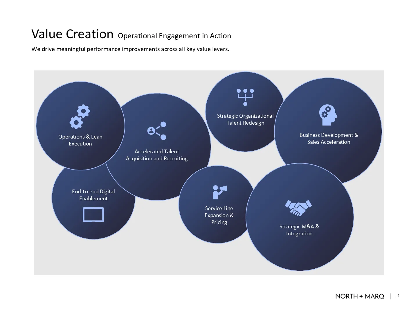

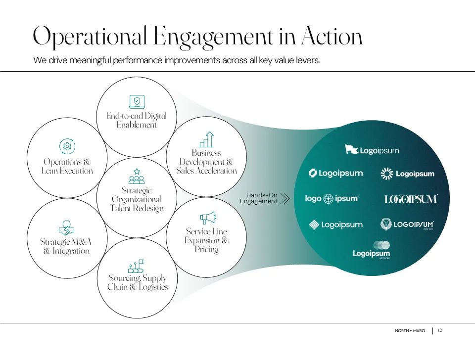
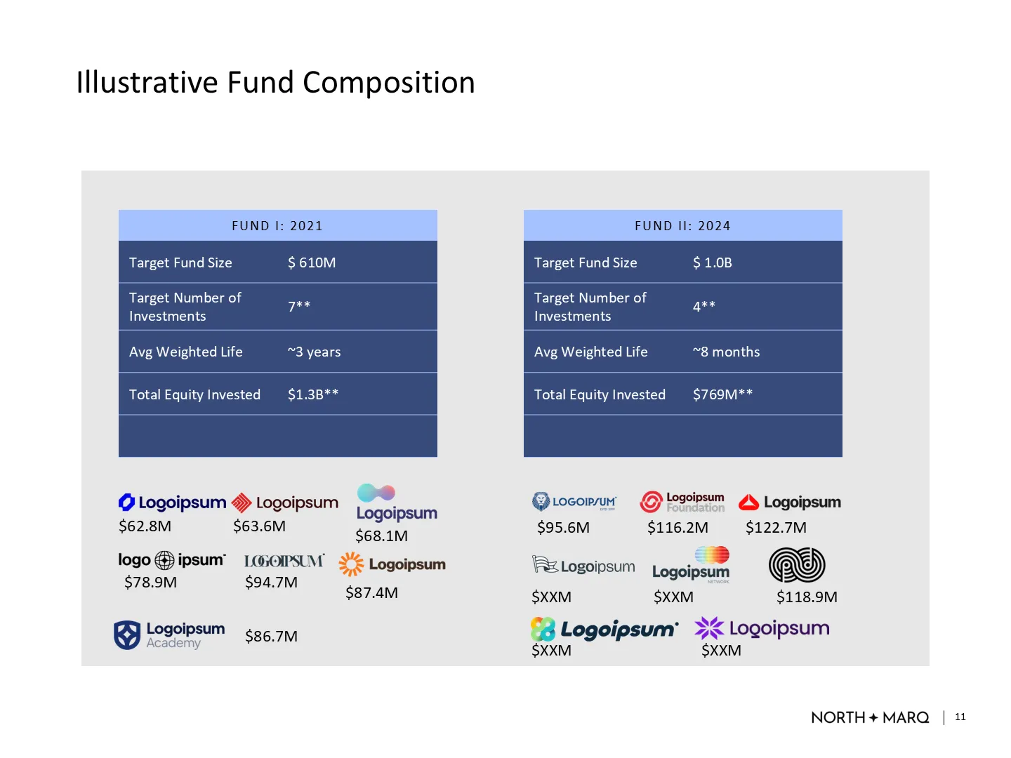

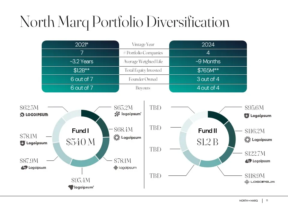
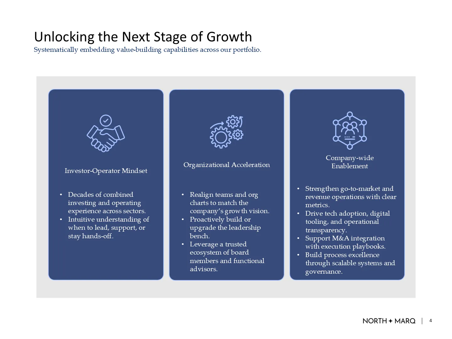

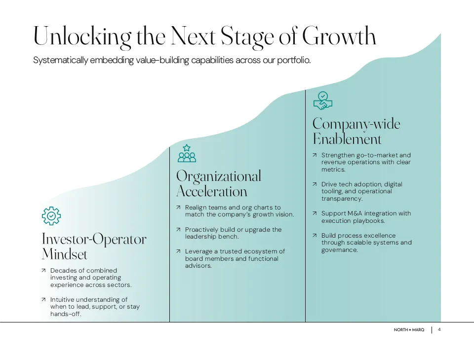


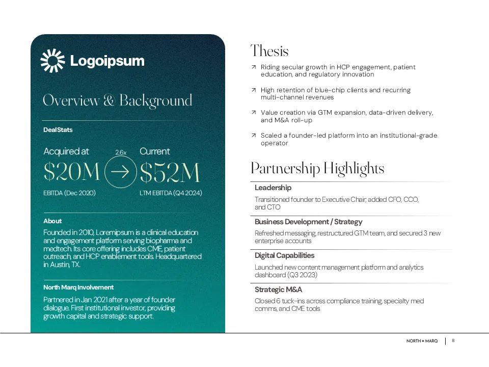


The final fund deck clearly communicated NorthMarq’s investment strategy, sector focus, thematic investment themes, and long-term platform vision. It was polished, well-structured, and designed to be confidently shared with institutional LPs, family offices, and co-investors.
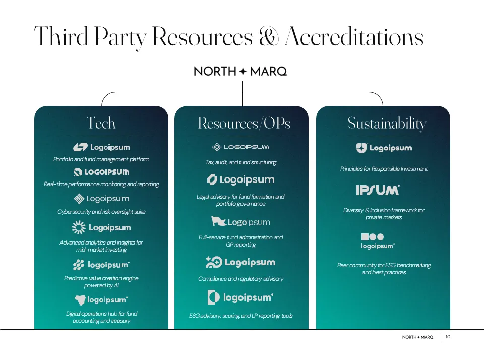
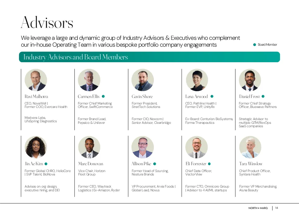

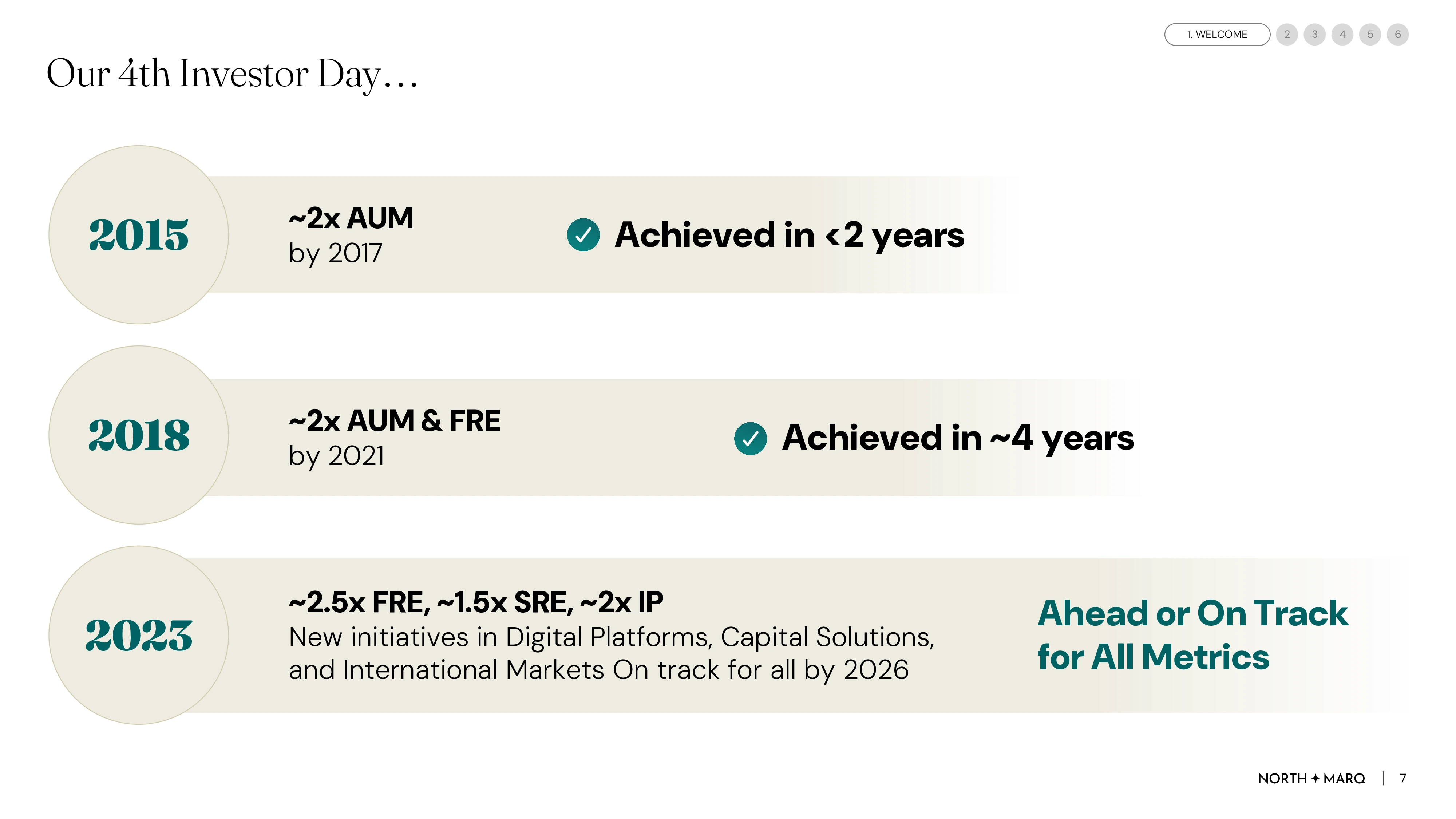
For their annual general meeting, we built a presentation that paired structured navigation with data-driven storytelling. Complex metrics were reimagined through impactful charts and crisp data visualizations, making performance easier to scan and compare.
Clear Structure
Track Record Focus
Impactful Charts
Forward-Looking Design
