

Designing a Clear Investor Story for a Modern Factoring Platform

The deck we received from the client contained plain text on the slides, lacking any branding or correct font usage. As the text was simply written, the key messaging regarding factoring and the Aspen process did not stand out effectively. It was also difficult to visually distinguish how the Aspen process differs from that of competitors.
.webp)


We completely y transformed the pitch deck for this fintech startup by applying brand guides, elements and using precise typography. Text-heavy slides were transformed into visually engaging ones through the incorporation of illustrations. The deck effectively conveyed a visual narrative of the company's process and overarching messaging.


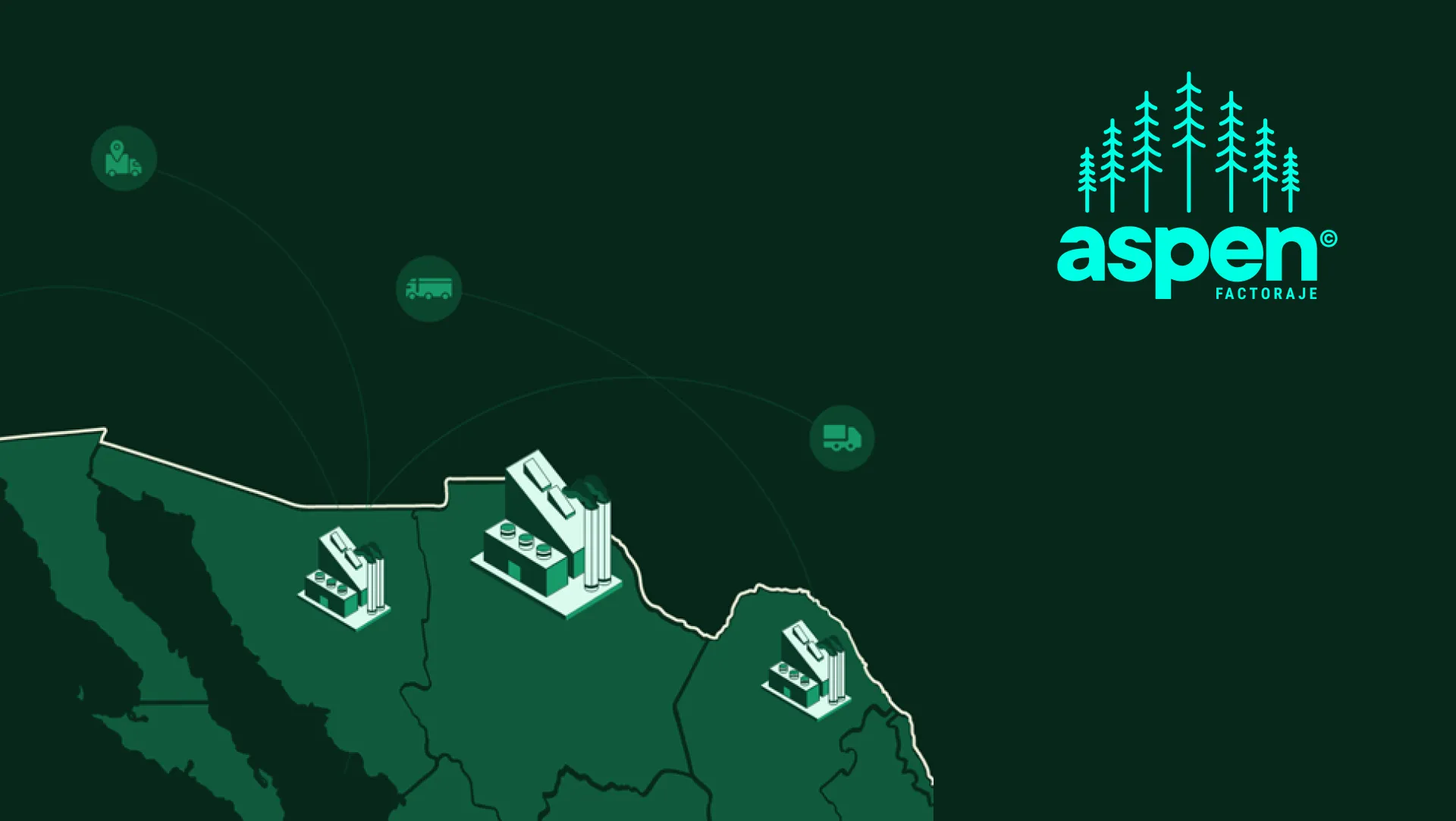
We've broken down the content into simpler points, highlighted key numbers, and added a map to show the main takeaway visually.

.webp)
Using illustrations and usage of the right icons and colors, we've shown the problem being addressed.

.webp)
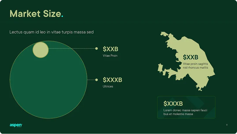
We've highlighted numbers, visually shown ratios, and used the map to showcase places.

To enhance clarity, we split slides into two parts. One to walk through the Aspen factoring solution and second to highlight key differentiators and outcomes. The result? A refined, fintech fundraising deck that’s aligned with modern investor expectations.

.webp)
