Redesigning a VC Fund Pitch Deck to Clearly Communicate Platform Value


Monark Ventures is a corporate venture capital platform investing in SaaS, healthcare, and artificial intelligence startups. They needed a venture capital presentation that could clearly communicate their fund strategy, structure, and LP value. We redesigned their fund deck to sharpen narrative flow, clarify positioning, and deliver a consistent, on-brand visual experience; the kind of presentation to venture capitalists that builds instant trust.

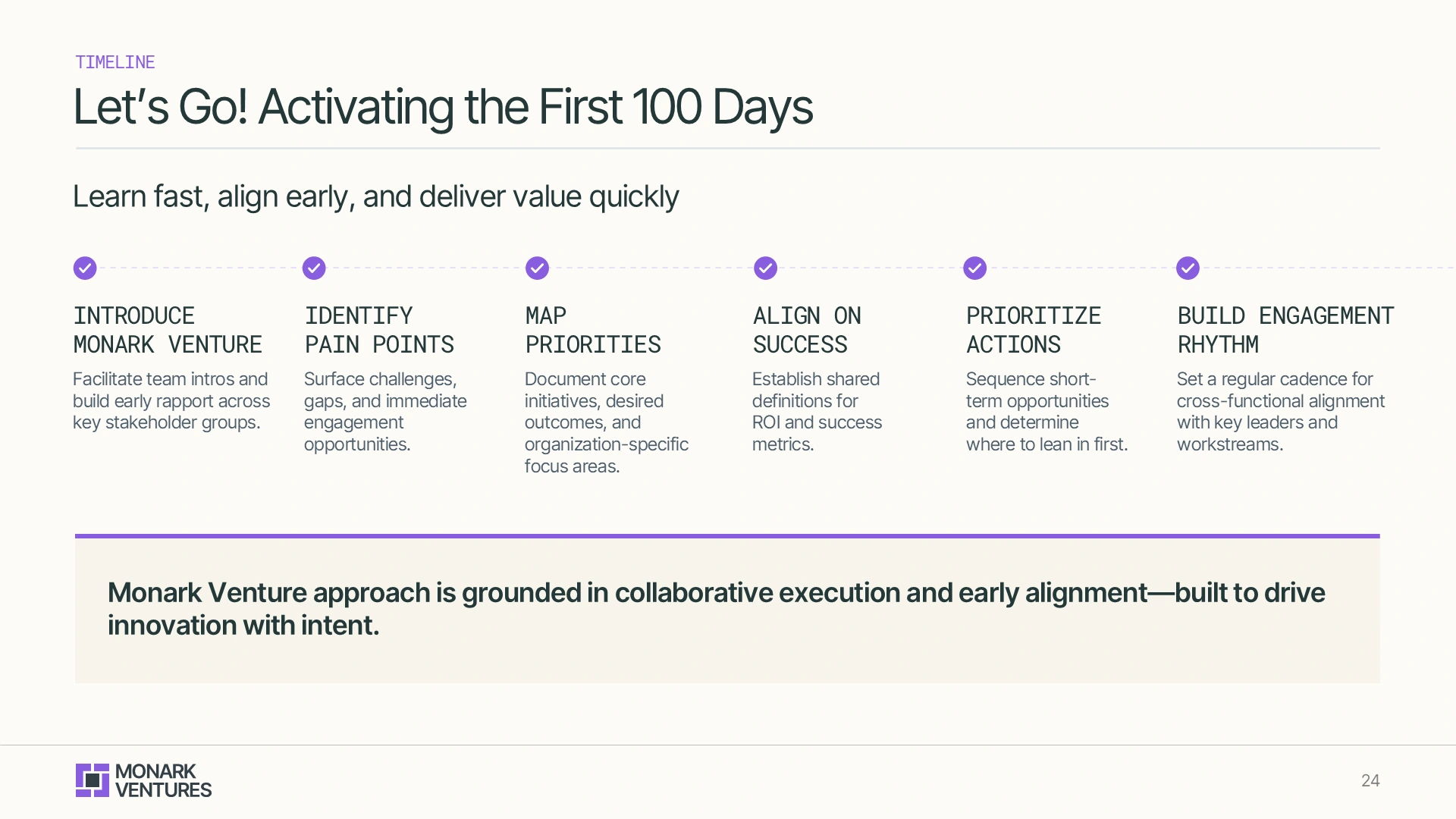
All the content and company name is redacted/replaced to maintain confidentiality.
Corporate
Venture Capital
3 Weeks
Fund Pitch Deck
New York, USA

The original VC fund pitch deck lacked clarity and consistency. It was overloaded with dense content, missing clear hierarchy, and didn’t reflect the sophistication of the platform.
Pain-Points
Non-Branded
Inconsistent
Dense Content
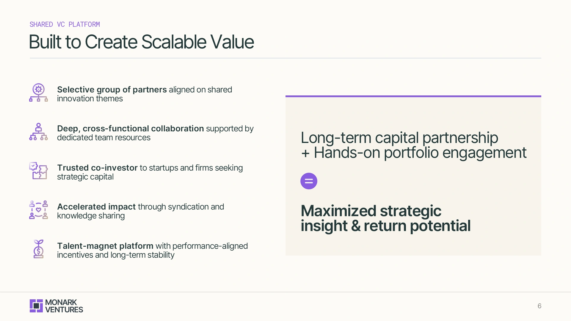
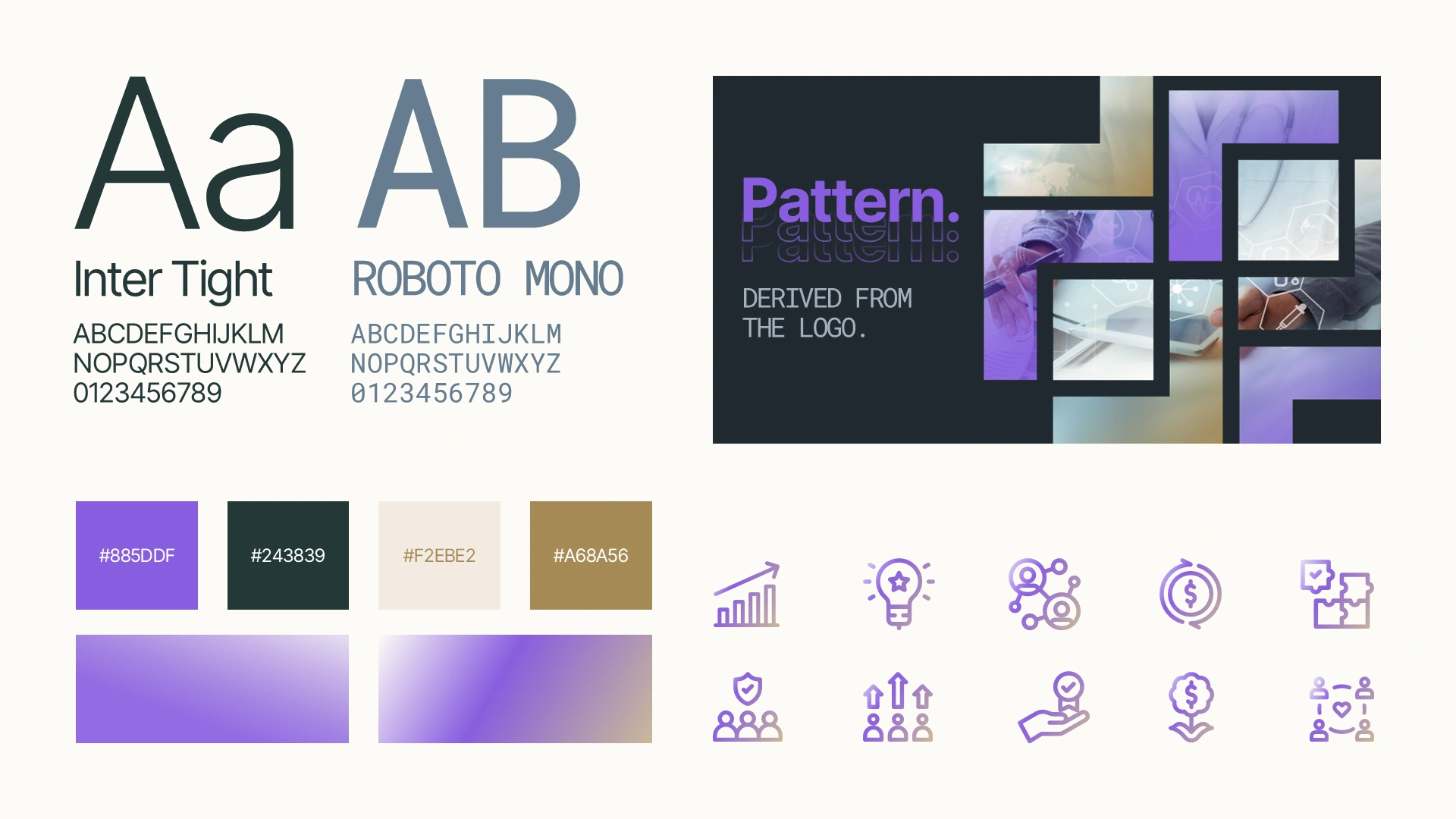
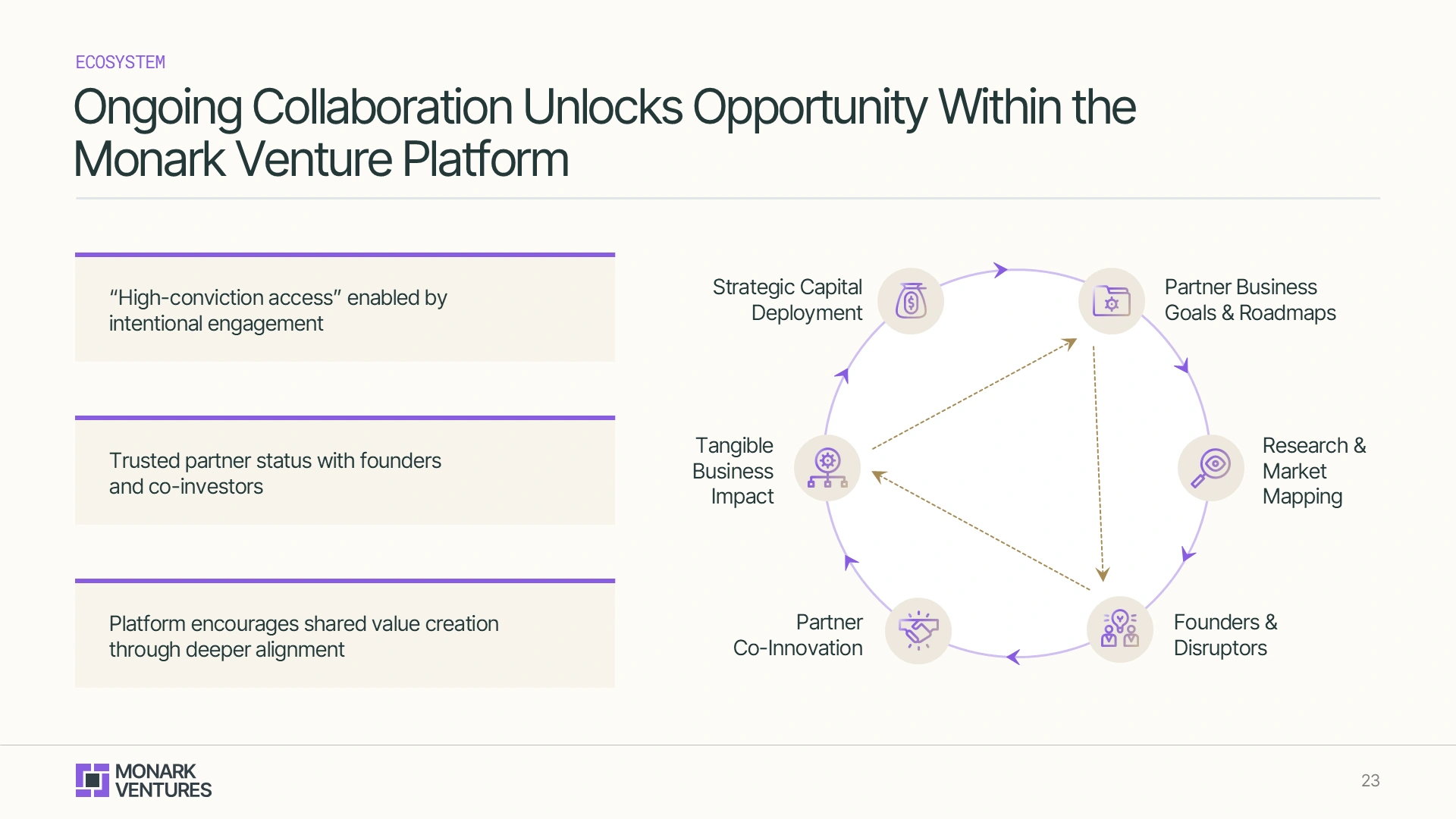
We began by crafting a modern, flexible design system using clean typography, gradient patterns, and refined iconography. This helped establish a clear fund deck visual identity.
A strong moodboard → stronger brand recall → stronger LP interest.

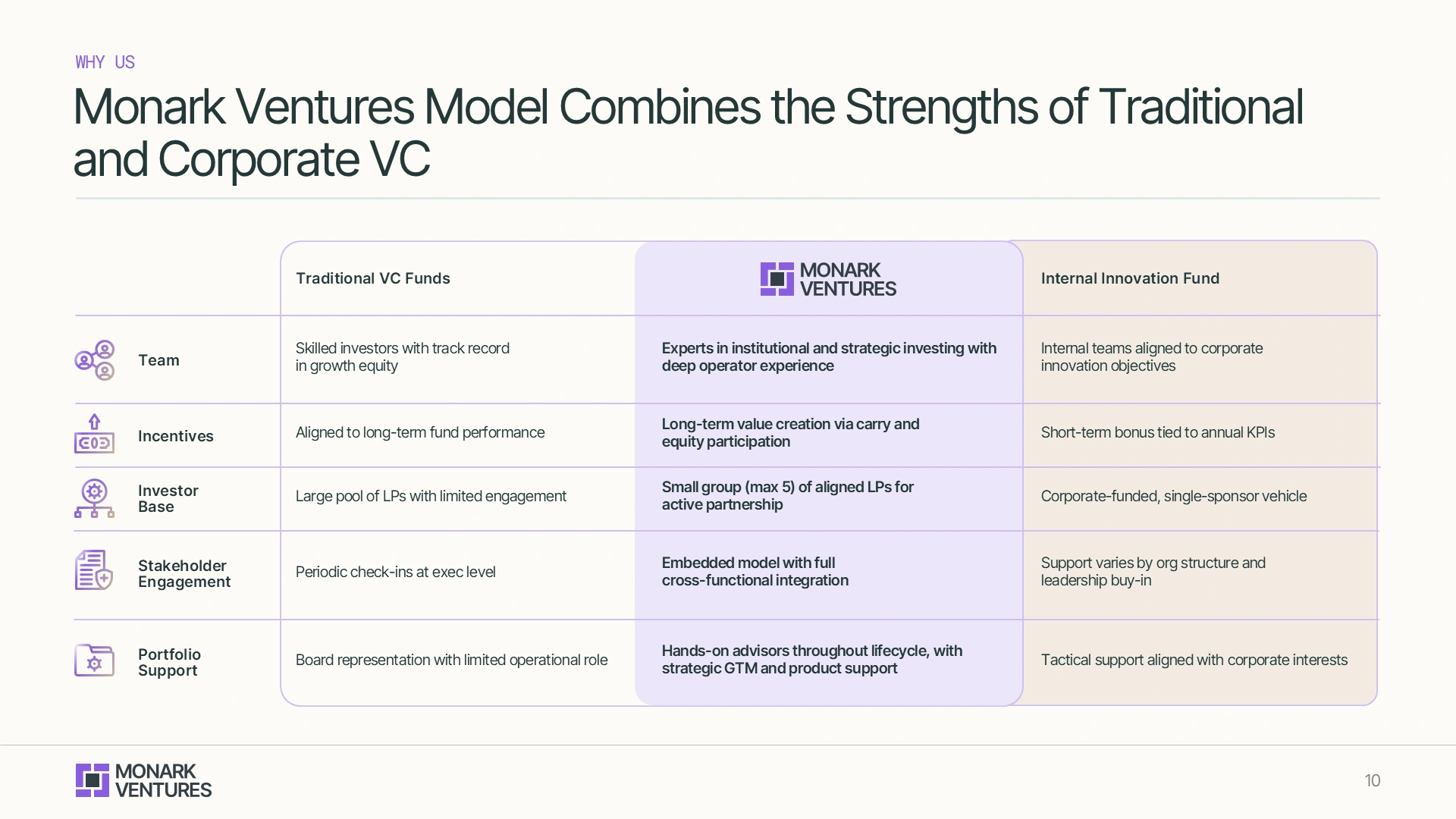
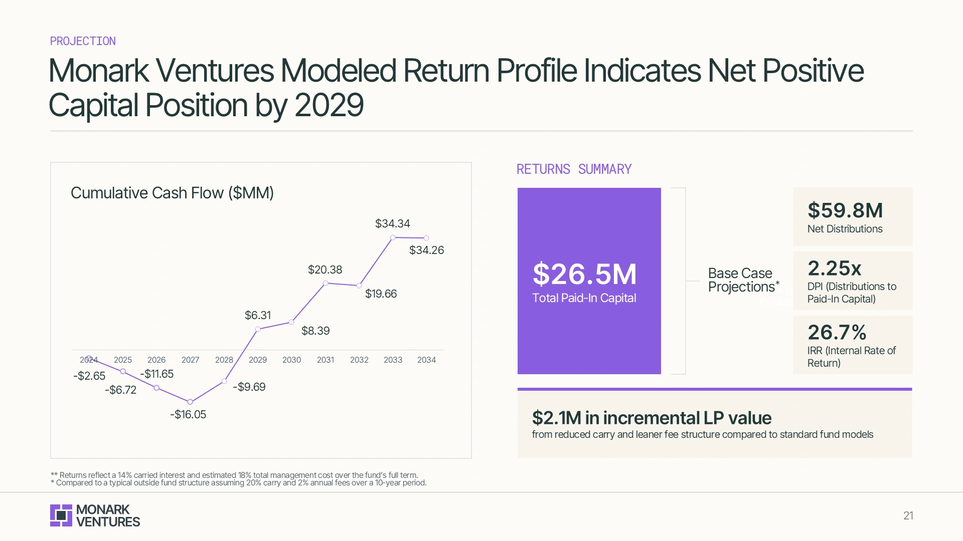
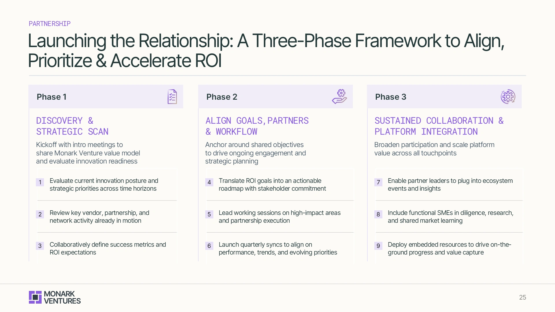
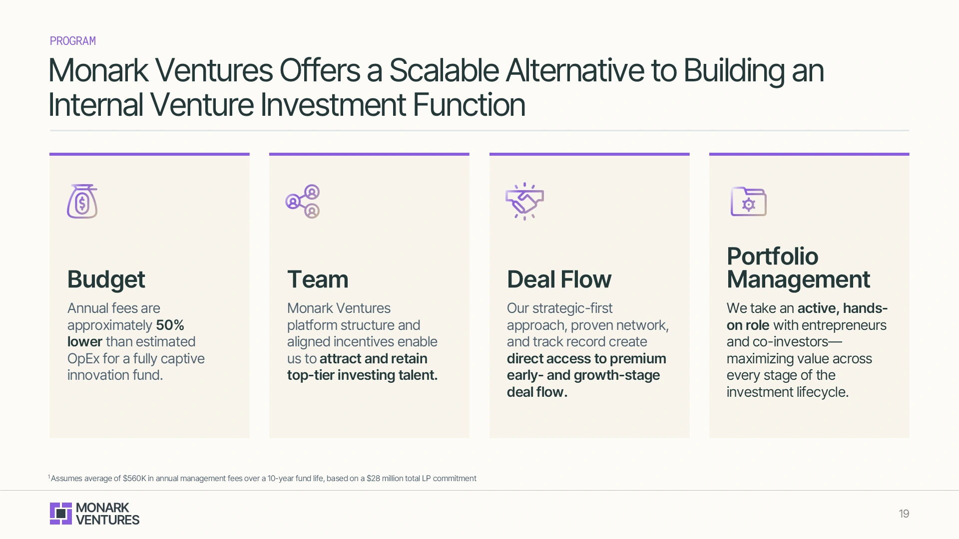
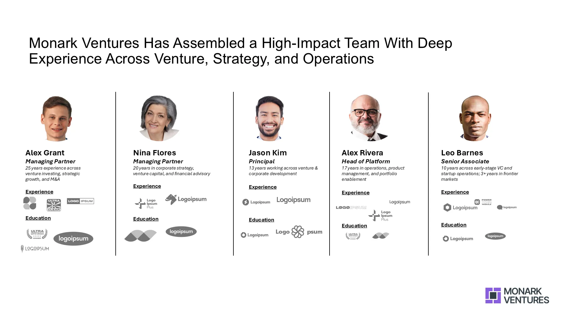
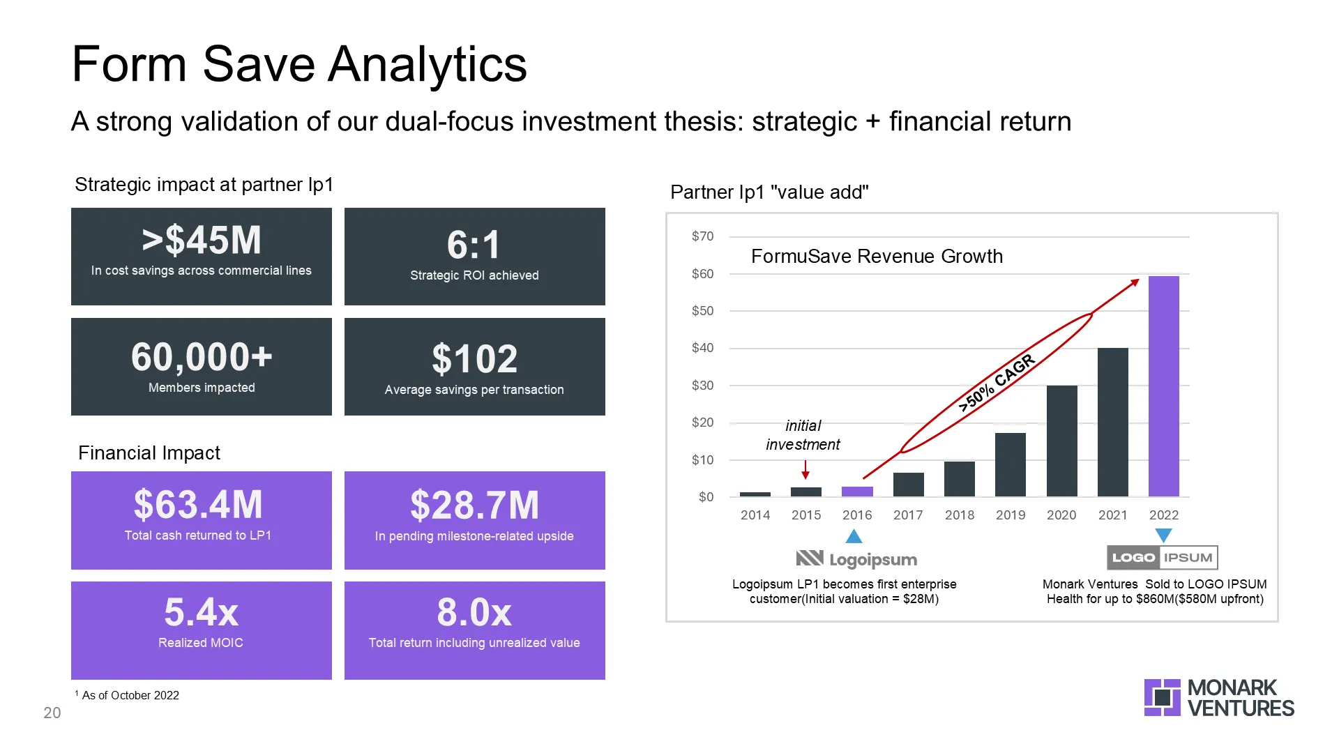
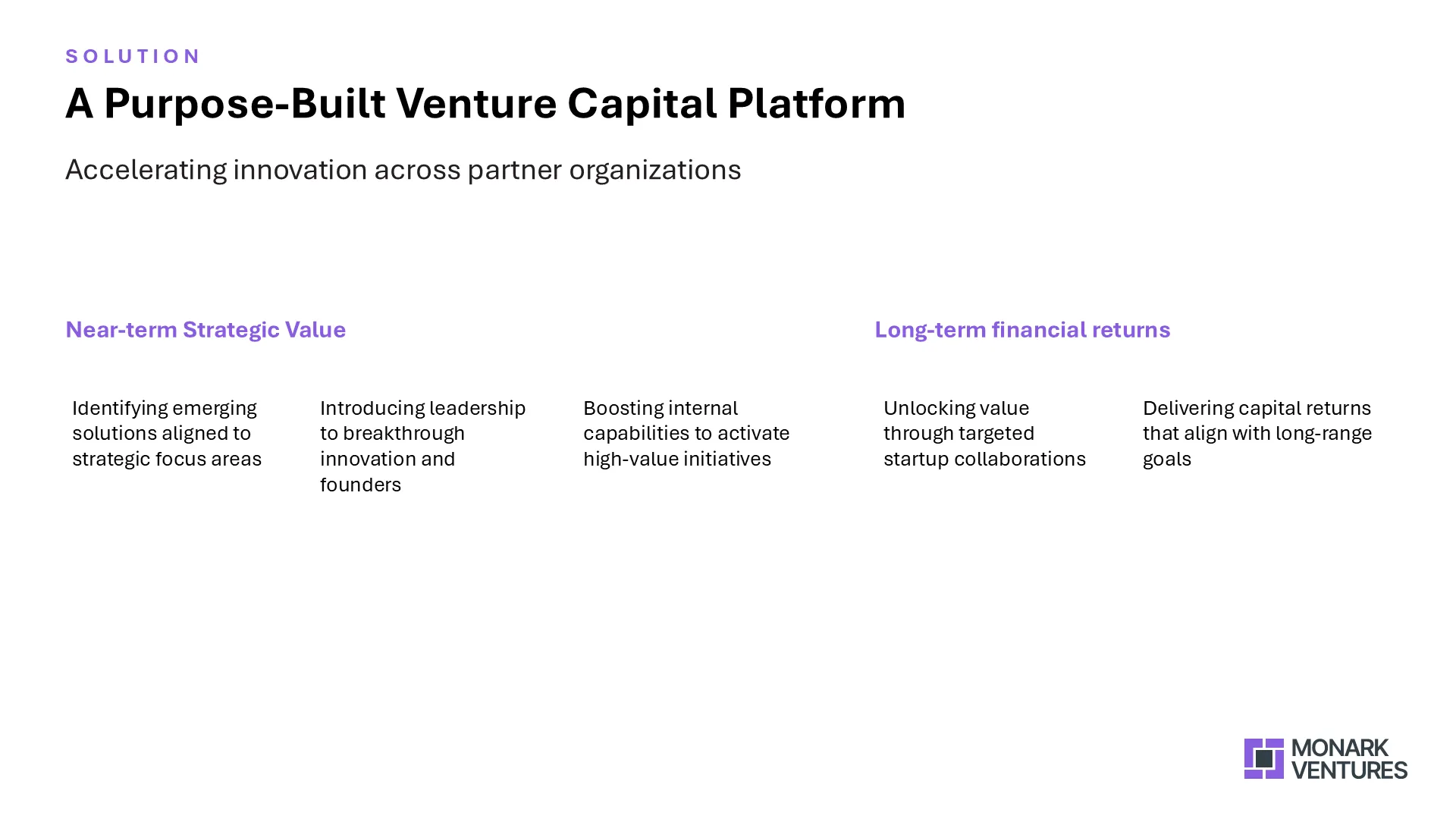
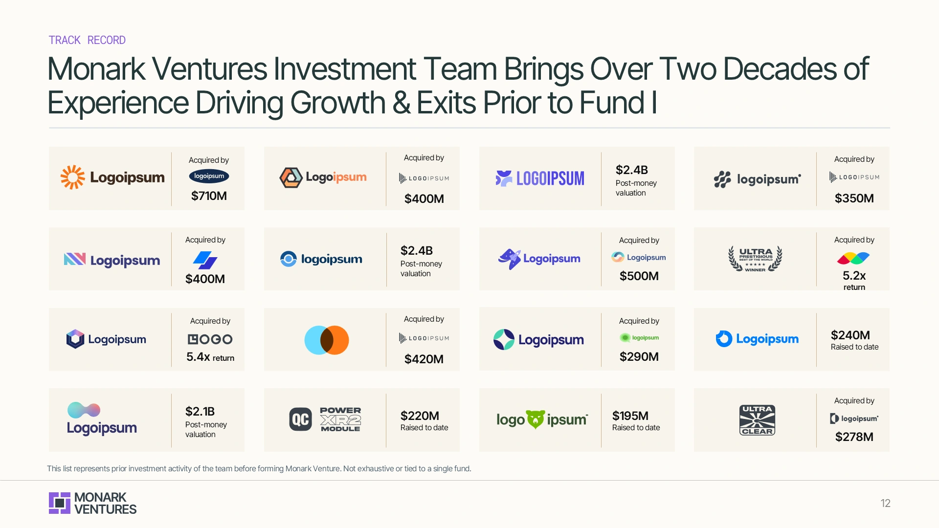
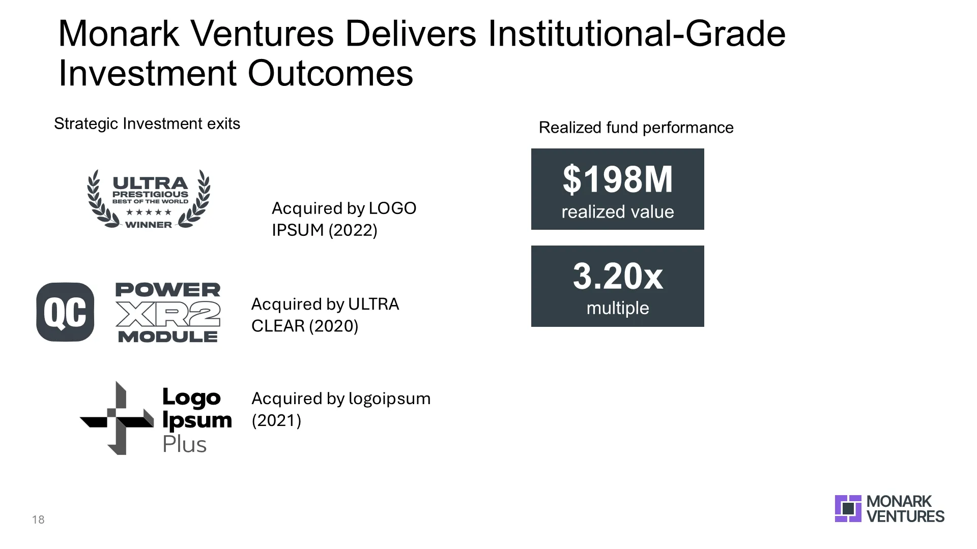
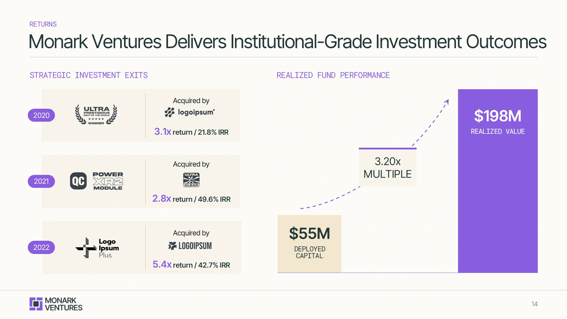
We rebuilt core slides using data storytelling, refined infographics, and enhanced messaging. From team bios to platform strategy, every slide was rewritten and redesigned to support LP communication.
Value Add
On-Brand
Data Visualization
Enhanced Messaging
Optimized Flow & Structure
.webp)
.webp)
The final venture capitalist presentation was clean, consistent, and confidently communicated Monark’s:
Platform Structure
Strategic Value
LP Strategy
Optimized Flow & Structure