

Redesigned an Investor Presentation for a Financial Services Firm

The deck provided by the client was difficult to understand and engage with. It lacked design and did not include data visuals or aesthetic elements that would make the information easily digestible.


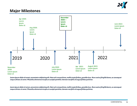
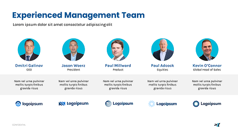
24x did not have a brand manual but their website was well-designed. Inspired by the same; we created a new visual language inspired by their website, incorporating branded layouts, custom graphics, and clean fonts. By combining storytelling with visuals, we made the key points more accessible—enhancing the overall investor experience.


